Author Archives: Jhoanna Dimapanat

Museum Visit: MoMA

I went to MoMA to see Betye Saar’s exhibit, “The Legends of Black Girl’s Window”. Specifically, I chose her infamous art piece, “Black Girl’s Window” (1969). I thought the closest project I’ve done that I could easily compare and contrast with her piece, is my selfiemotion one.
 

Project 5: imagiNATION

Bloom – For my first typography, I’ve decided to go for the vines crawling on this abandoned building. Personally, this is my favorite one out of the three I’ve done because I think I achieved my goal  of making it blend in with my subject but at the same time you could still see the word Bloom. This is also the one I’ve enjoyed making the most, the leaves were pretty fun to do, I thought it was interesting as I tried to make it look somewhat like the actual leaves — I did my best. Color matching the typography was fairly easy too, thankfully I found the colors I needed, I used a combination of black, browns and mustard yellow to match it with the real vines, which helped making the piece look united.

Creep – I had a hard time on this one. I had trouble making the typography stand out. Personally, I think I could’ve approached this better, it just lacks character. The word should’ve been the first thing you should see, but the hand I drew to go along with it takes away all the attention. The color I chose for the letters didn’t match the way I wanted it to be also, it was a tad bit brighter, it had more yellow tint to it. I still somewhat like the mossy look of the actual letters though.

Drip – This was the easiest one to make out of all three. There’s really not much going on for this piece though, it is also lacking character in my opinion. But, I was quite happy I had the almost exact color shades of the actual stain at least.

Project 4: Define


I chose Blue-green for my favorite color. Blue is the color of the sky and the sea, which projects a serene feeling in my opinion. Green on the other hand is the color of nature…of life, something new growing, thus gives a harmonious and relaxing feeling. Combined, it creates this beautiful color that brings all the best characteristic of both colors.

Project 3 – Selfiemotion – Deliver

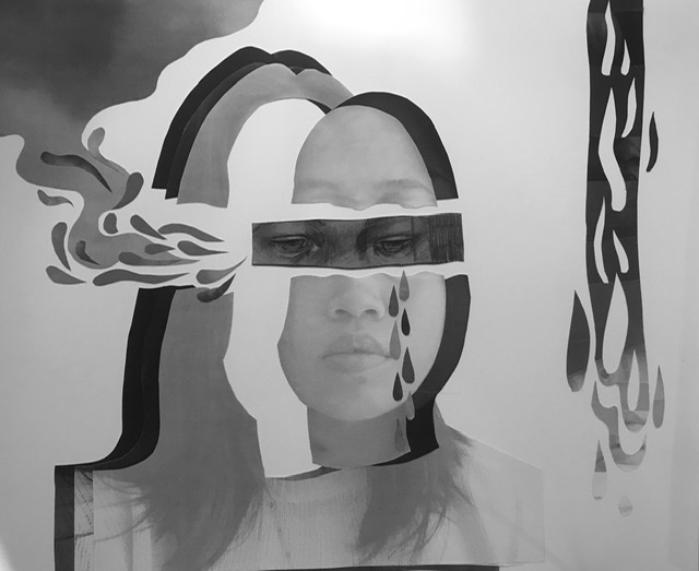
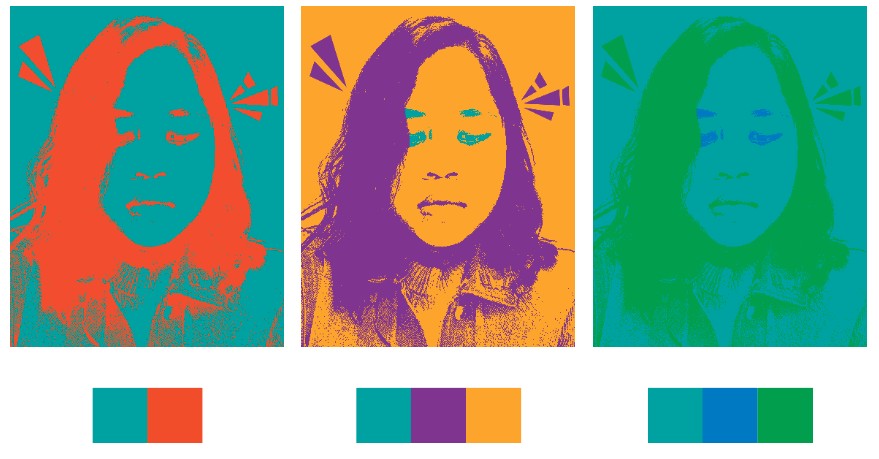
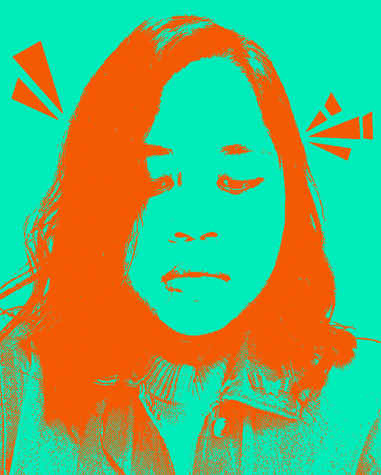
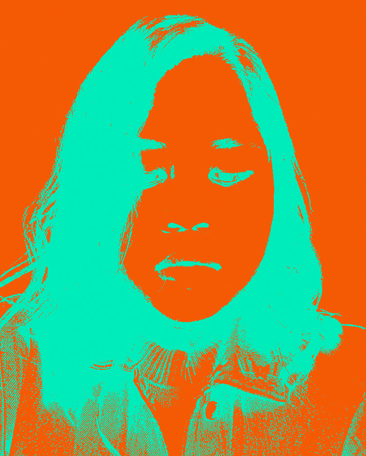
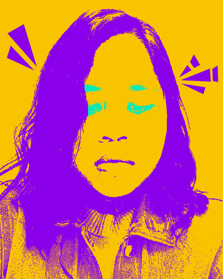
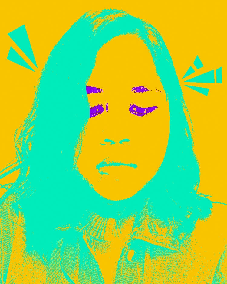
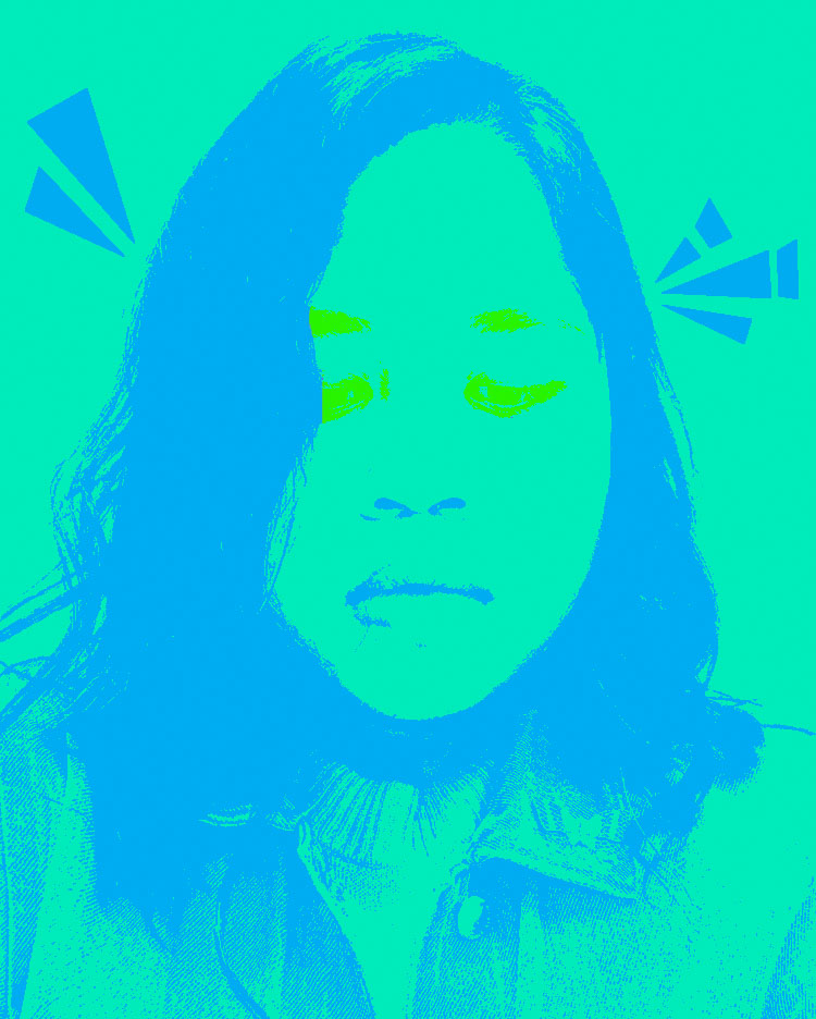
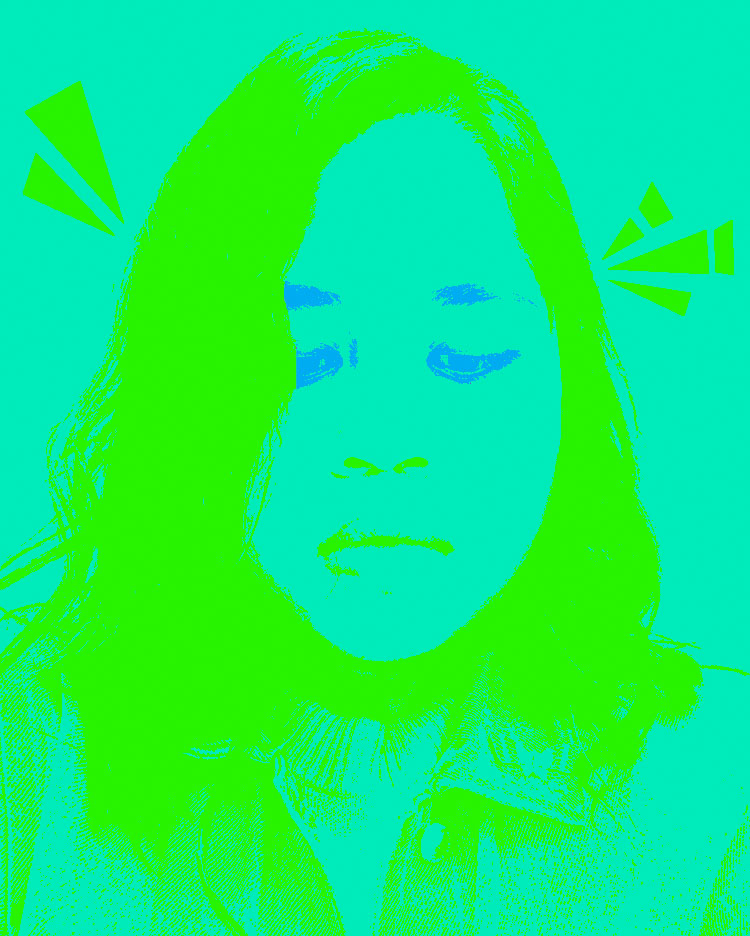
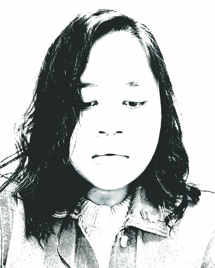
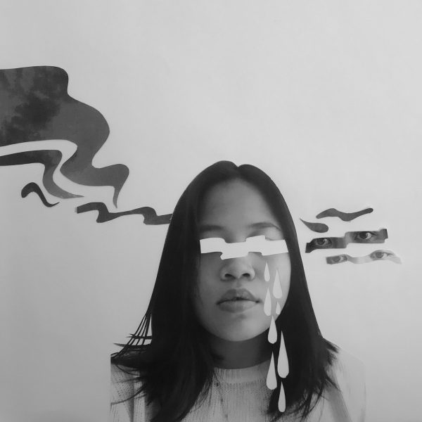
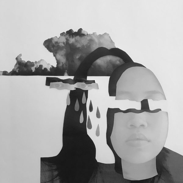
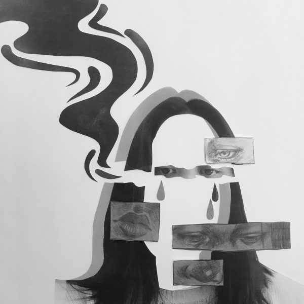
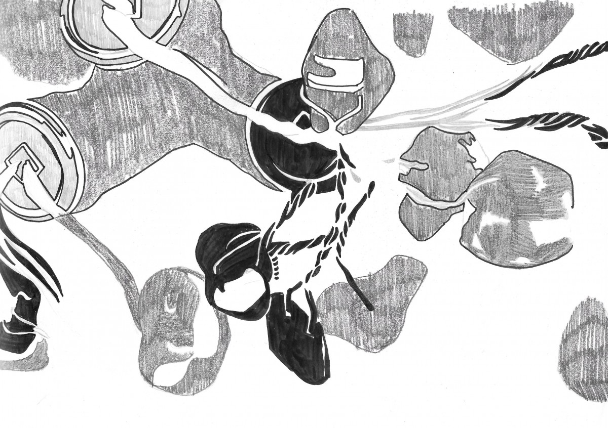
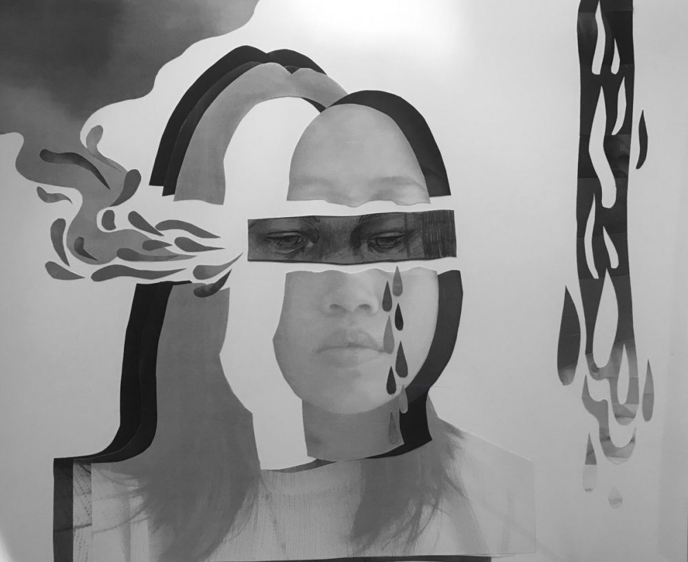
For my selfiemotion project, I’ve chosen the emotion of sadness. As you can see, there are three layers of my selfie, cut out in the same shape, while the face part is detached. I did this because personally, when I’m sad, I feel like I’m in pieces, that I am not myself, incomplete. Tears were also added as an obvious sign of sadness. The wavy shapes coming out of my temple symbolizes thoughts. When I think of sadness, I feel like we contemplate things too much that our mind is overcrowded and overwhelmed. You could easily tell when one is sad just by looking through their eyes, hence making that as my focal point. I had trouble really showing this through my sketches, so I’ve decided to go with a textured drawing to make it stand out, also making the front layer of my selfie light, contrasting with the eye drawing.

While I am not completely satisfied by my final work, there are some things I would like to change, maybe adding more middle grays in there and  I still feel something is missing, I think I’ve somewhat achieved what I was going for.

Project 3 – Selfiemotion – Collage

This is my very first sketch for my selfiemotion project. I was laying down the ideas that I would like to incorporate for my final work. I decided on having the the eyes as my focal point, but it’s not so clear yet for this sketch. The direction is not so yet, so that was another thing I had to work on.

More experiments on how I could deliver the idea of sadness for the final work. The cloud was an attempt as a symbol for an overcrowded head, like heads in the clouds, when I feel sad.

I’ve also want to include some drawings into the collage, not just cut outs of photographs to give it more character and different texture to it.


Project 2: Texture and Pattern – Deliver


Texture – I’ve decided to stick with one sized pen for my line composition and arranged the lines closeness to each other as a way to show the different grays from the original image. I made some lines a bit bolder to add a little character to the final ink work. For the type composition on the other hand, I used bolder and larger sized type to for the darkest part of the image. I mixed script and sans serif for this composition.

Pattern – I went along with my first experiment for my final line composition. I mixed bold and thin lines in order to get the different grays from the image. Meanwhile, for the type composition, I decided to just use sans serif and I used two different pen size, sized 5 and 1, to get the gradients from the original image.

Project 2: Texture and Pattern – Develop in Ink


Image above are my experiments at developing my line composition for my textured image, which was the desert. I honestly got stuck at this part, hence the multiple trials for this part. I was trying out different thickness and types of lines to see which suits best for the zen and peaceful feeling that the original image had. I’ve decided to stick with curved long lines over the broken lines. The broken lines looked grainy and rough, not the feeling nor look that the original image is giving.


For my type composition for the texture image, I’ve decided that I would like to incorporate different types in order to achieve the different grays that the original image had. I was also experimenting with the thickness of the letters, just like the line composition.

The pattern in the other hand, again, I was trying out different types of lines and also playing with the direction of the lines.

Lost & Found – Develop

OBVIOUS

The Button – For the final ink drawing of the image, I’ve finally resized it to work with the 30/60 (figure/background) relation. I’ve also decided to ink almost the whole inside of the figure to make it look more unified.

AMBIGUOUS

Money Tree – Inking the drawing for this one was my favorite because I had the most exploration done due to fact the the original image have a lot going on that I am free to play with shapes, patterns, and such. Compared to the initial sketch, I feel like the final ink drawings look much more simplified. Honestly though, I feel like something is still missing with the final ink drawing.