OBVIOUS
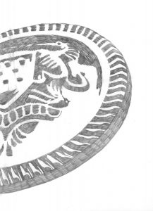
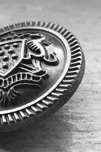
The Button – For the final ink drawing of the image, I’ve finally resized it to work with the 30/60 (figure/background) relation. I’ve also decided to ink almost the whole inside of the figure to make it look more unified.
AMBIGUOUS
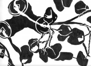
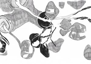
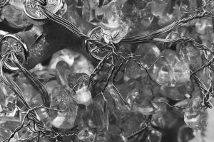
Money Tree – Inking the drawing for this one was my favorite because I had the most exploration done due to fact the the original image have a lot going on that I am free to play with shapes, patterns, and such. Compared to the initial sketch, I feel like the final ink drawings look much more simplified. Honestly though, I feel like something is still missing with the final ink drawing.




Wow! The details! It really shows how much work and time you put in. Great work!!!
Nevertheless, it looks absolutely amazing. It looks like a statement piece, a pair of earrings.