Project 4: Deliver
Leave a reply

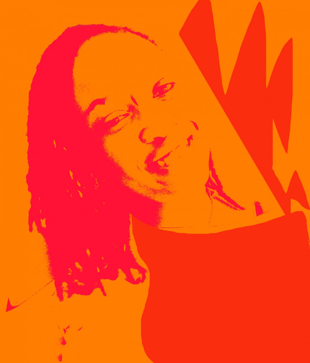
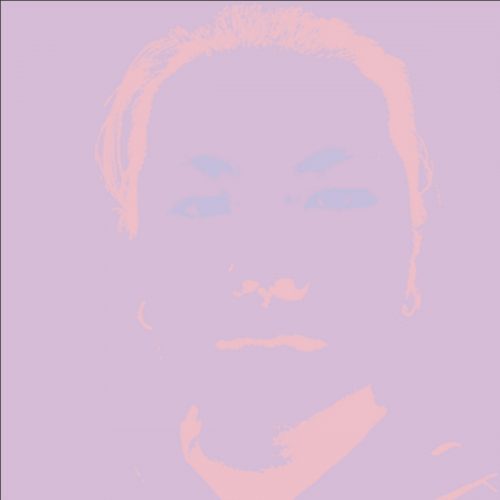
Complimentary

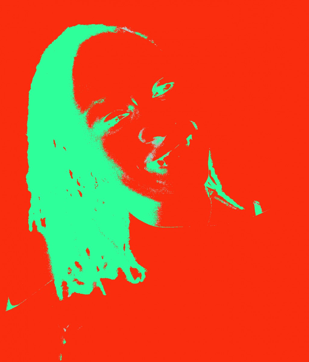
Triad


Analogous


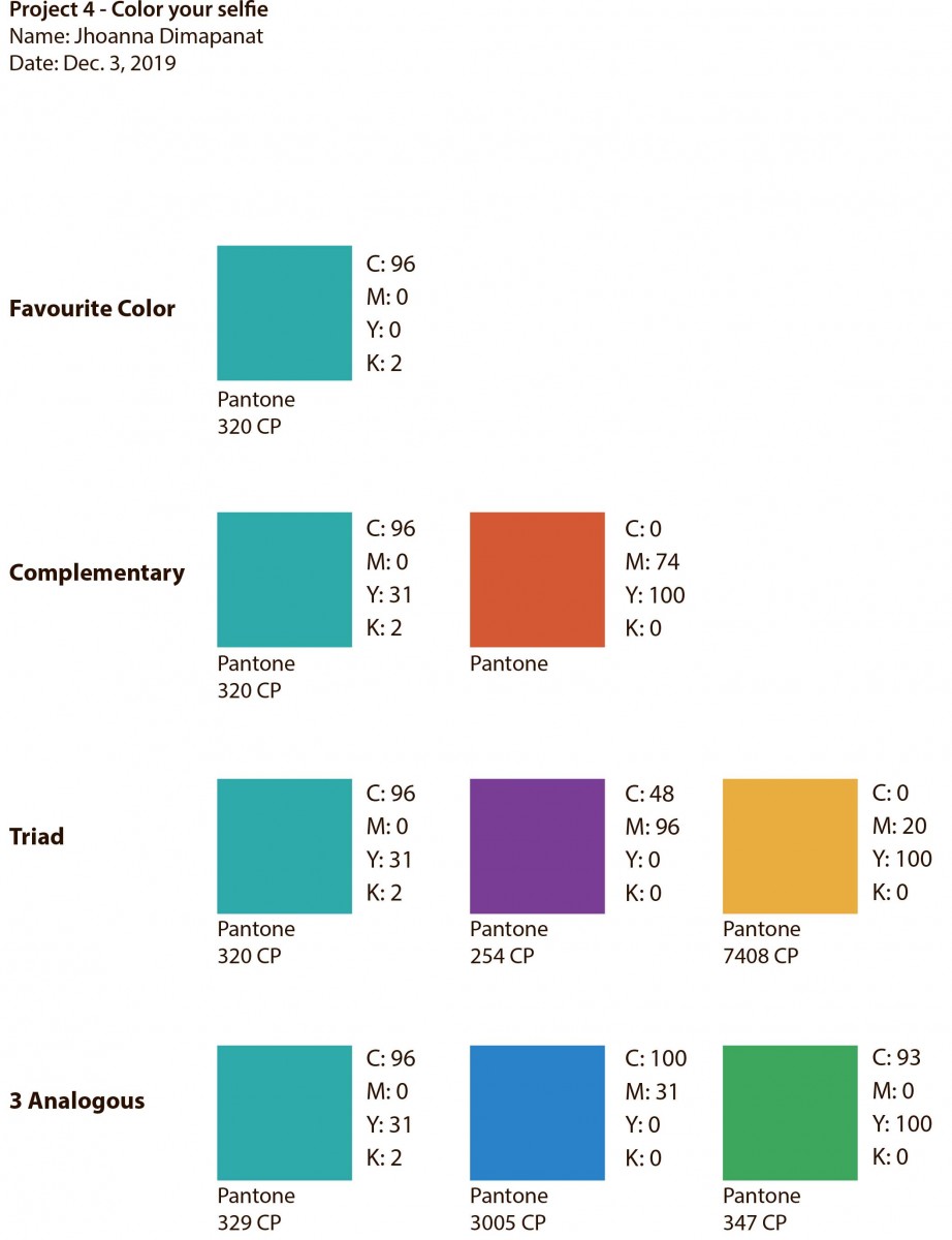

I chose Blue-green for my favorite color. Blue is the color of the sky and the sea, which projects a serene feeling in my opinion. Green on the other hand is the color of nature…of life, something new growing, thus gives a harmonious and relaxing feeling. Combined, it creates this beautiful color that brings all the best characteristic of both colors.

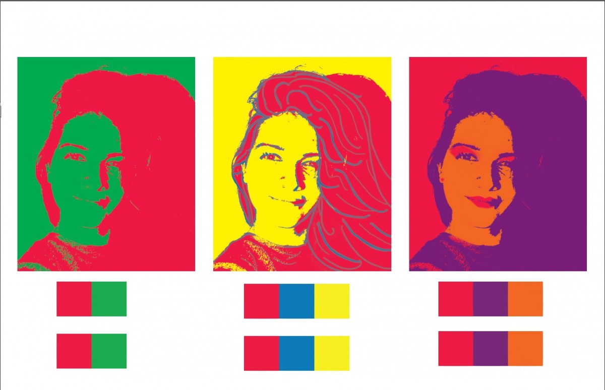
IsadoraMartinez-AnComposition
IsadoraMartinez-TriadComp
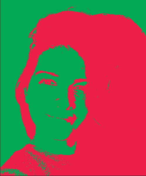
What I learned with this project is that colors have a psychological meaning on the viewer, and if the combination of colors is not balanced the composition will be spiky on the viewer’s eyes. For example, I selected red as my favorite color, while I was creating the complementary color composition I realized that adding green to it generated a clash in the image since they are both strong colors. To remediate this I decided to add the green in the background and red in the foreground and it toned down the intensity of the complimentary composition.
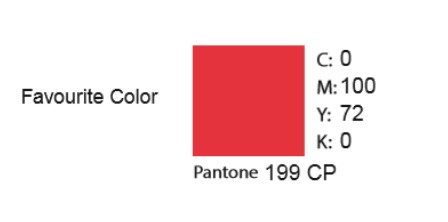
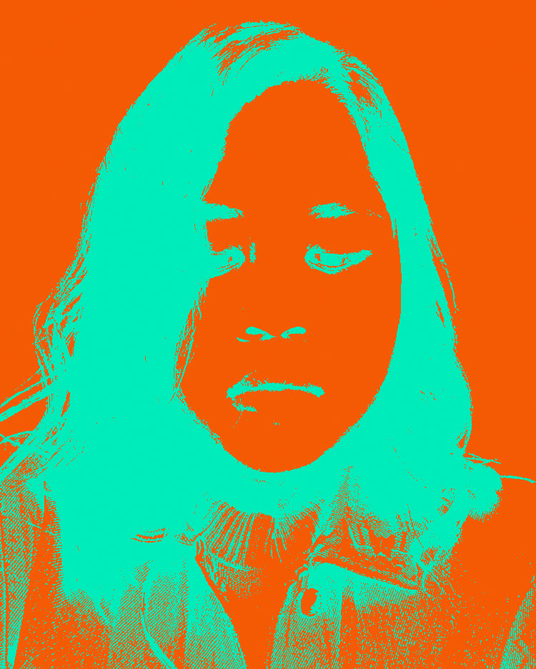
Isadora Martinez’s favorite color, RED
I chose the color red because for me it’s a powerful color. It is a color that motivates people to take action, we associate it with love, passion, energy danger, strength, and war. This resonates with me because I’m the kind of person that if there’s a problem to be solved I always decide to take immediate action. It’s an intense color that demands immediate attention. I even researched the psychological meaning of the color which has tremendous effects on the viewer, it increases metabolism, increases respiration rate and even raises blood pressure.
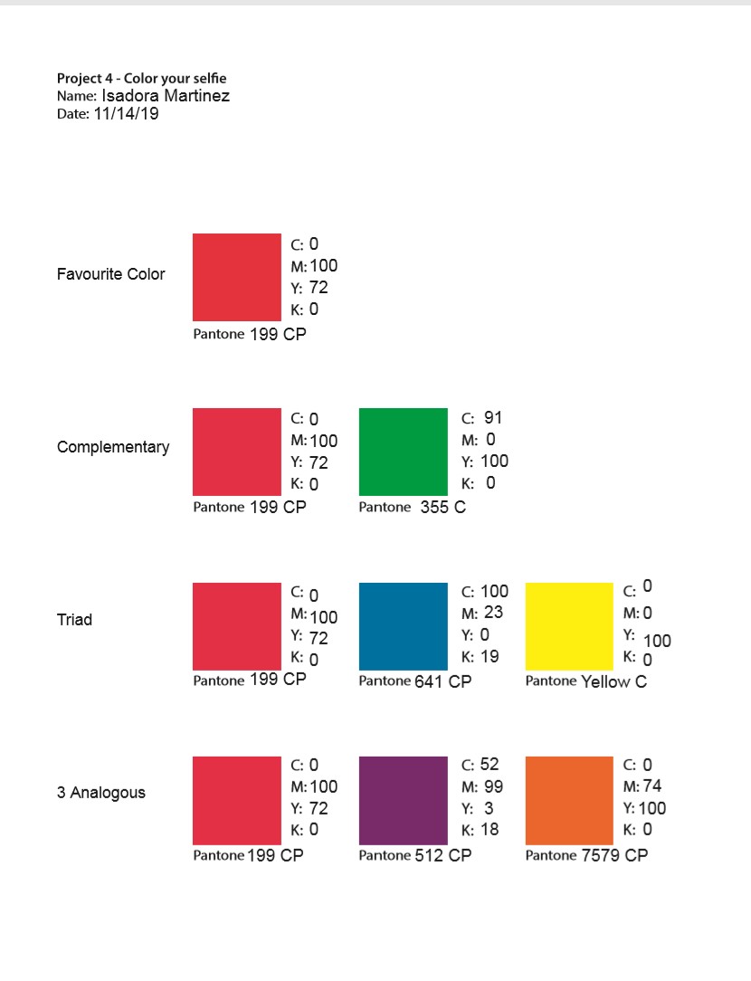
Isadora Martinez Color Wheel

Isadora Martinez b&w high contrast image
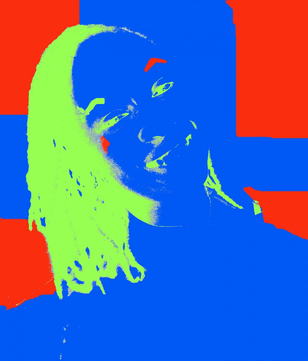
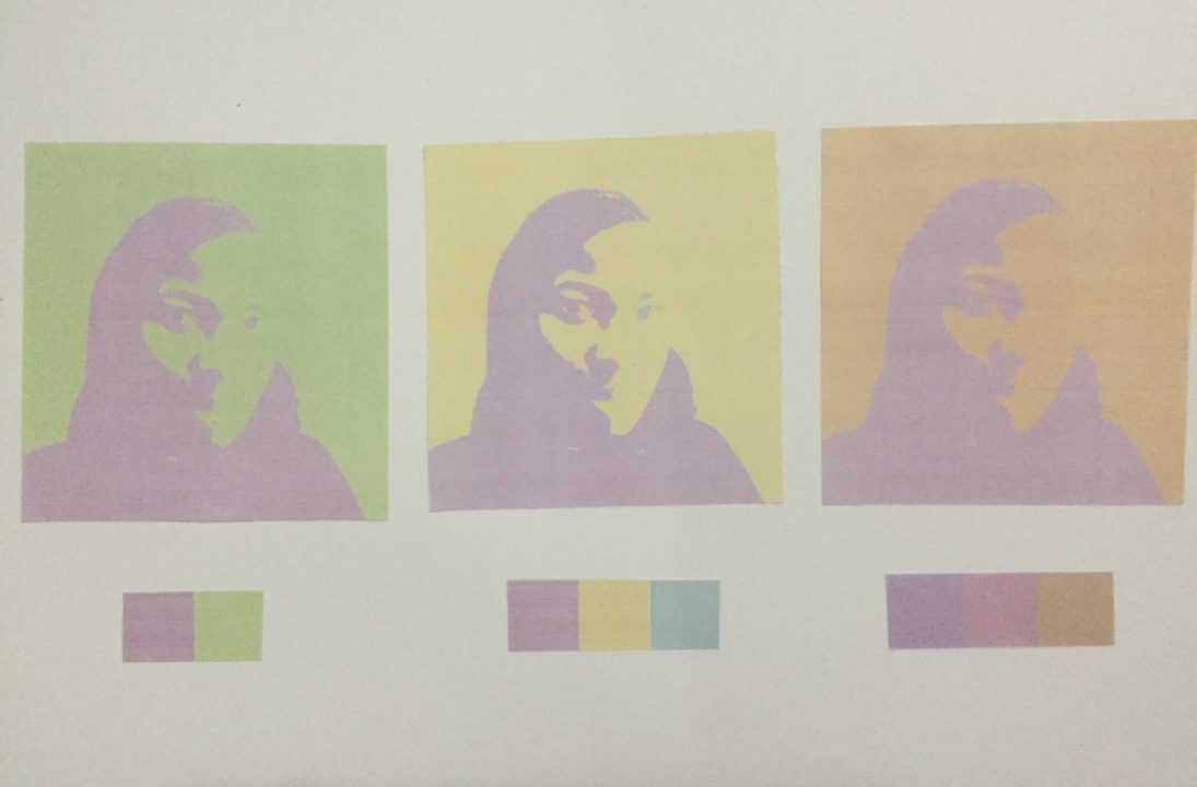
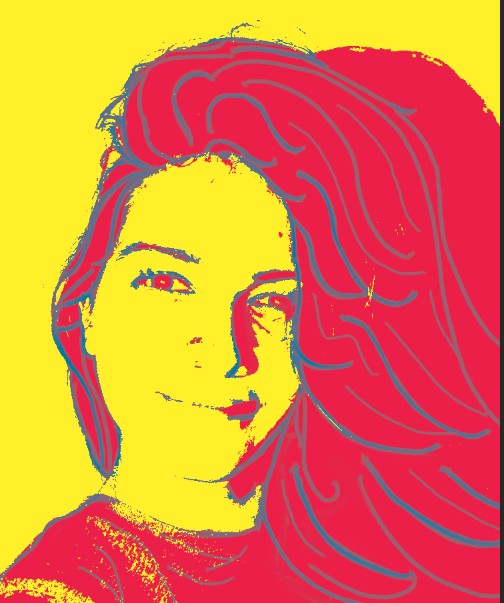
I learned that color I picked could’ve worked better if it was shade. Tint works well with complementary and Triad compositions but as a analogous, it lacked contrast. Before I chose violet as one of the analogous which was worst because since violet is a in the mix of red-violet, it was like the violet focal point was not there. For next project, I’ll use the one of the highest contrasting color chalks that fits the object.
The OpenLab is an open-source, digital platform designed to support teaching and learning at City Tech (New York City College of Technology), and to promote student and faculty engagement in the intellectual and social life of the college community.

 3 analogous composition
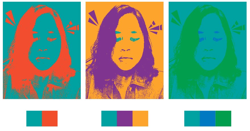
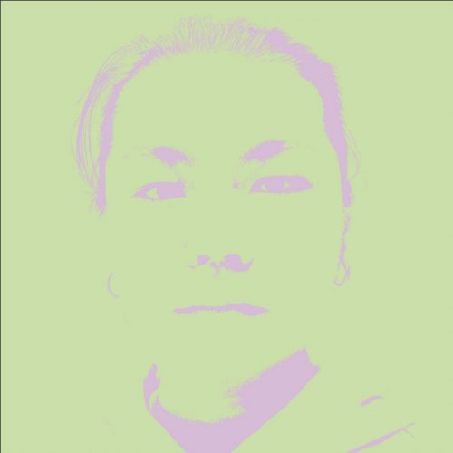 complimentary composition
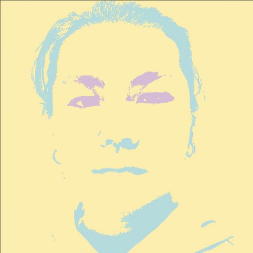 triad composition