The Manneporte
By Claude Monet

Starting points
Skatches
The starting point is of a stain that has more of a texture look, so in sketch I made it more smooth since I’m relaying on the texture of the sidewalk to get the same feeling.
I had a few ideas for the sticks but I pick the first design because it resembles a stick more than the others.
The spray paint on the ground are like the black gum you usually see near walls however instead of being simple dots, some had extra dashes and smaller dots around it. The image,”Eat”, was the first word but I changed it.
Final Compositions
I would improve these drawing by getting a stronger charcoal product so they don’t break on me every two seconds. The NYC can be improved if I draw it in a different angle so I could get a flat surface for the C.
I learned that color I picked could’ve worked better if it was shade. Tint works well with complementary and Triad compositions but as a analogous, it lacked contrast. Before I chose violet as one of the analogous which was worst because since violet is a in the mix of red-violet, it was like the violet focal point was not there. For next project, I’ll use the one of the highest contrasting color chalks that fits the object.
The contrast I got was hard get. In order to get the white I had to constantly raise the contrast however the more I raise the contrast, the more the left side of my face starts to blend with the shadow. I think I got the right balance where the you can see my eyes, eyebrows, nose, and mouth.
My favorite color I would be working on is red- violet (tint).

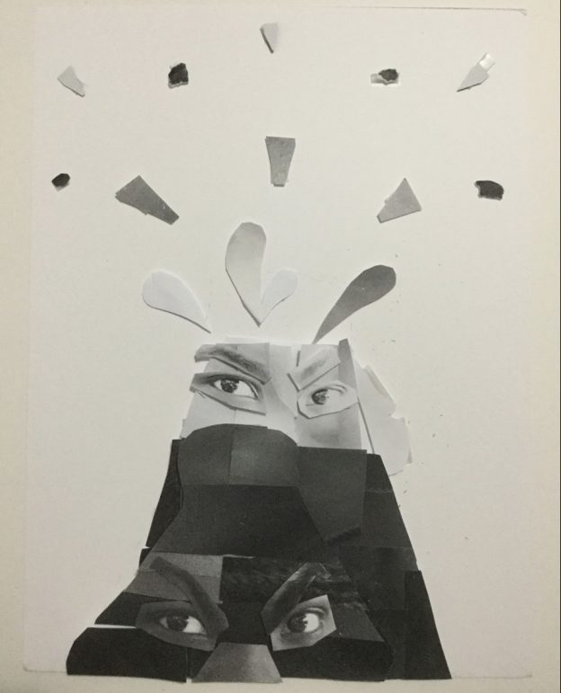
The mood of all the collage are anger.
These two were created the same day so I was cautious on cutting up the face because I was afriad of messing up.
In this was trying to figure out how to express anger than just changing the eyebrows. My mouth has a bit of a smile so tried to hind it up with mustaches. however I this one I draw my a mouth grunting the teeth. The lines on the side of the face were so pose to be wrinkles you get when you streach the mouth long.
This final collage capture movement by showing that anger builds up and then eventually let the rage out like a volcano. If I thought of this soon I would’ve made it more exagguated.
The areas of emphasis in my photo is going to reflect the mood, anger though the eyebrows, nose, eyes and mouth. The eyebrows and mouth is what most shows anger when they are squinch up towards the middle of your eyes. The focal point is the eyes since they direct the viewer to a direction of the photo. My photo is looking towards the viewer, so that means the eyes gives off tension.