Category Archives: Project 1 – Lost & Found

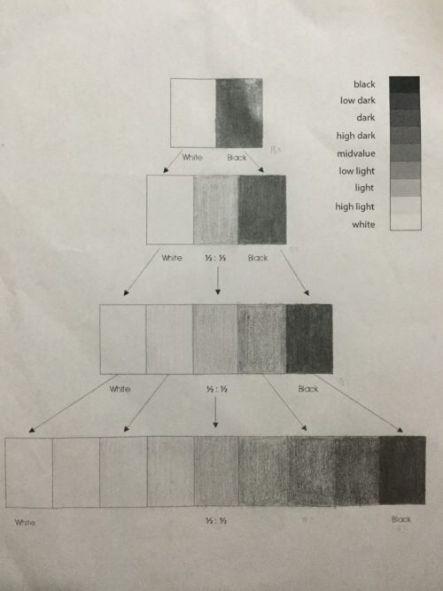
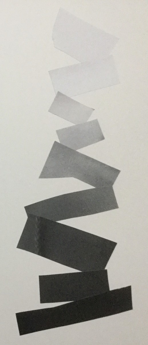
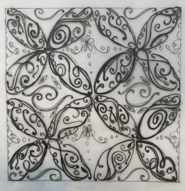
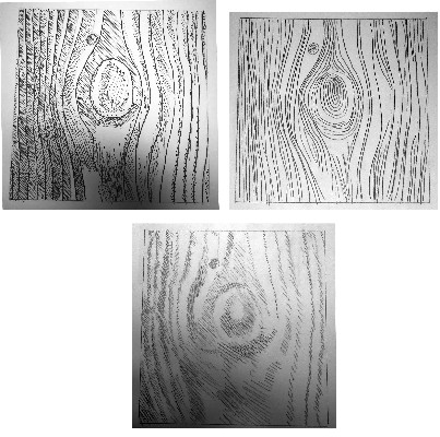
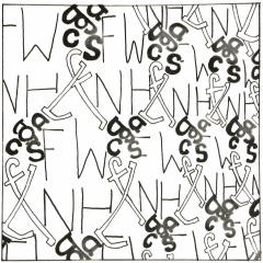
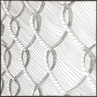
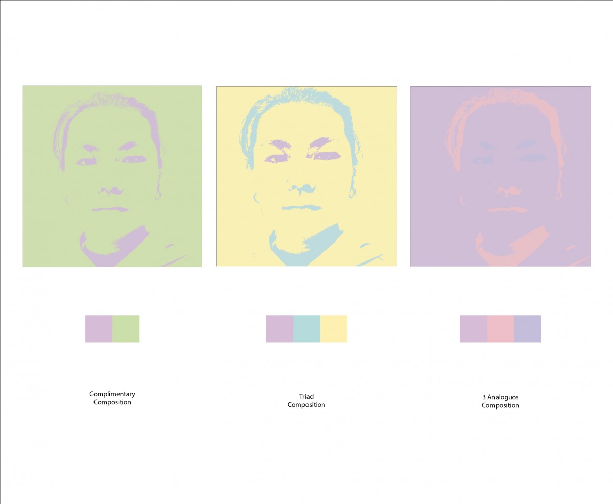
this is my final composition. through this project, I learned how to mix and match between the lighter and the darker color along with resizing images. I also learned how to select and color area with similar color. In this composition, I’ve found the cleanup and coloring selected area to be the hardest but now I can do it easily.
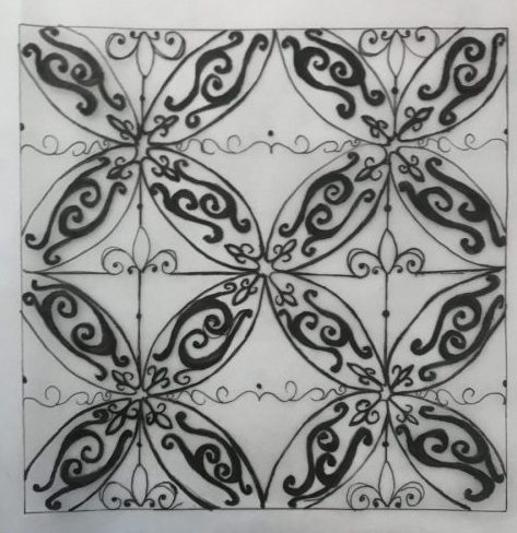
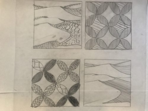
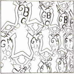
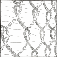
About the color Blue

Blue is my favorite color because it’s the most pleasing to me. It also makes me feel calm. I also like it because I associate the color blue with the winter and that is my favorite season. Many people have found that blue is the color that makes them feel secure, peaceful, and orderly. Not only does it make them feel peaceful, but it also makes people more productive. The color blue is the worlds favorite color because of the peaceful nature attached behind it, for example lakes, oceans, waterfalls, and because the color makes people feel secure. Although the color blue is the worlds most favorite color it is the worlds least appetizing color. According to dunnedwards.com people started, “making blue pigments…About 6,000 years ago, humans began to develop blue colorants, Lapis, a semiprecious stone mined in Afghanistan, became highly prized by the Egyptians”. Many people adored the color blue back then and still do today.

Project 3 Selfiemotion- step 2 define

The areas of emphasis in my photo is going to reflect the mood, anger though the eyebrows, nose, eyes and mouth. The eyebrows and mouth is what most shows anger when they are squinch up towards the middle of your eyes. The focal point is the eyes since they direct the viewer to a direction of the photo. My photo is looking towards the viewer, so that means the eyes gives off tension.

Line Pattern

Pattern Case Study:

I felt an ornamental and retro mood from the pattern. Therefore I started studying Ornamental lines.  Drawing different ornamental lines of several widths allowed me to create a pattern to work with and guide me while I was working on the bigger picture.


For this line pattern, I selected a theme which was the “Fleur-de-lys”. The fleur is very representative of the ornamental designs and found it a perfect inspiration for this design. I based the darker colors of the composition just by the thickness of the pens and not by repetition and filling the space.

Ink pagt

Pattern Line drawing with ornamental and retro lines. Repetition and thickness allowed me to make the darker spaces seem denser and fuller.

Txture & Pattern step 3 Define with Type

texture

https://drive.google.com/open?id=1CkilOuAzb14ZDA2FCeqKgCRtYRMrwCu-


https://drive.google.com/open?id=1FsVB5n1Nqlf3NaPUcYQ1P0j4rljtjo7I


https://drive.google.com/open?id=1rprBtyKVY8uVn4fAjbu5U7tYoeNntUbF


pattern

https://drive.google.com/open?id=1ZUjOtvc3_43J-g3kcVVU_1xPNQlJWvLI


https://drive.google.com/open?id=1j7fgwAeKXJKzwbrM_1oFmDn2Pdwb7x8l


https://drive.google.com/open?id=1OCYp_94nn-_oOOYNgHembpRvASoFHkZM

Txture & Pattern step 2 Define with Line

(the pictures can’t compress at 100K. Copy and paste link on google search to see image)

Texture lines

https://drive.google.com/open?id=1_dkQ5dssUYwZxpkvGKiasqHsOJSnjYT_


https://drive.google.com/open?id=1Jyxqih9dg2chxTdgZzrohh4naJHpAUHw


https://drive.google.com/open?id=1ZFmRup_tjRTNKo4j2TpC79GDqUSxlGSp

Pattern lines

https://drive.google.com/open?id=1wvIsJGLodQb31Q4dPTPmECQLnY_c0_GJ


https://drive.google.com/open?id=1h-7b93VDZTIv6wHxzYCnfzDeKcqBMn3Y


https://drive.google.com/open?id=1HaK9H873vTPLJ34it-XfRCEUPYGjd6Jn