Blue is my favorite color because it’s the most pleasing to me. It also makes me feel calm. I also like it because I associate the color blue with the winter and that is my favorite season. Many people have found that blue is the color that makes them feel secure, peaceful, and orderly. Not only does it make them feel peaceful, but it also makes people more productive. The color blue is the worlds favorite color because of the peaceful nature attached behind it, for example lakes, oceans, waterfalls, and because the color makes people feel secure. Although the color blue is the worlds most favorite color it is the worlds least appetizing color. According to dunnedwards.com people started, “making blue pigments…About 6,000 years ago, humans began to develop blue colorants, Lapis, a semiprecious stone mined in Afghanistan, became highly prized by the Egyptians”. Many people adored the color blue back then and still do today.
Category Archives: Step 3 – Develop
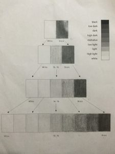
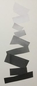
Project 3 Selfiemotion- step 4 gray scales
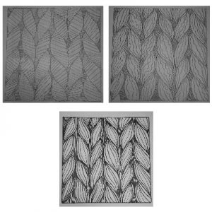
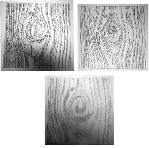
Project 2-Txture & Pattern-Develop
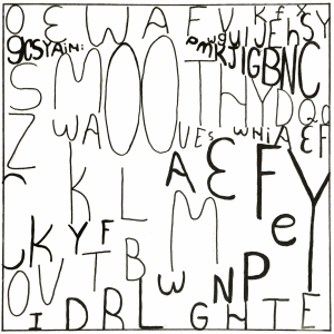
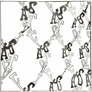
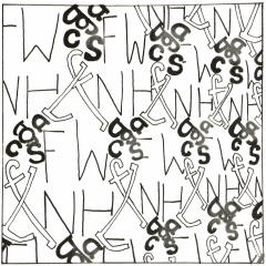
Txture & Pattern step 3 Define with Type
texture
https://drive.google.com/open?id=1CkilOuAzb14ZDA2FCeqKgCRtYRMrwCu-
https://drive.google.com/open?id=1FsVB5n1Nqlf3NaPUcYQ1P0j4rljtjo7I
https://drive.google.com/open?id=1rprBtyKVY8uVn4fAjbu5U7tYoeNntUbF
pattern
https://drive.google.com/open?id=1ZUjOtvc3_43J-g3kcVVU_1xPNQlJWvLI
https://drive.google.com/open?id=1j7fgwAeKXJKzwbrM_1oFmDn2Pdwb7x8l
https://drive.google.com/open?id=1OCYp_94nn-_oOOYNgHembpRvASoFHkZM
Project 1 – Lost & Found Step 3 – Develop
Steps 3 and 4 (Jordan Thomas)
Refine
Project 1- Andrew Chen – Step 3: Develop
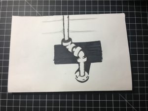
I was really satisfied with the work. I made the background and the shadow highlight the object. All I need to do next is adding more details.
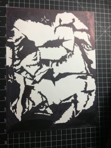
I feel like there is still more work needed to complete this work. The object is still too flat. I plan to add more details and shapes to increase the volume of the crumbled newspaper.
Lost & Found – Develop
OBVIOUS
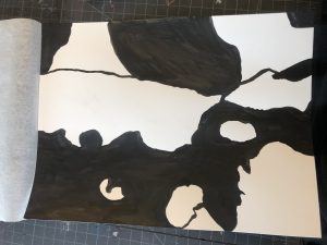
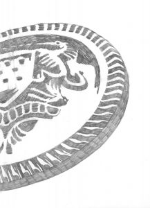
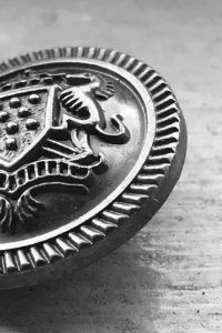
The Button – For the final ink drawing of the image, I’ve finally resized it to work with the 30/60 (figure/background) relation. I’ve also decided to ink almost the whole inside of the figure to make it look more unified.
AMBIGUOUS
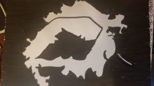
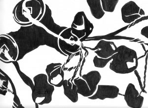
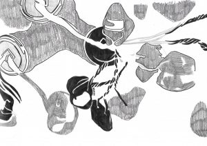
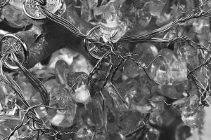
Money Tree – Inking the drawing for this one was my favorite because I had the most exploration done due to fact the the original image have a lot going on that I am free to play with shapes, patterns, and such. Compared to the initial sketch, I feel like the final ink drawings look much more simplified. Honestly though, I feel like something is still missing with the final ink drawing.

