Museum visit comparison images
Leave a reply

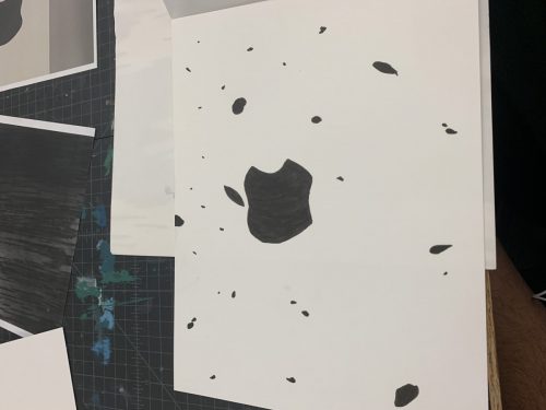
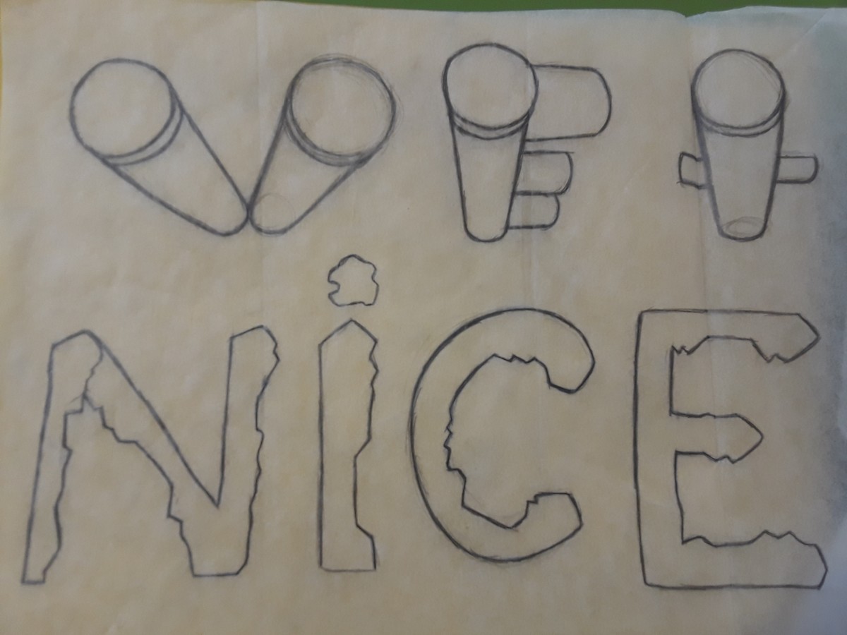
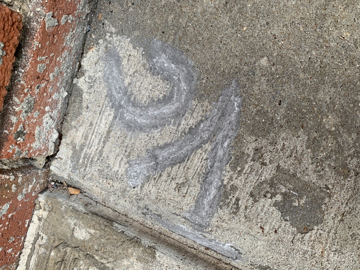
Starting points

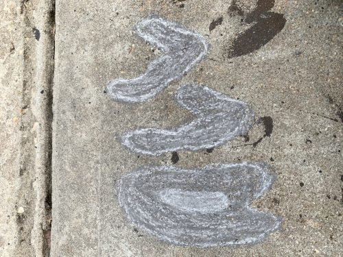
Skatches
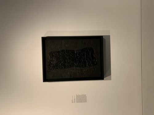
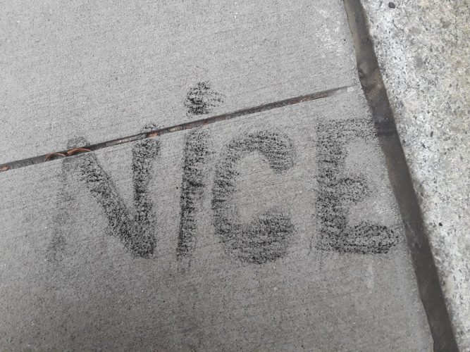
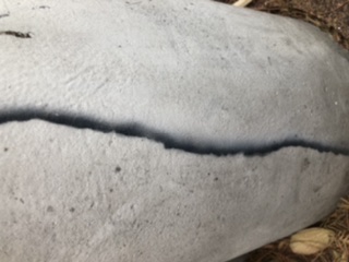
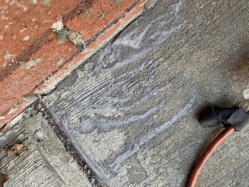
The starting point is of a stain that has more of a texture look, so in sketch I made it more smooth since I’m relaying on the texture of the sidewalk to get the same feeling.
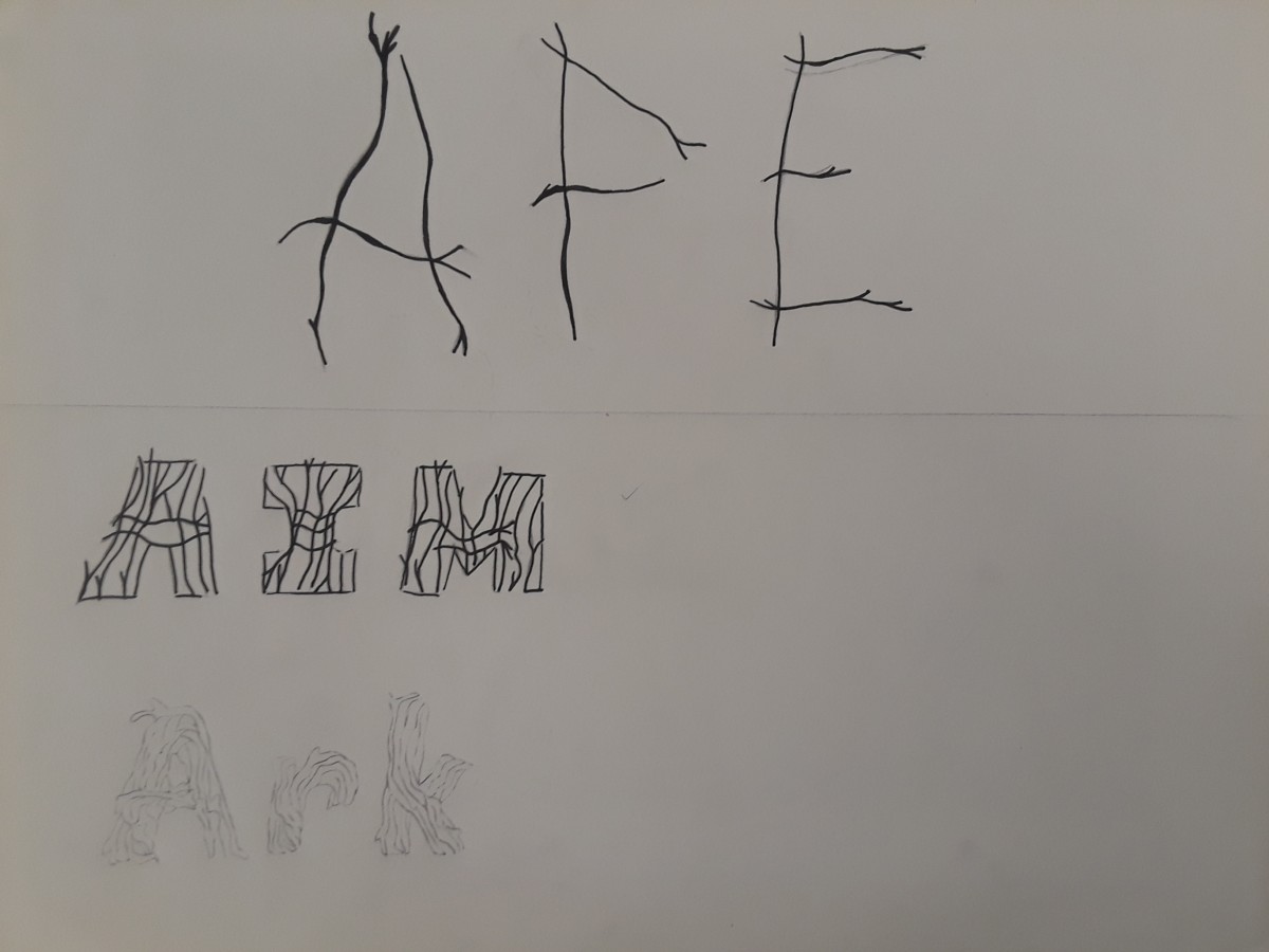
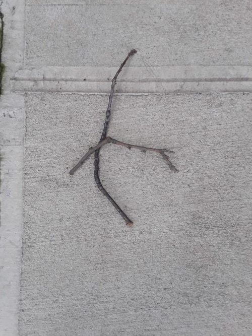
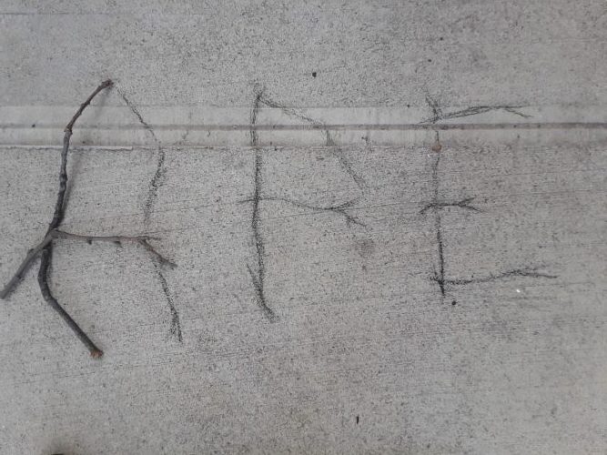
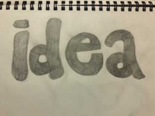
I had a few ideas for the sticks but I pick the first design because it resembles a stick more than the others.
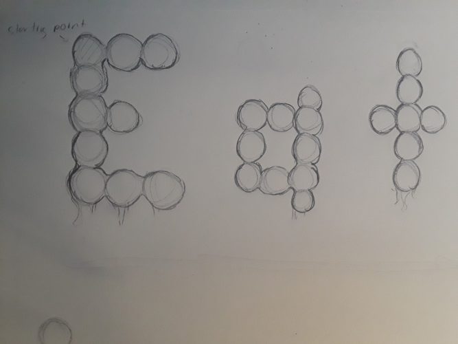
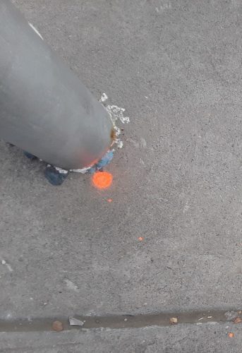
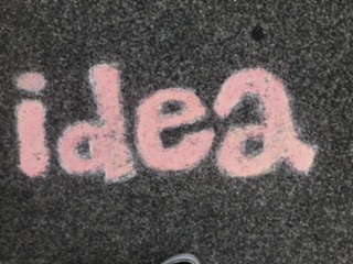
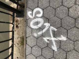
The spray paint on the ground are like the black gum you usually see near walls however instead of being simple dots, some had extra dashes and smaller dots around it. The image,”Eat”, was the first word but I changed it.
Final Compositions
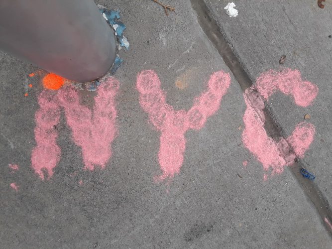
I would improve these drawing by getting a stronger charcoal product so they don’t break on me every two seconds. The NYC can be improved if I draw it in a different angle so I could get a flat surface for the C.
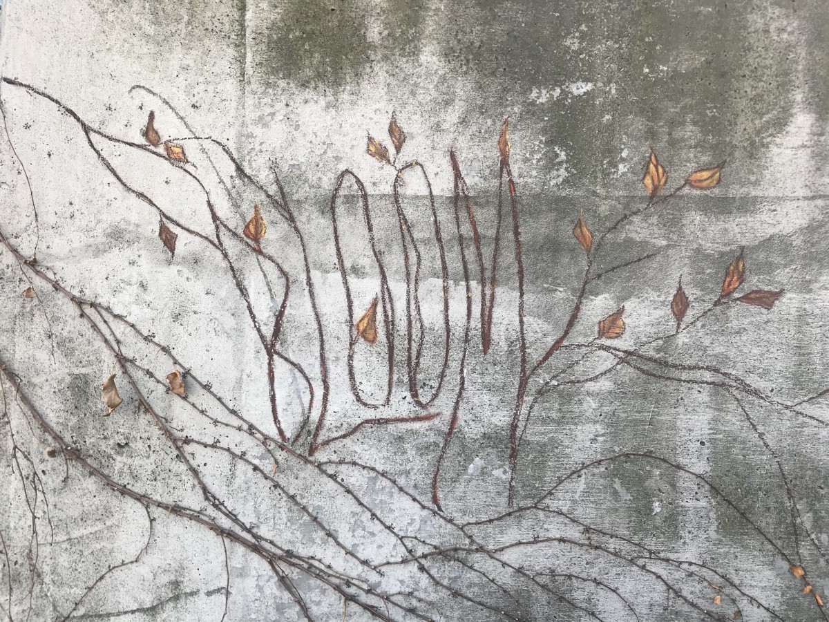
Bloom – For my first typography, I’ve decided to go for the vines crawling on this abandoned building. Personally, this is my favorite one out of the three I’ve done because I think I achieved my goal of making it blend in with my subject but at the same time you could still see the word Bloom. This is also the one I’ve enjoyed making the most, the leaves were pretty fun to do, I thought it was interesting as I tried to make it look somewhat like the actual leaves — I did my best. Color matching the typography was fairly easy too, thankfully I found the colors I needed, I used a combination of black, browns and mustard yellow to match it with the real vines, which helped making the piece look united.

Creep – I had a hard time on this one. I had trouble making the typography stand out. Personally, I think I could’ve approached this better, it just lacks character. The word should’ve been the first thing you should see, but the hand I drew to go along with it takes away all the attention. The color I chose for the letters didn’t match the way I wanted it to be also, it was a tad bit brighter, it had more yellow tint to it. I still somewhat like the mossy look of the actual letters though.

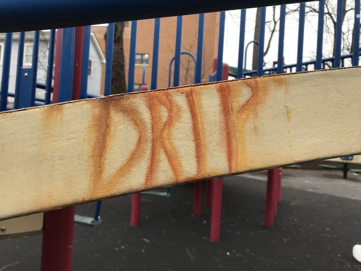
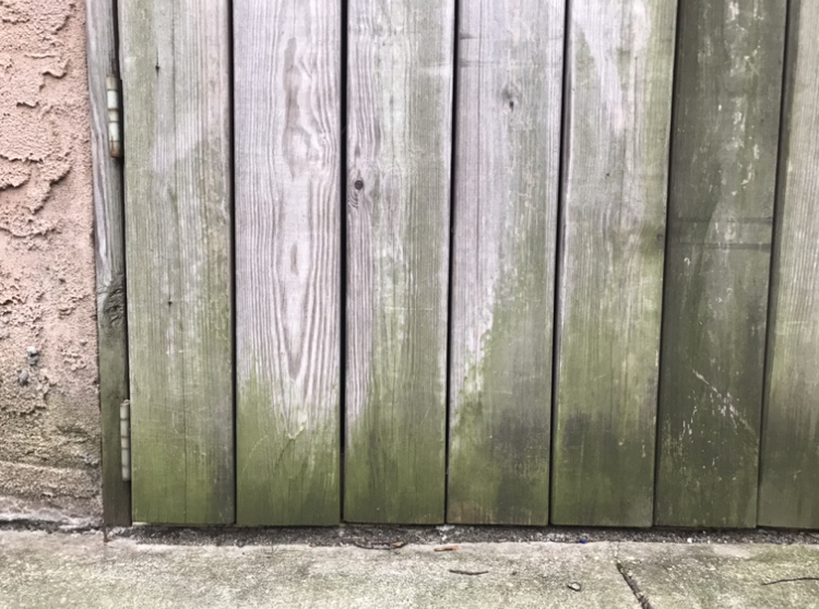
Drip – This was the easiest one to make out of all three. There’s really not much going on for this piece though, it is also lacking character in my opinion. But, I was quite happy I had the almost exact color shades of the actual stain at least.
sketches


Final composition
This project was really interesting to do. It was kind of hard for me to find spots because i didn’t want to be in the middle of the street drawing on the floor. It was also hard because of the weather some days was rainy or just really cold. I think they all turned out really nice, I would’ve done it better if I got a better variety of chalk. My favorite one is the first one “Boo!”, at first I was hopeless that it was gonna turned out good but it came really nice, even though it took a moment to match the colors so I had to blend the chalks together to get that nice shade in the borders. Overall I really like this project and I learned a lot about creating things out of simple stuff that you find in the street, you just have to think outside the box and be creative.
For my Museum visit i decided to go simplistic and go to the Brooklyn Museum. And it was here I found this piece of what appears to be a shark divided into three pieces, i wasn’t able to figure out or think hard enough to find a reason behind the piece, however i looked at it closer and realized that every piece was a tad lighter or darker than the other. I was already thinking that this was quite similar to project 4, but that just sealed it.
I am comparing this piece simply because of the fact that there is a clear division of shades in the panes of glass of which the shark is in. And it reminded me of the amount of texture changes and colors swaps we had to do in project 4. And while this piece is not as complex and doesn’t have that same detailed background as project 4 had, it still struck me as similar and compatible for comparison.
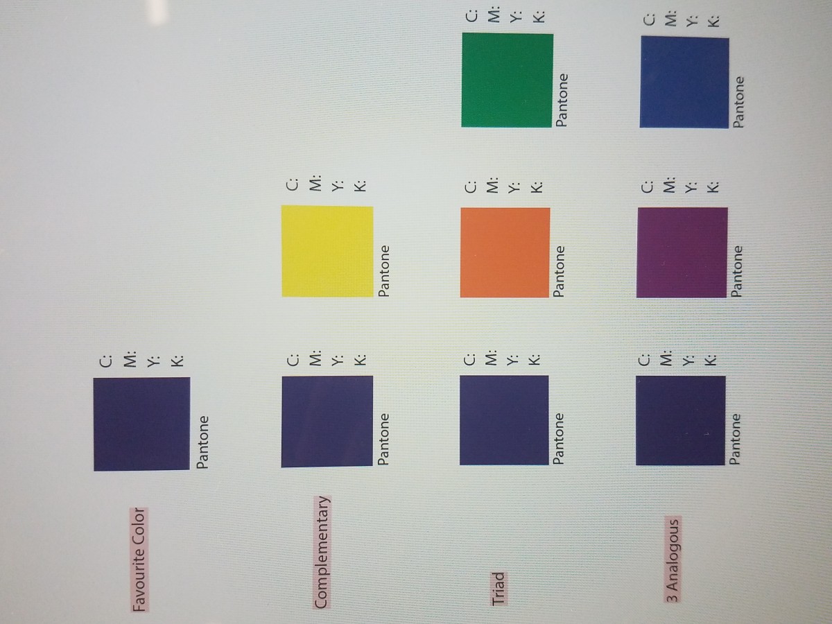
My favorite color is green. For as long as I can remember green has been my favorite color. It feels like I didn’t choose the color the color chose me. Green is a secondary color created by blue and yellow. The color green symbolizes nature and give off a calm relaxed emotion. The color green can be used to symbolize wealth, luck, nature, healthy and etc. Green is a calm color that can also symbolize balance, stability, reliability, safety and etc.
The OpenLab is an open-source, digital platform designed to support teaching and learning at City Tech (New York City College of Technology), and to promote student and faculty engagement in the intellectual and social life of the college community.

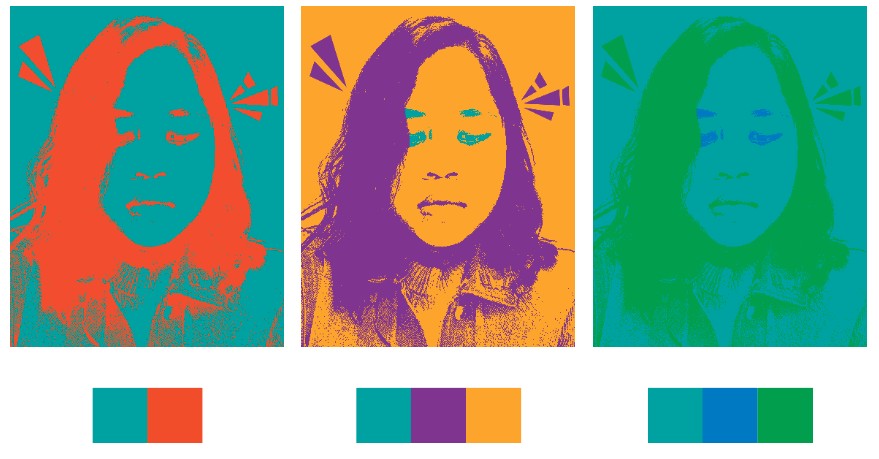
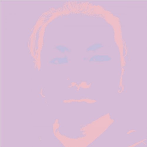 3 analogous composition
 complimentary composition
 triad composition