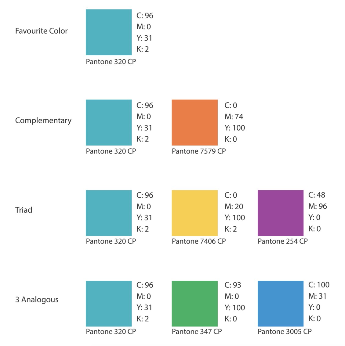
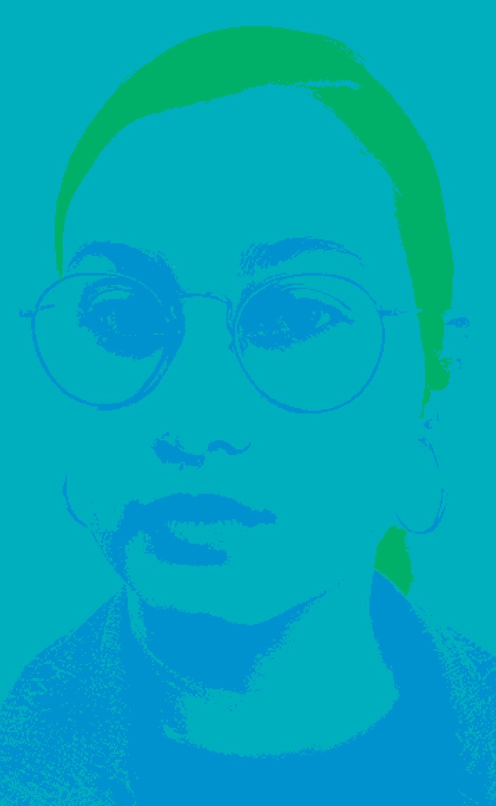
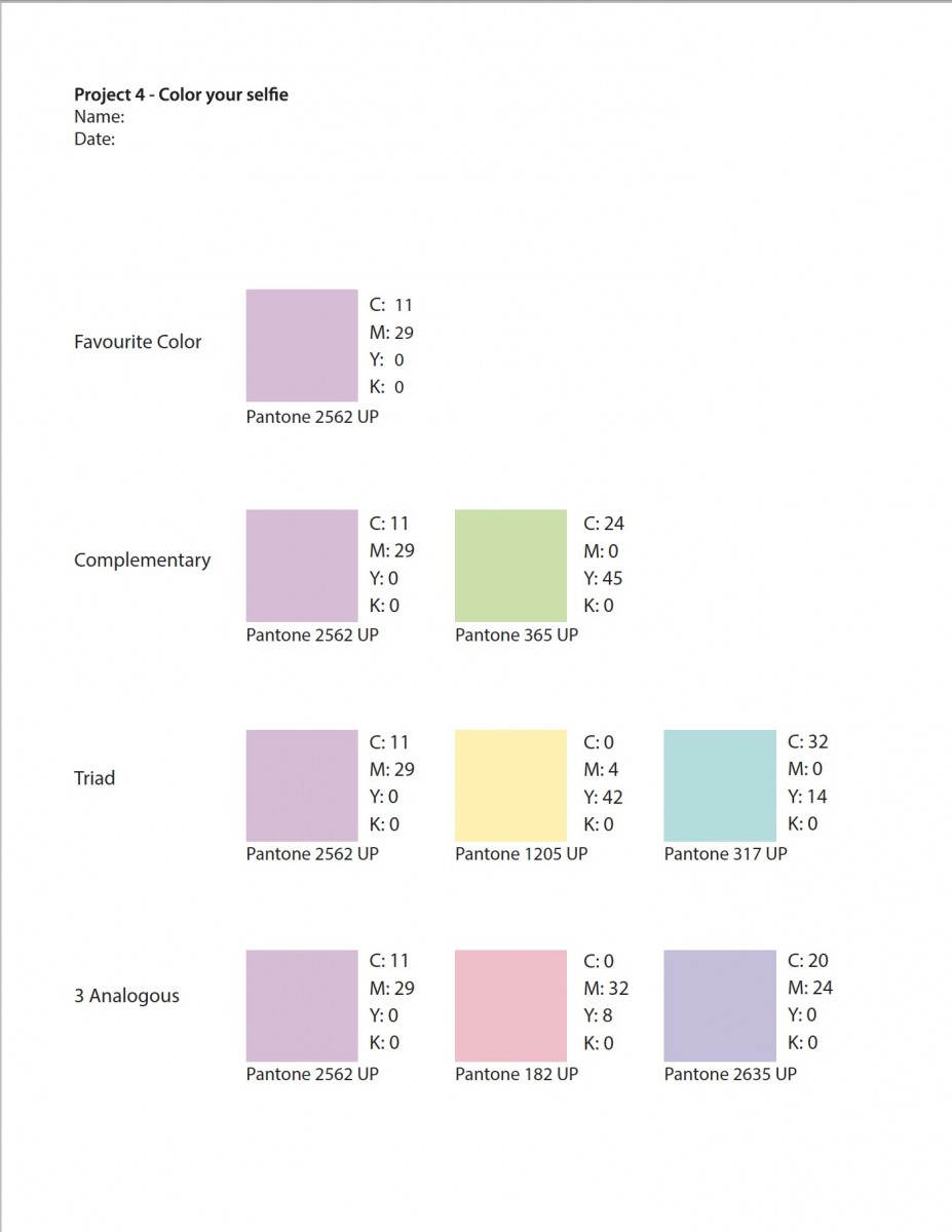
I don’t consider myself to have a favorite color but for this project I decided to go with Blue-Green because for me it’s a pretty color and it resonates with my personality. Also when I think back to when i was a teen, given the choices of objects that came in different colors I would almost always choose this one.
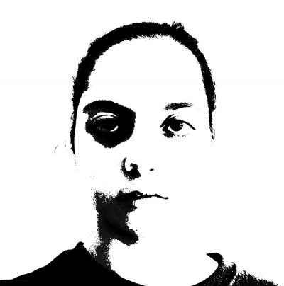
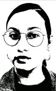
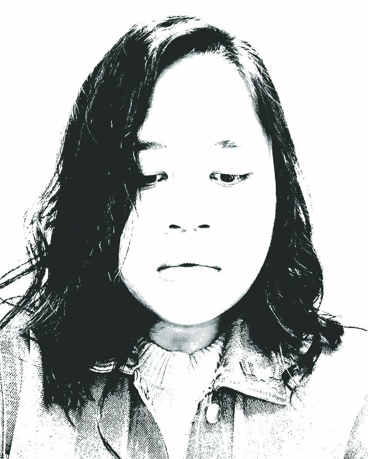
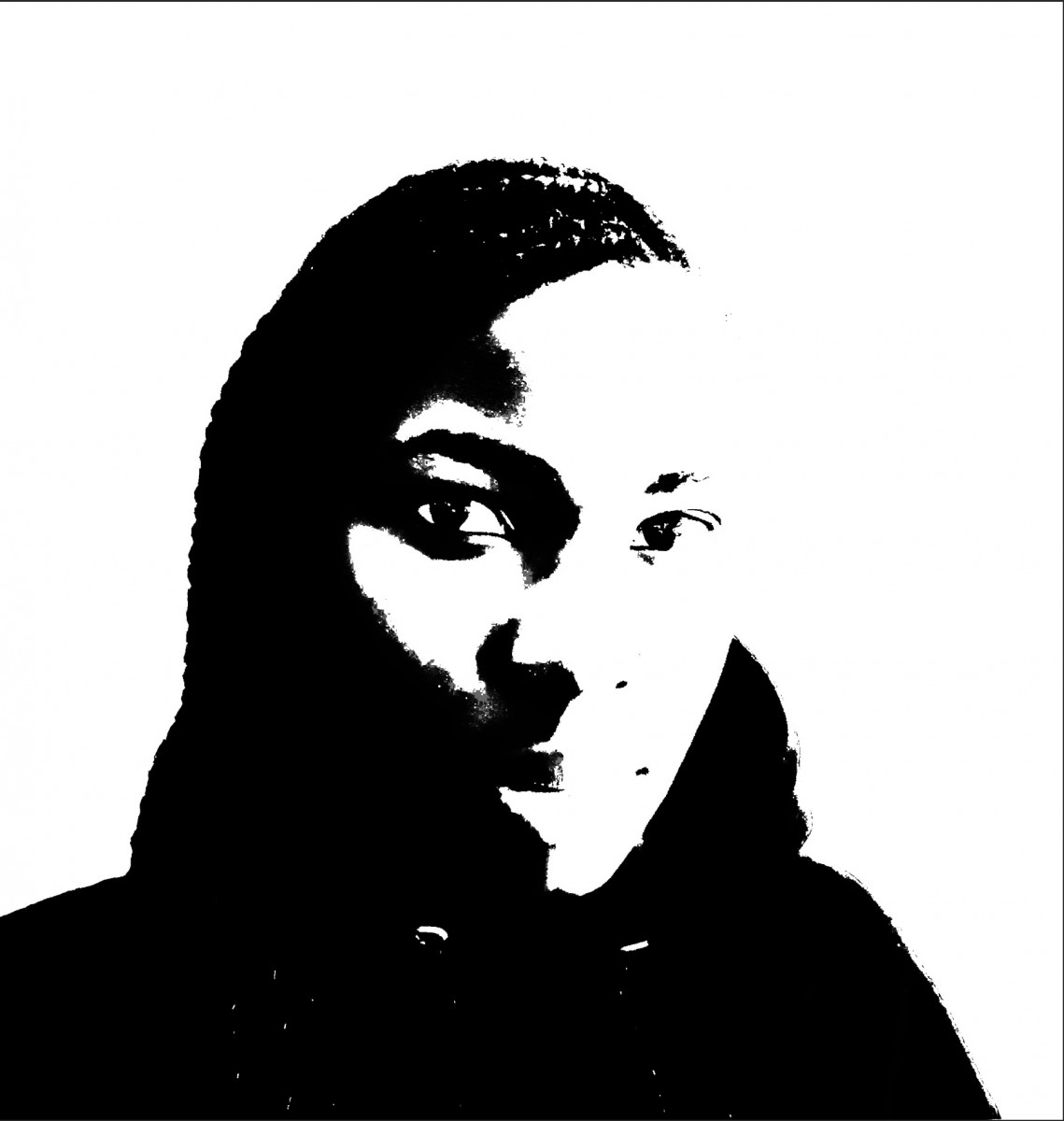
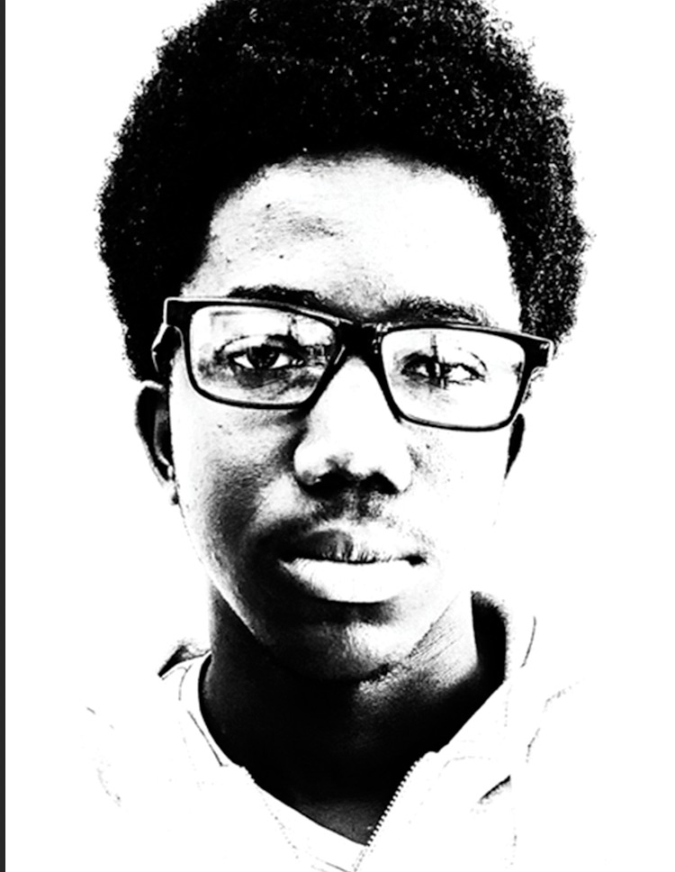
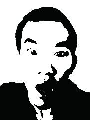
This is the black and white selfie that I’m working with:
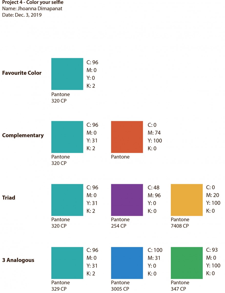
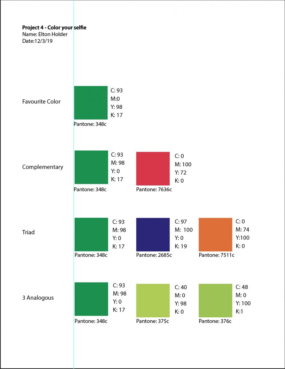
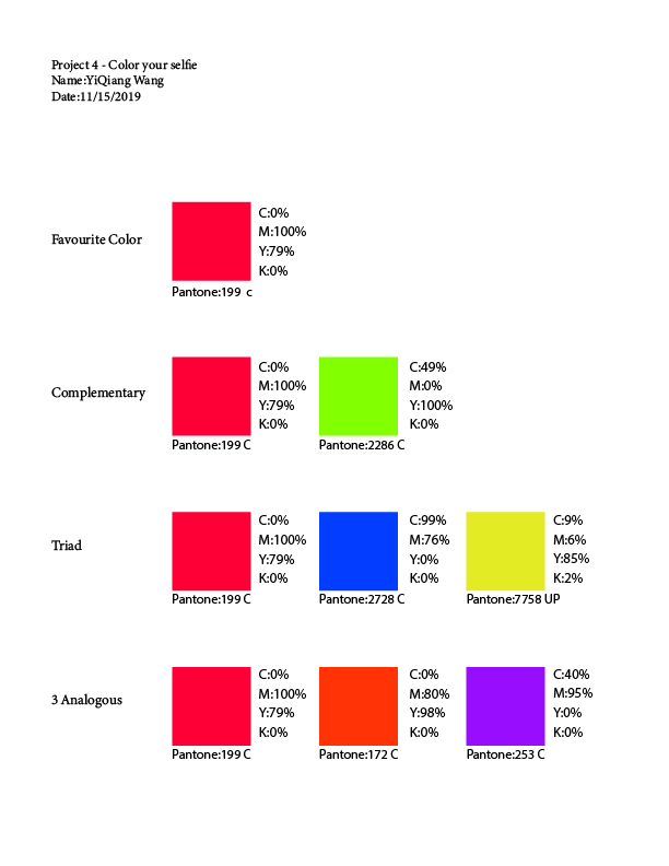
And these are the color schemes that I used to make the complementary, triad and analogous compositions of my selfie. I used a color wheel to choose the corresponding colors in each kind of composition and searched for them and their CMYK numbers in a Pantone book to help me find them easily in photoshop and illustrator.

Blue-Green is a color that is used to symbolize water, tranquility, intuition, communication and wisdom. It is a mixture of Blue, which has calming properties, and Green, which has growth properties. I like that it is a mixture. I’ve never really liked straightforward primary colors. And I feel that being calm and at least trying to have good communication and trying to be smart is something that I always do. I also love the ocean and looking at it. Living on a island for a long period of time showed me the different kinds of blues the ocean could take on, and Blue-Green is the nicest. It’s just a color that gives me the most welcoming feeling.
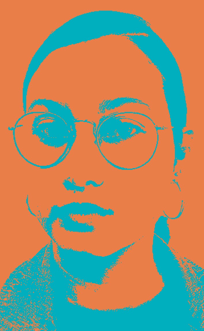
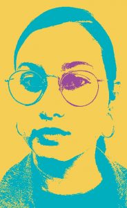
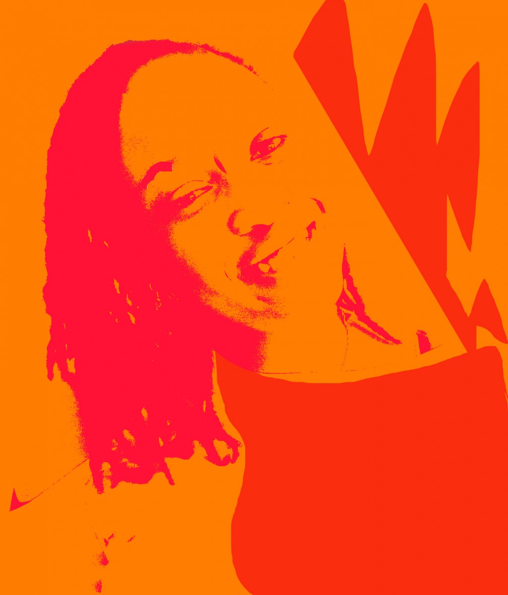
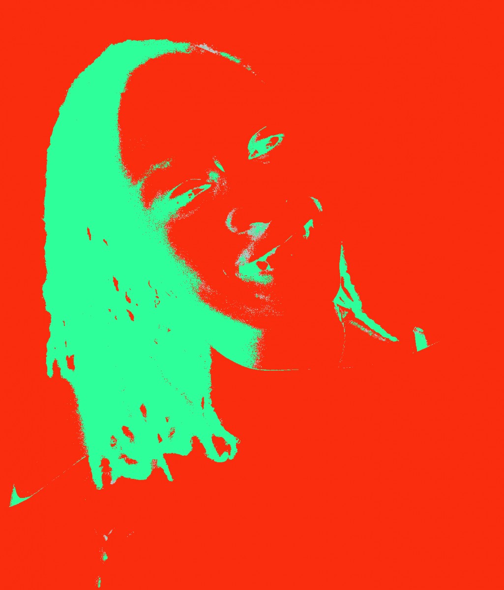
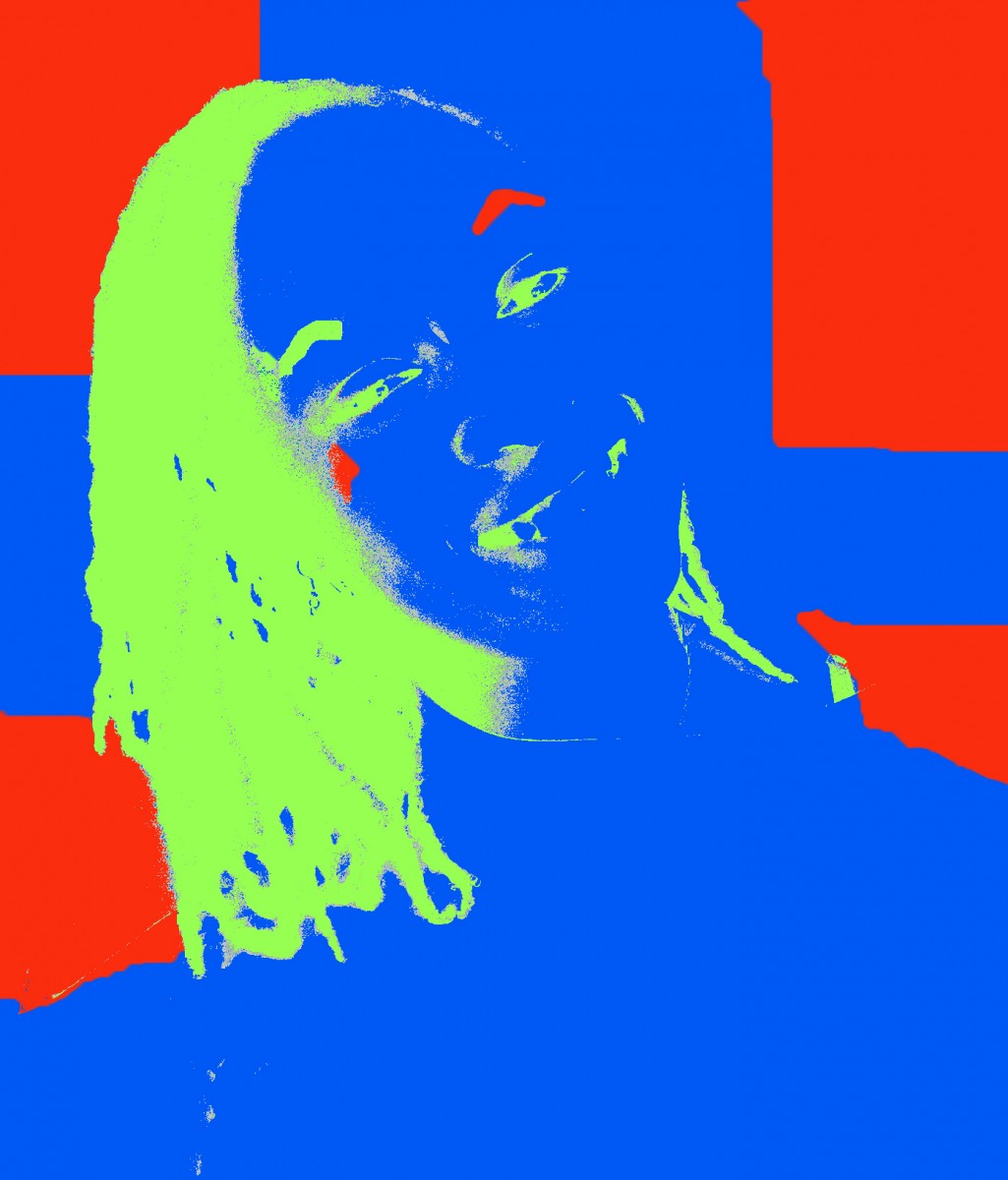
And using Blue-Green and its complementary, triad, and analogous colors, I chose to make my compositions like this:


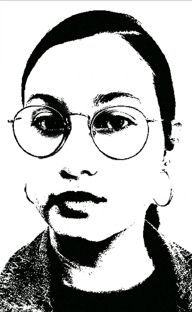
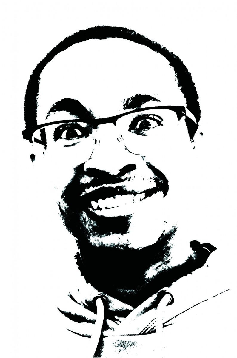
This project wasn’t hard but in order for it to come out right you need to really follow the steps for it to come out right. I had to re-do my main contrasted black and white image many times until I was satisfied with it and until it had no more grays. And I had to switch my colors around in each composition until it felt right or until it was more visible. I also feel like I learned a lot about the use of color for designs. I now notice other designs in real life and think about how they use analogous or complementary colors for their work. Before I would think that people just chose whatever colors they wanted for their work but it makes sense that there is more meaning behind it.

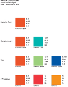
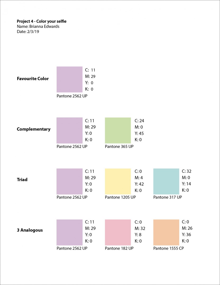
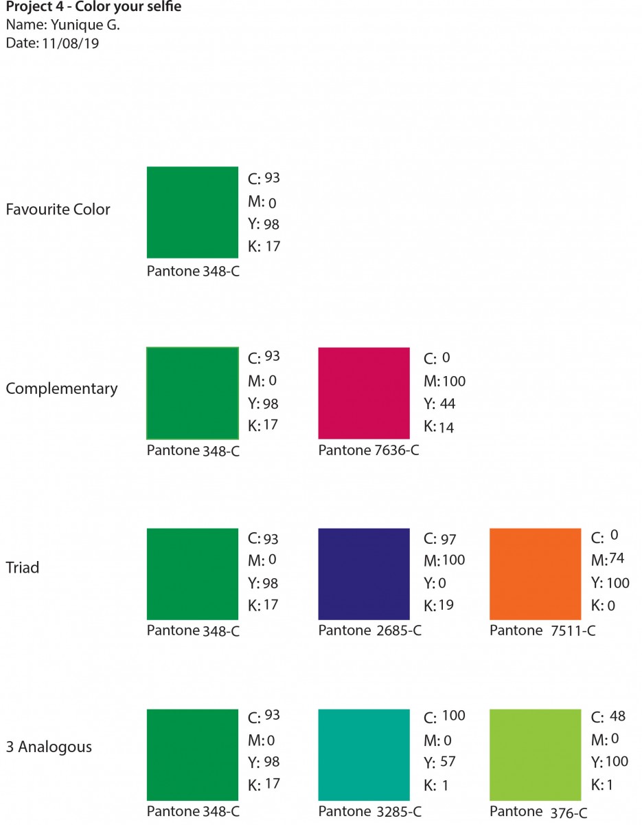
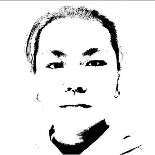 this is the color panel of my favorite color and the high contrast selfie that I’ve been working on.