Category Archives: Step 4 – Develop in ink

Project 2

this is the sketch of the pasta

on this one, I tried to have vertical lines along with the pasta and curve line for the dark area but then I realized it doesn’t work well with each other. the hardest part of this idea is that it is hard to make the lines look even.

this is my final inking with horizontal lines I used thicker inking pen for the dark part and also increase the intensity to make the dark darker. I used the thin inking pen for the lightest part and also space them out so it make the contrast more clear.

this is my final composition with text on this on I chose a san serif typeface with the dark area using bold and the lightest area using condensed / light version of the typeface I found this is really fun and the bold text really stand out compared to the rest.

this is the pencil sketch and I found out that coloring is wrong and it can’t have outlines

I really like this idea because it does show a clear difference between the darker and lighter area but on this one, the position of the dark and light area is incorrect.

this is the refined version of the same idea where I use lighter inking pen for the lighter part and thicker lines for the darker part. I also add dotted lines in one of the areas.

Type Compositions

While doing the lines I recognized that the texture of the dunes was part flowing down and the other part was static with no movement at all. I decided to represent this with a mixture of fun, serifed type to represent the flowing sand. While the san-serifed typography represents the parts where the sand texture looks static.

This was the first type drawing, I was still figuring out the thickness of the lines and the typography I was going to follow. Here I did all cursive with inking brush and pen.

Type Texture 1

Again a more artistic approach. The typography was more of a statement. It says: Sloggishly flowing down.

For this ornamental pattern, I selected medieval-looking, ultra-serifed typography perfect to give that retro feeling that I got from the original picture.

Line Pattern

Pattern Case Study:

I felt an ornamental and retro mood from the pattern. Therefore I started studying Ornamental lines.  Drawing different ornamental lines of several widths allowed me to create a pattern to work with and guide me while I was working on the bigger picture.


For this line pattern, I selected a theme which was the “Fleur-de-lys”. The fleur is very representative of the ornamental designs and found it a perfect inspiration for this design. I based the darker colors of the composition just by the thickness of the pens and not by repetition and filling the space.

Ink pagt

Pattern Line drawing with ornamental and retro lines. Repetition and thickness allowed me to make the darker spaces seem denser and fuller.

Line Texture

Texture Case Study

Texture Case Study: Sand Dunes

The texture picture I selected had sand dunes in it, this picture made me feel tranquil and serene. In the following case study I decided to test how lines could mimic the downward motion as sand in the desert dunes. I tested several line designs of different thickness to see which most effectively  conveyed a sense of smoothness and flowing motion the sand has while it trickles down from the dune peaks. I followed my designs taking these lines as inspiration

Texture line number 1

First texture line composition, simple lines that went down recreating the downward motion of the dunes. Here I tried to understand how to represent motion through lines. Mostly used the ink brush to represent shadows.

Texture line number 2

This is my second composition trying to understand how the different lines give out different feelings and emotions.

Texture line number 3
In the third ink composition I decided to go all out and get artistic with the lines. Traced each line with thin ink pen, this was great because this gave me greater understanding of how the shadows and highlights worked in the original picture. After I was ready to continue to the second part of the project

Develop and Ink-Tameara H.

In the texture assignment, I worked on the pasta. For the pattern, I worked on the fence.

The Texture of the pasta reminded me of a chaotic feeling a feeling of uneasiness. The pasta turned towards different directions and was overall very messy looking. I tried to convey that in my work. This was the first design that came to mind and i think it was too clear and not messy enough so I explored more.

Texture

Texture

I tried something messier and thought it convey what I saw more accurately

Texture

Texture

For my pattern, I saw something more clear that looked like entrapment and I conveyed that in my image. Entrapment but simplicity at the same time.

Pattern

Pattern


Texture and Pattern Project – Klarissa G.

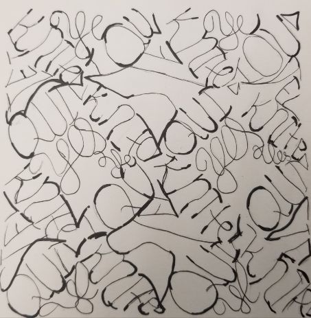
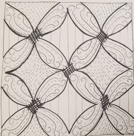
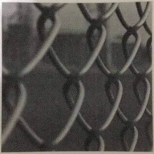
For my Texture and Pattern project I chose the Pasta photo(Fettuccine-looking one) as a texture and the Chain-link fence photo as a pattern.

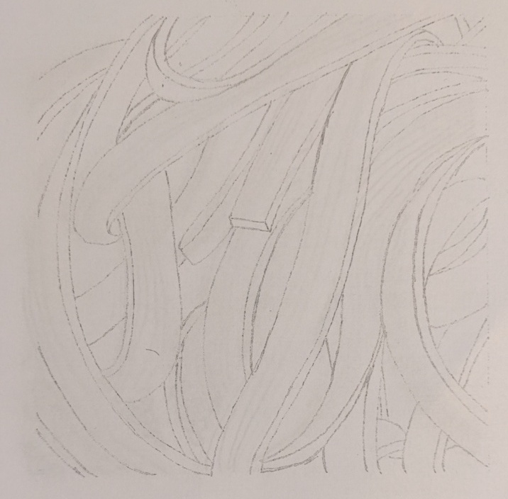
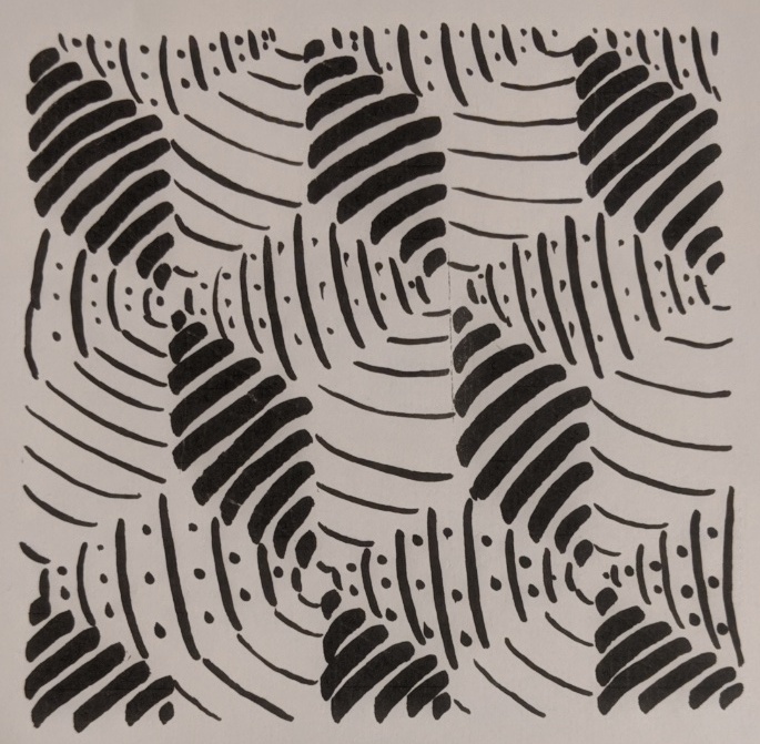
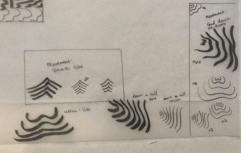
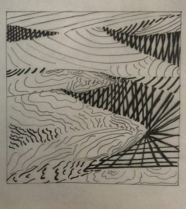
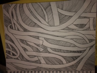
To me the Pasta image makes me think about a messy situation, stress, something that is all over the place, and unorganized. These were some of my initial type and line sketches for it:


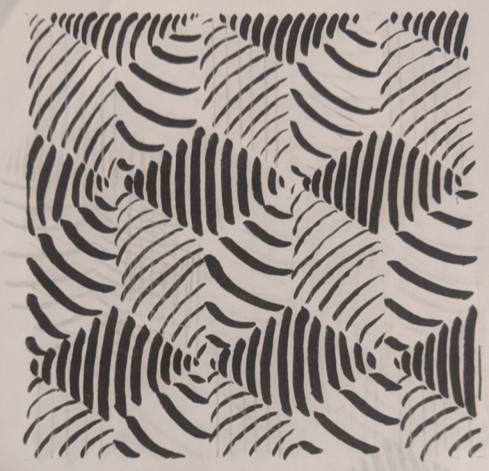
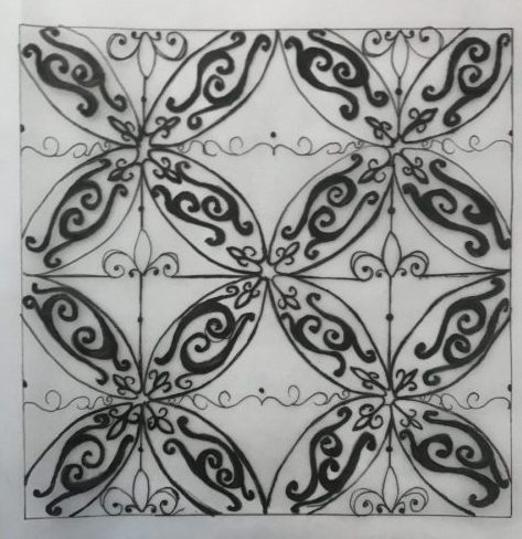
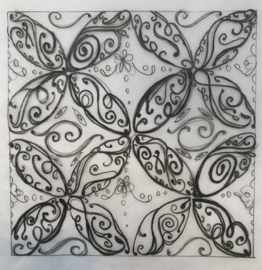
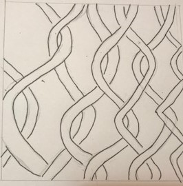
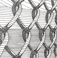
The Fence image is a pattern in perspective and it gives me a more unified feeling than the Pasta image does. It also gives off an oppressive mood because of the nature of the image. These were some of my sketches in line and type for it:


In the end I didn’t necessarily go with all my sketch ideas and in some cases I just ended up making a whole new composition. But in a way my sketches helped me decide what I thought could and could not work to make my final compositions, or what I needed to change to make them better.

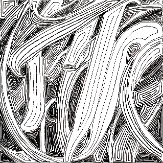
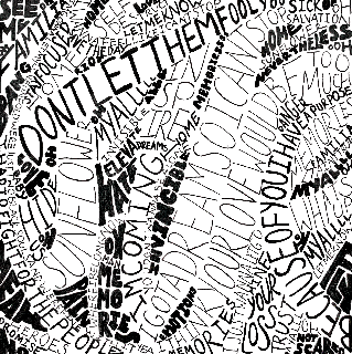
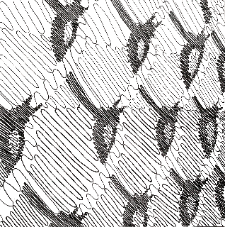
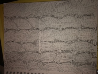
These are my 4 final ink compositions:


    .

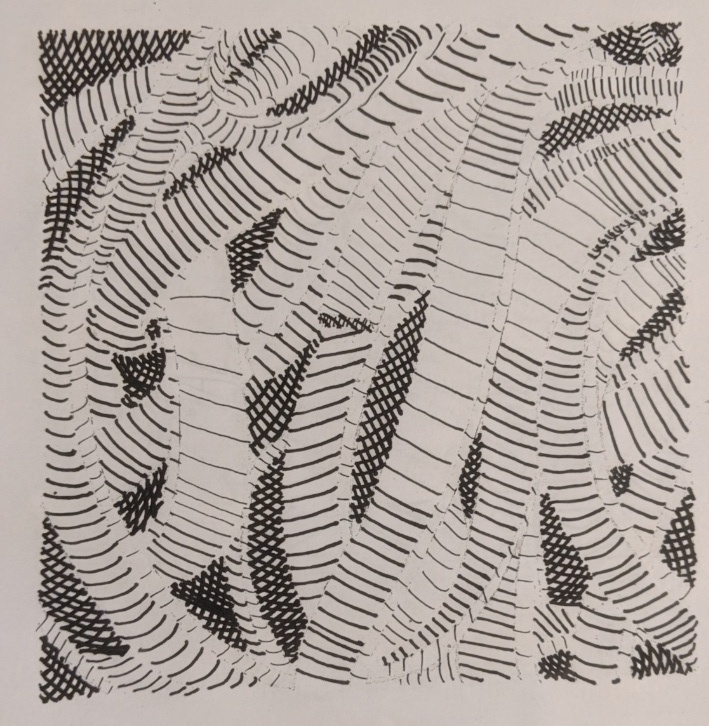
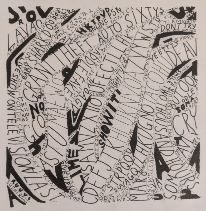
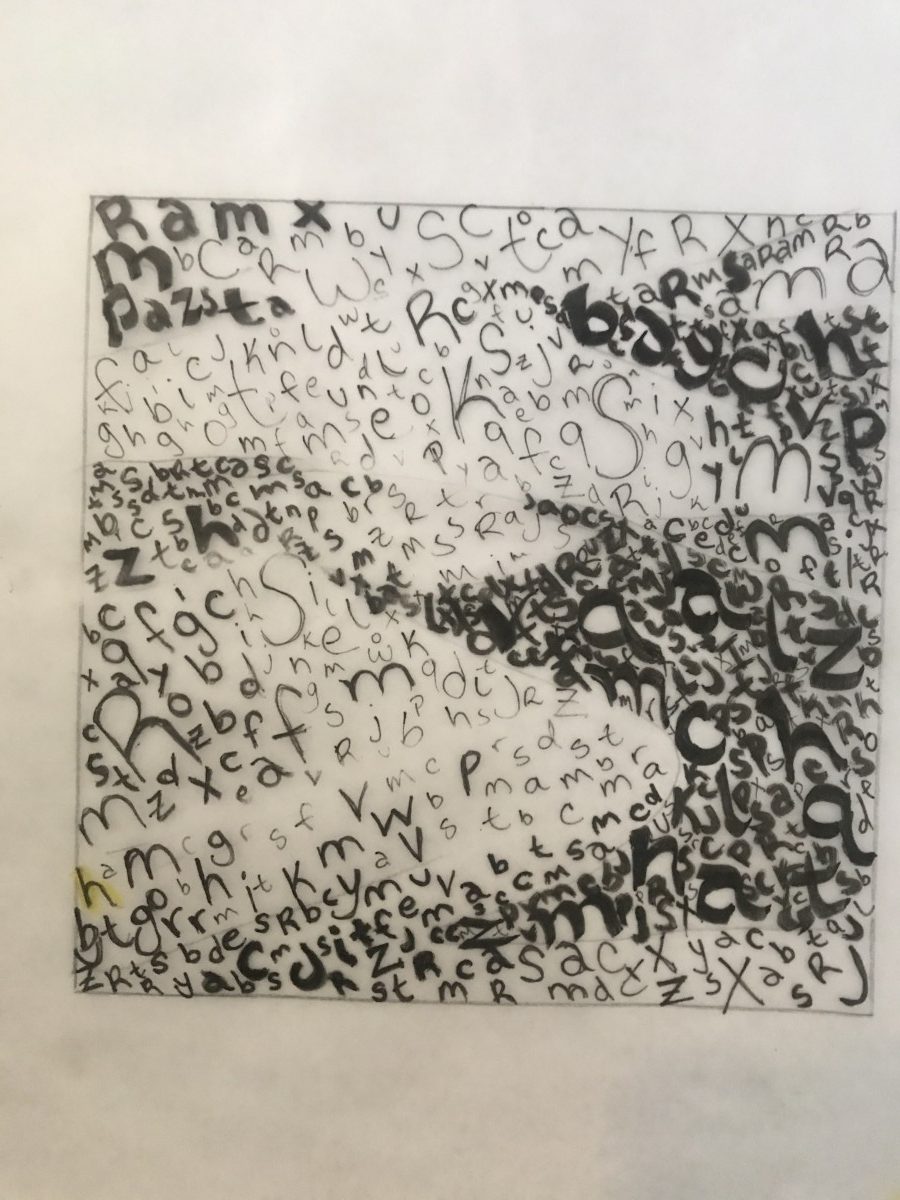
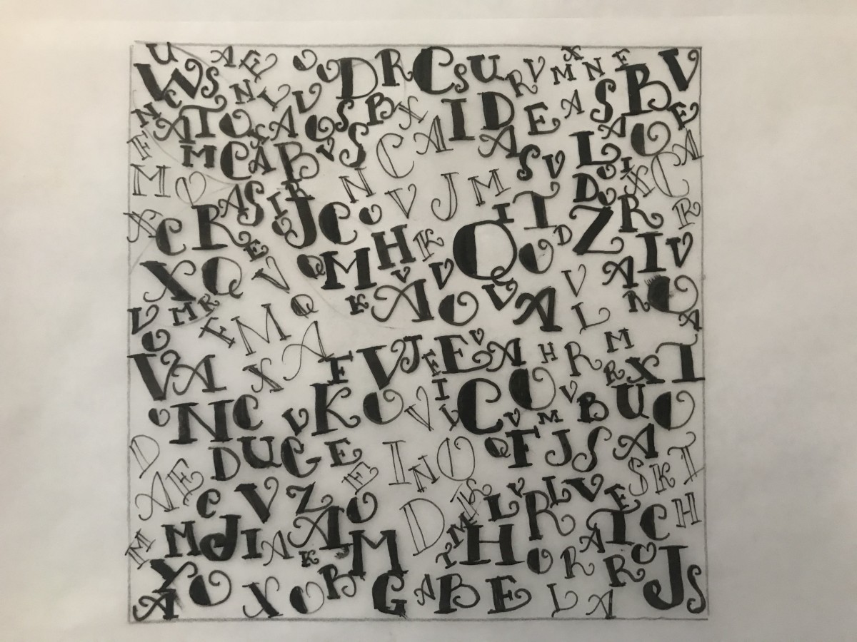
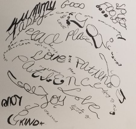
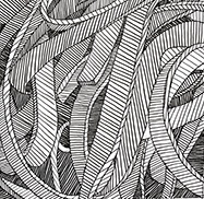
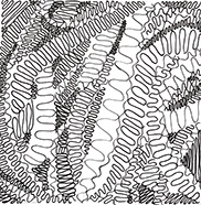
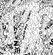
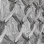
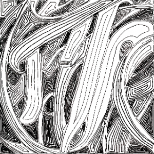
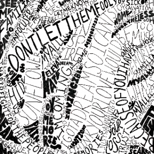
For my Pasta compositions I did a good job and I was able to show the contrast necessary to show depth. For my Pasta made with lines I decided to make each element like a continuous line going inward. They almost look like shapes but if you look closely you can see that they aren’t connected. My lines did touch a little in some places, and thats something I wish I could’ve done better. For my Pasta made with type I decided to fill the spaces with sentences/words from lyrics, going in different directions and using thicker and thinner fonts for the lighter and darker parts. This one is my favorite.

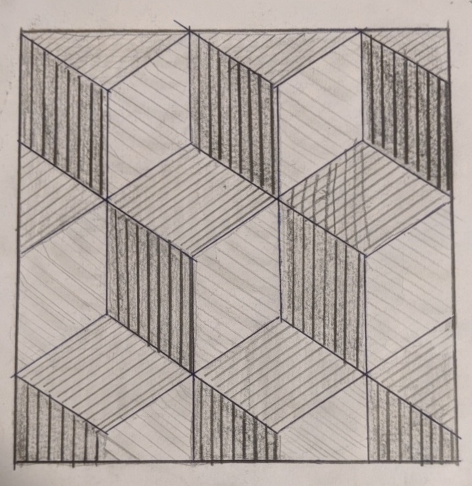
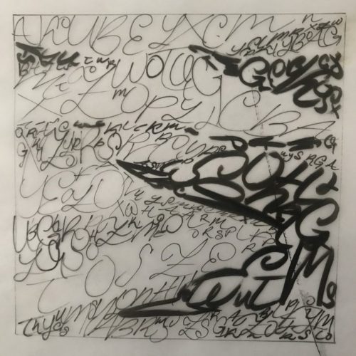
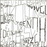
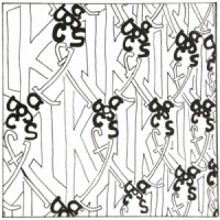
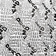
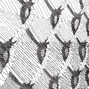
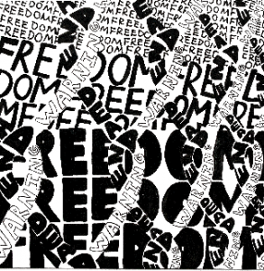
For my Fence compositions I’m okay with what I made but I feel like they could’ve been a little better. For my Fence made with lines the contrast is visible to me, but I question if it could have a larger contrast. I felt like one of my sketches came out better than my final composition. For my Fence made with type, I actually really like my idea. I made the fence using the words “dead end” and “warning”, while using the word”freedom” to fill in the background. I feel like there was a little white spaces in places there shouldn’t be, and that some of the type isn’t understandable because it might blend in together, but overall I like it.

Making this project wasn’t easy. It was very tedious and it was hard to come up with ideas that I felt would actually work. But at the same time it was a little fun and I liked that within the boundaries of what lines and typography styles we could use for this project, it was still broad enough for everyone to bring in their own creativity.


Pattern and Texture


These are the final pictures.  One represents a tile and the other represents, at least in my eyes macaroni.

Oh how yummy. The curves and the magnitude of the lines as well as the little particles on the top gives me the impression that it is pasta. Oh how I can taste the cheese melting on my tongue because it was fresh out of the oven. Eat this with macaroni with some chicken along with some avacado and your belly will thank you. Do not forget drink it down with some orange solo (a caribbean treat).

Every morning when I wake up to get ready for school, I go to the bathroom to take a shower. upon entering, I look down and see my reflection painted on the flower patterned tile. They are plated perfectly on the floor, you don’t know the cut off point on the tile. It sits perfect, I admire it for quite some time.

Txture & Pattern step 4 Develop in ink

images selected

https://drive.google.com/open?id=19BFyT7


https://drive.google.com/open?id=1pMt42-bA_BRKPWC8rhxl3WFUMrwY5Qy2

texture line and type


https://drive.google.com/open?id=1ijCV20fIL8XGToq-J0IMKFYXXMydBxp2


https://drive.google.com/open?id=1C6izgLA5gUBBiZ93JWHEunOu_Qqri3og

pattern line and type

https://drive.google.com/open?id=18ZZXiJbg2s-kzYd5NqmUxbtU0XufQcKd


https://drive.google.com/open?id=1SQRUbAMdV67WHKWeA54FyPju-1RtswMa


Step 4 – Develop in ink

The pasta was well done. I made different shades and space of strokes to define the object and the shadows.  Because it was a pasta I decided to make swirly patterns to describe the movement of the pasta.  It was a great practice and preparation for my last part, using script typeface. For the gates I was not happy with it because of the lack of background and too many white space that should not have been there.  I will continue to work on it, add lines to remove the white space.