
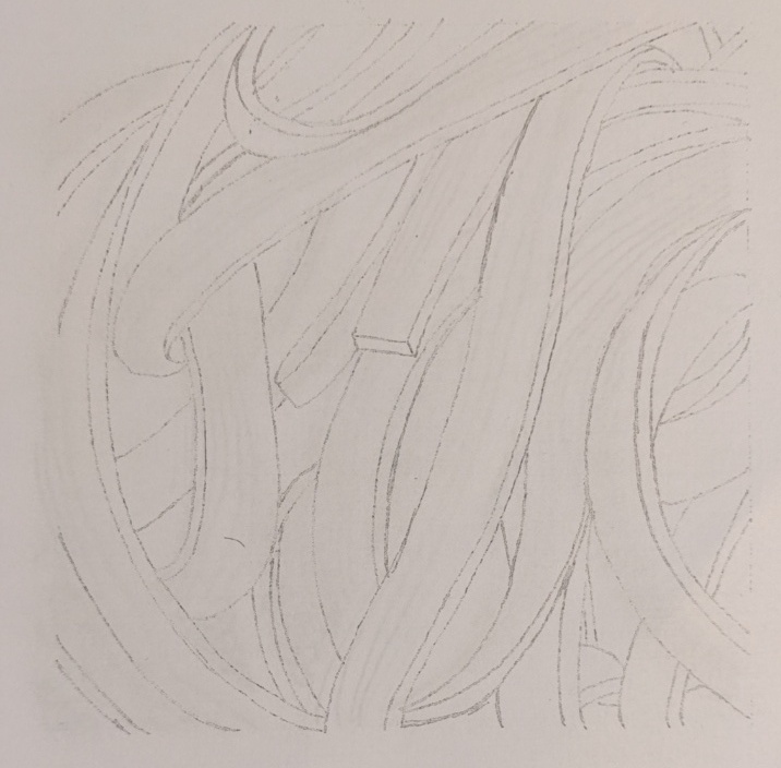
this is the sketch of the pasta

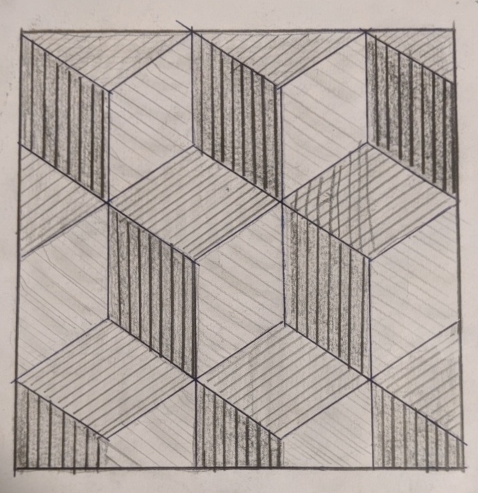
on this one, I tried to have vertical lines along with the pasta and curve line for the dark area but then I realized it doesn’t work well with each other. the hardest part of this idea is that it is hard to make the lines look even.
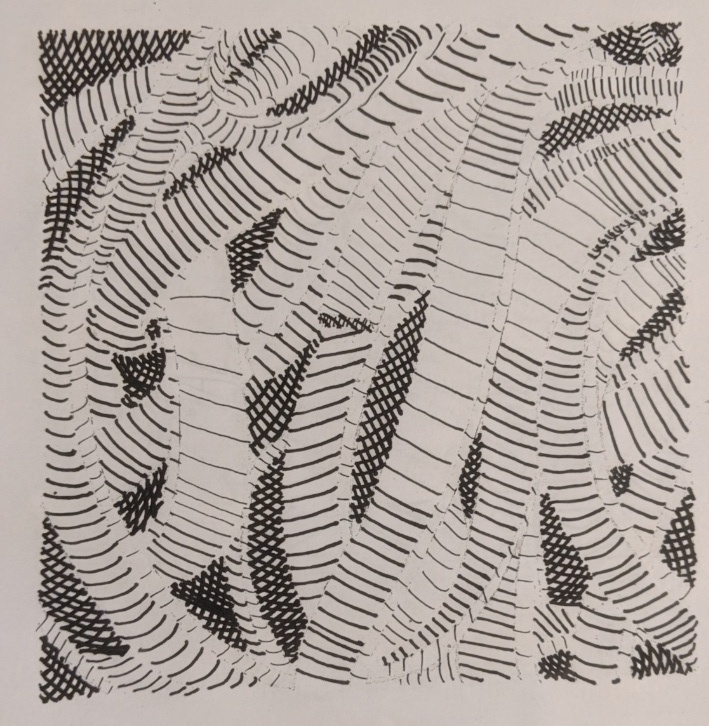
this is my final inking with horizontal lines I used thicker inking pen for the dark part and also increase the intensity to make the dark darker. I used the thin inking pen for the lightest part and also space them out so it make the contrast more clear.
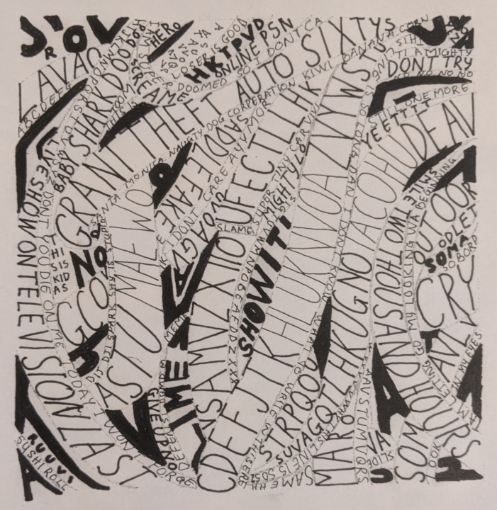
this is my final composition with text on this on I chose a san serif typeface with the dark area using bold and the lightest area using condensed / light version of the typeface I found this is really fun and the bold text really stand out compared to the rest.
this is the pencil sketch and I found out that coloring is wrong and it can’t have outlines
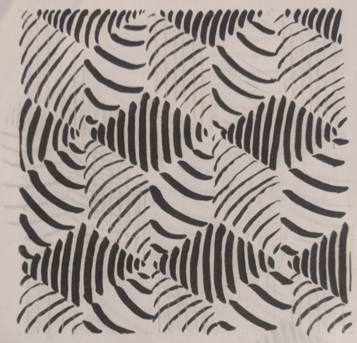
I really like this idea because it does show a clear difference between the darker and lighter area but on this one, the position of the dark and light area is incorrect.
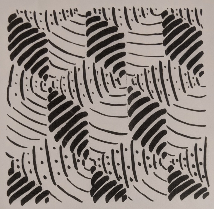
this is the refined version of the same idea where I use lighter inking pen for the lighter part and thicker lines for the darker part. I also add dotted lines in one of the areas.

