
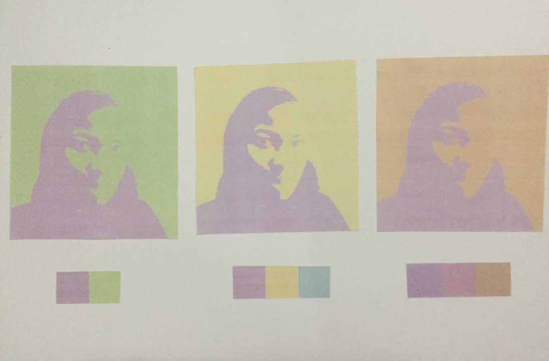
I learned that color I picked could’ve worked better if it was shade. Tint works well with complementary and Triad compositions but as a analogous, it lacked contrast. Before I chose violet as one of the analogous which was worst because since violet is a in the mix of red-violet, it was like the violet focal point was not there. For next project, I’ll use the one of the highest contrasting color chalks that fits the object.

