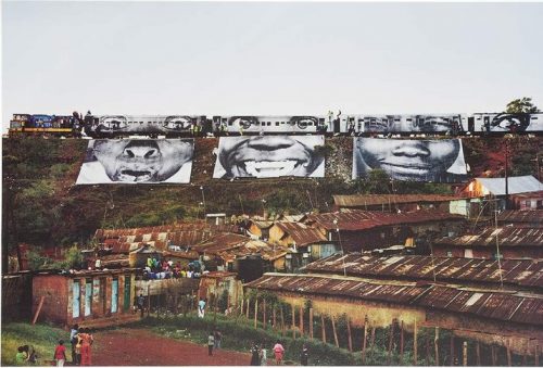
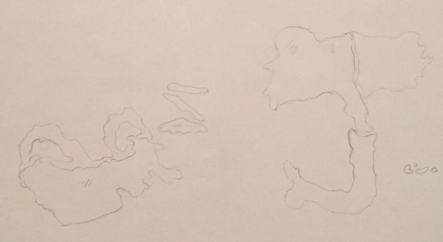
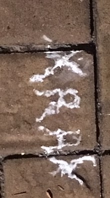
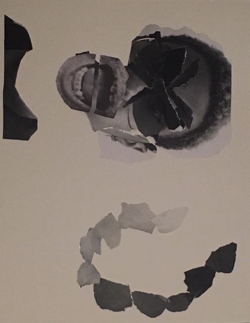
 Artwork I found at the Brooklyn Museum.(Jr)Action in Kibera, Kenya, Train Passage 1, 2009
 I compared this part of the piece to this project.
Third Project which focused on motion/emotion.
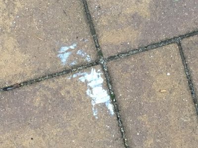
Museum Visit
Leave a reply

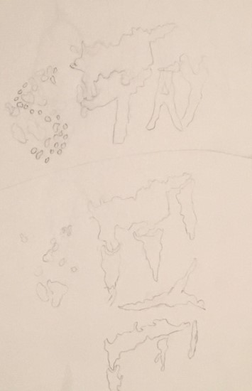
Artwork I found at the Brooklyn Museum.(Jr)Action in Kibera, Kenya, Train Passage 1, 2009
I compared this part of the piece to this project.
Third Project which focused on motion/emotion.
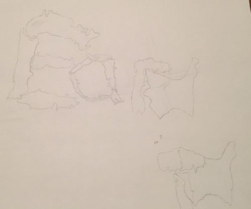
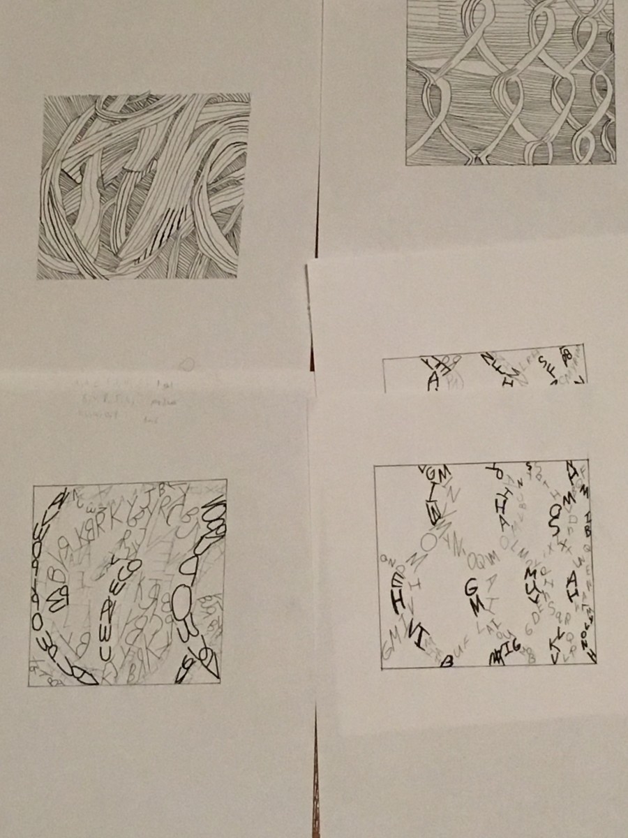
Here are all of my sketches that I worked on. I had a good amount of sketches because I was not sure how I wanted my final composition to look like. This project did take time to finalize because some days it would snow or rain. One day it rained which ruined my design so I had to restart. Another day it snowed which left ice on my spot for a day or so. The drafting process though was fun and engaging because to find different designs you can look at your image in different pov’s. Another difficulty was when using the chalk it would not come out the way I wanted it to. Maybe it was because the design was small scale or the direction I drew in, but I was not satisfied with the way the chalk designs came out.If I can redo this project I would definitely wonder around a bit more to find more unique scuff marks or dirt/stains or even shadows. I would have also liked to try using color chalk. This is because the more variety the better the outcome. I will remember when doing another project to plan further and aim for more variety.
Drafts/Sketches


Here are the final compositions
Starting point
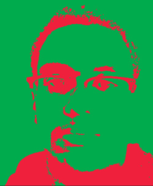

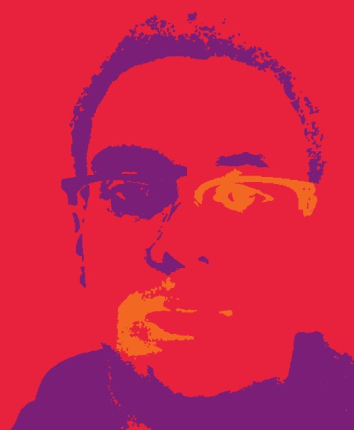
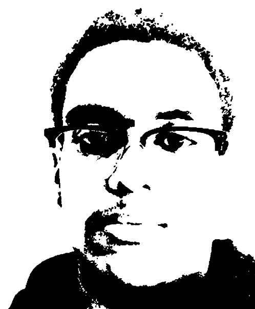
If you can look back at my step 3 post, you can see nothing has changed. I kept them the same because I felt that the style of my compositions were perfect for the colors I worked with. I learned how color can either make or break a creation. I also learned how to create a focal point(s) in different ways with color. In the previous selfie project I practiced making a focal point but it was with a gray scale. If I had more time for this project I would use a different selfie,because some images work while other don’t.Also while turning my selfie into a high contrast composition I lost some of the details, so another selfie would help with that issue. I will definitely apply the use of working with color for any other project I have. My work process was to create a folder of the same file, but switch up the colors I was working with to get a different outcome. If I can do that strategy in another project I will.
My favorite color is red, the vibrant hue makes it go well with anything from clothing to interior designing. After researching the color red I found out that its characteristics were daring, determined, energetic, and aggressive. For its social & cultural meanings red is among the most powerful colors in Indian culture and has various important meanings. To list some of them are, fear/fire, wealth/power, power, seduction, and beauty. I chose it because it has been my go to color since I was a toddler.
My favorite color is red, and here is the Pantone color scale I worked with. 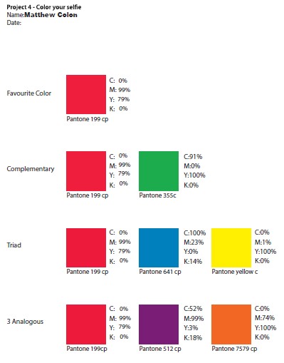
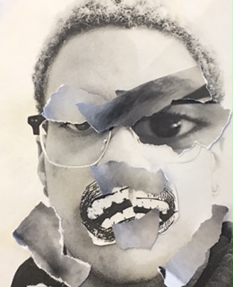
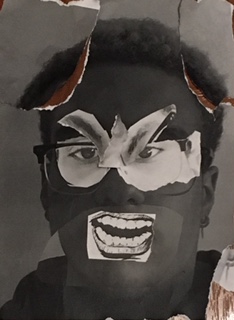
At the end of this project I really learned how to work on focal points and how it could really have an impact on your work. I wanted the focal points to be the mouth and facial expression/eyes , this is because in my opinion anger can be identified with just those things.At first my goal was to accomplish the mood anger with just the eyebrows but after feedback I realized that it was a bit confusing so I wanted the mouth and eyebrows to work hand in hand.I also experimented a lot more which I did not do last project , so I corrected my mistake.Just like my drafts I had a bit of trouble creating my mood while having movement,focal point, and grey scale all in tact.
The mood that I chose was anger , when I think of anger I always relate the eyebrows centering in with a slant , eyelids covering eyes more,also clenched jaw for bottling up anger, and screaming when releasing.Also this does not have to do with facial expressions but the way we act when angry is reckless which is what I tried to recreate in my collage.While creating my drafts I had a few ideas and tasks in mind,first one was to prioritize the mood “anger” in the piece. The next was to be abstract and creative.In the first collage I tried going for anger mostly through the eyebrows and on top, the mouth piece was to convey bubbling up anger.My second piece was where I tried to incorporate more ripping to the overall image, but I had trouble with movement (for most).The last draft I came up with had some elements that was asked of me but not fully. So I incorporated all of my drafts to reach my outcome.My hardest task was being creative whilst achieving movement,a proper grey scale , focal point and some uniqueness.

During this project I learned to be more experimental. At first I only stuck to one way/line usage , but towards the end I just tried what I thought would look good and it came out good. If I had a change to redo this it would be to plan this out further ahead and I would also try to be more experimental because the possibilities were endless. I will definitely plan ahead for my new project. The most successful thing for me was replicating the movement in the original image to my own drawing.
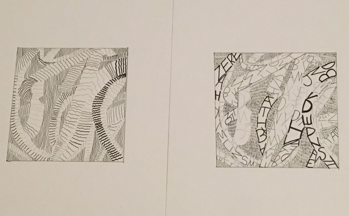
Final Composition
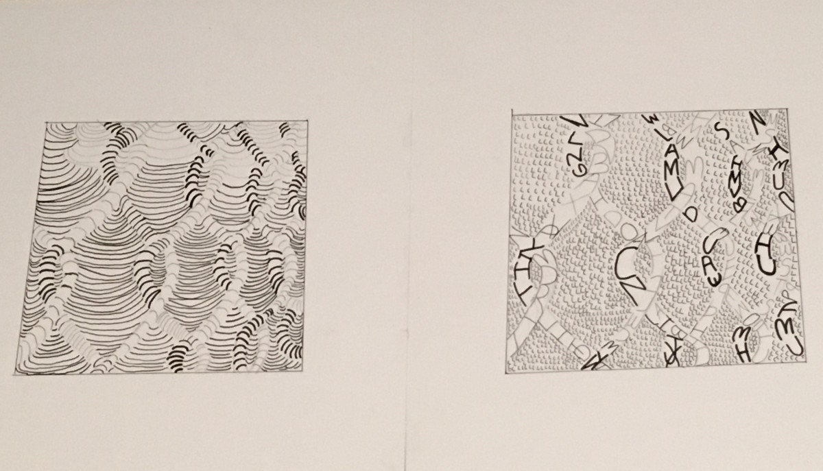
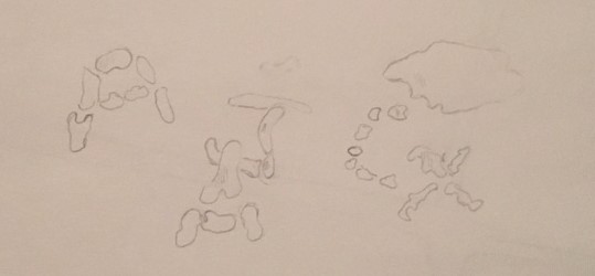
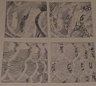
Sketches
The photos I choose were the rubber bands/pasta(texture) and the wired fence(pattern).For the texture it gave me a state of flow ,and restlessness.The movement was also going vertical and the light source created varying grey tones. The pattern image was similar to the texture but more symmetrical with motion.To me it had an energetic/straightforward mood/feeling. It was not that to go from sketches to final draft because I understood the project and the steps that needed to be followed. I also kept in mind the mood and characteristics that the images had .
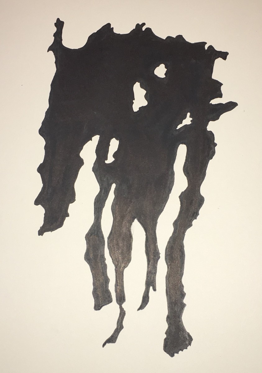
These are my final images,I am not fully satisfied with the outcome mostly because of the ink.This was my first time inking an image for a project so I did not know the proper motion and precautions for inking.Now that I have some experience with using ink ,next project I will properly utilize inking pens/brushes and maybe even techniques.For my obvious (the two items in the middle) I chose that image because the organic shapes had a certain appeal , it was simplistic but unique which really made me want to use it.I had trouble at first because I chose to rush and not trace during the first step so there wasn’t much going for the image,I then went back and traced it and loved the results.For my ambiguous image I had trouble tracing it because the image was really dark and was not much contrast for me to trace,so that was the best I could do tracing wise.I did run into a problem inking,I ended up smudging ink on the Bristol board so I had to redo it .I learned how important tracing can be and how inked designs can come out really nice if done properly and with the right tools.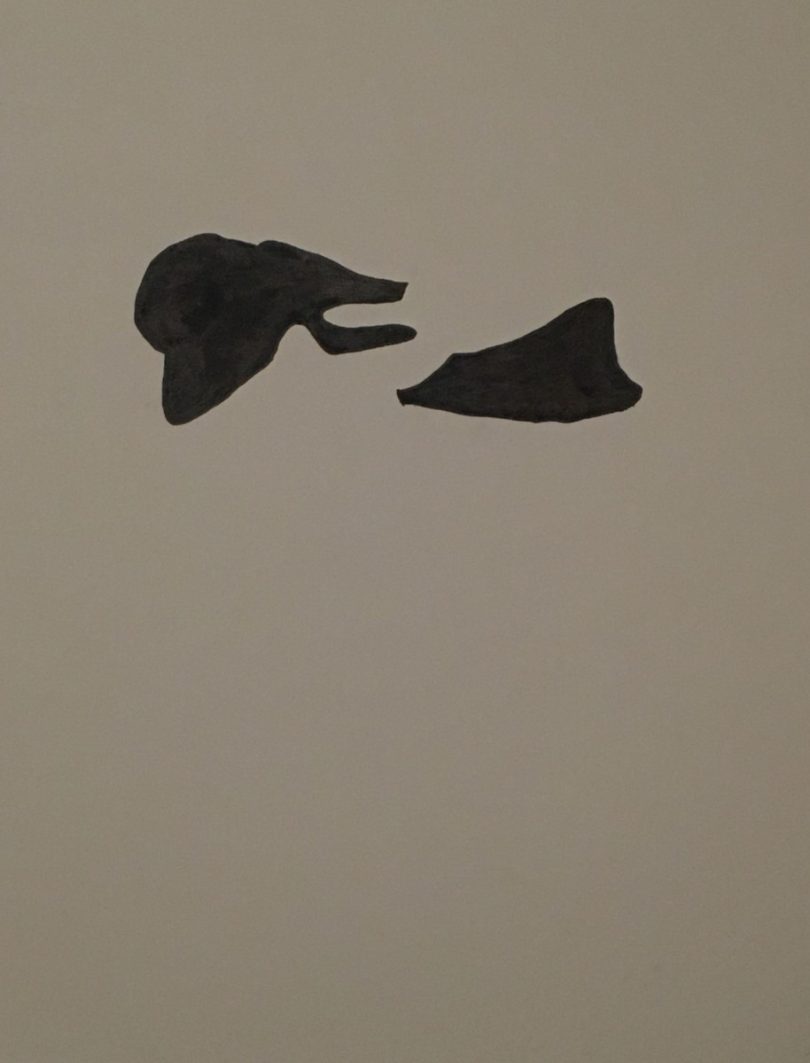
The OpenLab is an open-source, digital platform designed to support teaching and learning at City Tech (New York City College of Technology), and to promote student and faculty engagement in the intellectual and social life of the college community.

