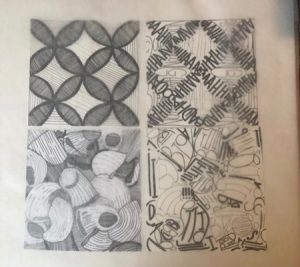
The Photo is facing the wrong way, it is supposed to be vertical not horizontal. I really struggled finding a good balance between light and dark, I was either too light or too dark. Once I finally found my middle ground I didn’t have to edit much. For the type pasta composition I made the dark areas darker and I also added more dark lines in the pasta one. For my pattern pieces it was a little less of a struggle, I believe this because the pattern image had a lot less going on and the shades were clearer. I think my type composition for the pattern turned out nicely and it was the most fun to do especially creating the medium tones.
https://openlab.citytech.cuny.edu/mpaularennis-despriciples1fall2019
A City Tech OpenLab Course Site


