Category Archives: Project 5 – imagiNATION

Project 5

I enjoyed this assignment more than any other one introduced in the class even though I don’t  like drawing.  This instilled in me concepts that I can use in the latter of my career (law and health). It took me a while to realize this , but this course has taught me things that I need to pay close attention to.  Nonetheless, the above were not the initial pictures that I was going to work with.  I changed over to this because it is not too complex. All of this was taken and done outside the basement area of my building. For PLOW I decided to outline the purple chalk with charcoal that way it would be more visable to the eye. Due to my inability to write small, I was not able to keep the fonts the same size as the objects or mark chosen. In the future, I would look for items that are much bigger to fit my penmanship.  I do take it upon myself to practice writing smaller on concrete and on paper. Did I meet the objective of the assignment..in some aspects yes. Much better could have been done.

Project 5: imagiNATION

Bloom – For my first typography, I’ve decided to go for the vines crawling on this abandoned building. Personally, this is my favorite one out of the three I’ve done because I think I achieved my goal  of making it blend in with my subject but at the same time you could still see the word Bloom. This is also the one I’ve enjoyed making the most, the leaves were pretty fun to do, I thought it was interesting as I tried to make it look somewhat like the actual leaves — I did my best. Color matching the typography was fairly easy too, thankfully I found the colors I needed, I used a combination of black, browns and mustard yellow to match it with the real vines, which helped making the piece look united.

Creep – I had a hard time on this one. I had trouble making the typography stand out. Personally, I think I could’ve approached this better, it just lacks character. The word should’ve been the first thing you should see, but the hand I drew to go along with it takes away all the attention. The color I chose for the letters didn’t match the way I wanted it to be also, it was a tad bit brighter, it had more yellow tint to it. I still somewhat like the mossy look of the actual letters though.

Drip – This was the easiest one to make out of all three. There’s really not much going on for this piece though, it is also lacking character in my opinion. But, I was quite happy I had the almost exact color shades of the actual stain at least.

imagiNATION-deliver

sketches


Final composition

This project was really interesting to do. It was kind of hard for me to find spots because i didn’t want to be in the middle of the street drawing on the floor. It was also hard because of the weather some days was rainy or just really cold. I think they all turned out really nice, I would’ve done it better if I got a better variety of chalk. My favorite one is the first one “Boo!”, at first I was hopeless that it was gonna turned out good but it came really nice, even though it took a moment to match the colors so I had to blend the chalks together to get that nice shade in the borders. Overall I really like this project and I learned a lot about creating things out of simple stuff that you find in the street, you just have to think outside the box and be creative.

Project 5 – ImagiNATION

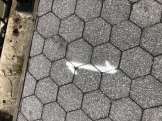
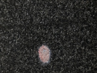
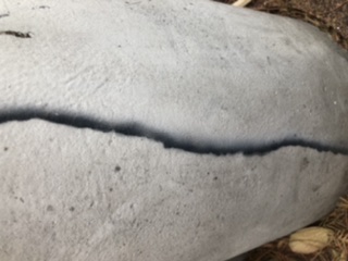
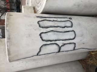
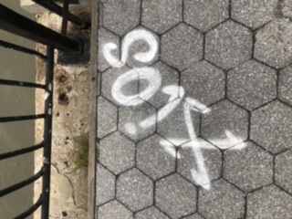
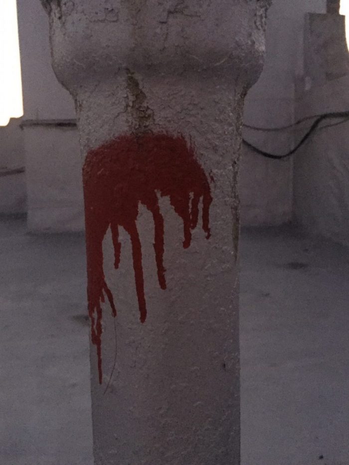
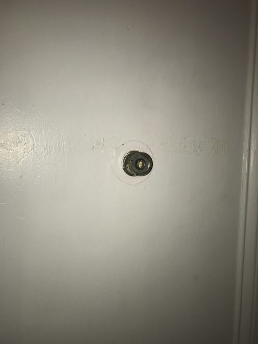
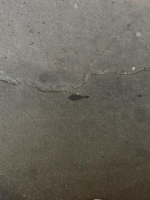
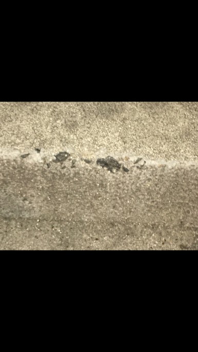
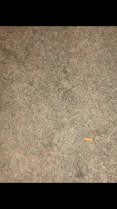
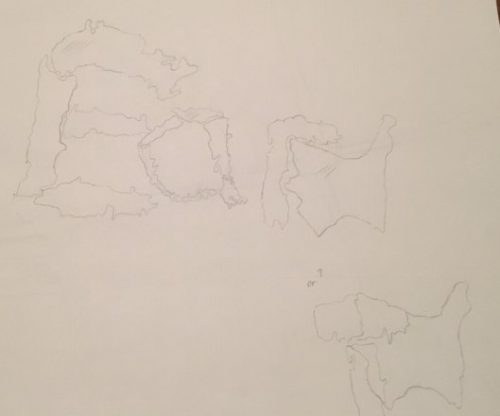
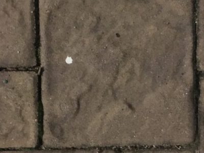
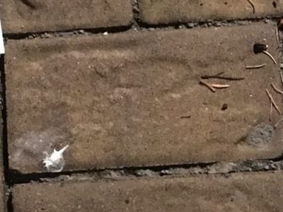
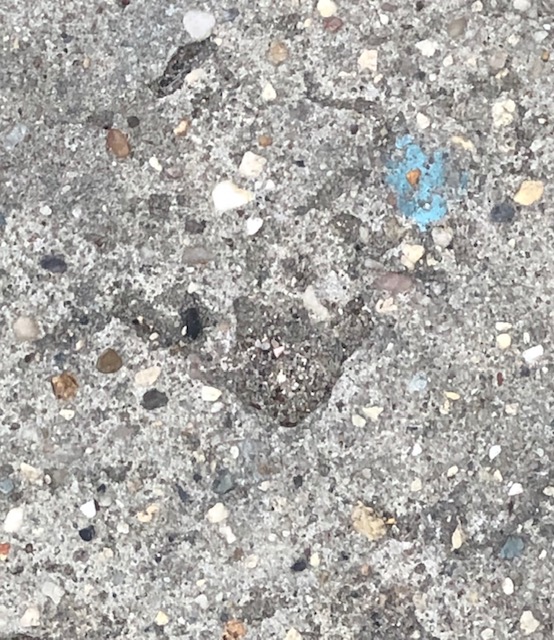
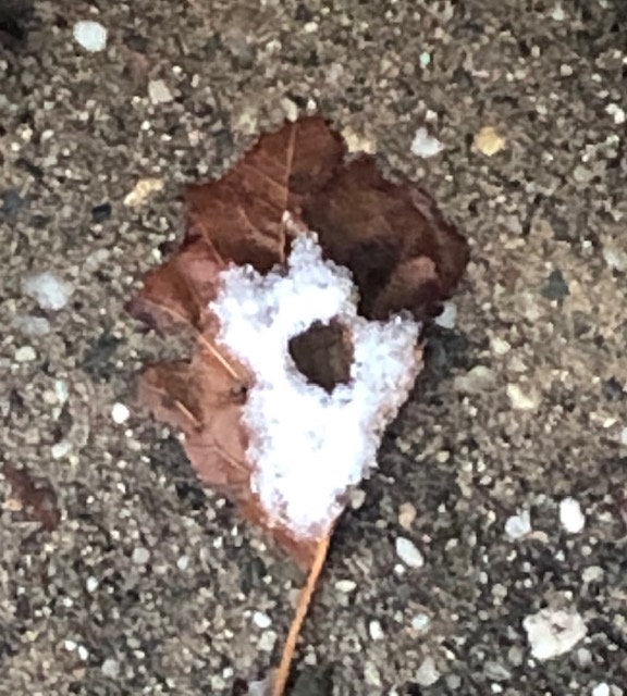
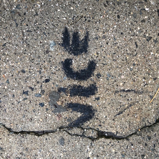
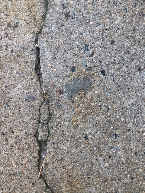
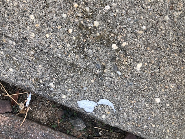
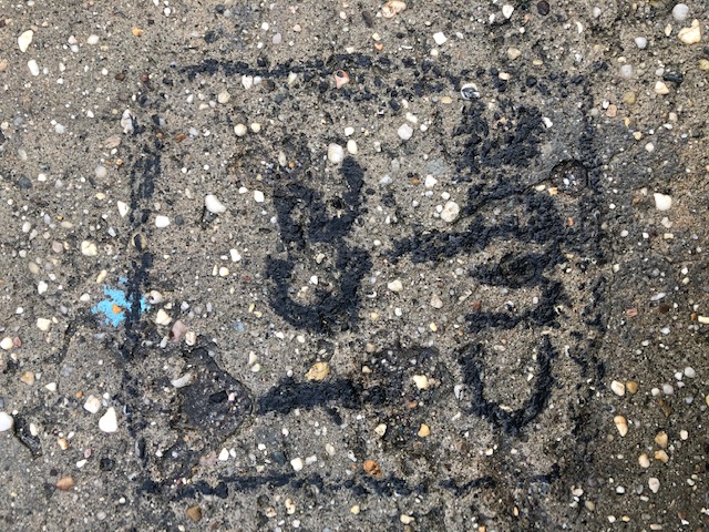
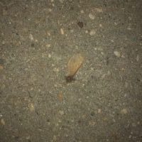
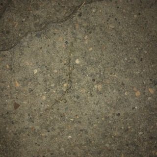
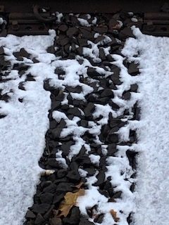
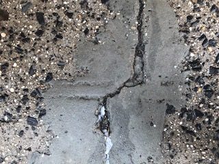
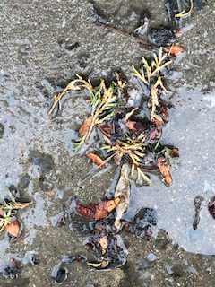
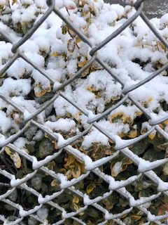
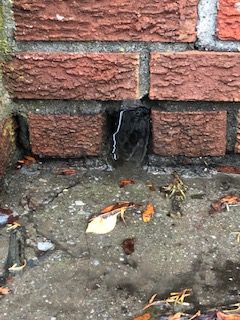
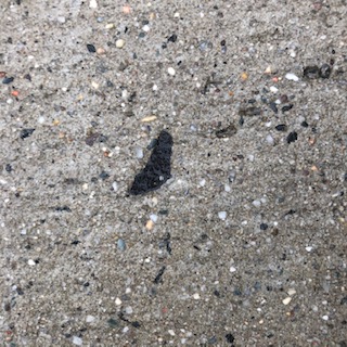
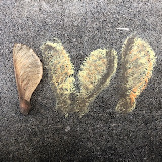
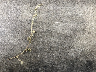
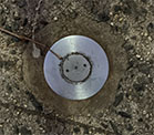
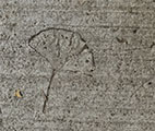
For this project I went out and searched for interesting objects and shapes on sidewalks. I had plenty, but these are just some of the ones I found:


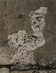
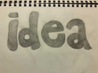
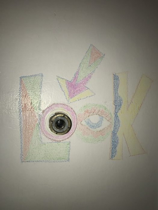
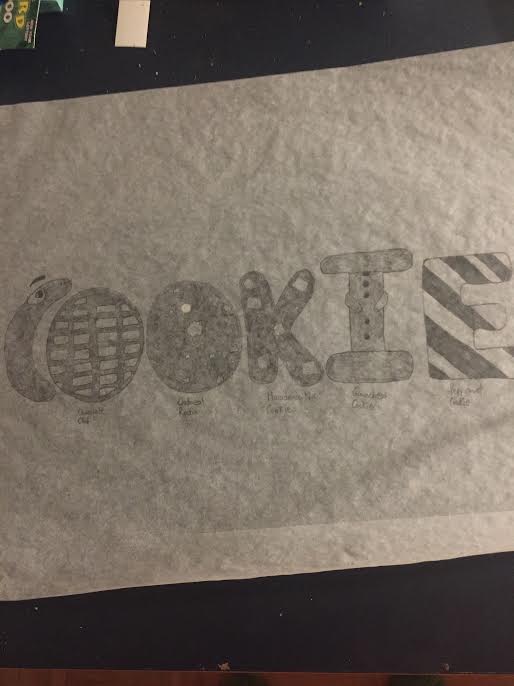
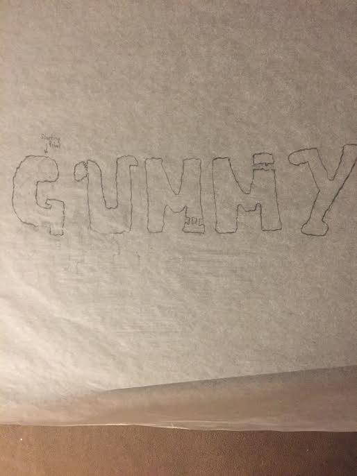
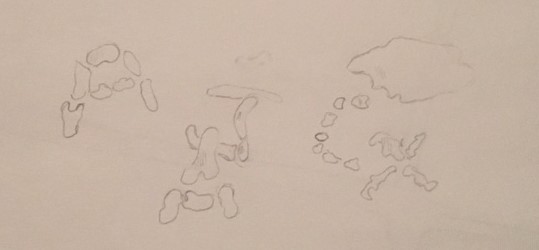
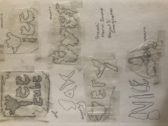
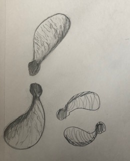
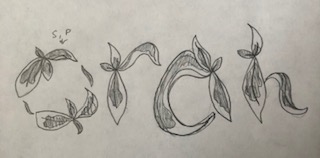
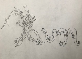
In class I came up with some ideas for how to turn some of these objects and shapes into type designs. I tried visualizing them as letters and then thought of which words I would want to use for each composition.


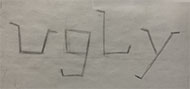
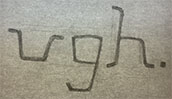
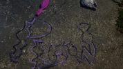
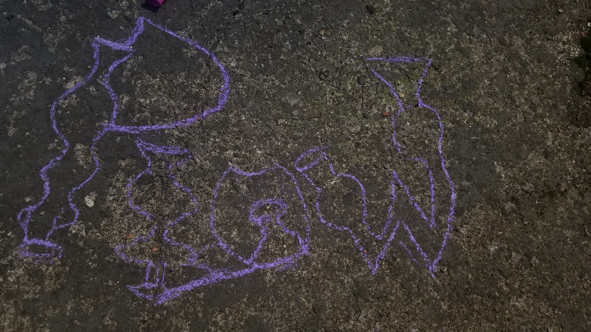
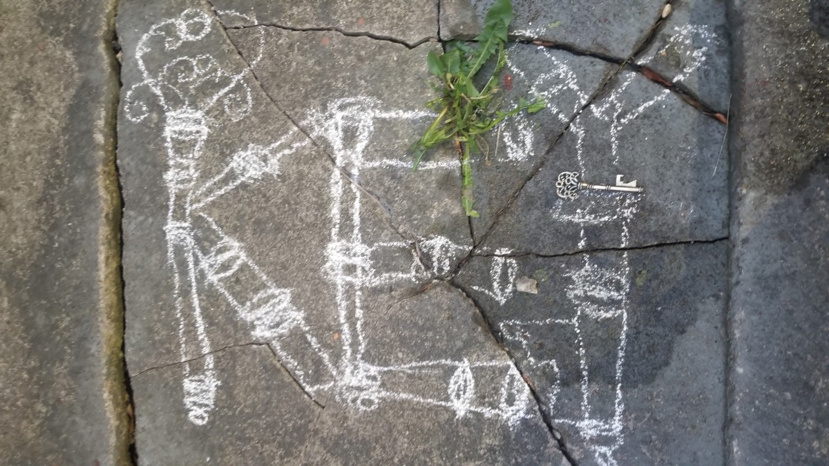
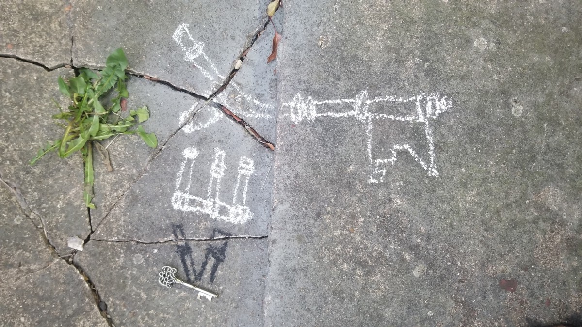
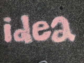
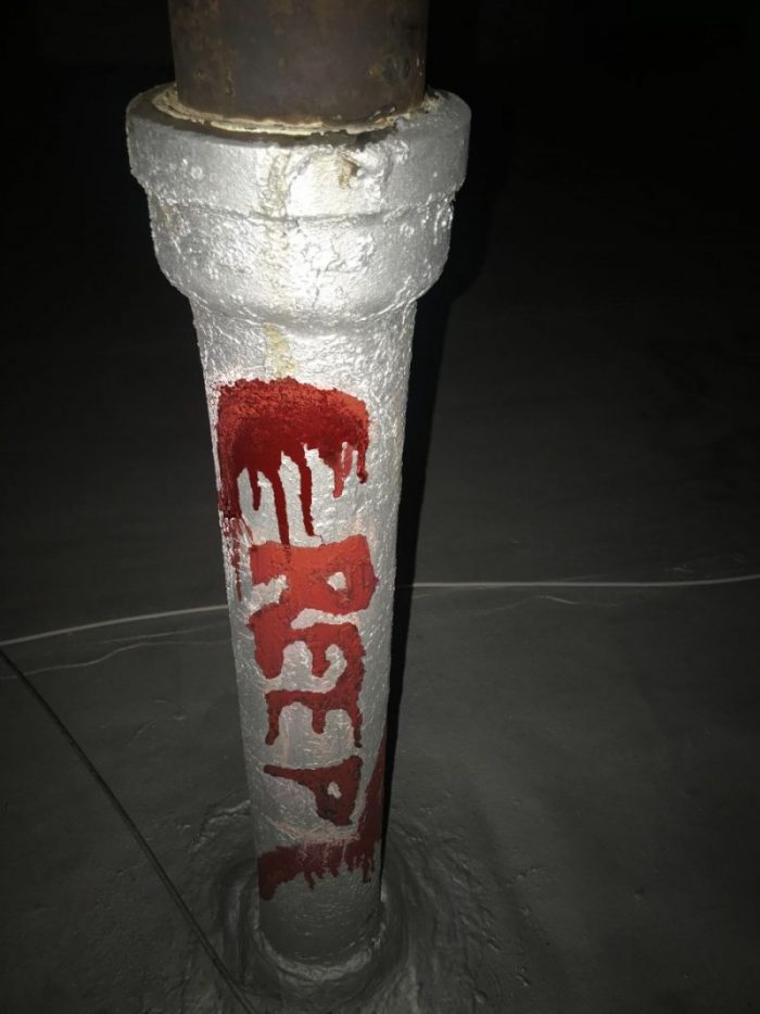
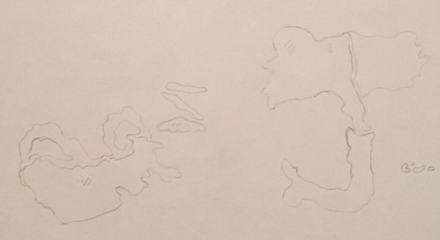
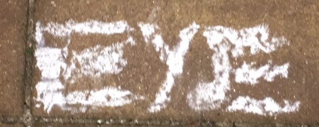
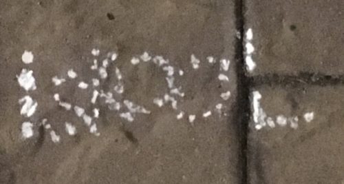
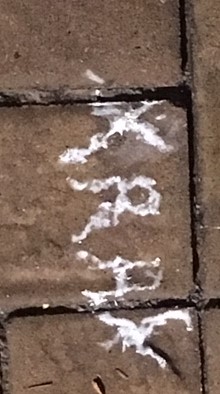
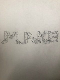
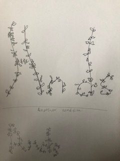
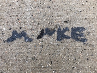
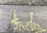
Then I went back to the same sidewalks and used the same shapes as starting points for my designs. These are my end results:


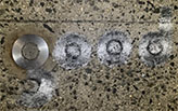
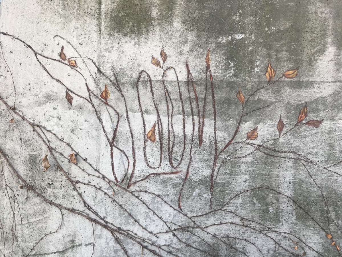
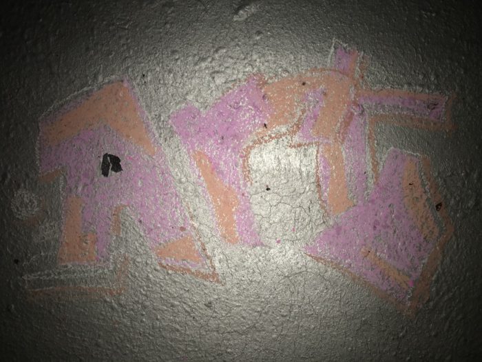
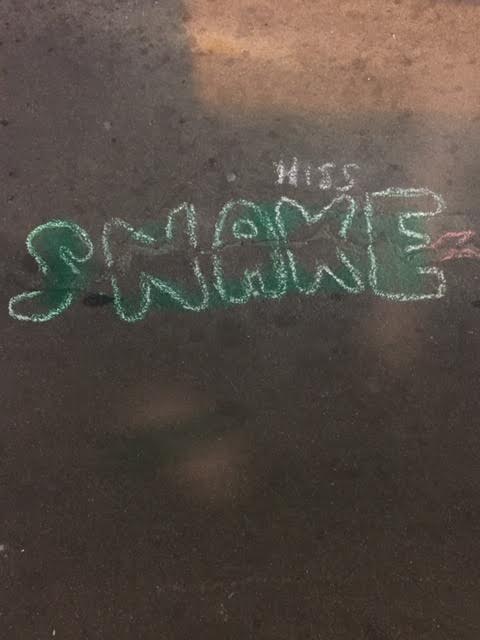
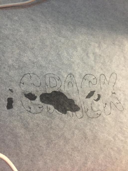
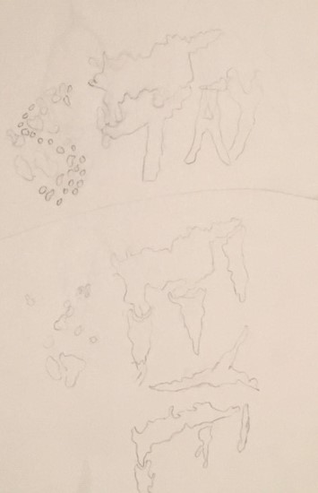
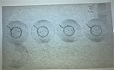
To me they are all readable, but the middle one that reads “good” is a little harder to see. It bothers me that I couldn’t make it better because it was my favorite one to sketch out. It didn’t work out as planned because the concrete near the metal circle was full of pebbles and that was not something I had thought about before going back to the location. It was hard to draw on that surface.

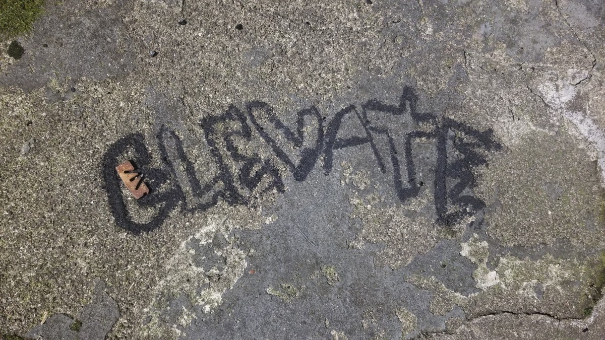
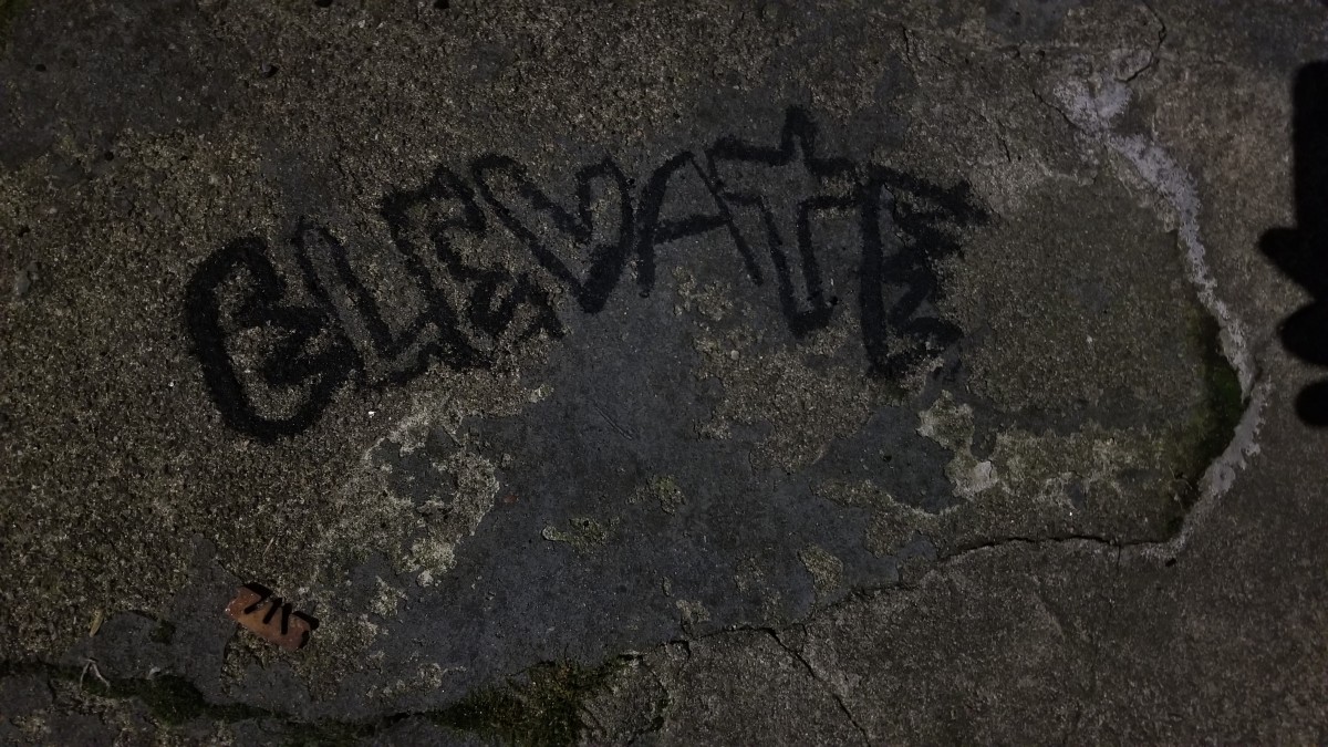
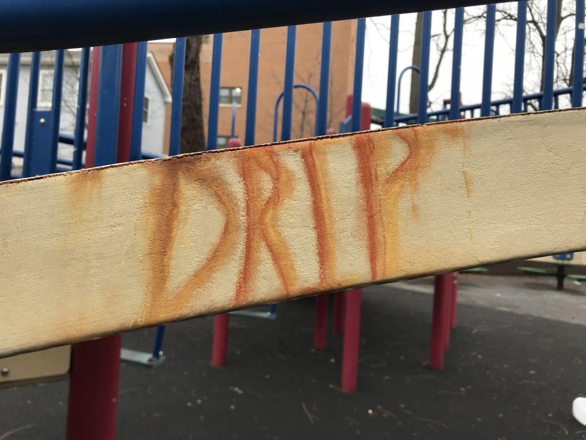
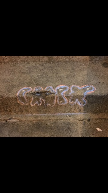
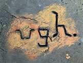
I wasn’t able to get the letters of my “ugh” design to be as thin as the object but I think its okay. For that one I also had to fill in cracks with orange because if not the empty spaces of gray made it look weird and patchy.

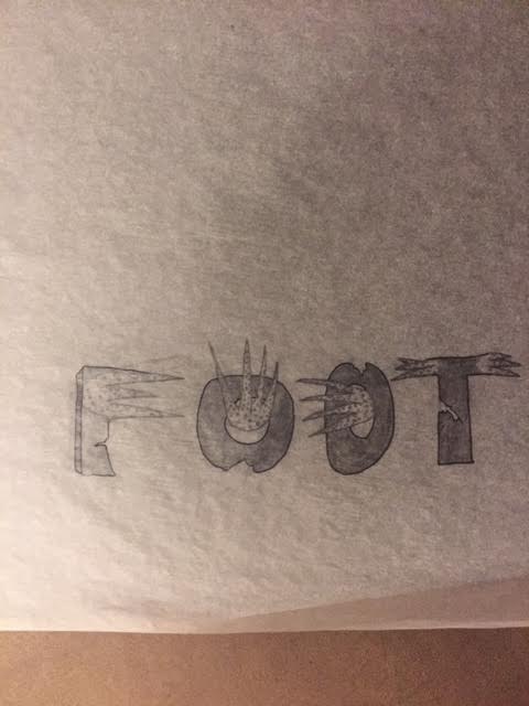
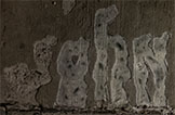
My favorite composition to do in the end was the third one that reads “john” because in a way it was the most elaborated one and I feel like it just works best and actually fits in with the object/crack on the sidewalk that i designed it with.

This project wasn’t difficult to do in itself but it was work. I had to do them at night while relying on street lamps and flashlights. I feel like having done them at night worked in favor of my “good” composition because when I saw it in the daytime, the metal circle looked one bright and glossy shade of gray and everything I added in chalk looked darker. But at night with the few lights around it, it was more reflective and I drew my sketches and my compositions to look like that. I realize now that I didn’t think about the fact that the circle would be bright gray in light because I first took the photo of it at night too. So it makes sense for me to have done the chalk-work at night as well. This same thought applies to the other two compositions.

The process was tedious and a little nerve-wrecking because every time someone would pass by me while I was working on it I thought they might say something about me drawing on the sidewalk. But they didn’t. That made it a little fun too.

In the end I’m stuck between loving what I made and feeling that I could’ve done it a little bit better.

Project 5 – imagiNATION – Step 4 “Deliver”


Originals | Design

Creep Originalcreep pole graffiti

“Bloody Creep”

My favorite one out of all of the compositions. This is an old rusty pipe with a rather sinister-looking red spray paint over it. This was my favorite because I had to put in plenty of effort to achieve typography that would match the spray paint. The first drafts over the print out were done with clean, round lines; which caused a total mismatch if I compared it with the look of the spray paint.  The professor indicated to me that the type had to match the mood of the object. I had many issues finding the correct letters because of the shape of the blob; I tried a horizontal “M”, and then a vertical “E”. The letter “E” made more sense but what word would express what I was seeing in the pipe? The smudge looked like blood dripping down, so I thought about the word “Terror” for the mood. I tried but couldn’t make the smear look like a “T” therefore I looked for synonyms of the word terror and came up with the word “Creep”. To achieve this “Creepy” look I had to write the word in chalk, then smear it with my hands, and grab wet cotton balls and dab it over the chalk to get the “Bloody” look. Overall had a lot of fun with the process of making this setup.

Peep hole OriginalPeep hole

“Look Through the Peephole”

This is a door viewer, the ones that allow an individual to look from the inside to the outside of a door. It was only natural I decided to go for a word like “Look” because that’s exactly what you do when you use this object. Plus the peek hole is a round shape that simulates an “O”. Finding the mood for this composition was a child’s play because the object already had the shape and a word that matched the item. I opted to go with bright colors because since it’s something you have to “look at” it demands your sight’s attention and what better way to do that other than with colors and bold letters.


Ground hole originalGround hole

“Rubber on Ground”

This arrangement worked out because of the black rubber on the floor that gave me the idea to have it function as a counter of the letter “A”. I went for the word “Art” because I think graffitis are art.


Project 5 (Final) Sketches and Compositions (2)


Overall I’d say this project was in a way frustrating, yet fun for me. The reason why I said it was frustrating was because I’m very detailed so it took me more time over the weekend to ensure that everything was right. For the top two pictures of mine the first one was a picture of different ginger ale bottles I’ve seen so when I sketched them out, I decided to arrange them and draw letters out of it. The second sketch of mine was that of a pothole I saw and decided to use that as my focal point and create a chocolate chip cookie. I also decided to use the rest of the letters as different kinds of cookies with the “c” eating them. My last sketch (last pic) was that a series of gum in which I found that I decided to make the font gummy while having the clump of gum on the “g” as my starting point. The last of my final compositions were that of a cigarette bud acting as it’s on fire. I wanted to create a more dangerous appeal and show off how dangerous cigarettes can be to someone. My second final composition was that of a crack that resembled a snake to me. I decided to create the word snake with the ending of the word acting as the snake head. Lastly, my third composition was that of a crack on a set of stairs. I didn’t like the way it came out especially with the last “c” and “k”. It was kind of hard to pull it off, but I wanted to challenge myself. It also rained a bit that day, but most of my work was preserved. This project was fun and I find this interesting that no matter where you are, you can make art out of anything.

Project 5 (Final) Sketches & Compositions

Pictures & Sketches #1

This is my first series of images I’ve decided to do. The first 3 photos will be that of a crack on the street that to my vision, resembled a crooked snake. I decided to use it for my final composition. My second image is that of a large crack on a set of stairs. I also decided to use that for my final composition. My last image is that of a old cigarette bud that will also be used for my final composition. The rest are sketches that I decided to explore for others pictures I took, but will not be posting for the sake of space.

Project 5 sketches and final composition

Here are all of my sketches that I worked on. I had a good amount of sketches because I was not sure how I wanted my final composition to look like. This project did take time to finalize because some days it would snow or rain. One day it rained which ruined my design so I had to restart. Another day it snowed which left ice on my spot for a day or so. The drafting process though was fun and engaging because to find different designs you can look at your image in different pov’s. Another difficulty was when using the chalk it would not come out the way I wanted it to. Maybe it was because the design was small scale or the direction I drew in, but I was not satisfied with the way the chalk designs came out.If I can redo this project I would definitely wonder around a bit more to find more unique scuff marks or dirt/stains or even shadows. I would have also liked to try using color chalk. This is because the more variety the better the outcome. I will remember when doing another project to plan further and aim for more variety.
Drafts/Sketches

Here are the final compositions
"eye" "iskool" "xray"

Starting point


Final Presentation P5- Maria Iacono

For project five i struggled a bit with finding the right object to make a typeface out of. I first started out with pictures of snow but quickly realized that i cannot use my original idea because the snow had obviously melted away. I eventually found some other promising things like cracks in the ground that could work well. When it was time to sketch you were able to see every detail that i had traced, it flowed well and when i finished my sketches i was really happy with how they turned out. But then it came to actually using the chalk and charcoal on the concrete surfaces. I found that in order for this to actually turn out like your sketch you need a really smooth surface and something that picks up the details well. When i started doing mine i realized that it was going to go south real quick. The texture of the sidewalk was NOT good for the chalk at all and i could barely get any of the details in because it was rough. I knew i had to make it work and i tried to the best of my ability to get it to resemble my sketch. I also tried mixing the colors of the chalk but i had a hard time and decided to make it more readable instead of having it blend in with the actual ground. My thinking was if i couldn’t read it or see what it says i didn’t really create the best typeface. But its a double edge sword because you want to be able to read it but you also want it to be able to match the sketch and have all of the detail within it.

Final Composition, Sketches, and Photos

For project five I really went through a lot of trial and error. I couldn’t use some of my photos that I initially wanted because it had snow in the photo, was on someone else’s property, the ground was wet, and the object in the photo had disappeared the very next day. So with all of these new challenges I realized that I needed to take photos of objects that I could either pick up and take home with me or take photos of something that I knew wasn’t going to disappear or distort. I really enjoyed the sketching process of this project and felt that my typeface based around the crack that says, “MAKE” was my best one and I really enjoyed doing the stick with leaves one as well. I struggled at first trying to sketch out ideas for the little sapling thing I found on the ground but then looked at it in a different perspective and found that I could spell out DVD. After the sketching process was complete I was excited to start the chalk part of it. But, unfortunately nothing was working. The surfaces that I found my objects on were way too rough and bumpy to actually see anything that I was doing with the chalk. So, I stayed in the same area but I had moved my stick and the sapling thing slightly to the left and onto a smoother surface because not only was the ground really bumpy and the words barely readable but the ground was wet and created little puddles in the cracks. I found it challenging to mix the chalks and ended up layering up the colors hoping that it would get to what I wanted. For my stick with leaves one it ended up being more green that I had hoped. The brown chalk was just not mixing with the green and it was difficult to make it look dead, it ended up looking lively. I think I had better luck with the sapling object because the colors I used mixed better, I still think the brown could have been darker but it wasn’t mixing with the charcoal I had and wasn’t working. Lastly, I had to do the word, “MAKE” so I went to where the word was originally found, started doing it with the chalk and quickly realized that there was no way that you could even see the word make. This is because the surface changed in elevation multiple times and the ground had things poking out of it such as rocks and wasn’t the smooth surface that I had thought it would be. So instead of working with it I went to look for another object and or crack and found a black shape that sort of resembled the same shape that I was originally going for. I used the charcoal to create the typeface and no matter how many layers I put down it still wasn’t getting darker. Overall, this project during the sketching process was enjoyable but I found it difficult to actually bring those drawings to life with the chalk due the outside forces of nature.