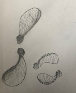
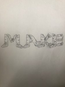
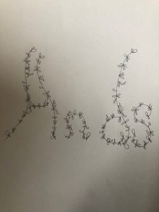
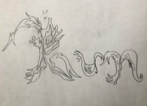
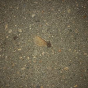
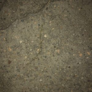
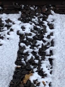
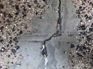
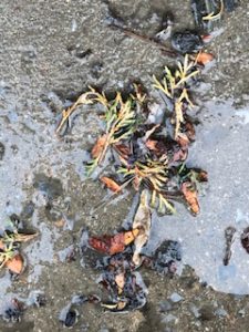
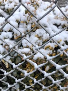
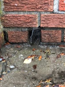
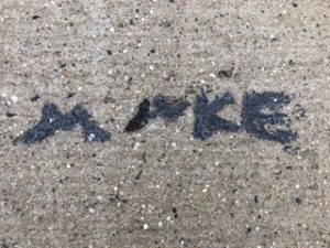
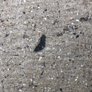
For project five I really went through a lot of trial and error. I couldn’t use some of my photos that I initially wanted because it had snow in the photo, was on someone else’s property, the ground was wet, and the object in the photo had disappeared the very next day. So with all of these new challenges I realized that I needed to take photos of objects that I could either pick up and take home with me or take photos of something that I knew wasn’t going to disappear or distort. I really enjoyed the sketching process of this project and felt that my typeface based around the crack that says, “MAKE” was my best one and I really enjoyed doing the stick with leaves one as well. I struggled at first trying to sketch out ideas for the little sapling thing I found on the ground but then looked at it in a different perspective and found that I could spell out DVD. After the sketching process was complete I was excited to start the chalk part of it. But, unfortunately nothing was working. The surfaces that I found my objects on were way too rough and bumpy to actually see anything that I was doing with the chalk. So, I stayed in the same area but I had moved my stick and the sapling thing slightly to the left and onto a smoother surface because not only was the ground really bumpy and the words barely readable but the ground was wet and created little puddles in the cracks. I found it challenging to mix the chalks and ended up layering up the colors hoping that it would get to what I wanted. For my stick with leaves one it ended up being more green that I had hoped. The brown chalk was just not mixing with the green and it was difficult to make it look dead, it ended up looking lively. I think I had better luck with the sapling object because the colors I used mixed better, I still think the brown could have been darker but it wasn’t mixing with the charcoal I had and wasn’t working. Lastly, I had to do the word, “MAKE” so I went to where the word was originally found, started doing it with the chalk and quickly realized that there was no way that you could even see the word make. This is because the surface changed in elevation multiple times and the ground had things poking out of it such as rocks and wasn’t the smooth surface that I had thought it would be. So instead of working with it I went to look for another object and or crack and found a black shape that sort of resembled the same shape that I was originally going for. I used the charcoal to create the typeface and no matter how many layers I put down it still wasn’t getting darker. Overall, this project during the sketching process was enjoyable but I found it difficult to actually bring those drawings to life with the chalk due the outside forces of nature.
https://openlab.citytech.cuny.edu/mpaularennis-despriciples1fall2019
A City Tech OpenLab Course Site




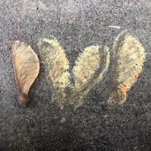

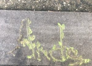


For some reason your chalk drawings just draws my eye. I love the way you added the vineyards towards your letter because drawing on concrete floor can be pretty rough for the chalk. You did a very good job doing your sketches as well.