Doing this project helped me better understand why we use color and how color can bring are work to life. I learned how to use photoshop and illustrator during the process. I got to say if wasn’t for those programs it would been hard to work with paint, especial gauche. I got to experience what real graphic designers have to go through in order to plan their work and be able to deliver it in hope that it brings meaning and attention to those that see it. This project was pretty cool and going to Cooper Hewitt was cool as well because it was place I never been before.
Category: Student Posts (Page 4 of 40)

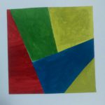
For my free study I choose to make a desert, the inspiration came from the photo that I saw at the museum. The dominant color is blue which I used for the sky and the subdominant color is the peach- like brown and my accent color is the sun- yellow.
-
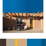
- Owe’neh Bupingeh Preservation Project
As I walked around the gallery room, I saw this photo of a man and a rural house. It was intriguing to see because the natural light from outside gave the setting a beautiful progression from light to dark. As you can see the the shadow of an object is blocking out light. So the dominant color is the picture is the blue and the sub-dominant is the peach like color and the accent color is the yellow.
-

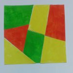
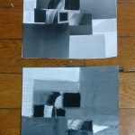
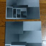
- tint progression
-

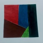
- shade progression
-

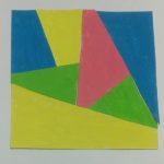
- two color progression
The first picture is on a snowy night, that depicts a good example of tint progression because the street lamp gives reflects light off the snow a orange like color that laminates the block making the scenery a beautiful, relaxing experience
I choose this bird because its’ feathers show a change of shade from light to multiple shades of brown.
The fish demonstrated a shift of color from its tail to its body.
For professor Spevack: My project 6 phase 3 pdf versions you asked me for


Time worked on: 3 hours
Time worked on: 2 hours

In this final project, i enjoyed learning about hierarchy and how to choose the accent, medium, and dominant colors. I found it really fun and interesting going to the cooper hewitt museum, to find our picture for our project. Being interactive makes everything more fun. All in all, this project was very exciting because we got to choose what it was that we wanted to create, and overall this was my favorite class of the semester. I learned a lot that had to do with the course and about myself.
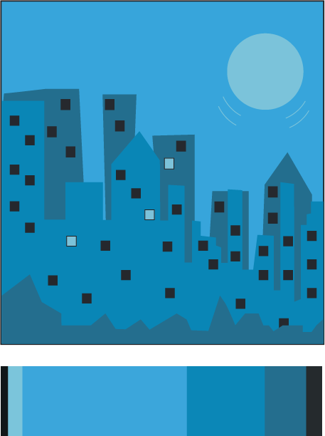
I always enjoy drawing different versions of the city. So for my freestyle i decided to use this color palate to create a piece of the city in another media, illustrator. The dominant color is the light blue, the accent color is the light turquise, and the medium colors are thr darker toned turquises and the dark gray and black.
Freestyle


Recent Comments