First Year Learning Community

Category: COMD1100 (Page 3 of 15)

Sound Visualizations: Phase 1

https://www.youtube.com/watch?v=rn9AQoI7mYU

The song is definitely a song you can dance to. It’s an EDM party song thus the composition for this must be a little rough although it is a little ‘easy on the ears’. The pattern is pretty basic in this 2:56 song. In verse 1 and 2 its basically the same from the beginning of the verse to the chorus. On the third verse however, the pattern changes a little. In the beginning of the third verse the mood of the song changes a little to the smooth side while keeping the EDM vibe and then in the chorus it returns to the same pattern.Ā My understanding of this song does not change after this observation, I still feel the ‘chilled out’ party vibe.
Urban Artifacts: Phase 4

https://openlab.citytech.cuny.edu/schmerlerspevackfylcfa16/2017/01/21/urban-artifacts-phase-1-16/

https://openlab.citytech.cuny.edu/schmerlerspevackfylcfa16/2017/01/21/urban-artifacts-phase-2-19/

https://openlab.citytech.cuny.edu/schmerlerspevackfylcfa16/2017/01/21/urban-artifacts-phase-3-15/

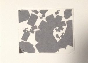
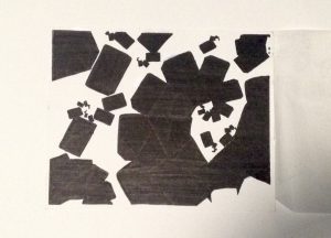
Starting with the basic terms we used during this project, I learned ambiguous and obvious figure grounds and I learned how to distinguish between organic and geometric shapes. In ambiguous compositions it is impossible to set a background and foreground while for the obvious compositions, the work is stable enough for us to distinguish the back ground and foreground. The organic shapes are more rounded and has “flowing contours” while geometric shapes are more precise in measurements and its easy to see shapes. Ā We viewed some stunning pieces of work to help us practice distinguishing figure ground relationships. For using the inking pen for the first time, I am moderately proud of what I’ve created. I wish I was able to fill in certain edges/ shapes in a more precise manner. I also learned it’s best to coat the inking layers at least 2 times so the work looks a little more filled in and more professional. In my next project i will make sure to sketch with the pencil a little more precisely before inking.

Urban Artifacts: Phase 3

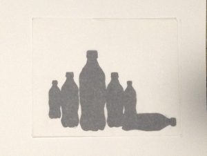
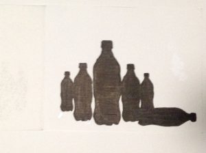
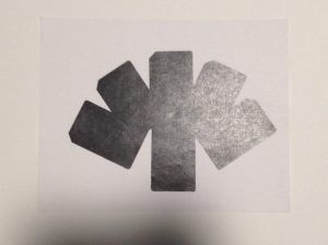
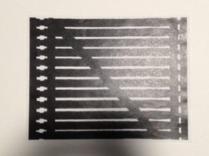
Trace Paper covered- Ambiguous Figure Ground

Unveiled Piece- Ambiguous Figure Ground

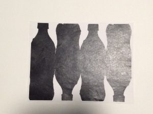
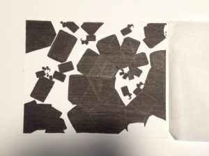
Trace Paper Covered- Obvious Figure Ground

Unveiled Piece- Obvious Figure Ground

This is the inked version of the digital compositions created previously through Adobe Photoshop. I chose to create the inked version of these two out of the other ones I made from the suggestions of my classmates and professor. The composition I created with the Metro Card was supposed to be ambiguous. I tried to make it as difficult as possible for the viewer to figure out the background from the foreground, which really doesn’t exist. As for the Obvious composition, its pretty clear what is the foreground and which ones the background, its pretty stable.

Hour(s) Spent: 2

Urban Artifacts: Phase 1

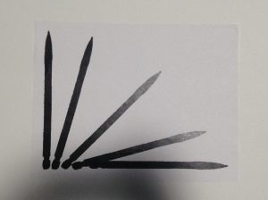
Woodside 61st street station- Creative utensil which could’ve been re-used with purchase of lead. What a waste of creative usage.

Woodside 61st street station- Another re-usable item (Metro Card) discarded in the wrong place by a irresponsible citizen.

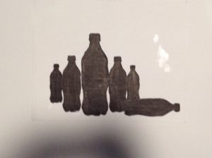
Woodside 60th street- Recyclable item (Plastic Bottle) discarded in the wrong place once again by another litterbug.

In thisĀ Urban Archeology Walk I found out there are many irresponsible citizens who misuse everyday items. Two of the objects I found are geometrically shaped which is clearly the metro card and the pencil. The plastic bottle had certain curves and circular edges which makes that object an organic shape.

These objects came from irresponsible citizens who don’t know how to recycle or are unaware of where things belong. These misplaced items have their own distinctive usage which makes them quite different. The only similarity they have between one another is their plastic and smooth texture and their irresponsible owner.

Hour(s) spent: 1.5


Value-Added Portraits: Phase 4

This project tome was the longest. It was interesting using gouache paint for the first time. It was difficult to me, I’ve never really been good at painting in general. Creating specific shades of light and darks was a challenge, partly because of mixing the wrong proportions of black and white and adding to much or too little water to the mixture. Something I could’ve done better was manage my time properly to have been able to finish in time. Overall it was a challenging and enjoyable project.

Phase 3

Phase 2

Phase 1

Value-Added Portraits: Phase 3

This took me a while to finally finish. TheĀ Narrow-Range Digital Collage took the longest due to the amount of small shapes the original collage has. Overall I am pleased with my work.

Time Spent : 4 – 5 hours

Value-Added Portraits: Phase 2

Time Spent : 3 hours

Color Interaction: Phase 4

This project was very cool to me, I like how we were in groups and were able to communicate with one another about our personalities. This was one of the best projects I have to admit, because of how we had to come up with a theme. I’m satisfied with how theĀ logos came out, because we actually sat and had a discussion about it. Overall I’m happy with how everything worked out and I’m also glad that I understand the terms more clearly now.

https://openlab.citytech.cuny.edu/schmerlerspevackfylcfa16/2016/12/08/color-interaction-phase-1-4/

https://openlab.citytech.cuny.edu/schmerlerspevackfylcfa16/2016/12/19/color-interaction-phase-2-5/

https://openlab.citytech.cuny.edu/schmerlerspevackfylcfa16/2016/12/15/color-interaction-phase-3-5/

« Older posts Newer posts »