First Year Learning Community

Author: Jeremy (Page 2 of 2)

Value-Added Portraits: Phase 1

For the high key picture, this was a group of flags on a wall in the first floor. A light is shining on the far right, with the rest of the photo having a slight reflection on the left.

20161019_123203

For the low key picture, this was the side of the entrance to  the cafeteria. The light lightly shines on the right hand side, leaving the other areas dark. Due to the fact that the cafeteria had lights on, it reflects on the surface of the entrance.

20161019_123409


Sound Visualizations: Phase 1

The song I used is CF0$’ song titled “The Rising Sun” (feat. Lee England Jr.)”, an entrance theme used by professional wrestler, Shinsuke Nakamura. It is a remixed version of their original version released of April this year, with this one having a live violinist performing. When listening to it, a  well done violin piece plays in the beginning. It starts off slow at first, but picks up shortly after. Then the main part of the song starts, with the violin’s beat still playing in the background.

The beginning gives off a calming and relaxing state of mind for the audience listening, as well as the person performing it. As it goes on, the speed of the sound accelerates, the tone changes slightly to a more erratic pattern, but still gives the feeling that something big is going to happen. Then once the other instruments come in, so many emotions begin to rush, as the new energetic beat begins to blend in with the soothing, calm sounds of the violin. Because of the intense feeling, it’s almost if it wants to continue on forever.

Song link


Urban Artifacts: Phase 4

This project helped me learn how to use Photoshop, a program I’ve been wanting to use for a while, and in turn showed me what we can create with just a few images taken from the outside world. The only thing I regret is not framing my second ambiguous photo properly on Bristol paper, making it looked unfinished or not drawn properly to submit.  But I look forward to learning more about figure-ground relationships in other types of graphic design, as well as the thoughts of my other designs from my peers.

Urban Artifacts: Phase 1

Urban Artifacts: Phase 2

Urban Artifacts: Phase 3


Urban Artifacts: Phase 3

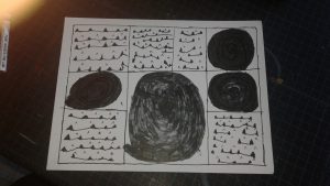
For this part of the project, I had to choose 2 different images that I did on Photoshop that best shows the figure ground relationship from and ambiguous image and an obvious image. Tracing the photos was the hardest part for me, since I couldn’t get a good light to shine on the Bristol paper. Inking the photos on the paper took a while, especially the second photo, but it wasn’t too difficult.

Urban Artifacts: Phase 2

Obvious

Ambiguous

Work time: 2 Hours


Urban Artifacts: Phase 1


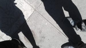
The cigarette stub lies on the sidewalk as a geometric circular shape. It is a stable figure that blends in with the outside floor. The trash scattered next to the trees are organic shapes. The objects blend in well, making it a stable figure.  The plants next to the seats give off a geometric shape since they grow symmetrically. It is an ambiguous figure, since it is out of place from the background.

When the person was smoking, the cigarette accidentally fell on the ground. This explains why the paper didn’t completely burned off.  The plants were added in that area to make it more lively, since the area is surrounded by construction and buildings.The snacks and cigarette was the result of someone on their lunch break, looking to relax after a long day of work.

Newer posts »