Assignment 1

- Strategy: 1
- Layout/Design: 1
- Copy: 3
- Message: 5
- Creativity: 1 –
Awesome color palette and use of images. TINY text is very hard to read. The message is pretty rash but true. Then again, Febreeze commercials are pretty intense.
- Strategy: 5
- Layout/Design: 4
- Copy: 5
- Message: 5
- Creativity: 4
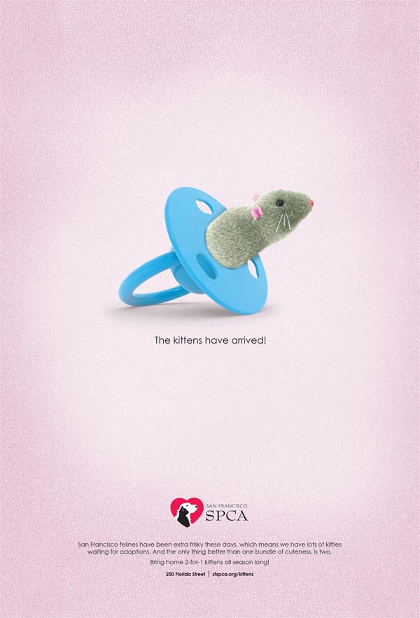
I was very confused upon scrolling onto this Ad. First thing I saw was a fuzzy pacifier and I really made no sense to me until I read the tiny print. The small print at the bottom should be bigger as it is important information that is needed to get a sense of what this ad is about. Perhaps if they added a kitten paw or a still action shot of a kitten paw I would’ve gotten it sooner. 2 for 1 Kittens is a big deal.
- Strategy: 5
- Layout/Design: 2
- Copy: 5
- Message: 5
- Creativity: 2
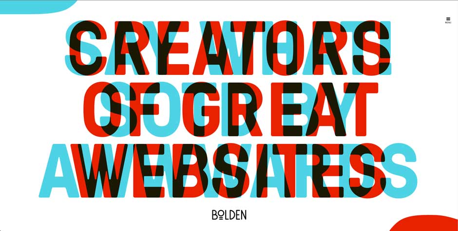
I know a lot of designs are great because of their contrast, but this is overload. Awesome colors but, it gets me pretty nauseas as a viewer. I am not a fan.
- Strategy: 1
- Layout/Design: 1
- Copy: 3
- Message: 5
- Creativity: 1
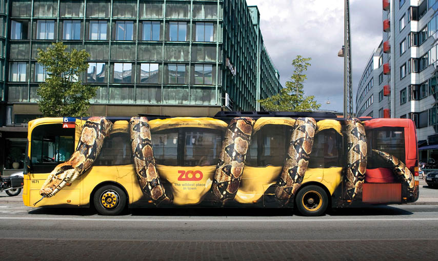
This creativity team brought the zoo feel to the streets. It gives the viewer a sense of excitement. I want to go to this zoo after seeing this bus. The copy is in good placement. This design is great on a bus given the fact that the Zoo is a place all audiences. I do feel bad for those with snake phobias though.

- Strategy: 1
- Layout/Design: 1
- Copy: 1
- Message: 1
- Creativity: 1
This ad was designed very minimal and to the point. It’s one of those “if you know, you know” kind of ad’s. The silhouette of the crescent moon and the midnight blue color play major roles here by adding the feel of the night.
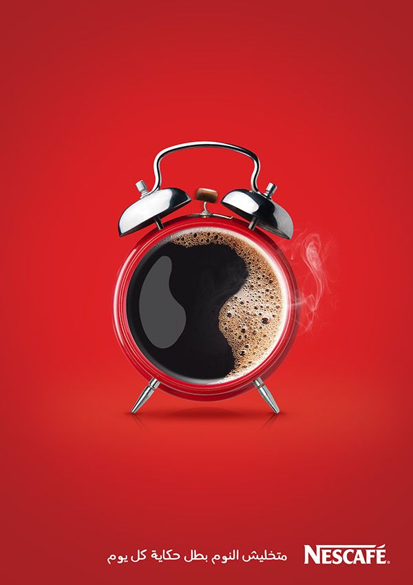
- Strategy: 1
- Layout/Design: 1
- Copy: 1
- Message: 1
- Creativity: 1
This Ad is straight to the point, coffee time! The use of color and image play just ties in together so seamlessly.


Leave a Reply