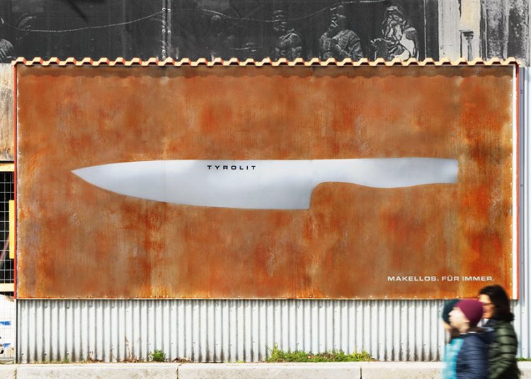
Strategy: 5- At first l thought it was a knife ad, but it is an ad on material.
Layout/Design: 1- This feels like a lot of thought went in to creating the shape of the knife with the material while everything else is rusted.
Copy: 1- The tone of the ad gives a clear message that their material does not rust.
Message: 5- I still think it is an knife ad.
Creativity: 2- Time and effort into shaping there material out of knife while everything else is another material was unique.

Strategy: 1- I think it is a genius ad, I fully understood it.
Layout/Design: 1- The layout of the picture in the middle, with the 2 razors in the shape of a paused button was unique. I like open space.
Copy: 1- The tone of the ad gives a clear message on stop shaving.
Message: 1- It is very clear
Creativity: 1- Using 2 razors in the shape of a pause button was clever.
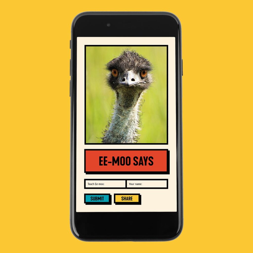
Ee-Moo Says
Tourism Australia
Strategy: 4- I like the pic of the ee-moo but I’m still unclear on how tourism plays a roll in this.
Layout/Design: 5- There is no logo or text to state what they are advertising.
Copy: 2- I like that it looks like a picture your sharing on the phone and the yellow that pops.
Message: 5- “Ee-Moo Says” is very confusing.
Creativity: 3- It is sort of unique but I still don’t get it.
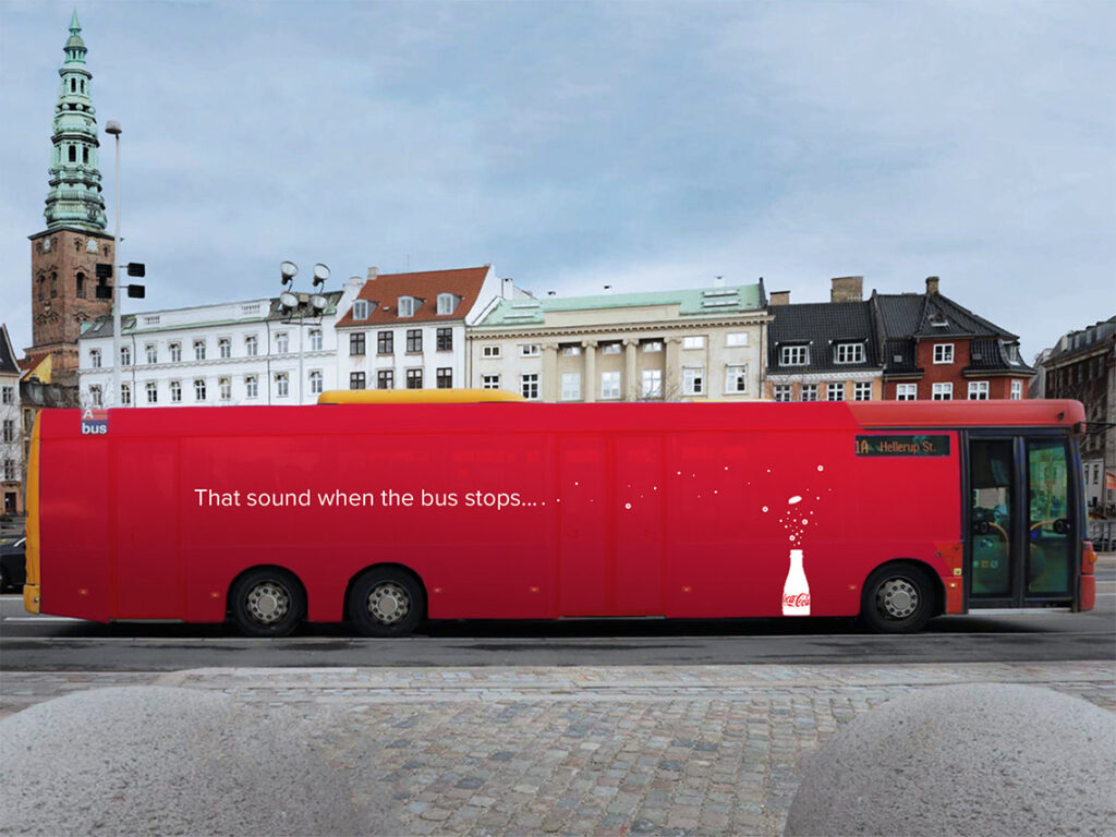
Strategy: 1- This is a straightforward and uncomplicated ad, where the sound of the bus sounds like opening a bottle of Coke.
Layout/Design: 2- The typography is directly in the middle of the bus along with red which.
Copy: 1- Clearly shows the company’s color scheme
Message: 1- “That sound when the bus stops…” We all get it.
Creativity: 1- Love, the creativity very eye catching and can put a smile on someone’s face.
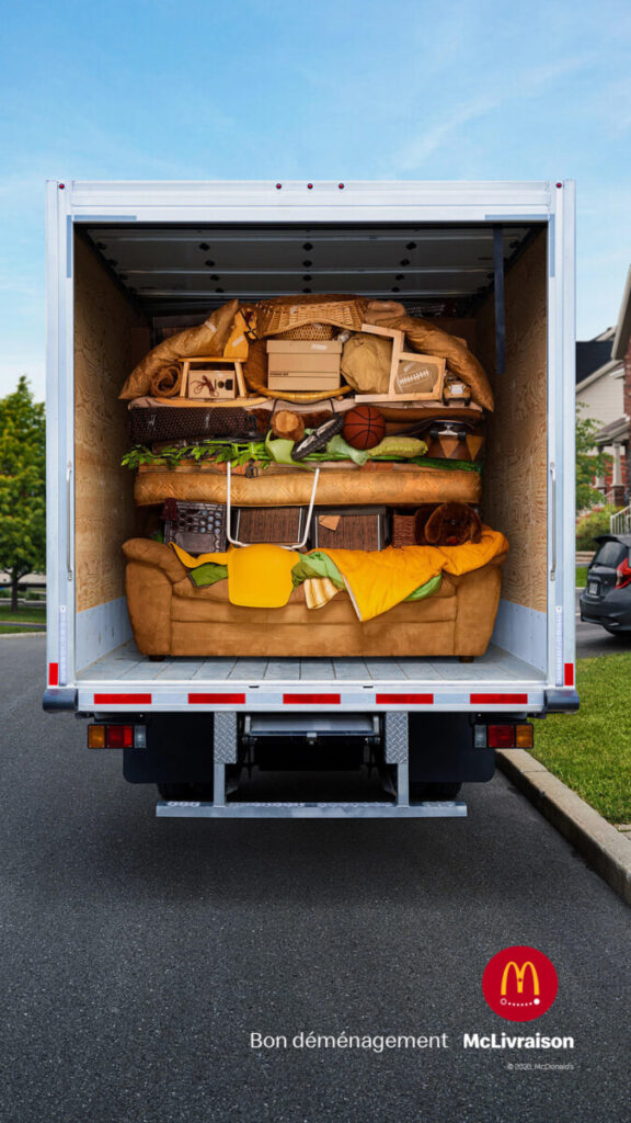
Strategy: 1-This McDonalds ad is to make you want to get a Big Mac.
Layout/Design: 1- The layout of the burger, that is directly in the middle of the picture, its shows the moving truck and also the outside area
Copy: 2- The typography on the ad states “Bon déménagement” means good move in English. All the furniture organize very neatly in a shape of a burger.
Message: 4- Not sure what the ad have to do with moving.
Creativity: 1- The creativity was very clear.
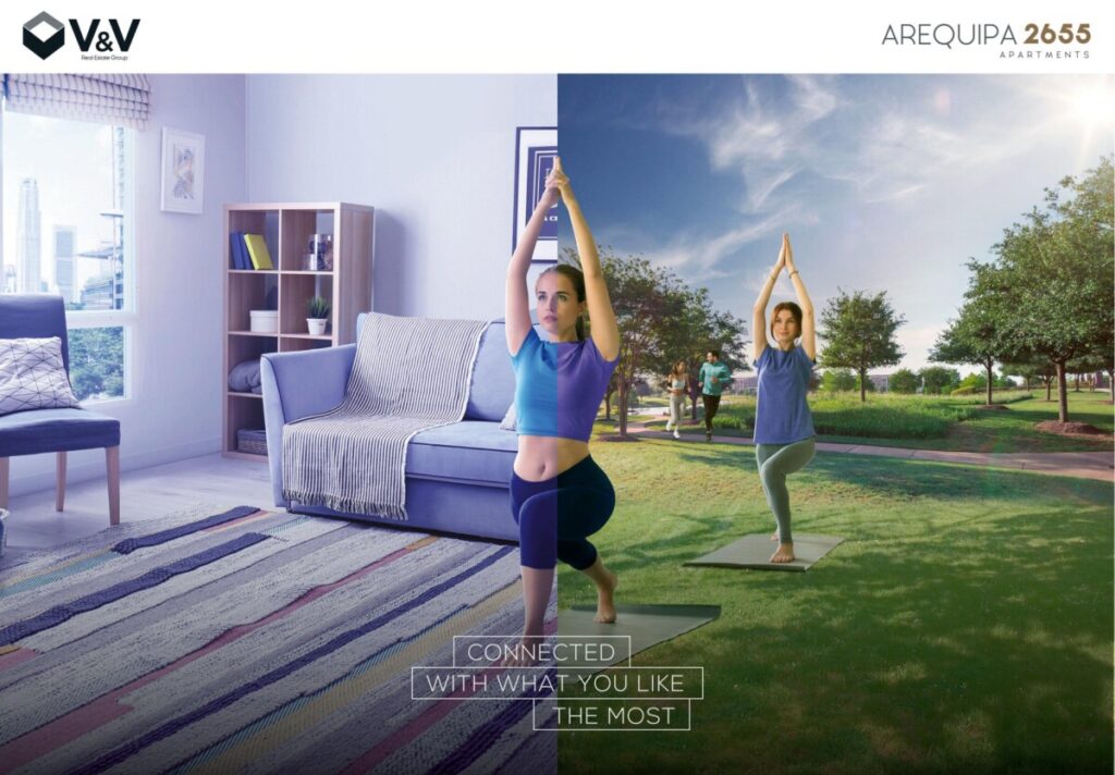
Strategy: 5- I thought this ad was about gaining connection to your spirituality through yoga and exercising.
Layout/Design: 3- There are 2 pictures put together was ok but still not giving a clear indication that its real estate company. The typography placement covering the 2 different mats looks a bit awkward. I am not sure about the box around it.
Copy: 5- The tone of the ad is calm just like an yoga studio ad.
Message: 5- It is very unclear
Creativity: 5- They could have done better.


Leave a Reply