
Author: Val Bailon (Page 1 of 3)
In this final project, i enjoyed learning about hierarchy and how to choose the accent, medium, and dominant colors. I found it really fun and interesting going to the cooper hewitt museum, to find our picture for our project. Being interactive makes everything more fun. All in all, this project was very exciting because we got to choose what it was that we wanted to create, and overall this was my favorite class of the semester. I learned a lot that had to do with the course and about myself.
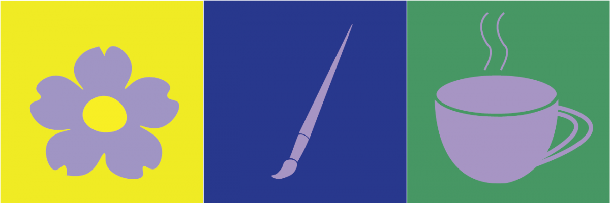
I always enjoy drawing different versions of the city. So for my freestyle i decided to use this color palate to create a piece of the city in another media, illustrator. The dominant color is the light blue, the accent color is the light turquise, and the medium colors are thr darker toned turquises and the dark gray and black.
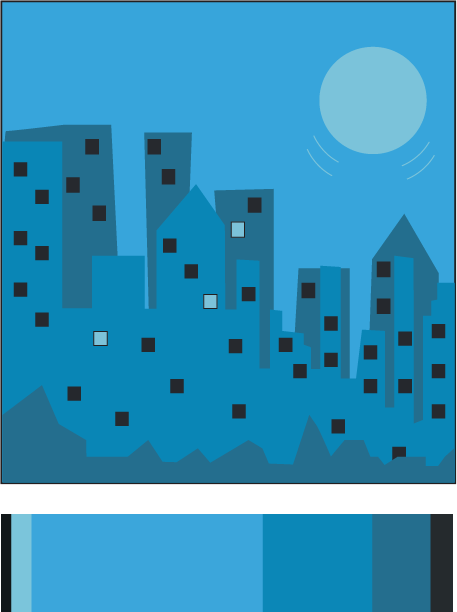
Freestyle
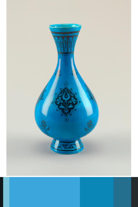
I found this image of this vase in one of the digital tables at the Cooper Hewitt Museum. It was given to Christopher Dresser and manufactured by Minton’s Art Pottery Studio. There are different shades of blue from this point of view, and that is what caught my attention. It is dated 1870s and was acquired in 1998. It is a medium glazed porcelain, and part of the Product Design and Decorative Arts department.
two-color progression

shade progression
Done by:
Gege
Katherine
Val
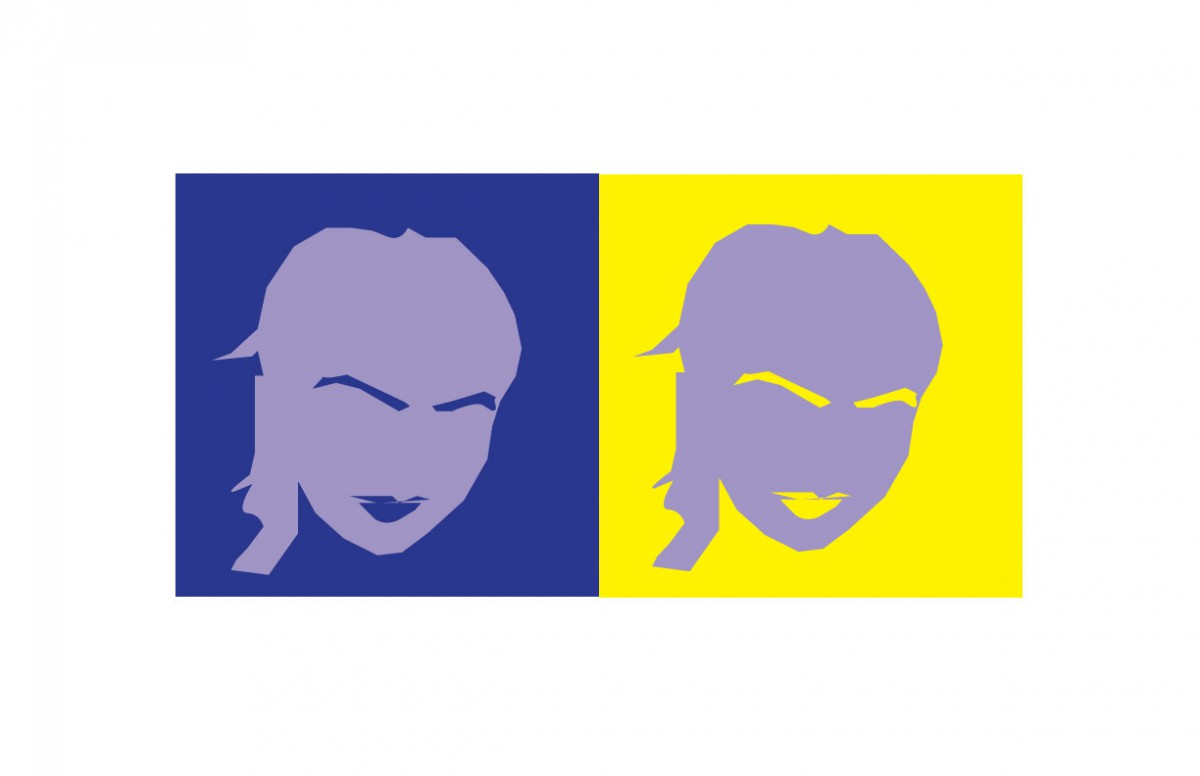
This was also one of favorites. I think i finally got the hang between the difference of hue and value. I also finally learned how to use the pen tool! I took my time and tried my best to remake gege’s profile. Gege chose the color yellow for me because she says im a very energetic and athletic person, and i chose the color blue for her because gg is very deep and passionate about the things that catch her attention and she’s also very smart. We both decided that the color purple, represented the both of us because we are both very artistic in our own way.
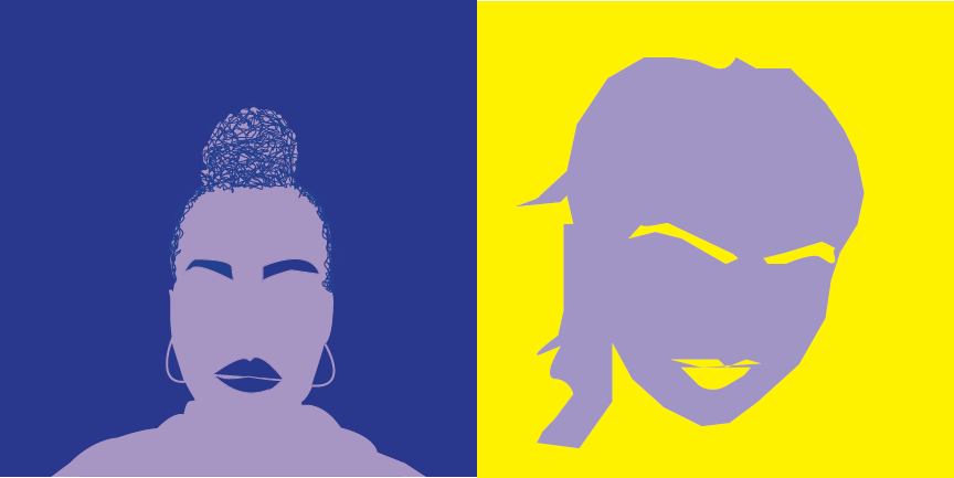
Val&Gege
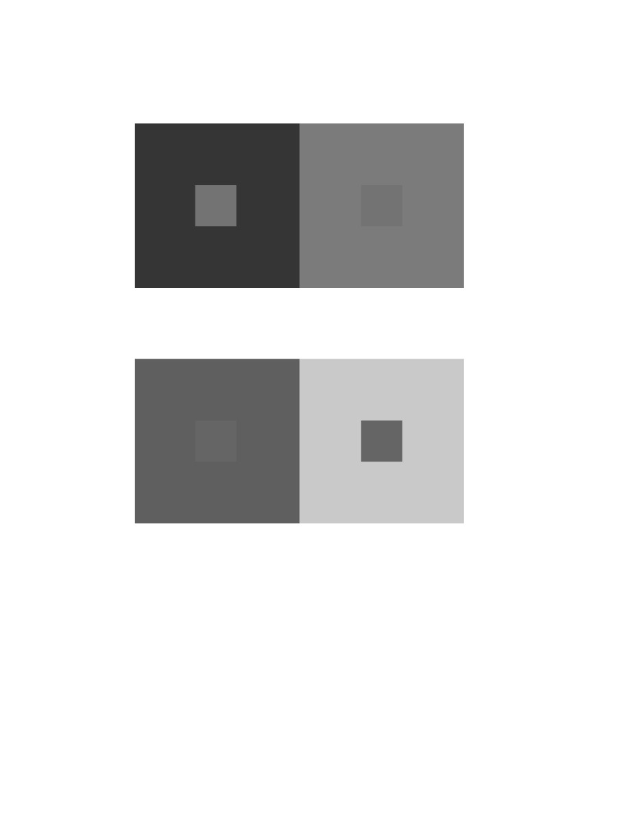
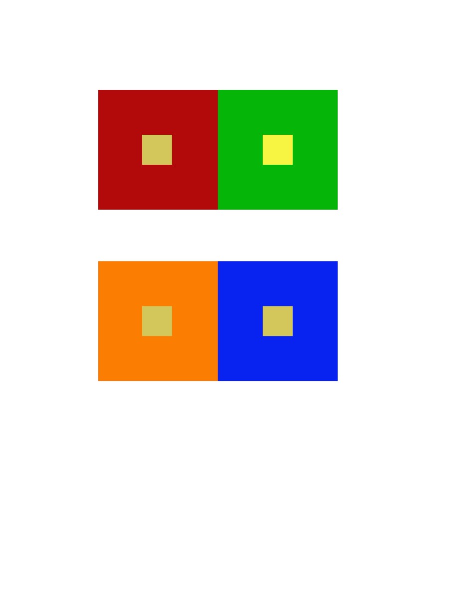
2 pairs of achromatic gray studies interactions by shifting values

2 pairs of color studies interactions by shifting value (with color)
shifting hue not value
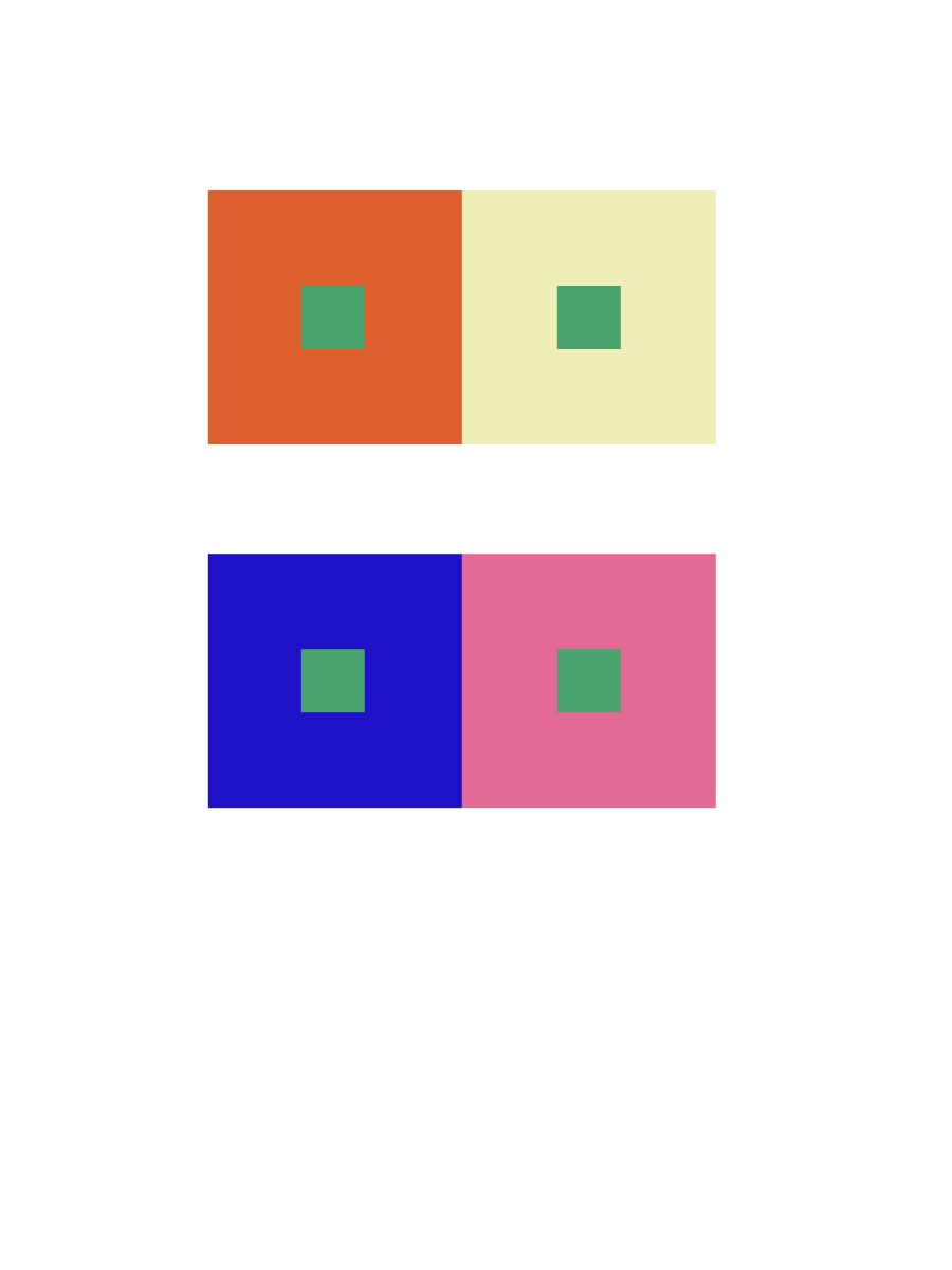
shifting hue and value
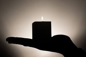
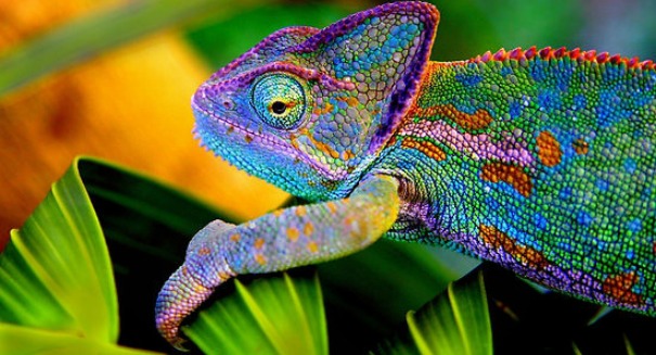
Learning about color and how our eyes perceive it, is really interesting. Playing around with the app helps you see how mixing different colors together in one piece can make your eyes perceive it as a different shade depending on how you choose your colors. The first thing that popped into my head that demonstrates a different interaction with colors is a sunset. Sunsets are always a mystery, because you never know how it is that the colors are going to be that evening. Then theres the Chameleon, a very interesting reptile that changes color, which i find very intriguing… imagine if our skin changed colors.


Recent Comments