I honestly really enjoyed this project, even though i stressed a little while making it. I finally learned the difference between the saturation of colors and the value of colors. In this project i felt more prepared and less insecure about getting the color on paper. I tried keeping the theme of a pretty clean and neat overlapping design throughout all phases. This was one of my favorite projects.
Author: Val Bailon (Page 2 of 3)

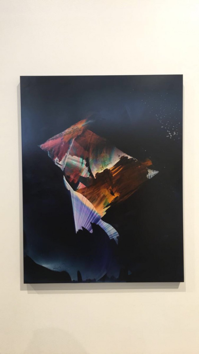
Fugue , 2016
Rachel Ostrow
Medium: oil on panel
This piece of artwork was the one that most stood out to me. It looks like an opening to another dimensions. I can relate this to a movie I recently watched, intrasteller. Towards the ends there was a part where the main actor entered into another dimension and the images looked just like this painting. I can also relate this to the recent project we did in class, with the saturation a in color.
Chromatic Grays
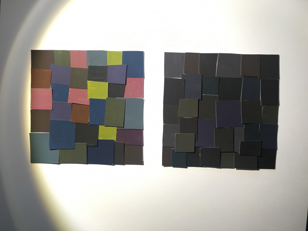
Hours worked on: 2Hours
Prismatic Colors
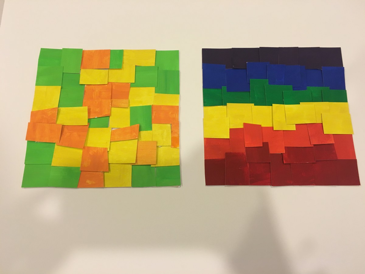
Hours Worked on: 2 hours
Muted Colors
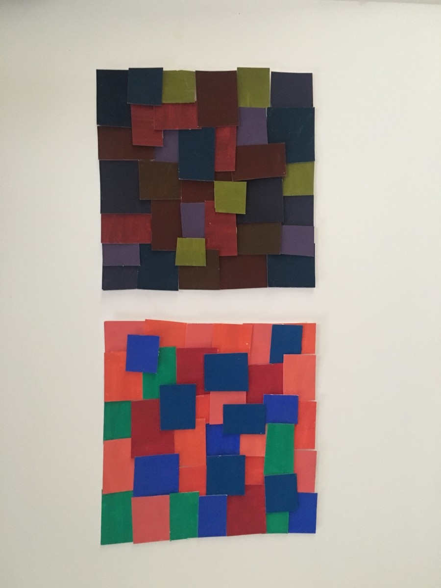
Hours Worked on: 2 hours

Concept: Umbrella
My partner chris and i decided to use and umbrella as the color wheel, but showing different gender. Mine was painted with female legs and his will be done with male legs.
Hours worked on: 3 Hours
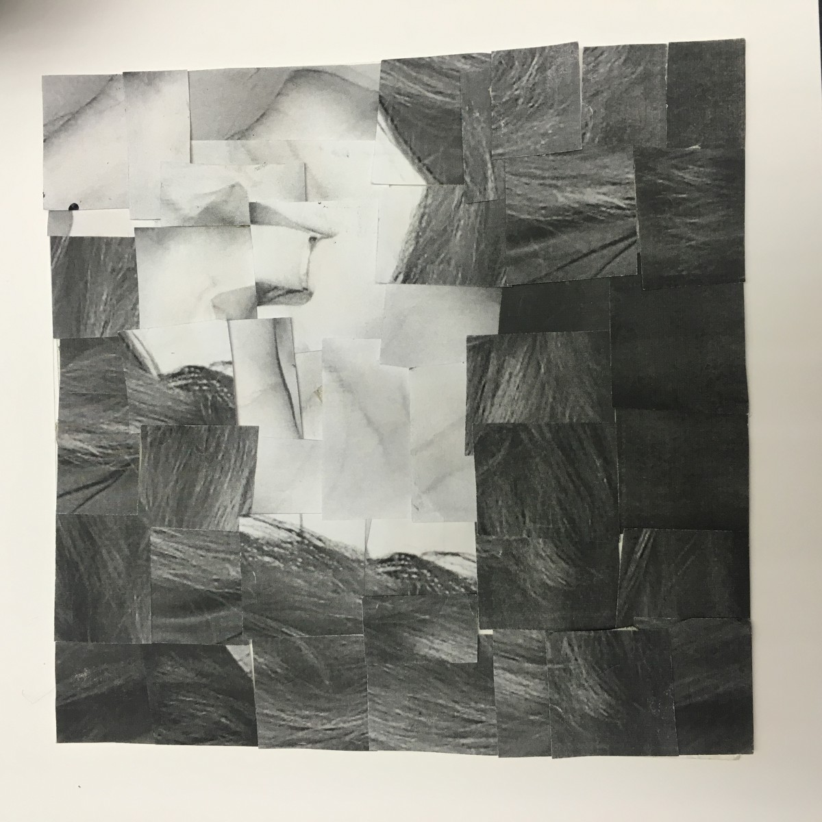
This third project made my head hurt. I must admit painting with gouache and a brush is not easy at all. I did all i could to follow all the instructions i was given. In the end i did make a couple of mistakes but managed to fix them in my final product. I now have experience in using this particular type of paint and will try to do better in my next project. Showing narrow and broad range values was pretty hard when cutting out the original picture, but when it came to the painting it was just easier to blend the black and white and create shades of gray instead of looking for the shades in the pieces.
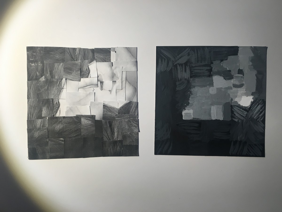
Broad Range Value
Narrow Range value
Hours worked: 5-6hrs
I’ve learned a lot thoughout this midterm, learned new vocabulary how to use photoshop and do an animation. I also learned how to use the actual drawing pens and what’s a hard and soft pencil. Lastly I’ve learned that my weakest side is how to use a paintbrush. That’s probably not my best job done. But I’ve put a lot of effort and time into my projects. And I’ve also lost my shyness to present in front of a classroom. (I usually couldn’t even stand up and look out to the from of the classroom).
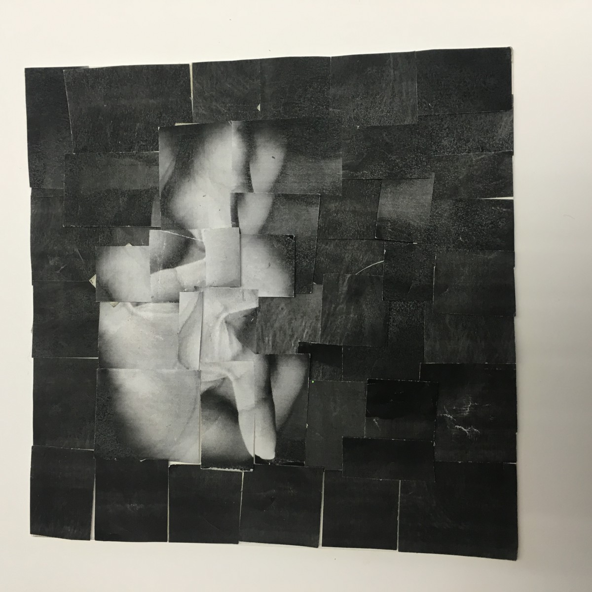
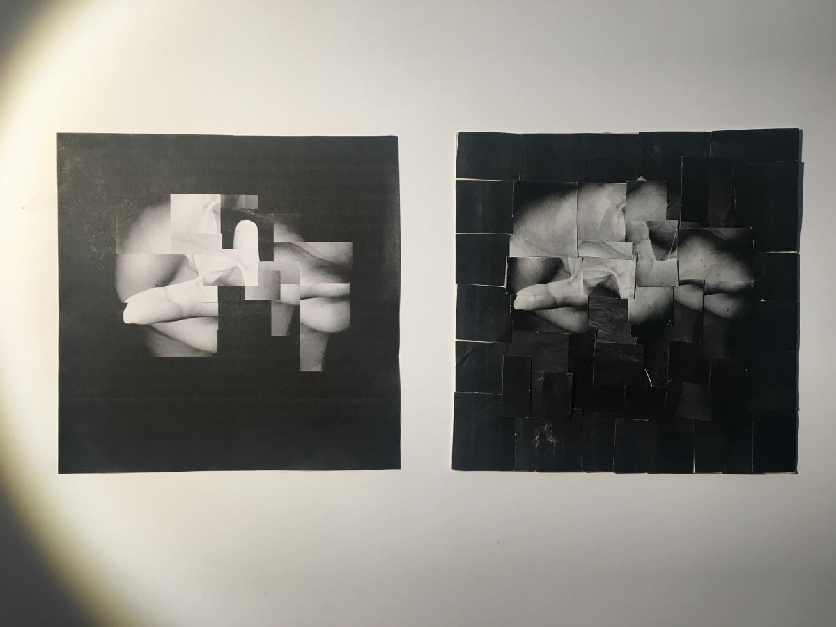
Narrow rage value
Broad range value
hours worked: 4hours
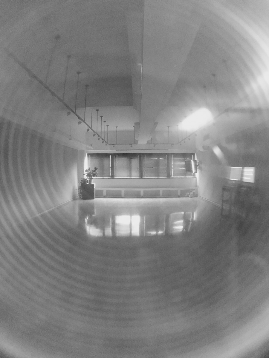
HIgh-key range:
My high key picture is the city tech art gallery. The way this picture was taken lets it represent a high key image. The mood of this composition expresses success and joy. The highlight of the sun coming in makes it look like an artists heaven.
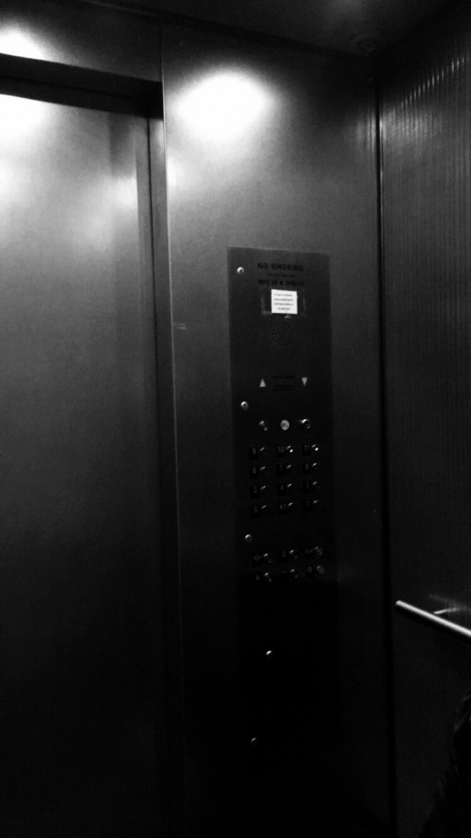
Low-key range:
My low key picture is one of the elevators in City Tech. This image gives off a very dramatic, and mysterious expression. The contrast between very dark to low light, gives it a synical feeling.


Recent Comments