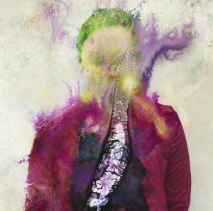
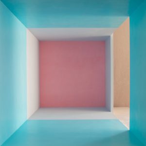
From my observation several different colors are interacting throughout both compositions. The colors in the first composition create an amazing visual of a person, this really caught my attention when I first spotted it. The purple and green really go together quite well, to where it makes the picture come alive in a way. The 2nd piece of art shows what looks like a room, divided into several different pieces. I personally like this image because the sky blue brings all the colors together, and everything else falls into place. The pink to me fades a little bit and the blue stands out, in which this shows a great amount of interaction between all the colors.
Recent Comments
- ShanShan on Color interactions: Phase 4
- Franco on Color Harmony: Phase 3
- Franco on Color Harmony: Phase 3
- Franco on Color Interaction: Phase 3
- ShanShan on Color Harmony: Phase 3
Archives
Categories
Tags
#phase3
BRIC
Color Harmony
Color Harmony: Phase 1
Color Harmony: Phase 2
Color Harmony: Phase 3
Color Harmony: Phase 4
color interaction
Color Interaction: Phase 1
color interaction: Phase 2
color interaction: phase 3
Color Interaction Pairings: Phase 4
color interactions
gelek samphel
Midterm Grade
phase #2
phase 1
Phase 1: Discover
Phase 2: Define
phase 3
Phase 3: Develop
phase 4
Phase 4: Deliver
Project 2
Saturation Studies
Saturation Studies: phase 1
Saturation Studies: phase 2
saturation studies: phase 3
Saturation studies: phase 4
Saturatio studies: phase 3
Saturatio studies: phase 4
Sound Visualization Phase 1
sound visualization phase 2
Sound Visualization Phase 3
Sound Visualization Phase 4
Sound Visualizations: Phase 1
Urban Artifacts
Urban Artifacts: Phase#2
Urban Artifacts: Phase 2
Urban artifacts phase 3
Urban Artifacts Phase 4
value-added portraits: phase 2
Value Added Portraits: Phase 4
value added portraits phase :1
Value added portraits phase: 3


Leave a Reply