- Low-Key
- High-Key
The first image was took in the class room and edited in Photoshop to give more of dark look. The darkness gives a very mysterious feeling, maybe it just me but I feel almost afraid to walk in to it. The highlight is the small paper cup on the right, and the darkest part is the deepest part of the counter top. As you move from the paper cup further in towards the center, the items on the counter top get harder to see.
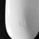
The second image was also taken in the classroom. It was just cropped to have more white in the composition. The strong contrast created by the white mouse and the black pad make a closed value composition. The little marks and dust gives the mouse a ton of character. The white specks give the black pad texture. The highlights are the reflected light coming from the open windows on the left.
Time Worked : 1 hour.


Leave a Reply