Obvious

Ambiguous
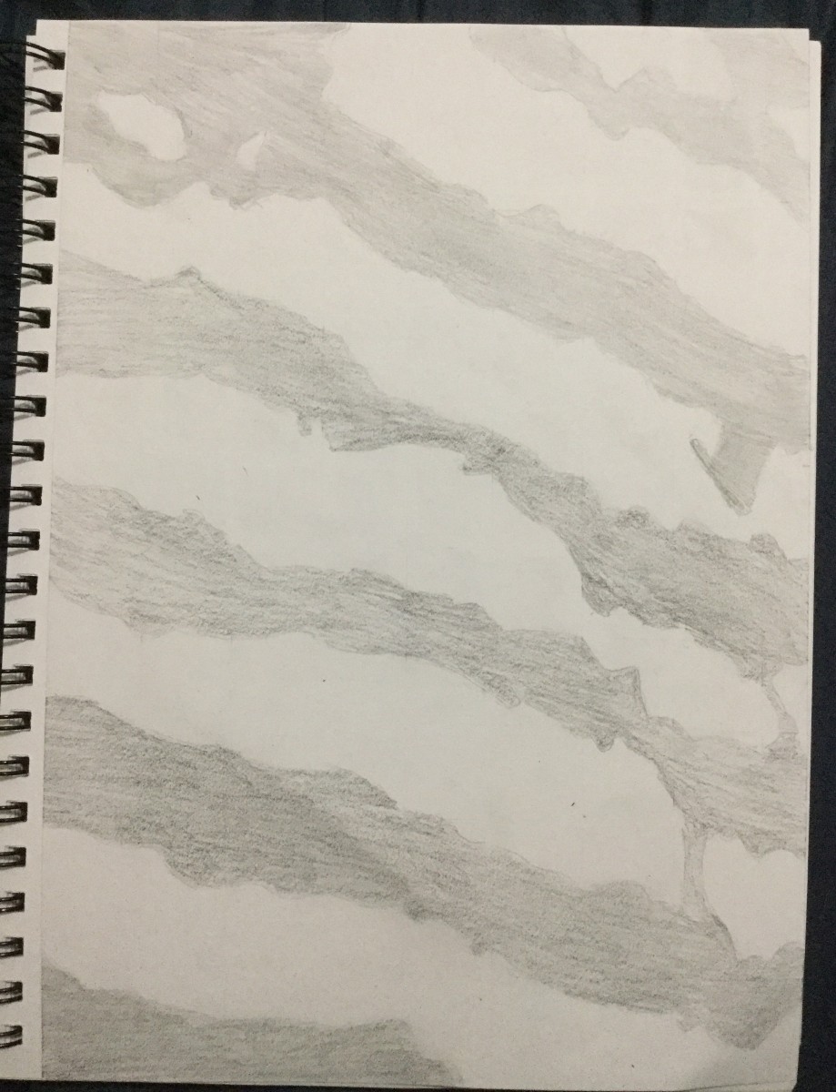
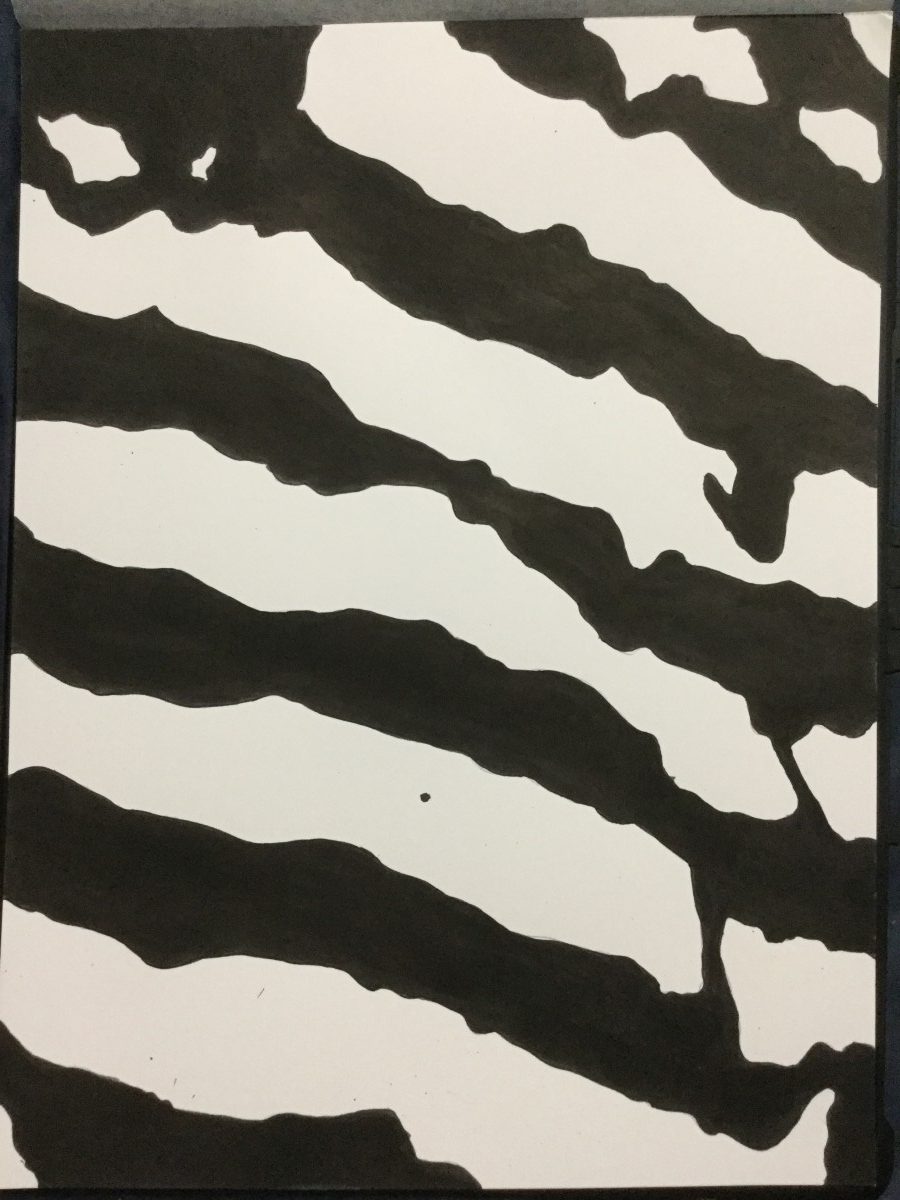
I think that this composition still communicate the same mood as the final sketch. The lines are the same but the contrast in the final sketch is light compared to the final which is India ink.

Obvious
Ambiguous
I think that this composition still communicate the same mood as the final sketch. The lines are the same but the contrast in the final sketch is light compared to the final which is India ink.
obvious 1
final sketch
obvious 2
final sketch

obvious 3
Ambiguous 1

final sketch
Ambiguous 2
final sketch
Ambiguous 3
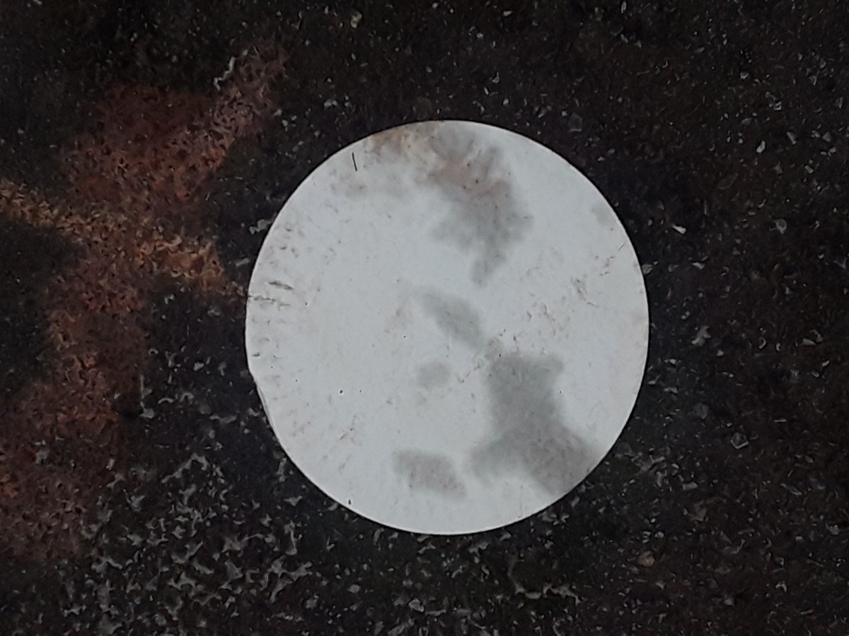
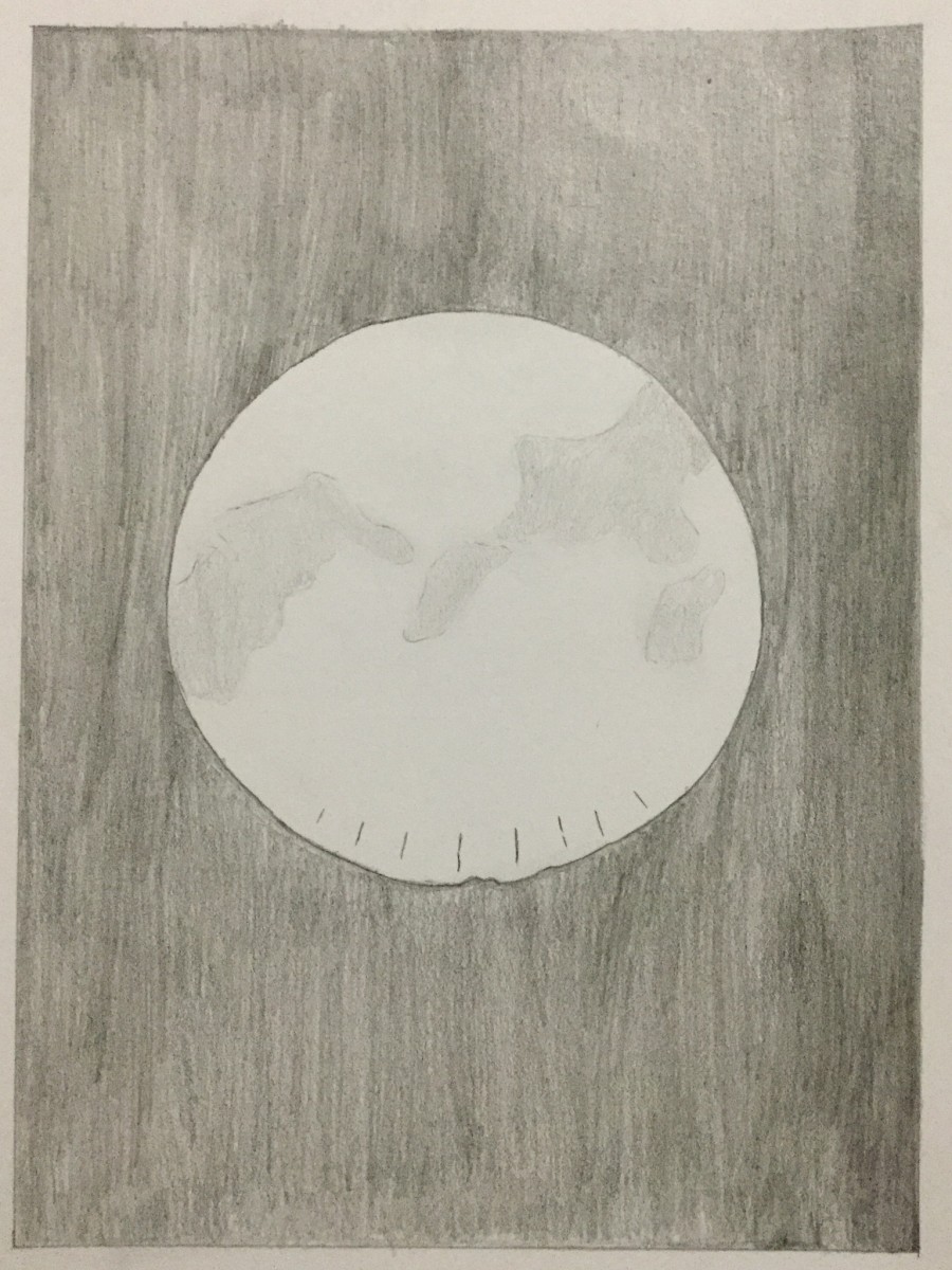
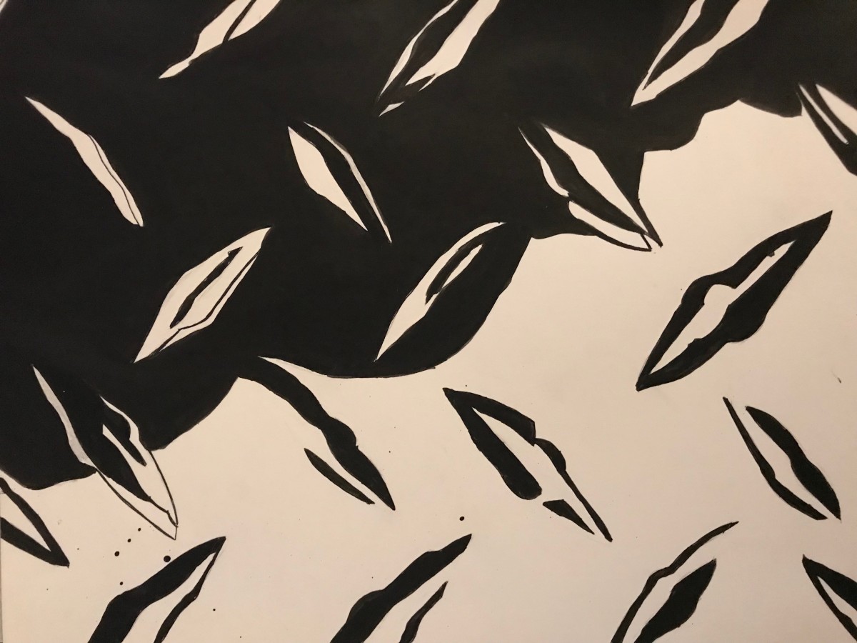
The image is a geometric shape. Its clearly circler with a few bumps on the edges. The relationship between the figure and background is the difference of monochrome. The contrast is really bright between them. The image is obvious because the circle takes up about 30% of the foreground.
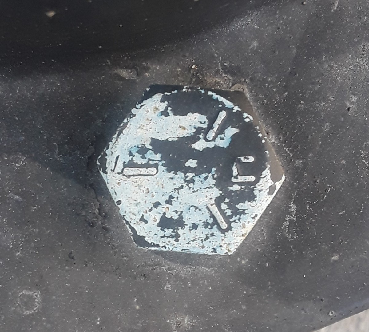
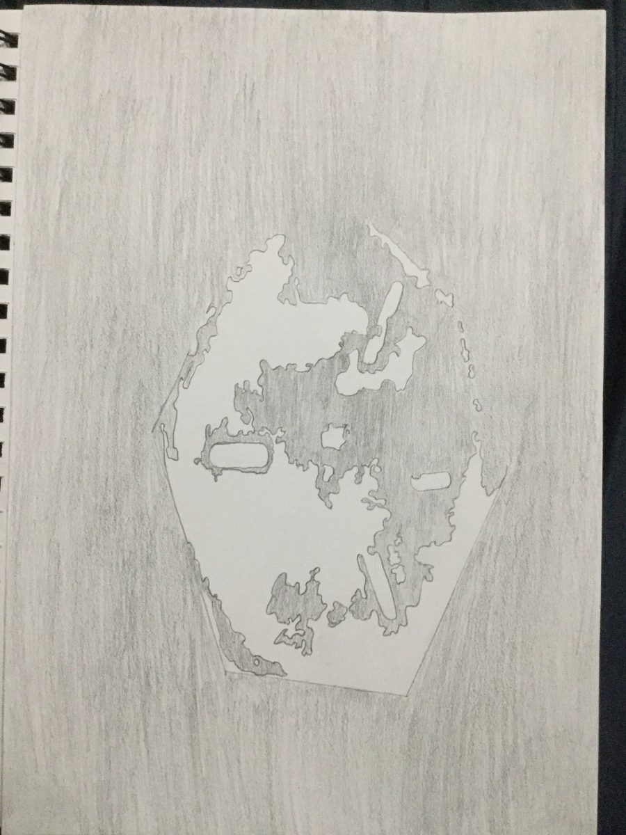
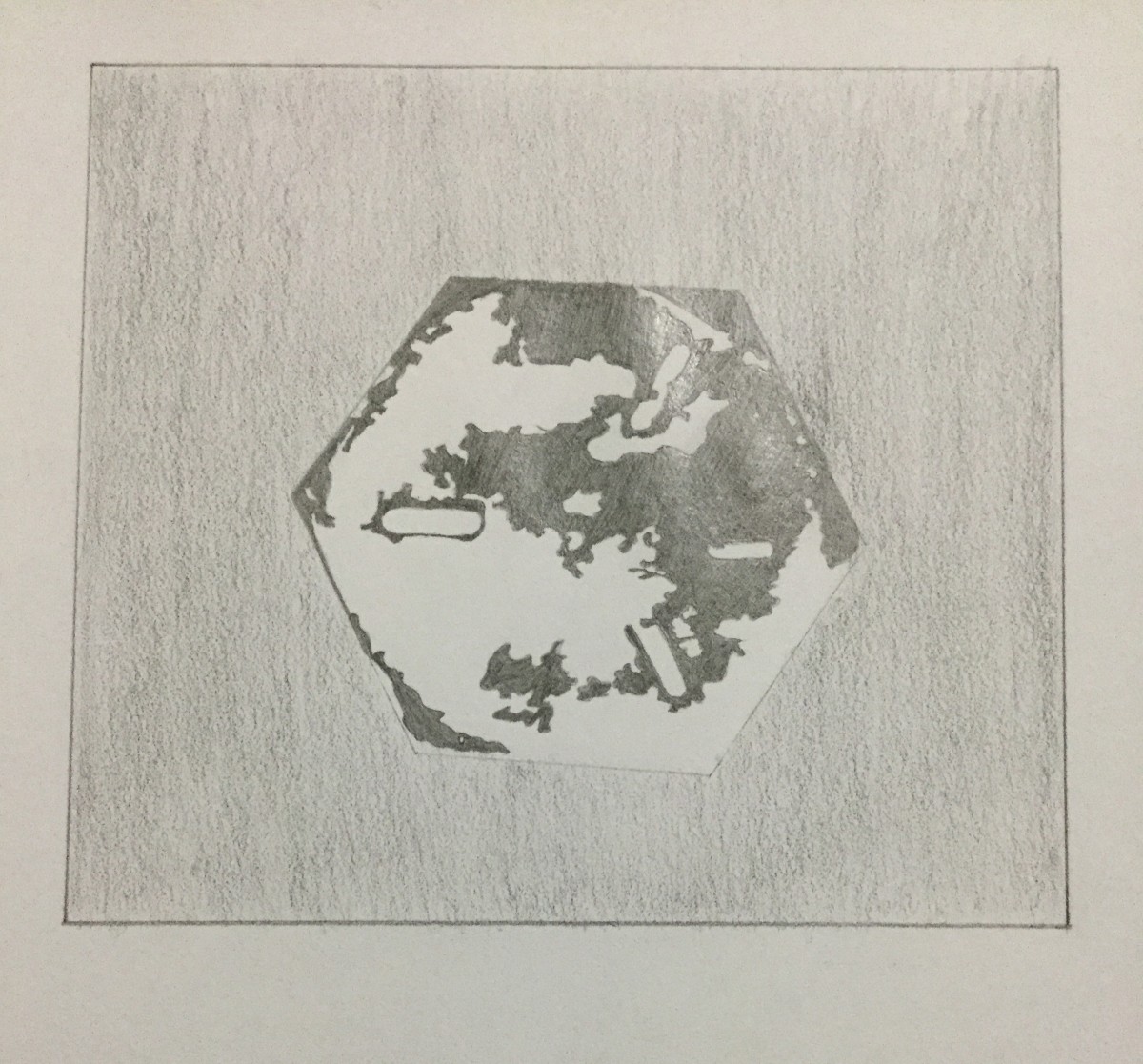
The shape is also geometric. The shape is hexagonal in overall shape. The relationship between the figure and background is a weird one. The use of contrast are on the shape but the black goes on to the background. This means on the dark side, the figure wouldn’t keep its hexagon shape. The is obvious because again this takes up about 30% of the whole image.
This one is geometric. The image has a background with similar monochromes to it. its mixed with two shapes with both being in the lighter shape of gray. This is obvious because the figure stands bigger and sticks out.
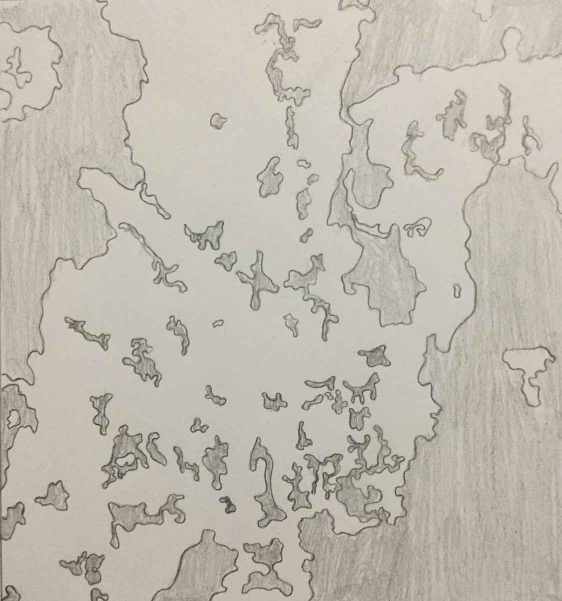
This image contains many shapes with different monochromes. Its round in some places but also look like the liquid of a lava lamp. This makes the edges of the shapes look organic. Since the figure consist of many shapes with two contrast, it would be hard to tell what sin front and what’s in the back.
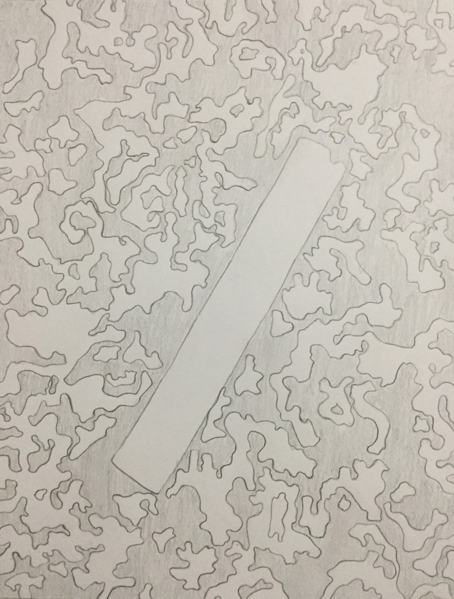
This is another rectangle shaped figure. Its geometric but more wavy and folded. The relationship between the figure and background is the almost perfect spacing of the positive and negative space. if this was adjusted then it would be perfect. This is ambiguous because base on the shape itself. It would be easier to tell the difference if the first half was cropped.
This is the most difficult to find. I had to go looking for this image. The shape seems organic since there is no clear geometric shape within this image. The relationship would letting be the negative space being small in some locations while the positive takes up a large about of space.
Story for all images (combine in one paragraph)
The busy streets of New York is not too kind to the things within it. The things we create or put there all have their story on how and or why they got there. Not every try is usable. A circle like figure was a leftover from a delicious meal and was toss aside on the cold hard pavement. The same can be said for another paper like figure. This one was left alone next to the trash when it’s owner failed to aim it in the bin. These two figure gets constantly stepped and rolled on until the magic moving bin swipes them away. Wings are not needed to fly where this thing is going. All it needs is the wind to carry it on its journey to freedom from the deadly valley below. As for the other figures, nature are not so kind to them. Constant rain and oxygen doesn’t make the metal. Not being able to move like the figure above can lead to being abuse by the creatures and the air around them. The lava shape figure could get to this state by other creatures with sharp claws and other organisms that might find this figure as a snack. The jagged shapes can be from the elements chipping away at it and the tape from content posters plated on it making at the damage worst.
These images above are the final draft of this project. Throughout this project I learned a numerous amount of things. One being that I have to be patient and trust that the work will get better , draft after draft. If I were to redo this project I would have gotten a better tracing paper that was more I guess visible. To add on to what I would have bought, is a thin brush because it was difficult going through the tight areas in my piece. Overall I learned the difference between ambiguous and obvious figure/ground relationships. My final piece compared to my refined there is a difference in the ambiguous, One being that the coloring to totally different and I gave it more definition and personality. When looking back to my first sketch you can see that I keep the image bland and boring. In my final piece you see the change.

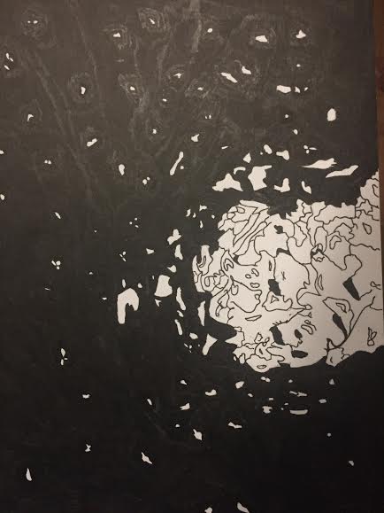
This is my final inked composition of my ambiguous photo of the hole in the wall. I can say that this was hard to do, but no matter what I pushed myself through it. I incorporated many elements of black and white and for the hole in the wall I wanted to add some definition to it to make it look exhibited. One thing I wish that could’ve came out better was the ink because for some areas it appears to look lighter outside the top and side areas of the image. 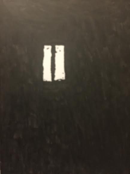
This is my final inked composition of my obvious image of the reflected window. As stated earlier in my other inked composition, I took out a lot of detail that was going to be in the inked out background of the wall. For the actual image of the window I kept in the dirt and mold being shown, but I made it to as where a lot wasn’t being displayed. The original image didn’t have a lot of specs, dirt, and mold so I decided to take it out and add my own details. This came out perfectly and I don’t think I should’ve added anything else as it was going to ruin it.
Note: This project gave me a lot of clarity on obvious and ambiguous images and gave me a better understanding of it. From now on when I look at any photograph I could look at it and determine what it is whether it’s ambiguous or obvious. One thing that was challenging was the lines being displayed because for most of my sketches I had to tune out most lines and configure it into either organic or geometric shapes.
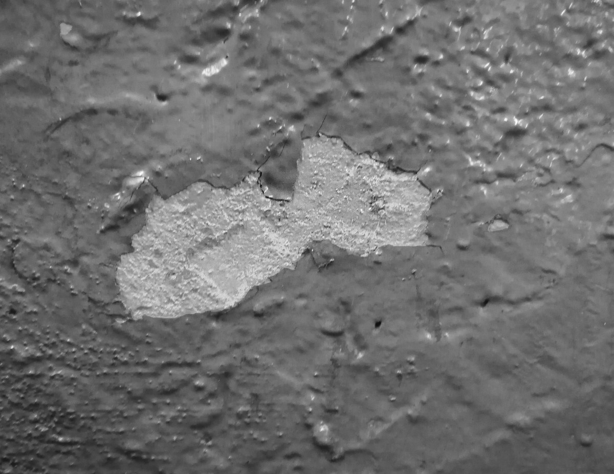
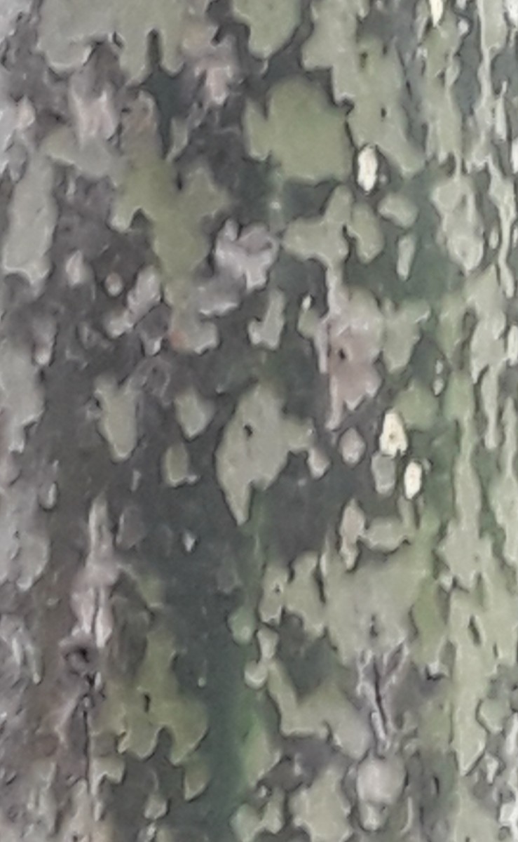
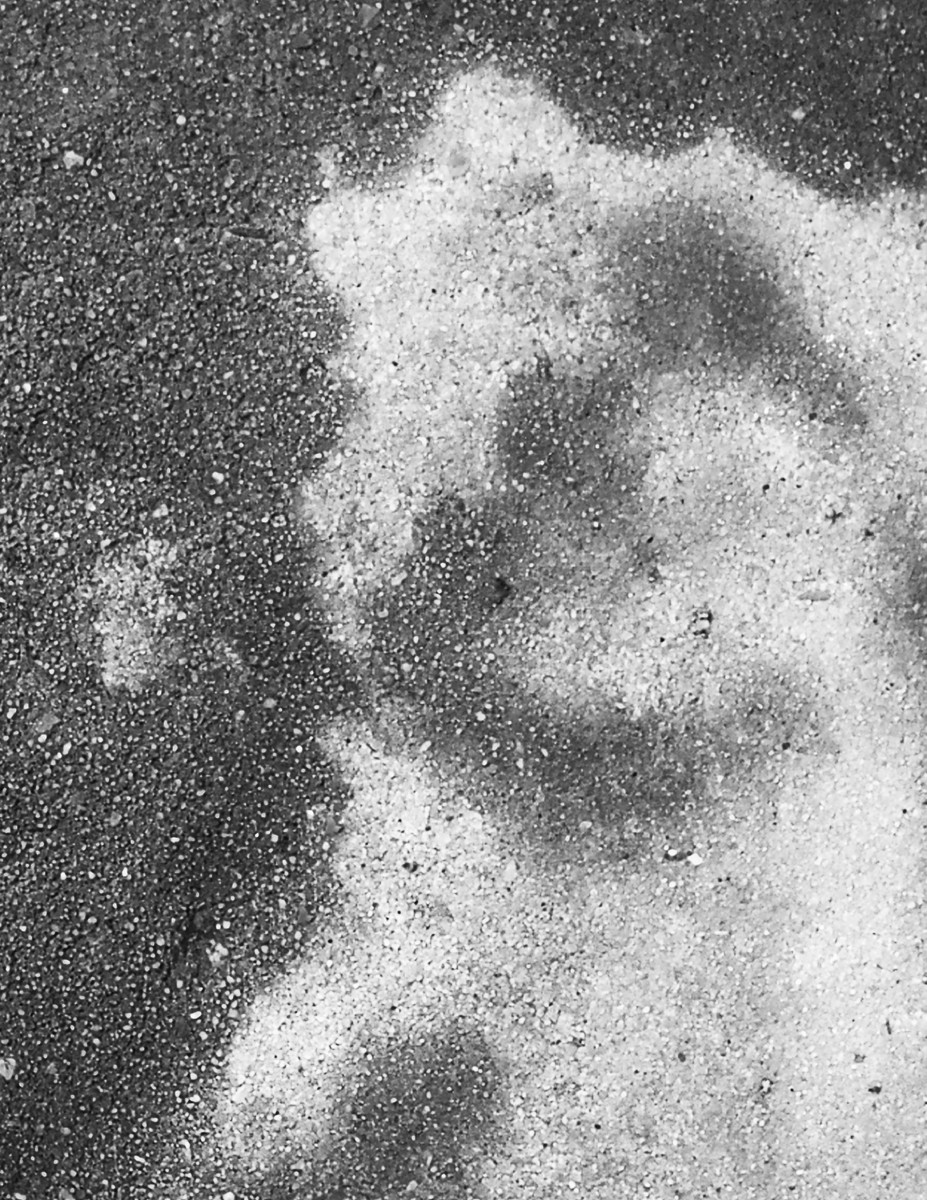
This is a picture I took on the wall of the subway station. I think it’s caused by the peeling off of the wall.
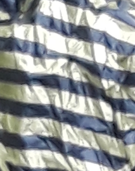
This is a picture I took on the wall of the subway station. I think this is caused by paint.
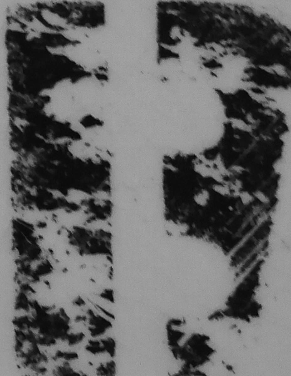
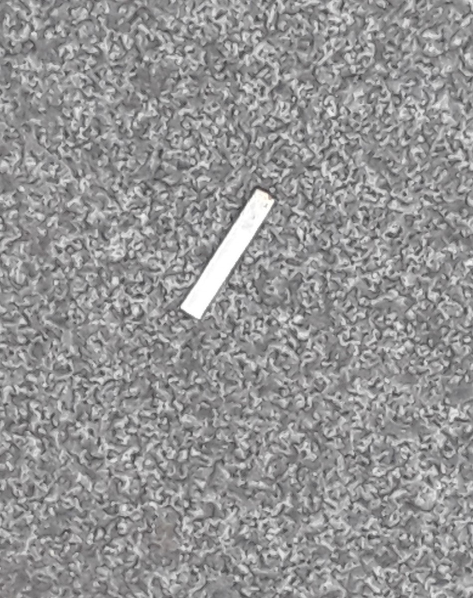
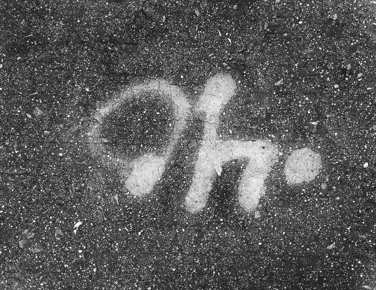
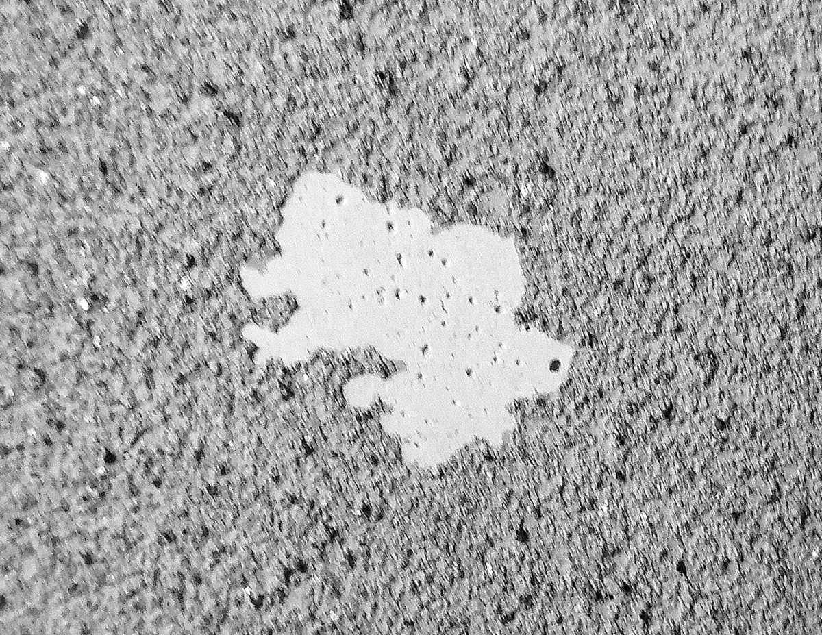
This is a picture I took on the wall of the subway station. I think this is the letter b
This is a photo I took when it was raining. Wet land and dry land constitute “Ambiguous”.

This is a picture I took on the wall of the subway station. I think it’s caused by the peeling off of the wall.
This is the refined and final sketch of my ambiguous photo of the hole in the wall. I’ve decided to change it up a bit and just really focus on the hole elements and see how I could put it on my bristol board on ink. The darker shades of black on the actual hole itself was represented in my image and I decided to incorporate it onto the refined version. The specs outside of the hole itself is peeling paint that surrounds it.
This is my refined and final sketch of my obvious image of the reflected window. Now as you can see I’ve also decided to scratch away most of the elements in my first sketch as it made it look a bit more ambiguous. I thought it was one of my best refined images due to me making it simple and not too complex. I focused more on what was being shown in the window reflection which was dirt (30%) and the background which was (70%) . I was going to add aspects of the dirt being in the wall in the back, but I wanted to make it look more unique in my own way.
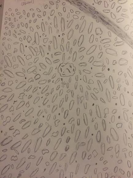
This was a rough sketch of my gum photo which was obvious. There was a lot of fine detail incorporated within my photo, but I’ve decided to simplify it and give it its own taste. The gum was 30% of my image while the rock and pebbles surrounding the gum on the ground is composed of the remaining 70%. I’ve ultimately decided to not put this in my final pieces due to the amount of fine detail I would have to incorporate in my final inked piece.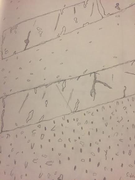
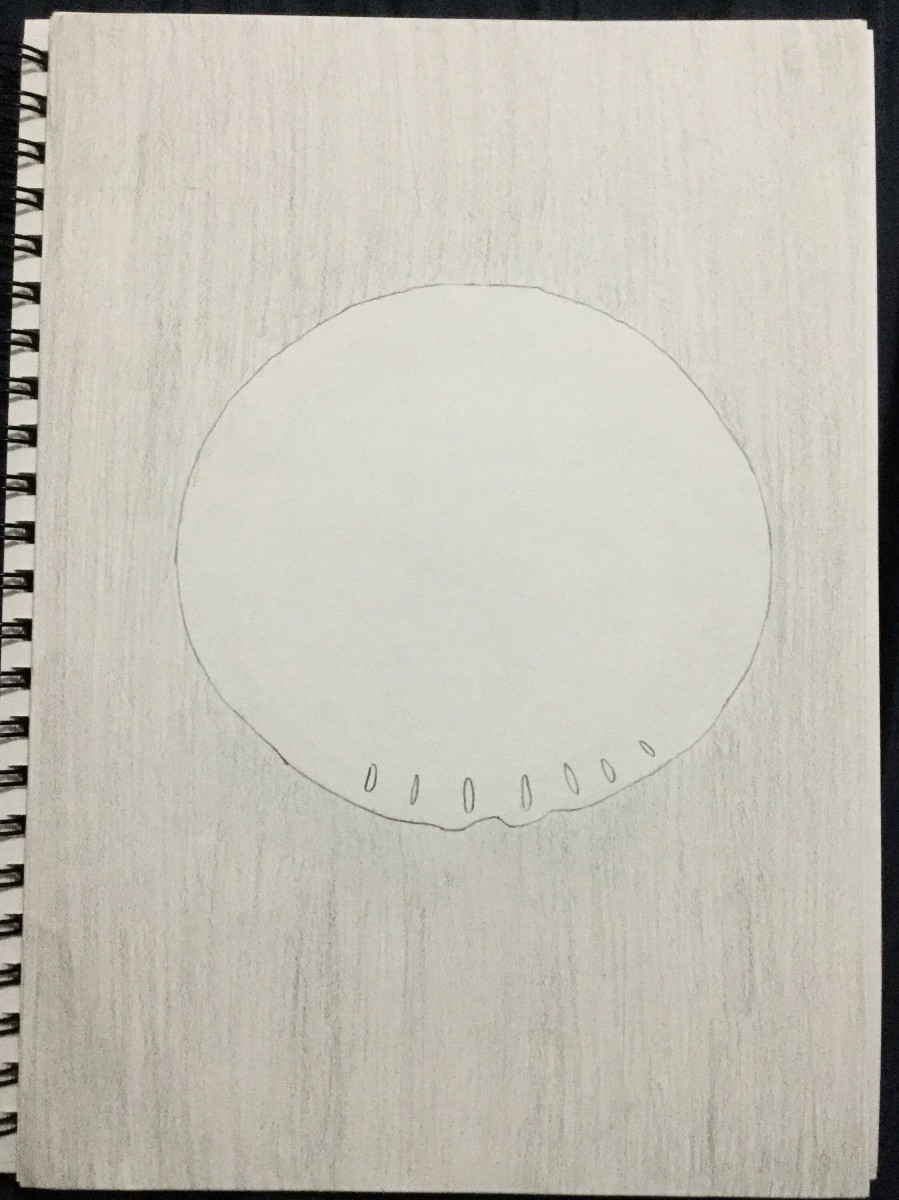
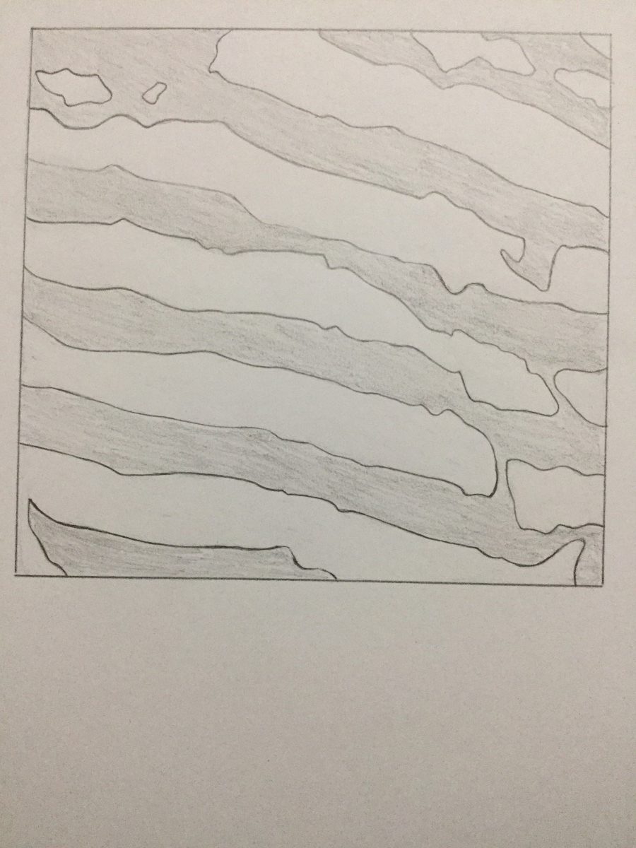
This was a rough image of an obvious image I took which is a sidewalk. This sketch turned out to be one of my favorite amongst the rest of my sketches, but I didn’t like the amount of shades incorporated within it. If this was going to be my first inked obvious image, then I would have needed to have added light and dark compositions into it.
Note: The photo of my sketch didn’t come out correctly as the ground in which holds the crosswalk is supposed to be larger. It was supposed to come out as 30×70. I kept trying to fix it, but to no avail. 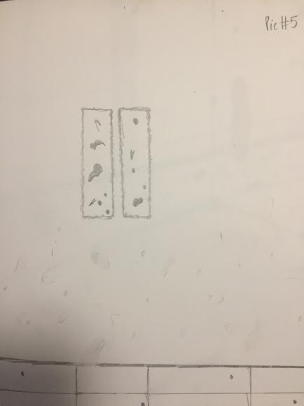
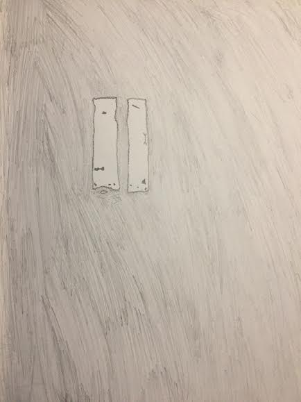
This was a sketch of my last obvious photo which is a window reflection. The window had mold and dirt stains tainted on it, but the reflection with the dirt had been darker when it was displayed. This sketch was later picked for my final composition and I tweaked a lot about it through many suggestions. \
\
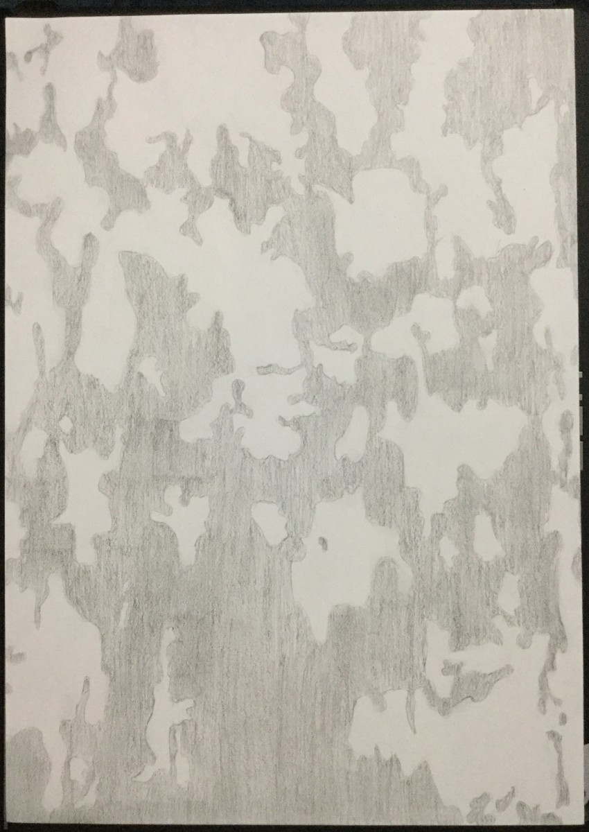
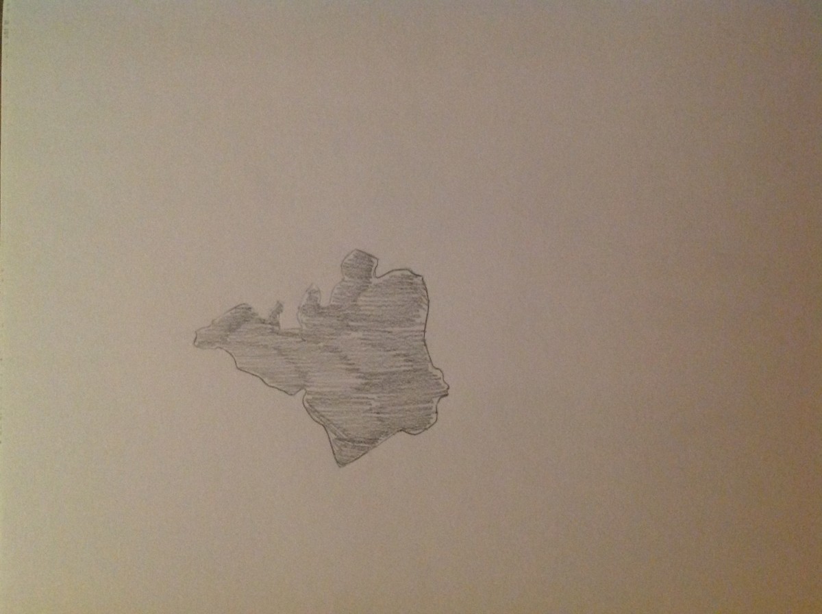
This was my first ambiguous sketch in which is supposed to be a hole with peeling paint around it. This was by far one of the hardest sketches I had to do, but decided to challenge myself by adding fine detail of the paint and the after effects of the hole. For this sketch and for this purpose only I decided to trace it along some tracing paper and incorporate onto my sketchbook. I loved the way it turned out and chose it for my final inked composition. 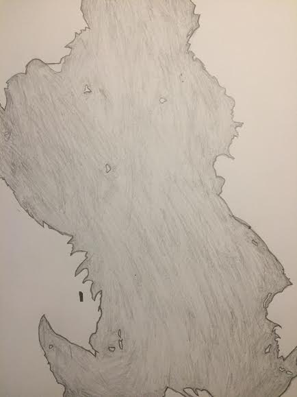
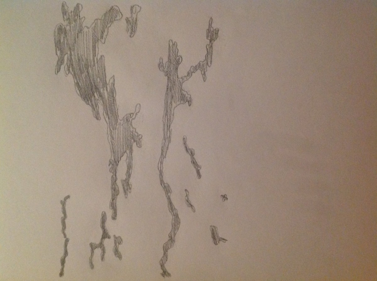
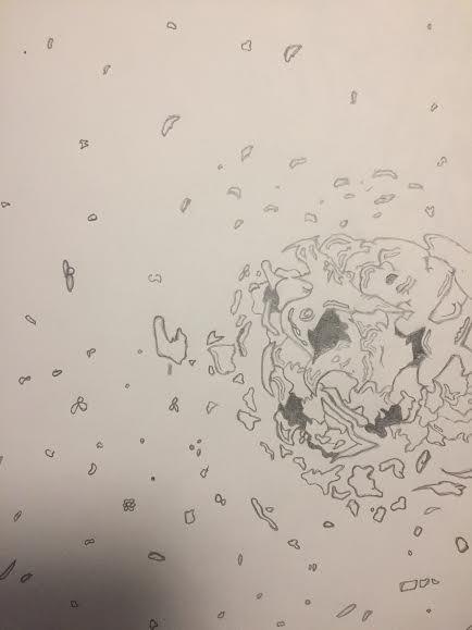
This was one of my second ambiguous sketches of a wall which has peeled paint on a white painted background. The elements incorporated within this image has minimal tearing of paint through the sketch and if you look at it closely, it kind of looks like a pig. The wide tearing of the paint is 50% and the white background in which supports it is 50%.

This is one of my ambiguous sketches of a tear through a wall in which has mold fighting for dominance. I decided to just sketch it out to give me some ideas on what it could possibly look like on bristol paper, but I decided to not put it as my final inked ambiguous composition.
The OpenLab is an open-source, digital platform designed to support teaching and learning at City Tech (New York City College of Technology), and to promote student and faculty engagement in the intellectual and social life of the college community.