
texture
https://drive.google.com/open?id=1CkilOuAzb14ZDA2FCeqKgCRtYRMrwCu-
https://drive.google.com/open?id=1FsVB5n1Nqlf3NaPUcYQ1P0j4rljtjo7I

https://drive.google.com/open?id=1rprBtyKVY8uVn4fAjbu5U7tYoeNntUbF
pattern
https://drive.google.com/open?id=1ZUjOtvc3_43J-g3kcVVU_1xPNQlJWvLI
https://drive.google.com/open?id=1j7fgwAeKXJKzwbrM_1oFmDn2Pdwb7x8l
https://drive.google.com/open?id=1OCYp_94nn-_oOOYNgHembpRvASoFHkZM
(the pictures can’t compress at 100K. Copy and paste link on google search to see image)
Texture lines
https://drive.google.com/open?id=1_dkQ5dssUYwZxpkvGKiasqHsOJSnjYT_
https://drive.google.com/open?id=1Jyxqih9dg2chxTdgZzrohh4naJHpAUHw
https://drive.google.com/open?id=1ZFmRup_tjRTNKo4j2TpC79GDqUSxlGSp

Pattern lines
https://drive.google.com/open?id=1wvIsJGLodQb31Q4dPTPmECQLnY_c0_GJ
https://drive.google.com/open?id=1h-7b93VDZTIv6wHxzYCnfzDeKcqBMn3Y

https://drive.google.com/open?id=1HaK9H873vTPLJ34it-XfRCEUPYGjd6Jn
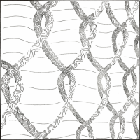
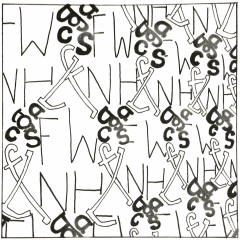
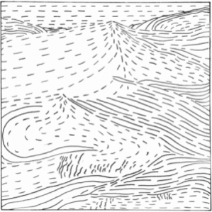
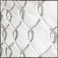
I chose the fence for the pattern and dessert for texture.
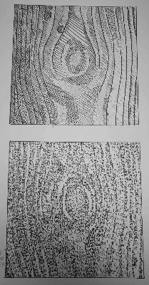
The texture of the desert picture looks smooth for most of it but in other parts of the image the sand looks like a rough texture. The ‘lines’ in the image are organic and has a constant flow like waves of an ocean. The movement moves are going mostly horizontal with little sharp angles. This picture stood out to be because of the balance between light and dark and high contrast between them. The dark is almost close to black while the lightest is above the mid tone.
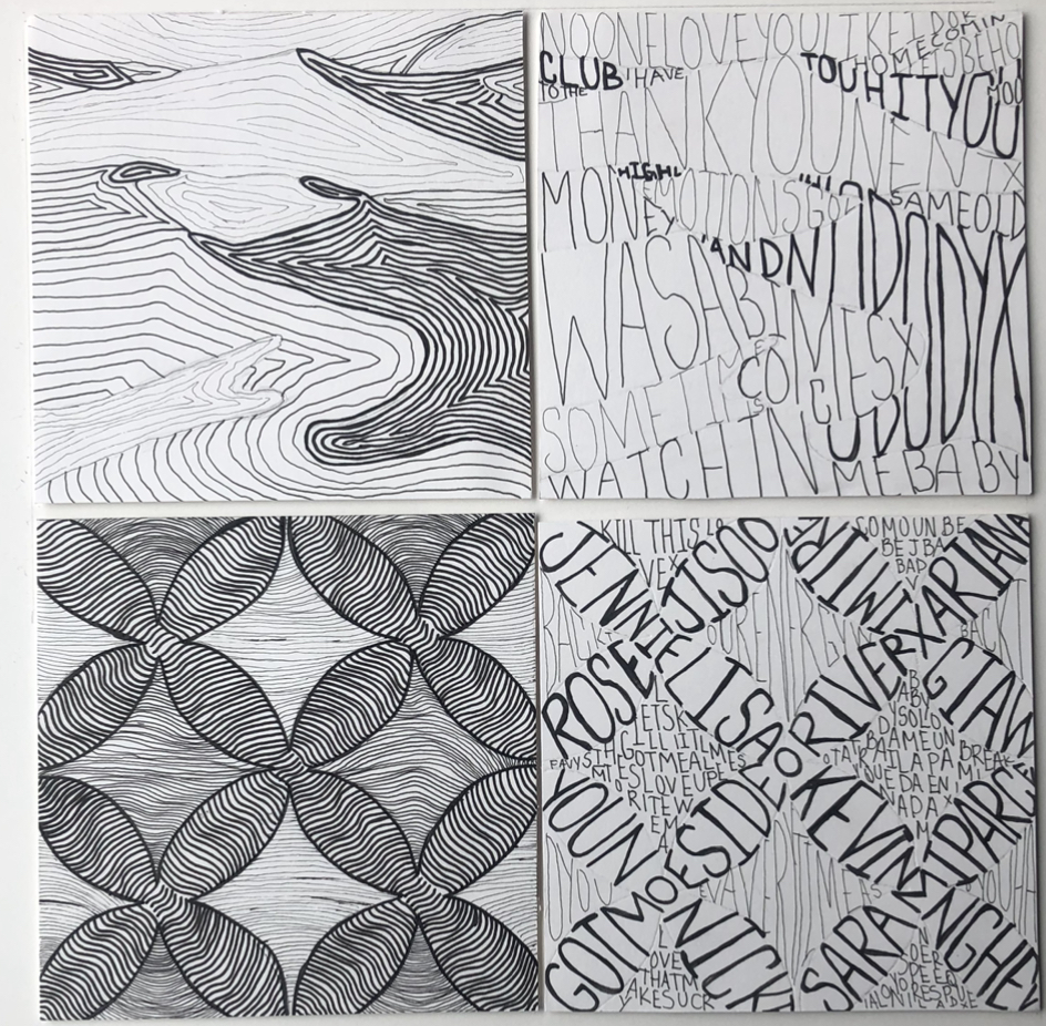
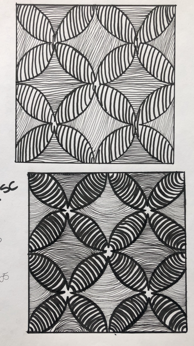
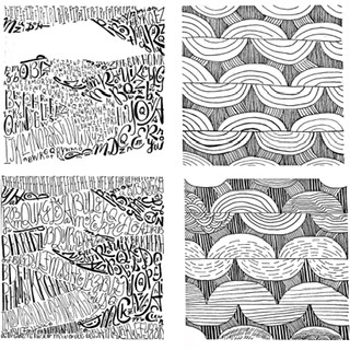
The fence is a pattern of twist and turns. The pattern repeats from left to right and top to bottom. The rhythm is consistent but the further it goes the smaller it gets dur to the prospective. The contrast between mid-tone and the darkest sports are not strange. Its hard to tell without taking closer look.
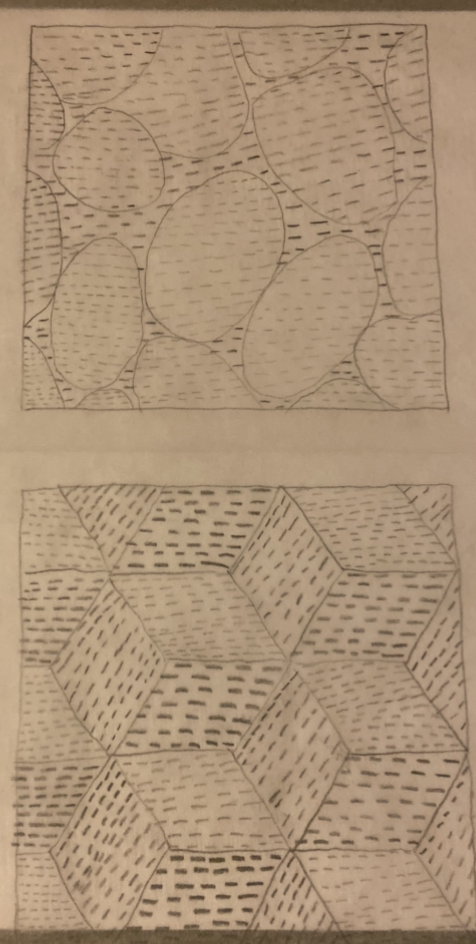
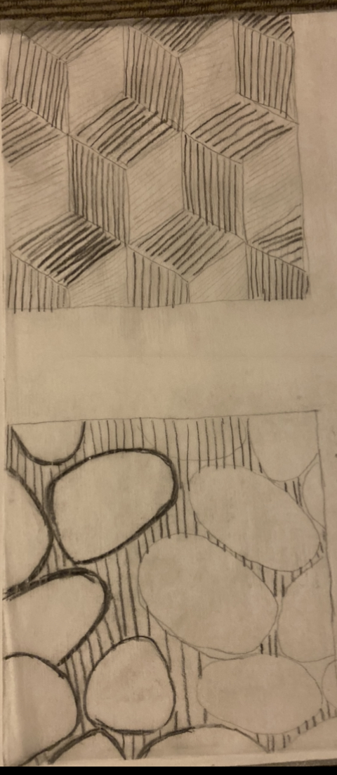
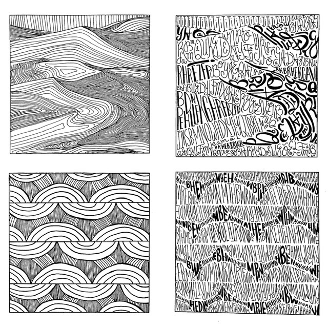
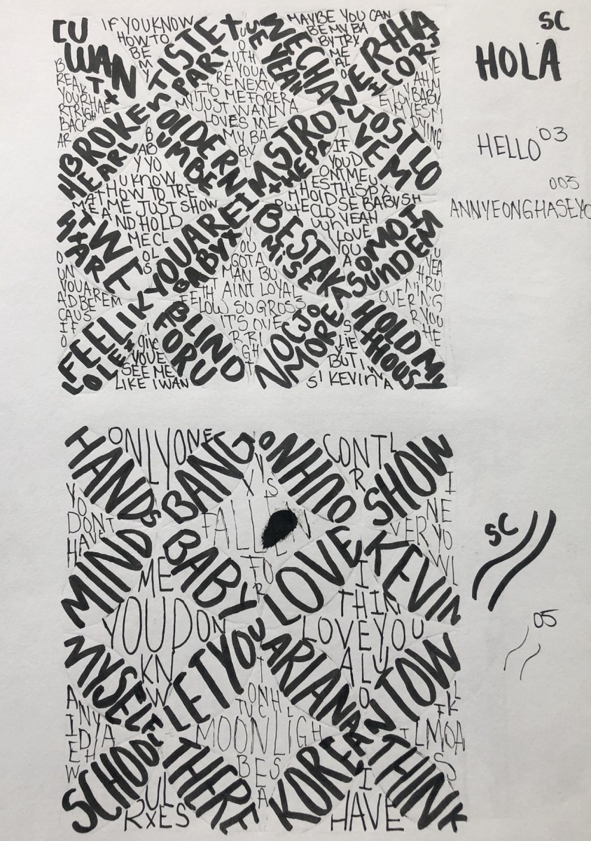
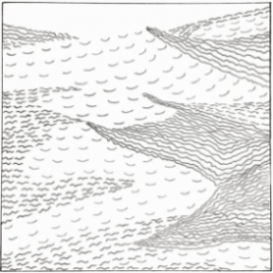
Texture – I’ve decided to stick with one sized pen for my line composition and arranged the lines closeness to each other as a way to show the different grays from the original image. I made some lines a bit bolder to add a little character to the final ink work. For the type composition on the other hand, I used bolder and larger sized type to for the darkest part of the image. I mixed script and sans serif for this composition.
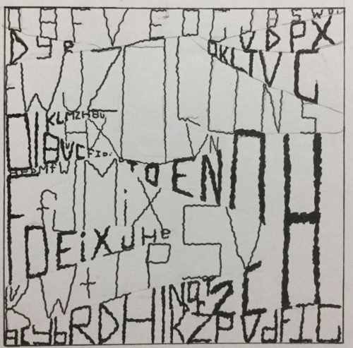
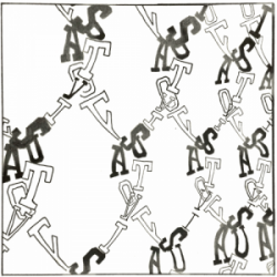
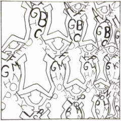
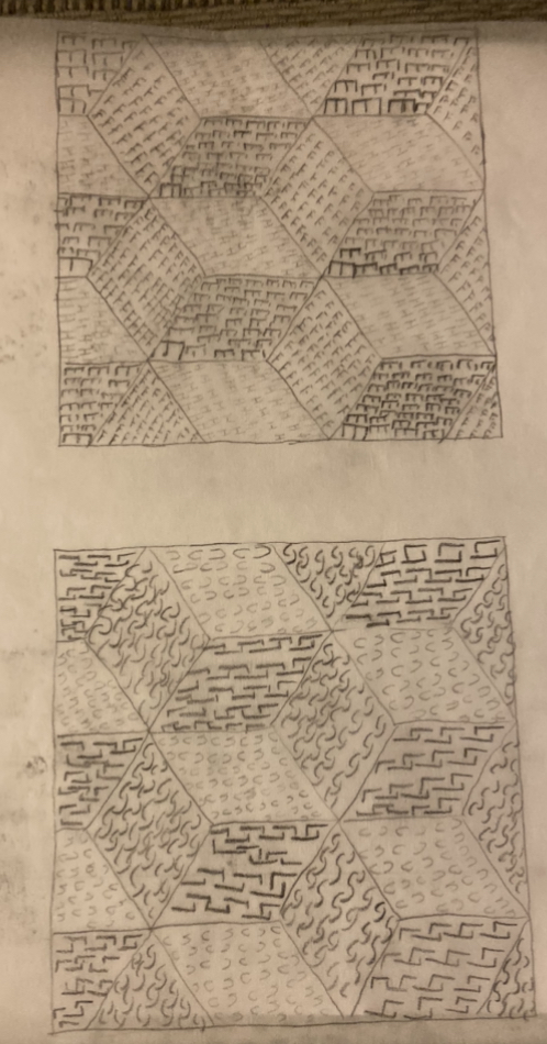
Pattern – I went along with my first experiment for my final line composition. I mixed bold and thin lines in order to get the different grays from the image. Meanwhile, for the type composition, I decided to just use sans serif and I used two different pen size, sized 5 and 1, to get the gradients from the original image.

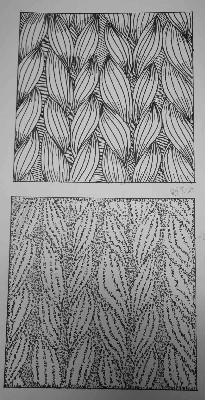
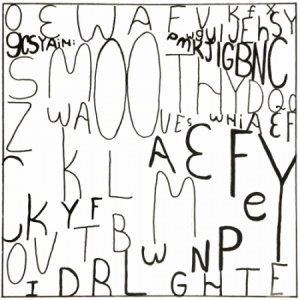
Image above are my experiments at developing my line composition for my textured image, which was the desert. I honestly got stuck at this part, hence the multiple trials for this part. I was trying out different thickness and types of lines to see which suits best for the zen and peaceful feeling that the original image had. I’ve decided to stick with curved long lines over the broken lines. The broken lines looked grainy and rough, not the feeling nor look that the original image is giving.
For my type composition for the texture image, I’ve decided that I would like to incorporate different types in order to achieve the different grays that the original image had. I was also experimenting with the thickness of the letters, just like the line composition.
The pattern in the other hand, again, I was trying out different types of lines and also playing with the direction of the lines.
The OpenLab is an open-source, digital platform designed to support teaching and learning at City Tech (New York City College of Technology), and to promote student and faculty engagement in the intellectual and social life of the college community.

