Monthly Archives: October 2019

Project 2 : Texture & Pattern | step 5 -deliver

This is my final composition, for starters one thing I knew that would occur through the duration of this project was trail and error. Some of this things that worked for me in this project was not having an outline in the image forming the shapes for it to be translated in line and type. If I were to go back to a day ago I would buy more ink pens because midway of doing my ink compositions my pens were running out of ink. I feel like that had a big impact on how my project turned out. Something I learned in this project is how much of a mood a image can give you. Also how that mood can be developed using different lines and type.

When I first saw the texture photograph that first thing that came up in my head was that it felt so zen. Throughout the process of sketching out my line composition I decided that I would stick to a rather regular line, but that had a sense of movement. When furthering to the type composition I found that while sketching I was losing the mood of calm it just looked to crowded so i decided to change it a little for my final.

As for the Pattern photograph the initial mood I personally got was confusion. It was one of those photographs that when you it one shape can pop up in your head. But as you look more you different shapes. My type composition was a little tricky at first because I wanted to use letters to form the shape and not have a actual outline of the shape. Soon after I decided to use the outline as a sort of guide and I think it helped me in the end.

Final Compositions

View post on imgur.com

This project was very difficult for me. The hardest part of the project was making the letters look identical to the original image but I tried my best. I enjoyed this project because it forced me to be creative and taught me how to experiment with different designs. I think I did pretty well on my line drawings which had a lot of organic shapes. For the next project, I will experiment on more sketches and try to keep on track with my work.


Develop in Ink

Texture Description – The texture photograph is a picture of a set of black and white rocks. The rocks are organized by having 7 black rocks on the left side and 10 white rocks on the right side. This makes a total of 17 rocks in the entire image. The black rocks look more rough than the white rocks
The white rocks have a rounded shape. Between the rocks have a dark black color. The flow of the image is smooth. The black rocks have more angles.

Pattern Description – The pattern photograph is a picture of a bunch of rope. The rope has a rough-looking texture. The rope is going down vertically. It has some strands of string coming out of it.
The rope has a bumpy shape. There is two rope next to each other making the imagery of a pattern. There are lines going through the rope diagonally. The rope has rough lines.

View post on imgur.com

View post on imgur.com


Final Compositions

I thought this project was quite interesting towards the middle of it. During the beginning of this project I was lost and confused because this was something that I’ve never done before and it required me to push myself and be more creative. To be honest I started becoming quite frustrated towards the sketching part due to me being to detailed in which required a lot of time to get these done. I also had so many ideas into what I wanted to put into my final pieces and it wasted some time for me. What I could’ve done better was to stop wasting so much time for my sketches because after all they’re just sketches. In the end I’ve figured it all out and I thought it my pieces were great since I took back feedback and put them into my work which worked out in the long run. My creative process for this was long, but it was worth it and I’m proud of my work.

Final Texture & Pattern


During this project I learned to be more experimental. At first I only stuck to one way/line usage , but towards the end I just tried what I thought would look good and it came out good. If I had a change to redo this it would be to plan this out further ahead and I would also try to be more experimental because the possibilities were endless. I will definitely plan ahead for my new project. The most successful thing for me was replicating the movement in the original image to my own drawing.

Developed In Ink Creations

Final Composition


Sketches

The photos I choose were the rubber bands/pasta(texture) and the wired fence(pattern).For the texture it gave me  a state of flow ,and restlessness.The movement was also going vertical and the light source created varying grey tones. The pattern image was similar to the texture but more symmetrical with motion.To me it had an energetic/straightforward mood/feeling. It was not that to go from sketches to final draft because I understood the project and the steps that needed to be followed. I also kept in mind the mood and characteristics that the images had .

Inked Compositions

For my inked sketches I’ve decided to really change things up and decided to incorporate major detail into what I was doing. For the handmade twists on the top right I’ve decided to follow the shape of each twist and incorporate it into lowercase type.  I didn’t just throw words into it to make it random, but this time I wanted to make it unique. For my line (sand dunes) bottom left, I wanted to add gradient in it to achieve the rich and smooth texture of the sand. On the top left for my type for the sand dunes I wanted the darker side of the dunes which represented the shade to look bigger so that when seen from far away people can see it. Lastly for the bottom right for the lines  for my pattern image I kept that same feeling of my first line sketch so that it achieves a rough, itchy, but yet homemade feel. I kept the contortions too add a bit of that hand made feel. Subject to change for final.

Final Pencil Sketches

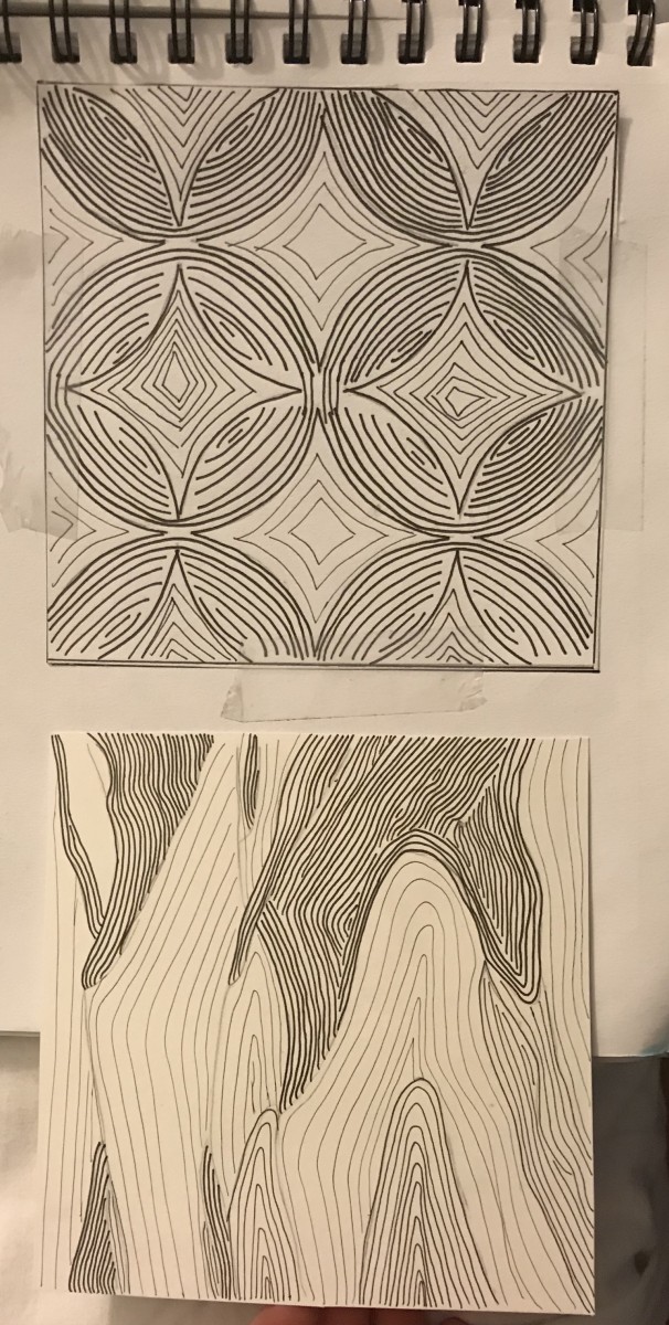
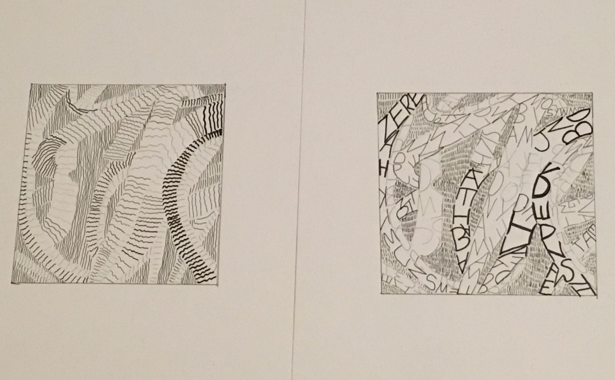
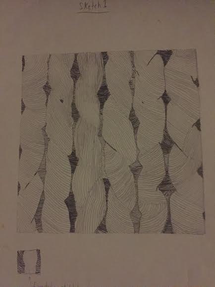
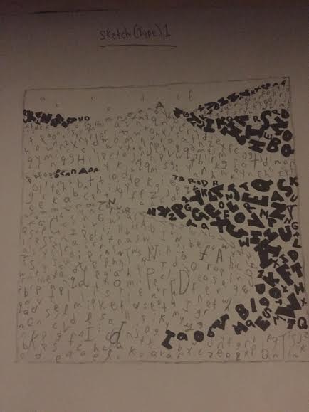
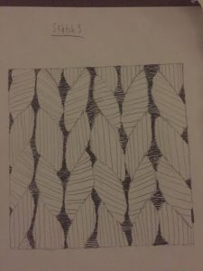
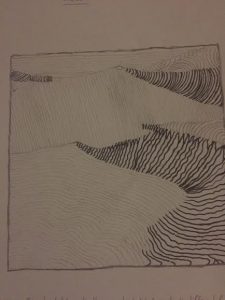
For my first line sketch for my pattern image I wanted to implement contortions and twists that made the feel homemade and the mood smooth. The image I’ve chose was hand crafted and not made by machine, so that meant some things were going to be loose and weird. If it was made to near perfection, then my image would’ve been perfect symmetrical wise.

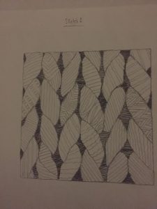
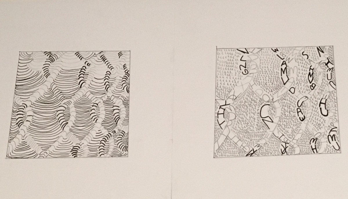
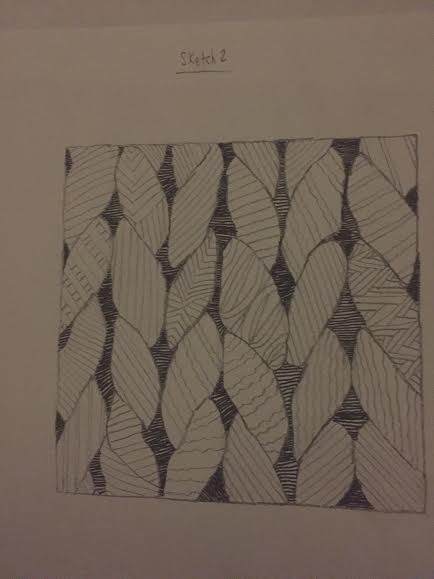
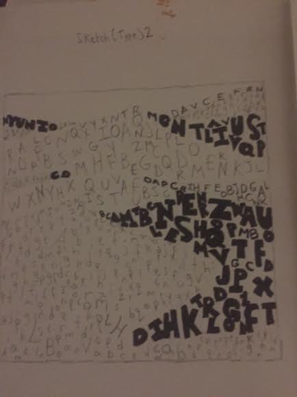
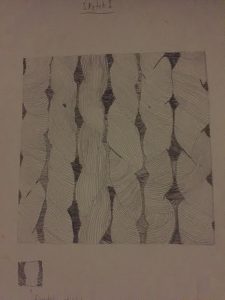
For my second line sketch of my pattern image I’ve felt that I lost the feel of the image I’ve chose. for my first line sketch I’ve added twists and contortions and that’s what I was aiming for, but I lost it for this one. I’v achieved the mood I saw which was a itchy, but calm mood, but I mad the feel of it too perfect. That wasn’t what I wanted. I’ve also implemented patterns of my own to give it a different feel, but again I didn’t think it achieved what the image portrayed. This is only a sketch and not final.

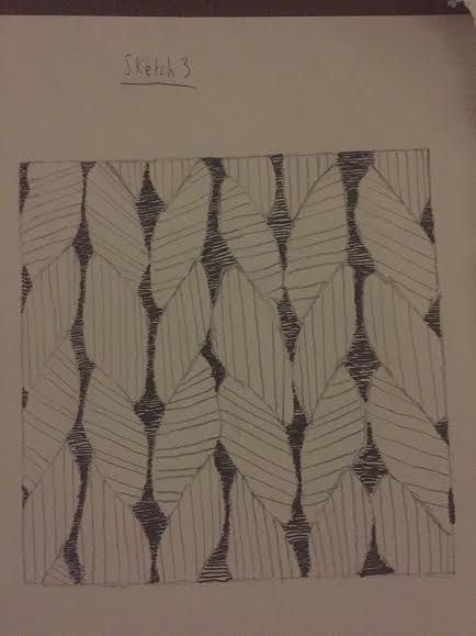
Again for this image I made the lines too perfect and added minor difference form my second sketch. I also didn’t like this image and though it was time to go forth a different path for my ink compositions. Once again this is a sketch and not final.

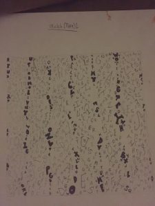
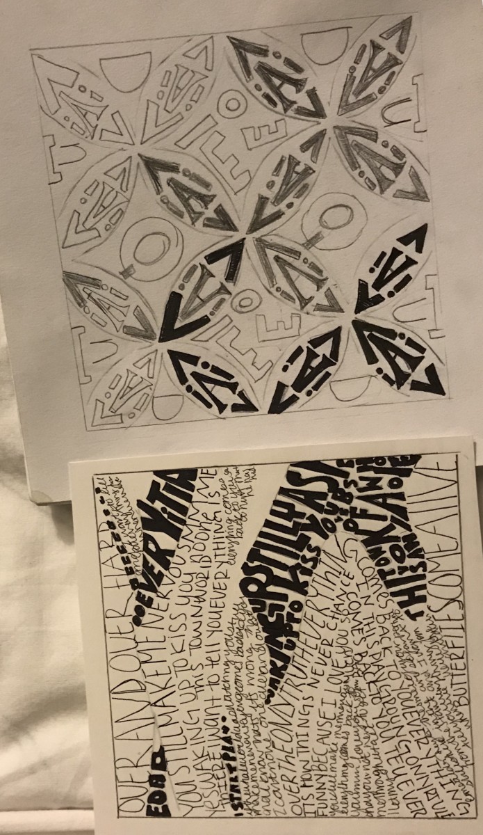
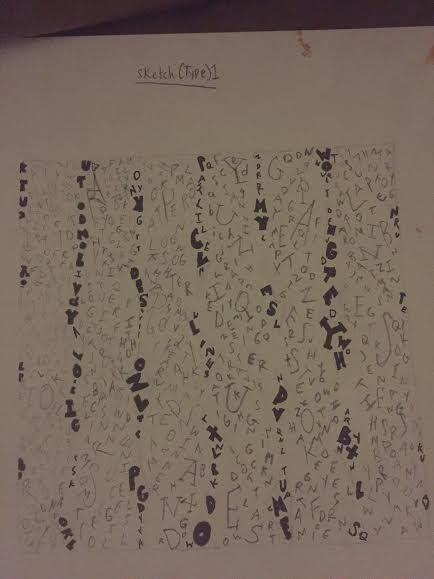
This is my first sketch of my type for my pattern image. I wanted to instead of adding the letters into the shapes of the image, I wanted them to vertically go down. The bold letters shows the dark spots within the image. This is a sketch and is not final.

.

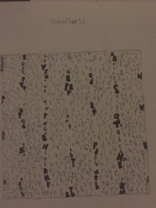
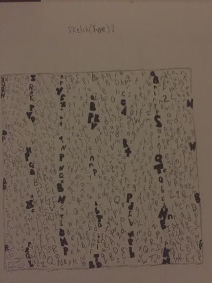
For my second sketch for type on my pattern image I’ve decided to enlarge it so the type can be more visibly seen. I’m not quite satisfied with my sketches, but as I get to some of my ink and final presentation drawings it turned out great for me. This is a sketch and is not final.

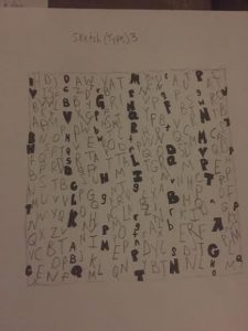
For my third sketch I wanted to enlarge my the type and when I took a look at it I thought this looked ugly. It’s as if I completely lost the feel of both the image and what I wanted. Although this is a sketch and not final I wanted to show people my process from beginning to end. For my refined ink compositions they get better.

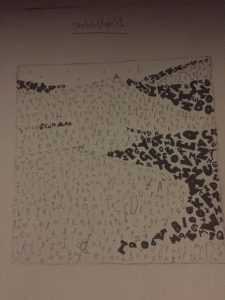
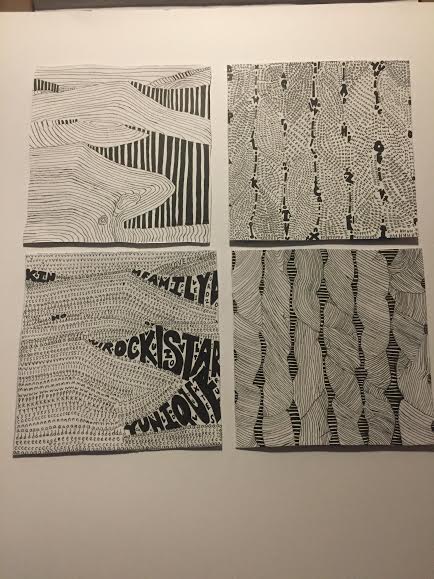
For my first sketch for my type I wanted to add the letters in a somewhat horizontal motion so that it gives it the feel of smooth terrain which is also what I’ve described for my mood. I was quite satisfied with my first type sketch for my texture image and it gave me a sense of what I wanted to do. Not final.

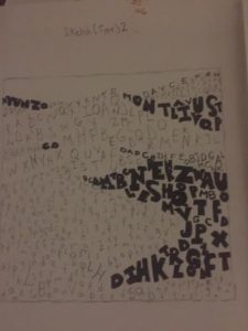
For my second sketch for type for my texture image I wanted to make the letters look bigger. I wanted to show the clear contrast between regular sans serif type to ultra bold sans serif type. I liked this sketch I did, but I wanted to make it more clear and aesthetically pleasing. I was thinking about incorporating this sketch into my final ink one, but i had other ideas in mind.

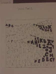
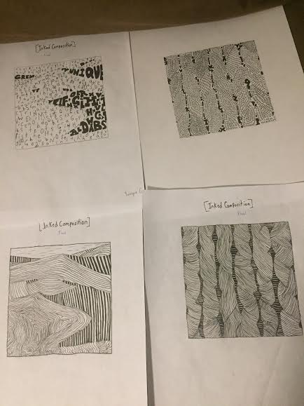
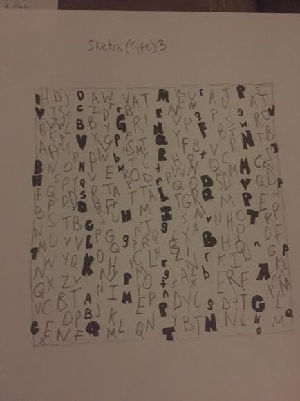
For my third sketch I’ve also made the text appear bigger and for some reason I didn’t think I’ve achieved the mood I wanted. I wasn’t satisfied with the product and brainstormed other ideas to make it look more simple. This is a sketch and final.

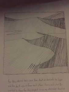
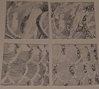
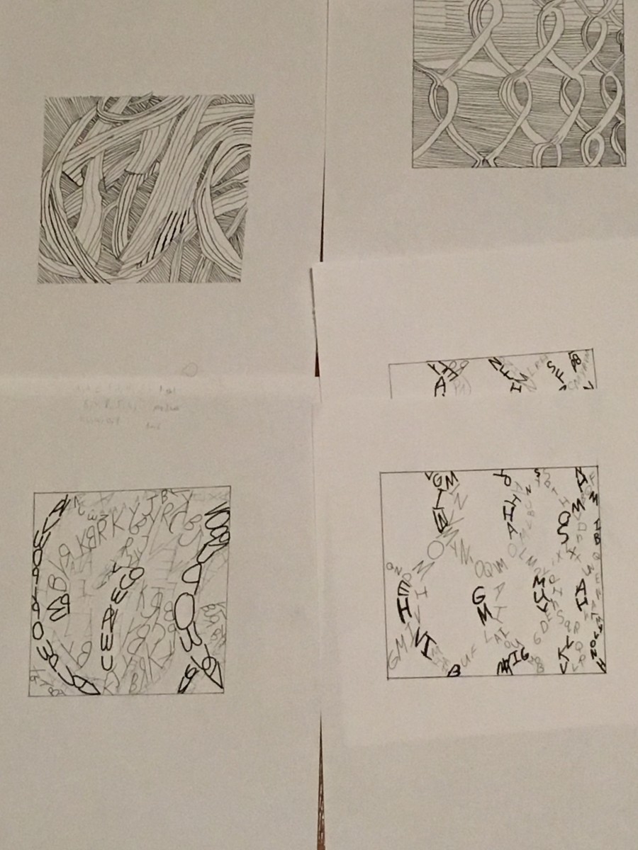
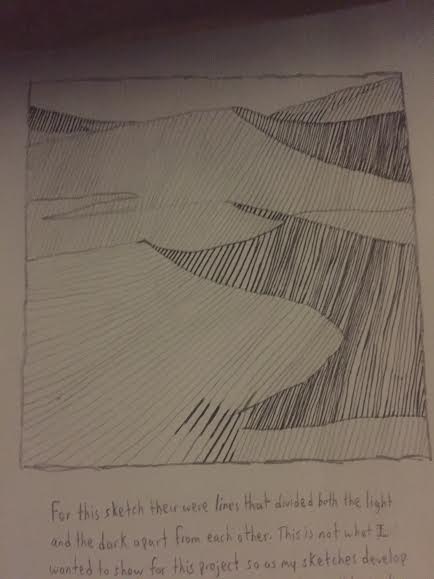
For my line sketch for my pattern image I’ve added smooth lines that shows a clear contrast between light and dark elements. One thing I thought I did wrong was by adding lines that separated from light and dark. This isn’t what I wanted and for the next sketch I’ve decided to go for a different approach.

For my second line sketch for my texture image I’ve decided to eliminate all divisible lines. For the bottom right side for the dark elements I think that some areas didn’t work because I’ve added squiggly lines and I thought that it quite didn’t match the mood i was aiming for. Not final.

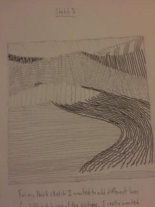
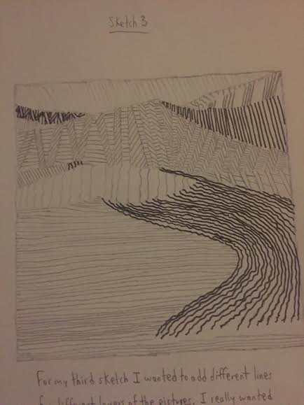
For my third type sketch for my texture image I did the same thing for my second sketch, but decided that I wanted to make the lines smaller. I also made various pattens for different areas of the sand dunes, but once I looked at from far way I didn’t like it. Not final.

Final Compositions

The Photo is facing the wrong way, it is supposed to be vertical not horizontal. I really struggled finding a good balance between light and dark, I was either too light or too dark. Once I finally found my middle ground I didn’t have to edit much. For the type pasta composition I made the dark areas darker and I also added more dark lines in the pasta one. For my pattern pieces it was a little less of a struggle, I believe this because the pattern image had a lot less going on and the shades were clearer. I think my type composition for the pattern turned out nicely and it was the most fun to do especially creating the medium tones.