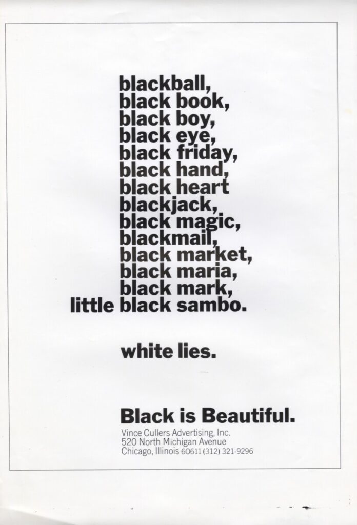
- STRATEGY: 5
- LAYOUT/DESIGN: 2
- COPY: 4
- MESSAGE: 4
- CREATIVITY: 5
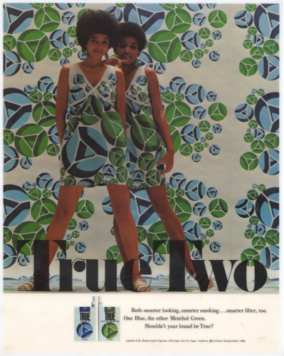
- STRATEGY: 1, I don’t really understand the concept behind the ad.
- LAYOUT/DESIGN: 4, Good color selection, compliment each other very well.
- COPY: 2, I cannot discern the voice of this ad.
- MESSAGE: 2, There is no clear message.
- CREATIVITY: 1, The ad just fails to communicate its concept.
- STRATEGY: 3
- LAYOUT/DESIGN: 2
- COPY: 4
- MESSAGE: 5
- CREATIVITY: 5
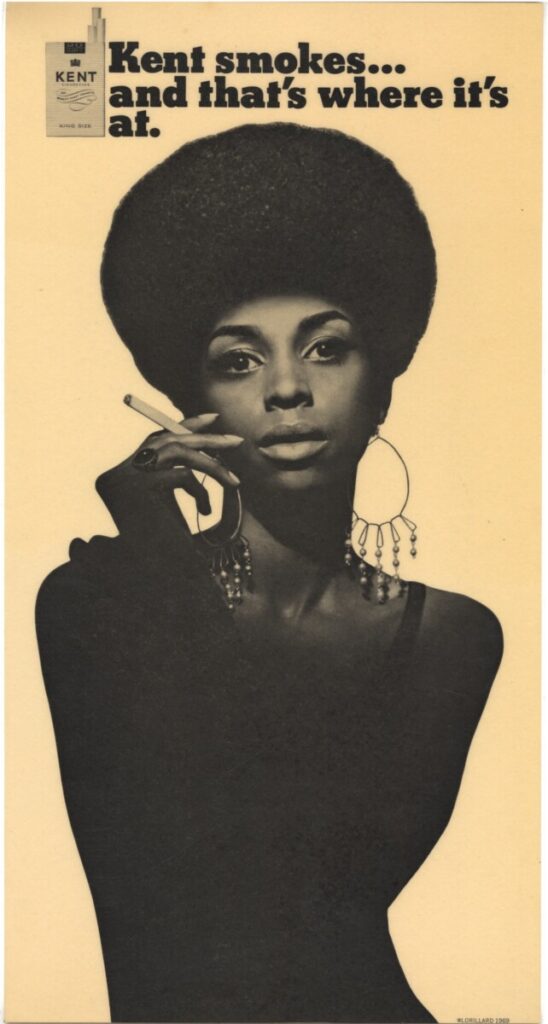
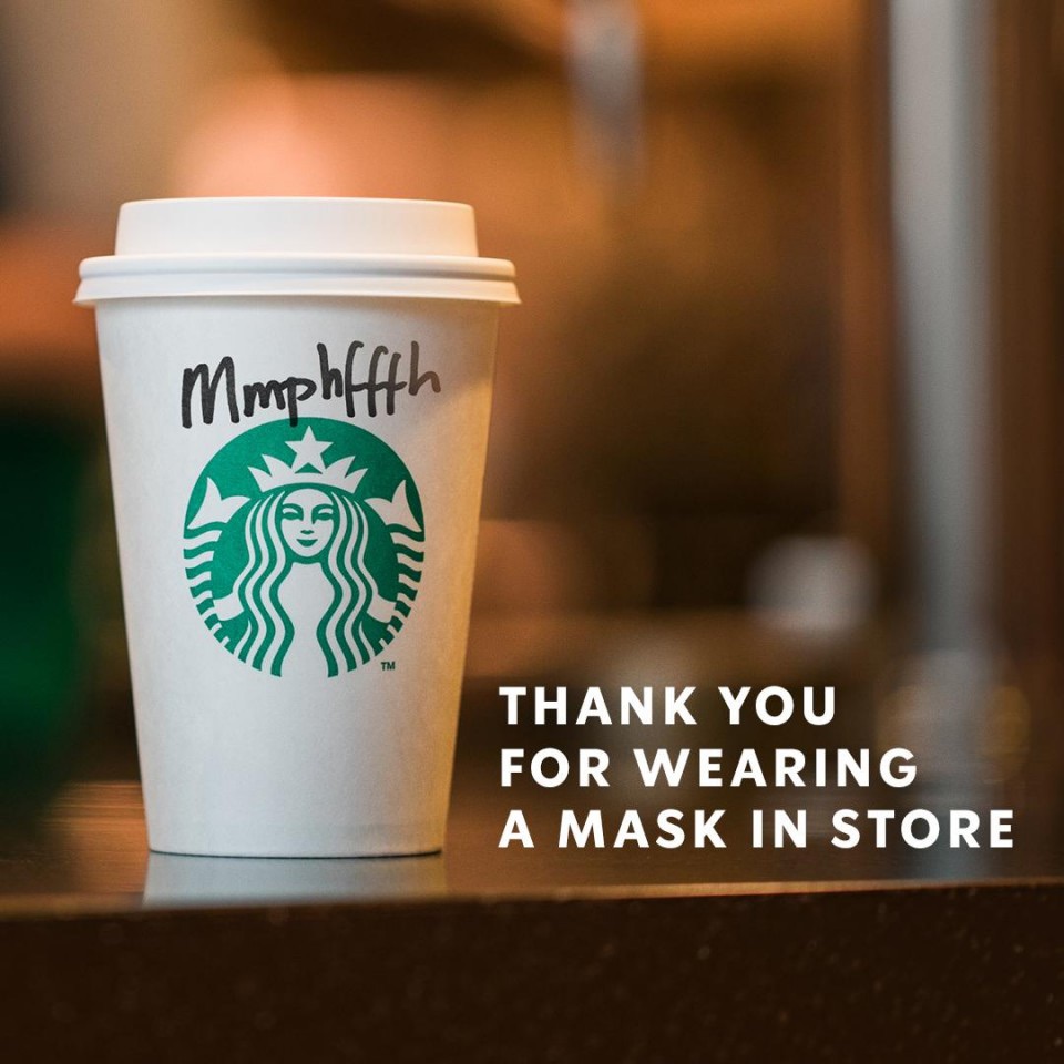
- STRATEGY: 5, I understand the motive of this ad.
- LAYOUT/DESIGN: 1, The ad is well designed, good structure and contrast.
- COPY: 1, The ad communicates the message with a confident voice.
- MESSAGE: 1, I clearly understand the message communicated by the ad.
- CREATIVITY: 3, Not the most creative but the minimalistic, black and white works well.
- STRATEGY: 1
- LAYOUT/DESIGN: 3
- COPY: 1
- MESSAGE: 1
- CREATIVITY: 4
- STRATEGY: 5
- LAYOUT/DESIGN: 4
- COPY: 4
- MESSAGE: 4
- CREATIVITY: 3


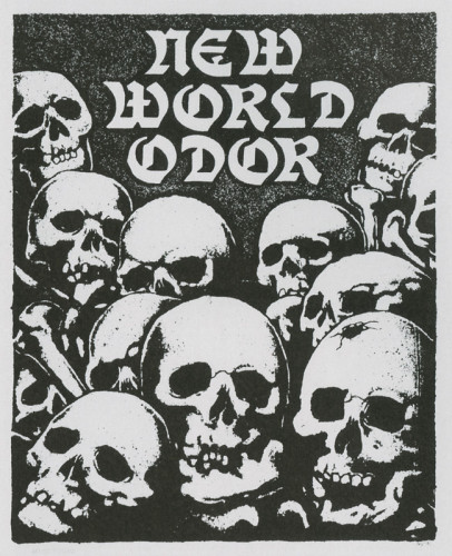
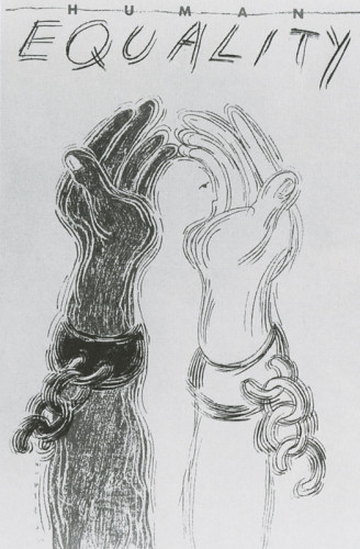
Strategy 5: There is no clear motive for this app.
Layout/Design 3: The black and white grunge aesthetic is well executed.
Copy 3: The text does characterize the voice of the client.
Message 5: I don’t understand the message in itself but i do not understand to whom it is addressed to.
Creativity 5: AD failed to clearly communicate its message.
Thanks for posting Yvan. We did not yet discuss in class. Would be great to have you walk us through and get your thoughts.