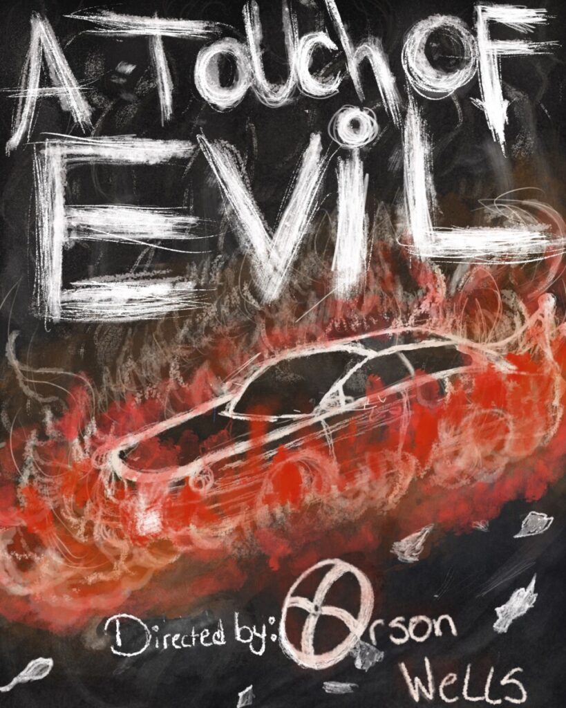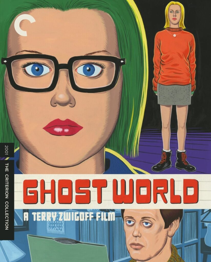
COMD3313, Illustration 1

Professor Diana Schoenbrun | COMD 3313 | SP22

Final Project:

MOVIE POSTER DESIGN

  1. Illustrate and design a movie poster for a classic film.
    First, choose a classic film.
    Look at films listed on the Criterion Collection website, Rotten Tomatoes, or IMDb for lists of classic films.
  2. Top Criterion Film Poster Designs for some ideas as well.
  3. Remember your poster can be viewed on a theater wall or it could be used online on a website such as Netfilx, Apple Movies, Netflix, etc. You may want create a second or revised version for online.
  4. Watch the film or films. You can choose a movie you have already seen of course.
  5. You can do 2 poster designs for extra credit.
  6. Final art will be full color in any medium you choose.
  7. Include the title of the film and director’s name.
  8. Final poster can have lettering (illustrated type) or typography in the title name, or director’s name.
  9. Save one final file version as CMYK and a second as RGB to compare the colors.

    Final should include
    1. RGB version with title of the film and director’s name.


    PART 1
    PITCH due April 29th
    Include the following in your pitch:
    1. What is the movie name? Post a previous movie poster design or designs for the film. What do you think is successful or not fun the design?
    2. Write a brief summary of the film, telling what it’s about. 1 paragraph
    3. Make sure to mention any important characters and setting.
    4. Who is the audience for the film?
    5. Jot down a few key words or ideas you want to focus on in your illustrated poster design. These could be descriptive words, words related to the film’s tone. Think word web.
    6. You can start thumbnailing. I suggest doing 10-20 thumbnail sketches.
    7. Final size should be: 16″ x 20″
    8. Post to Openlab>Activities> Final Project

PART 2

  1. Develop Concept Sketches
  2. Work on a color study to decide your color palette
  3. Work on typography and lettering for the film title and director’s name. I suggest using Illustrator or Indesign. You can also use photoshop.
  4. Create your final poster in traditional media or digital
  5. Post to Openlab>Activities>Final Project>Film poster
  6. Write a short paragraph about your process and color choice.
    How do you think your style works with the tone of the film?

7. Extra Credit. Print your poster out. Remsen Graphics is near City Tech. The full posters for 16 x 20 are quite pricey at $40. However, you can print your poster at 75% percent scale 12″x15″ for only $4. It’s always good to compare your print image vs digital. Remember to send a CMYK file. Call ahead to ask the turnaround time.

We’ll present final projects next week!

Week 14

Class Info

  • Date: 5/13/22

To-Do Before Class

  • FINAL PROJECT
    Develop concept sketches

Activities

Class time to work on the final film poster

  • Make revisions on concept sketches based on feedback from me.
  • Create a color study to figure out your color palette
  • Work on typography and lettering for the Film title and Director’s name.

Final Class Next Week

1. Final Project: Film Poster, present work and write up for Openlab

2. Hi res files to hand in by Monday, May 23 9am
*send a link via wetransfer
See pdf below.

Sketchbook Week 11

Now that the weather is warmer it’s time to go outside and get some spring inspiration.

Fill two pages in your sketchbook with landscape outdoor drawings. Go to a park, someone’s backyard, a skate park, garden, etc. You can try drawing one page showing a wide shot from faraway and then a second sketch zoomed in on one area.

Or fill two pages with full landscapes. The theme is outdoors and spring. So make sure you focus on that. Feel free to include people and animals. Try adding color.

Sketchbook drawings by Ligang Luo

Sketchbook drawings by Ligang Luo

Week 11

Class Info

  • Date: 4/8/22

To-Do Before Class

Assignment 2, Editorial Illustration Assignment 2, part 3

Sketchbook/Reading Exercise Week 10 : Listening and Drawing

CLASS

Warm Up Exercise

Pick a postcard. Inspiration drawing

Activities

Discussion

  • Critique: Assignment 2, Editorial illustration
  • Sketchbook review

DEMO
Watercolor Demo with Line

Due Next Week (after break April 29th)

New: Final Project
Movie Poster: Part 1
Final will include a process presentation

  • Final Project: Proposal to include research, reference, brainstorming
    & thumbnails

Week 10

Class Info

  • Date: 4/1/22

To-Do Before Class

EDITORIAL ILLUSTRATION

Revise your concept sketches based on the class critique. Work on composition and concept. Use references and research to aid in your revised sketches.

SKETCHBOOK

READING

Topic:

Editorial Illustration & Point of View

Activities

Warm-up exercise

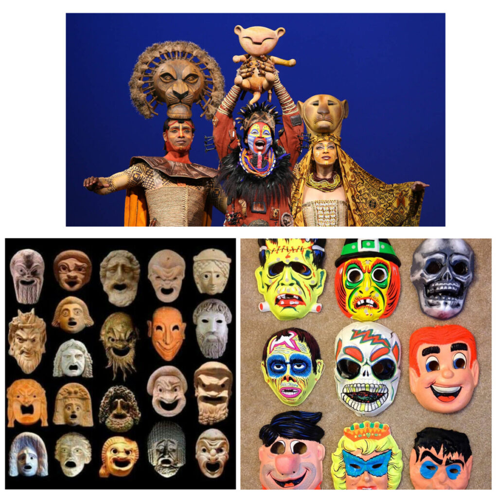
  • Masks

Discussion

  • of last week’s reading

Sketchbook review

Class Critique
Breakout groups

In class work time

Work in Class on Assignment 2, Editorial illustration:
  • Apply Feedback to Concept Sketches
  • Refine Concept Sketches into final art
  • Begin Final Art

Due Next Week

EDITORIAL ILLUSTRATION

Assignment 2, Editorial Illustration Assignment 2, part 3

Sketchbook/Reading Exercise Week 10 : Listening and Drawing

Sketchbook Week 10

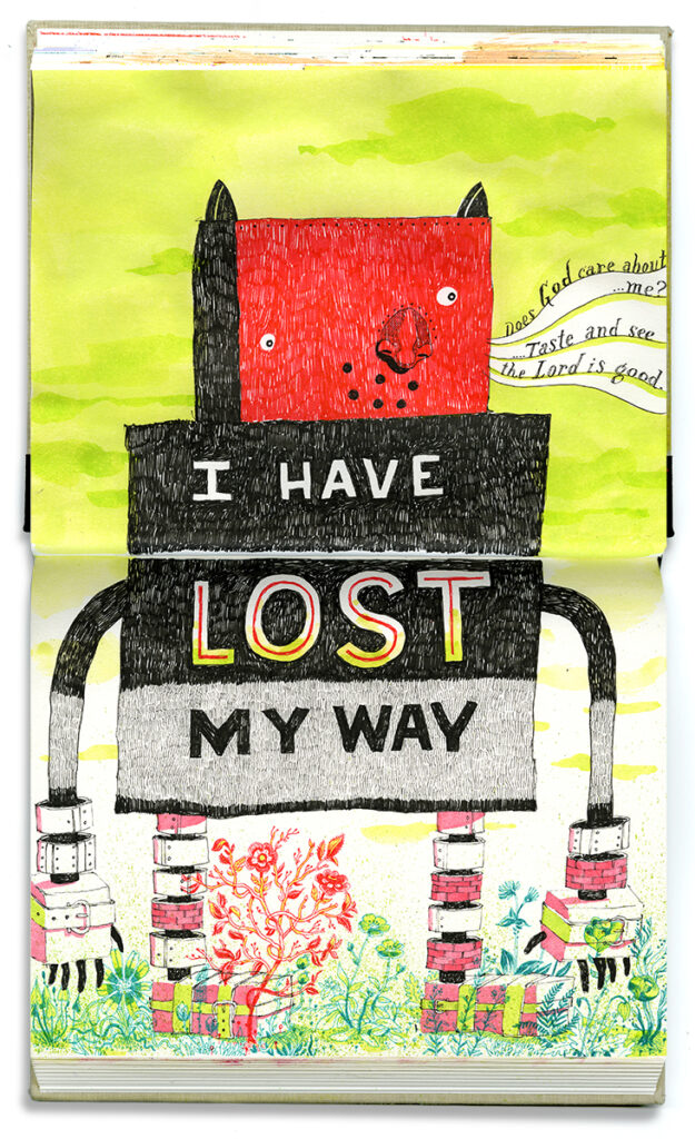
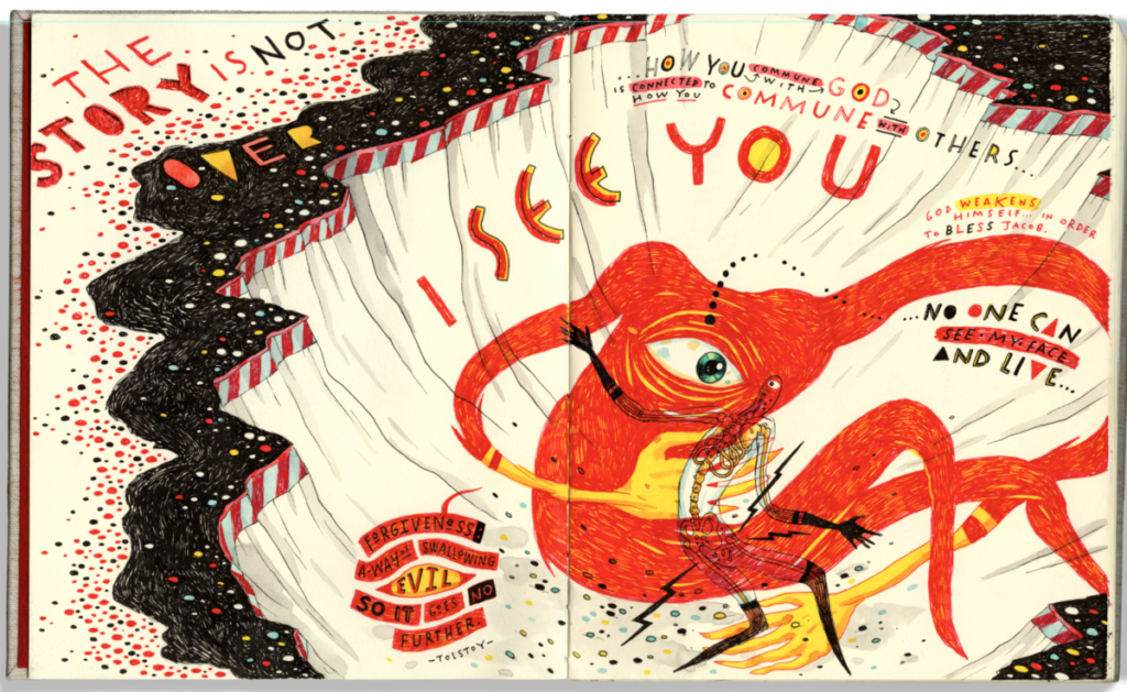
The illustrator John Hendrix draws and records in his sketchbook when he goes to his Sunday church services.

John Hendrix

Go to a place that you enjoy and feel comfortable sketching at. Listen to the conversations, music, noise, any sounds. Write down words and phrases. Based on your observations and inspiration create a spread or fill 2 sketchbook pages.

Possible places could be a restaurant, coffee shop, the park, a museum, the subway, the library, a friend’s house, your place of worship, etc.

Have fun with this!

Reading: John Hendrix article

Week 9

Class Info

To-Do Before Class

Topic:

Editorial Illustration

Activities

Warm Up

  • Group exercise Before, During and After

Sketchbook

  • Sketchbook share

Discussion

Editorial Interviews, Ana Juan, and Edel Rodriguez

Class Critique
Review Editorial sketches

Class Work time

———————————————————–

Homework due next week

EDITORIAL ILLUSTRATION

Revise your concept sketches based on the class critique. Work on composition and concept. Use references and research to aid in your revised sketches.

SKETCHBOOK

Draw the News or a Podcast

READING

How Wes Anderson’s Creative Team Designed the The French Dispatch Magazine for His Latest Film

How Wes Anderson’s Creative Team Designed the The French Dispatch Magazine for His Latest Film

Read the article here.

Choose one of the French Dispatch covers that you like and describe what you think the illustrator’s intention and subject matter was? What is the color palette? What is the tone or feeling you sense from the illustration? Does the illustration remind you of anything in NYC or can you find a  parallel situation in New York? 

Draw the News or a Podcast

Draw the news via television or radio. 

Or Draw a podcast.

Focus on one segment in the news or choose one podcast. (Podcasts and online radio segments can be replayed which makes it easier for taking notes.)

Jot down key words and phrases discussed.

Fill three pages of your sketchbook with images that come to mind by listening to the news segment or podcast.

For example, if you listen to an interview you could draw the person being interviewed (do some photo research) as well as some specific things they mention in the interview. If it’s a musician or actor with a new album or movie that just came out you could draw something related to the film. Or if they talk about a song you can try listening to the song and do a sketch.

Have fun and experiment! This is very open to your specific interests.

Television

CBS , NBC, ABC,etc

NPR has lots of good segments

A few Podcasts I enjoy. Feel free to listen to others.

Modern Love

Science Friday

Radio Lab

Week 8

Class Info

  • Date: March 18th

To-Do Before Class

Topic:

Editorial Continued

Activities

Warm Up

  • Spring Fever

Discussion:

Review Week 6 artist/color

Group review of editorial articles and presentations

Process of Editorial illustration project

Class Working time:

Thumbnails and concept development

Review Assignments and Expectations for Next Week’s Class

Due Next Week

Week 7

Class Info

  • Date: Friday, March 11

To-Do Before Class

Discussion: More Color
Sketchbook Exercise
Reading : Peace, Love, & Protests
Catch up on assignments missing or behind

Activities

Warm Up Exercise

The FUTURE

GUEST SPEAKER
3pm
Reid Kikuo Johnson
Editorial Illustration

Ask questions!

Discuss MoCCA Anthology and Ink Club

Sketchbook

  • Small group sketchbook share of 4 color compositions of an object

Introduction to Assignment 2
Editorial Illustration

Due Next Week

Editorial: Assignment 2 , Part 1
Midterm Presentation/template


Sketchbook Week 6: Color and Composition

Color and Composition, 4 small illustrations.

  1. Choose an object that interests you. The object can be simple such as a piece of jewelry, a vase, a leaf, a seashell, a shoe, lightbulb, etc.
  2. Neatly draw 4 squares or rectangles on a sketchbook page or over 2 pages. The boxes can be small 2×4, 3×4, 2×2, etc.
  3. Draw the object in each box. 4 different compositions. Draw lightly with pencil. You could draw the object close-up , far away, from an overhead view. What happens when you draw the object upside down or turned at a different angle? Consider the composition and negative space.
  4. Choose a medium such as ink, a micron marker, or a brush pen to add line.
  5. Now try adding color to each small drawing. For example, you could add a single color/ pop of color to one composition. Try two complementary colors in the second composition. For the third, try a monochromatic or analogous palette, etc. You can add color with traditional materials or digitally. Keep it simple.
  6. Upload your drawings on Openlab.
  7. Write a brief description saying chose what color palettes you used. Which one do you feel is most successful?

Post when complete:

GO TO: CLASS SITE

DASHBOARD > POSTS > ADD NEW >

Write your post. Add a Descriptive title.

Choose CATEGORY (bottom right side): Sketchbook

PUBLISH

Please add your introduction by [DATE AND TIME].

Discussion Week 6: Color continued

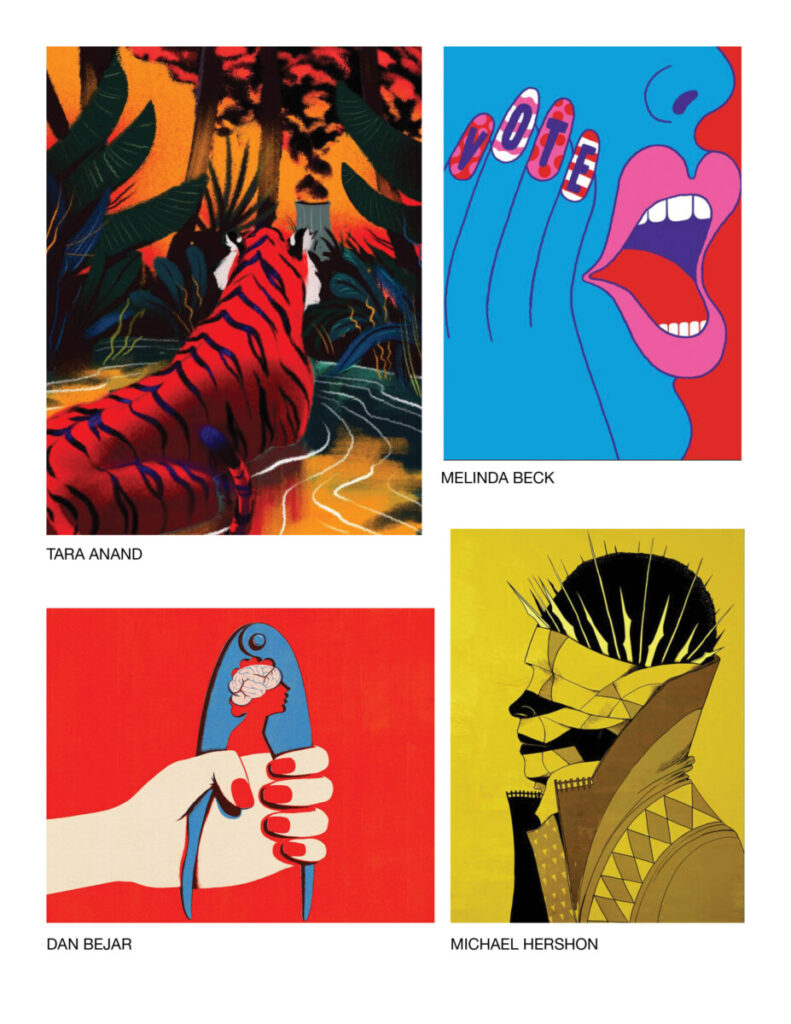
Choose an illustration which makes strong use of a limited palate. (5 colors or less ) Share it along with a few sentences about why you chose it, who the artist is, and how the artist uses Color Theory in the composition.

  • Deconstruct the illustration:   Who created it and what process and media do you they use or what media do you think they used it is not listed.
  • Share links to more of their work or their personal website.
  • What does Color Techniques does the illustrator use?
  • Why do you consider them effective?

Look for an illustrator who peaks your interest. Look in ads, magazines, Society of Illustrators, comics, etc.

Week 6

Class Info

  • Date: Friday, March 4

To-Do Before Class

Watch two videos on color

What is Color?

Color Contrast

Reading WGSN’s colour director

Assignment 1, Part 5

Sketchbook

Activities

Warm Up

  • SUPER POWER

Discuss MoCCA and Ink Club

Sketchbook

  • Small group sketchbook share

Critique

Assignment 1 , part 5

Introduction to Editorial Illustration

Editorial Exercise-NYTimes Opinion article

Due Next Week

Reading Week 5

WGSN’s colour director on the evolution of how humans perceive and define colour

In the reading the the article states:

“Humans connect with colour on a visceral level, and a colour’s psychological associations run deep within human culture and imagination. As such, when faced with making colour selections people tend to be guided by their own subjective colour propensities. “

Jane Monnington Boddy

What color choices do you make ? Do you have color preferences? Why do you think you choose the colors that you choose? Do those colors convey anything specific or remind you of anything?

Respond with commentary in a few sentences.

GO TO: CLASS SITE

DASHBOARD > POSTS > ADD NEW >

Write your post. Add a Descriptive title.

Please add your introduction by [DATE AND TIME].

Choose CATEGORY (bottom right side): Reading

Choose TAG>Week 5

PUBLISH

Assignment 1, Part 5

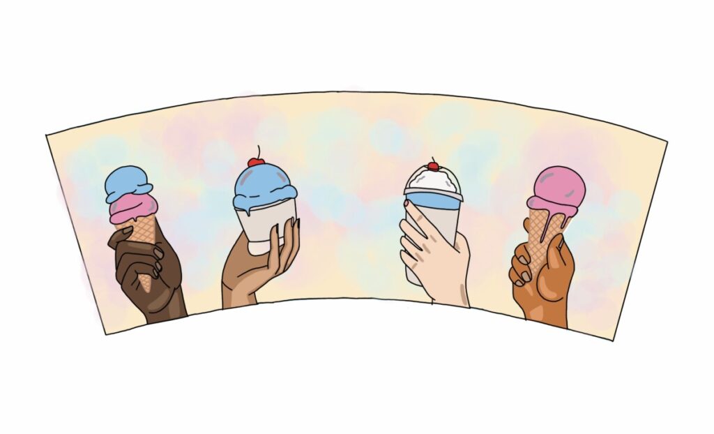
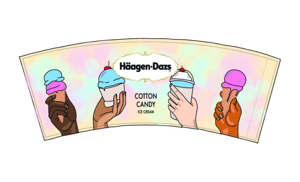
COLORING YOUR ILLUSTRTATION FOR PACKAGING

  1. You can add color traditionally using watercolor, marker, colored pencil.
  2. Or you can add color digitally using photoshop or procreate to add color to your line art. Use whatever traditional or digital mediums you would like to use.
  3. If traditional, scan your final art, hi res at 300 dpi as a .tiff or .jpg.

Do 2 color studies for the final.

Choose your color palette .

  • Complementary
  • Split-complementary
  • Primary
  • Triadic
  • Warm
  • Cool
  • Monochromatic
  • Analogous
  • Limited (no more than 5, b&w)
  • Personal or using a reference

DUE NEXT WEEK:

  1. Place both color studies in the packing template and save as .jpgs and post on Openlab.
  2. Decide which color palette is most successful and use that one for the ice cream container. Print out or cut out the final art from the packaging template. Remember to cut on the black trim line. Tape art to the actual ice cream container and photograph. If you illustrated the top piece of the container, photograph that as well. Photograph container on a blank background, preferably a white wall. Keep background from being distracting.
  3. Then place the art into the banner template file. Decide where you want the logo to go. Post on Openlab as well.

POST all art

Student Posts>Work in Progress> Week 5

Does the color convey emotion or give feeling to the piece? Why did you choose the colors? Label with your name and date and a description what color palettes you chose and why.

Sketchbook Week 5, Playing with Value

This week in your sketchbook, we will continue to practice line and creating value
using ink.

SWATCHES

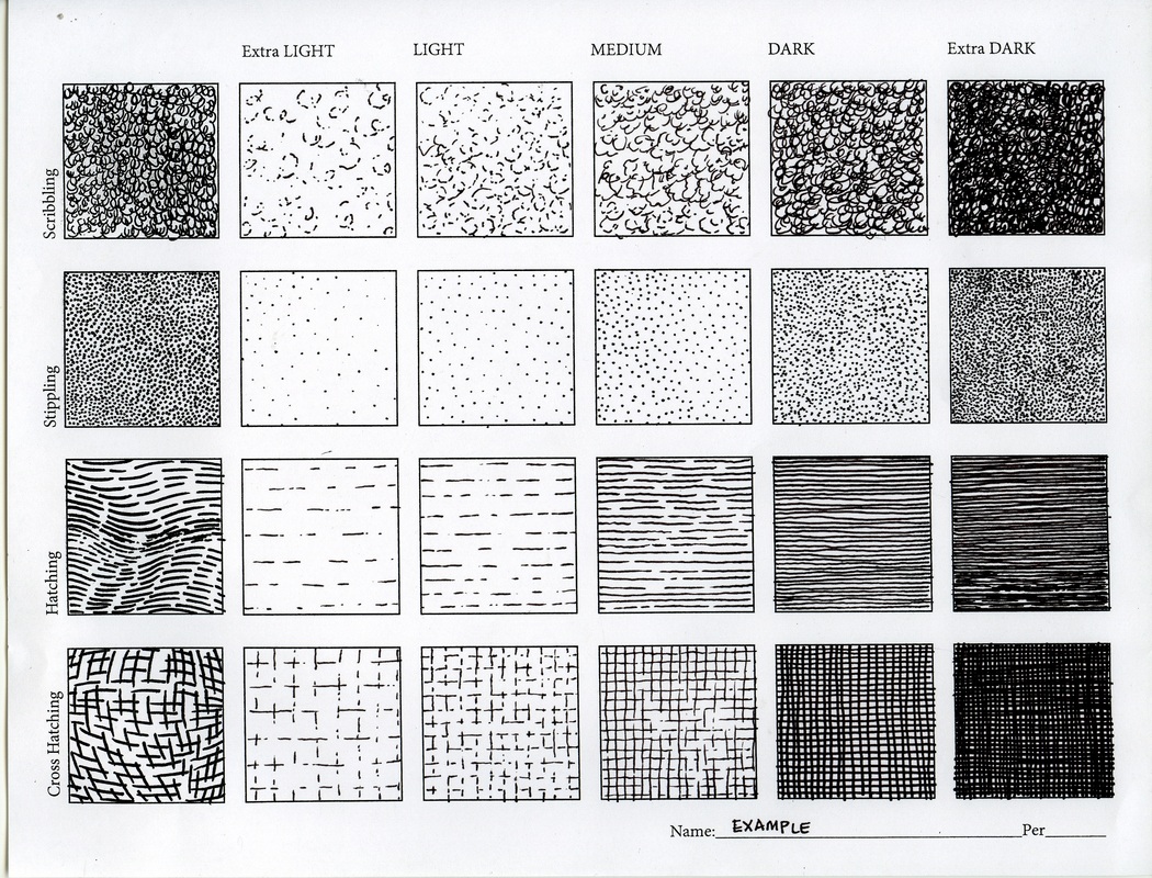
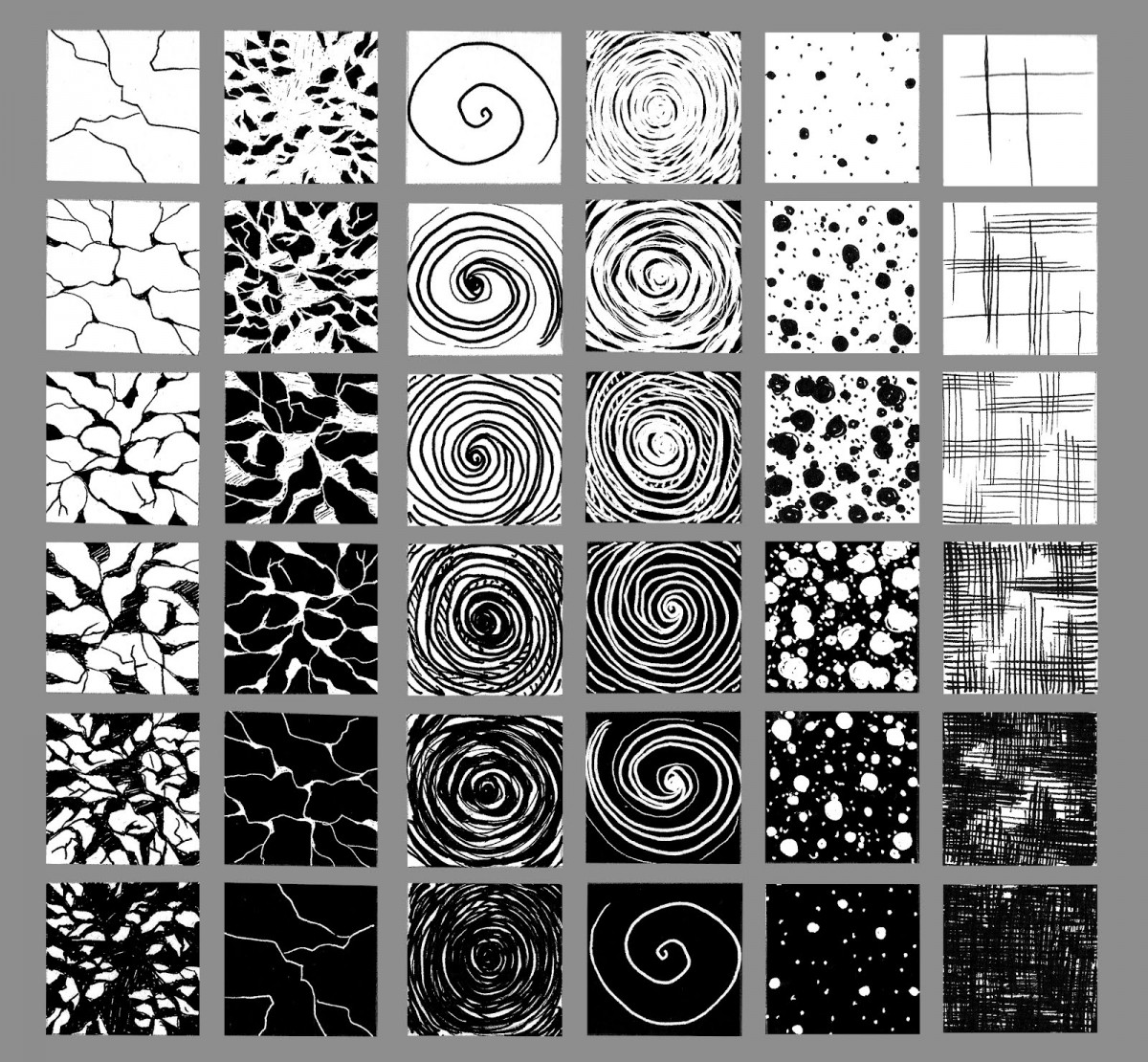
In this exercise try creating multiple steps in value, using a variety of mark making techniques in ink.  Notice in this set of swatches all of the different methods used to create value.

Part 1

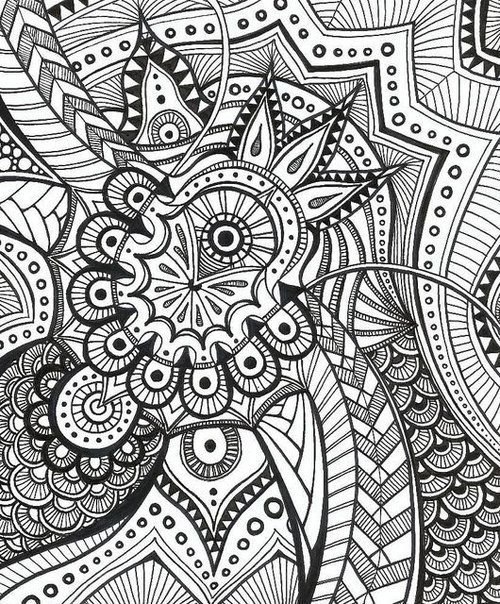
Try creating value scales which move evenly from light to dark.  See the swatches below as examples, but feel free to come up with your method of shading, and unique patterns textures and designs.

Examples:

Examples

Part 2
Create an abstract design and fill in the design using these different swatches of value.  Try patterns, stippling, hatching, and crosshatch.  Try ink wash techniques as well. POST your work Tagged Sketchbook, Week 5, along with your thoughts on it how you accomplished the task.

Post when complete:

GO TO: CLASS SITE

DASHBOARD > POSTS > ADD NEW >

Write your post. Add a Descriptive title.

Choose CATEGORY (bottom right side): Sketchbook

PUBLISH

Please add your introduction by [DATE AND TIME].

Week 4

Class Info

  • Date: Friday, February 18th

To-Do Before Class

Topic:

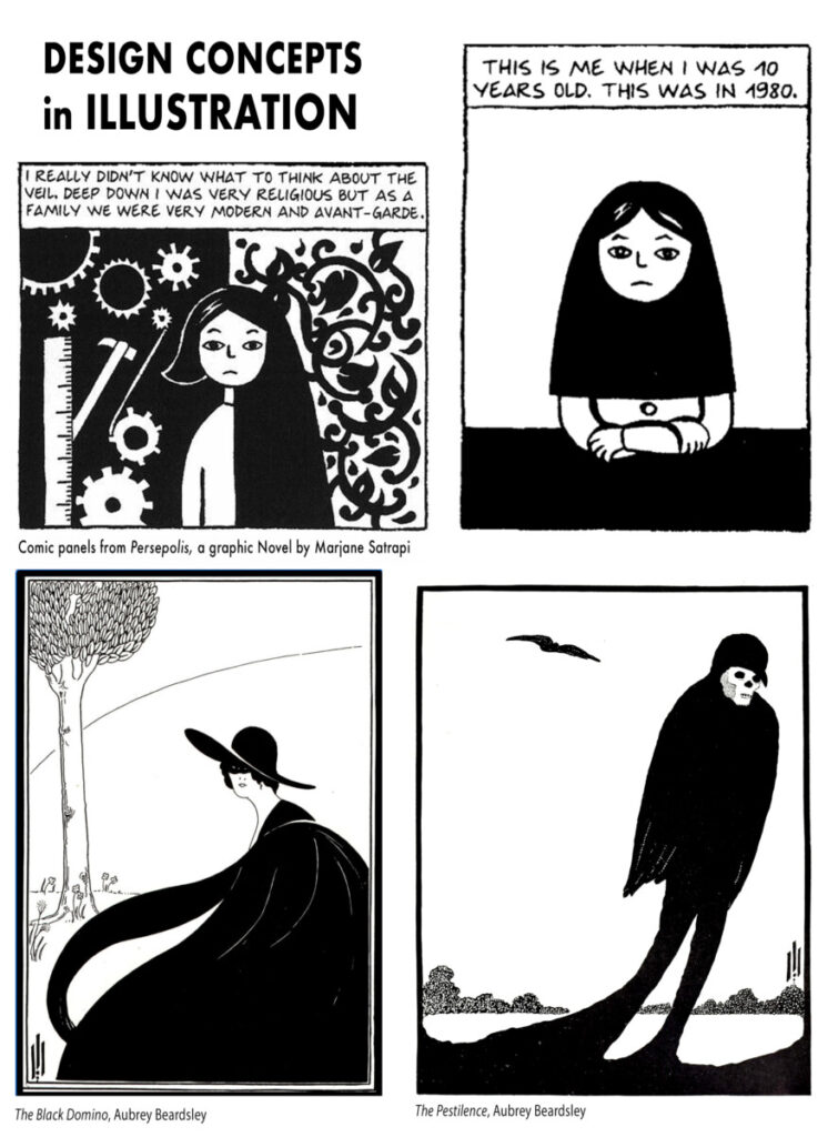
Design Concepts in Illustration

Activities

Warm Up

  • Draw a feeling

Sketchbook

  • Sketchbook share

Lecture

Design Concepts in Illustration

Critique

Assignment 1 Ice Cream Packaging
  • Part 3 of 5 due

In Class Demo 

Inking

Review Assignments and Expectations for Next Week’s Class

Due Next Week

Week 3

Class Info

  • Date: Tuesday, February 7th
  • In person P-125

To-Do Before Class

Topic

ILLUSTRATION PRACTICES: PROCESS & WORKFLOW

Activities

Warm Up Drawing exercise

  • Food

Discussion

Sketchbook

  • group sketchbook share of Visual Vocabulary

Lecture week 3

Video: Art director, Soojin Buzelli

Critique

  • Small Groups Critique Assignment 1, Part 2 Thumbnails

In Class Demo 

  • Demo: Digital Tools for Basic overall Image Editing.  (Show adjustments for taking thumbnails to concept sketches.)

Review Assignments and Expectations for Next Week’s Class

Due Next Week

Week 2

Class Info

  • Date: Friday, September 9, 2:30-5:50 pm

To-Do Before Class

Topic

ILLUSTRATION PRACTICES: PROCESS & WORKFLOW

Activities

Warm Up Drawing

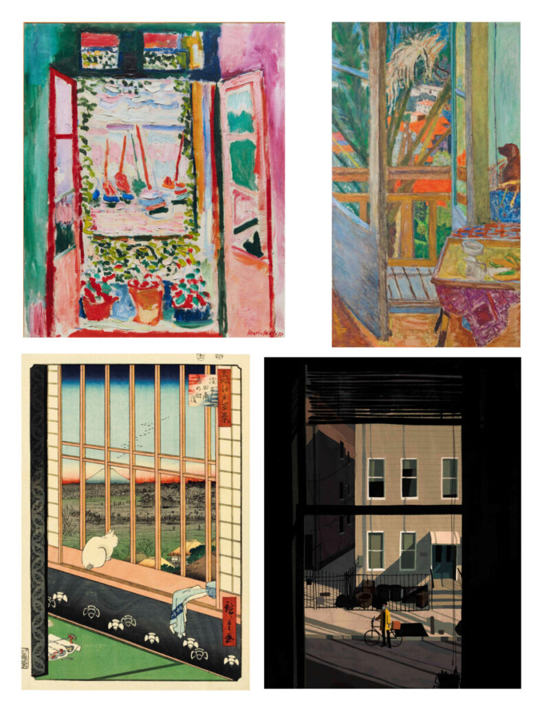
  • Window Views
top left, Artist: Henri Matisse, The Open Window 1905
top right: Pierre Bonnard, French Window with Dog, 1927
bottom left:  Utagawa Hiroshige final masterpiece, a series known as ‘One Hundred Famous Views of Edo, 1858
bottom right: Katherine Lam, untitled, 2020

Discussion

Sketchbook

  • Let’s share our Meet the Artist

Lecture 1

Conversation between Soojin Buzelli and Jon Han

ILLUSTRATION PROCESS

  • The importance of multiple solutions.  
  • Personal Vision         
  • Thumbnails: How to and how many is too many?


Review thumbnail drawings and concepts for Assignment 1, Part 1

Due Next Week

Week 1

Class Info

  • Course Goals: To familiarize students with the field of illustration including its basic working methods, industry practices, basic history and philosophies. Artistic techniques will be taught as well, however this is a class focused on concept generation, and the creation of thoughtful illustrations, as opposed to a drawing or painting technical course.

Topic

WELCOME TO INTRO TO ILLUSTRATION

Class Introductions

Everyone introduce themselves

Objectives

  1. Syllabus
  2. Materials
  3. Join Openlab
  4. Openlab site overview
  5. Course Structure

Activities

Lecture

  • What is Illustration?   
  • Illustrator as visual problem solver

Introduce Assignment 1:
Product Illustration: Ice Cream Packaging

Demo: Group brainstorm and word web

Discussion

Due Next Week

Part 1 of 5 due next week – Brainstorm and research

Reading Week 1 : 5 Steps to Developing a Sketchbook Practice

Sketchbook Exercise Week 1 : Meet the Artist

Purchase Art Supplies from the syllabus
(Bring sketchbook and drawing supplies for next week)

Week 5

Class Info

  • Date: Friday, February 25th

To-Do Before Class

Topic:

COLOR

Activities

Warm Up Exercise

Sketchbook

  • Small group sketchbook share of Drawing from Experience

Critique

Assignment 1 , Part 4
  • Line and Value

COLOR REVIEW

Lecture

In Class Demo 

  • Demo: Line Isolation In Photoshop
  • Tips for adding color to line art

Due Next Week

Watch two videos on color

What is Color?

Color Contrast

Reading WGSN’s colour director

Assignment 1, Part 5

Sketchbook

Nathalie Q. Assignment 2 part 1

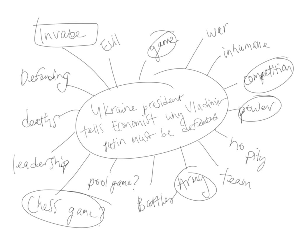
For this project I will be focusing on the war between Russia and Ukraine. Overall, a fair war would be between two countries mutually agreeing to battle. However, Russia would just be attacking while Ukraine goes on the defense. This article speaks about what the president of Ukraine feels about Vladimir Putin and his intentions behind this whole attack. Overall, Putin only moves with intentions to gain control over something that does not pertain to him. The desire for him to attack Ukraine to gain control is a dictatorship mindset many countries are moved past. Ukraine simply serves their people, and this attempt to trap them under a dictatorship is a simple act of control. The president of Ukraine explains how this is nothing but a game to Putin as he does not part take in the battles and simply watches as his troops risk their lives. He gives examples of all the Russian solders bodies being abandoned and Putin showing no compassion to even identify and take these corps out to bury etc. Through this editorial project, I am choosing to illustrate the mindset Putin holds with this war, in hopes that it illustrates his abuse of power and carelessness to the people overall.

« Older posts