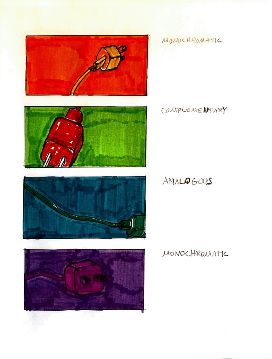
For the first color composition, I chose a monochromatic scheme of only shades of orange. For the second, I chose a complementary scheme of red and green. For the third, I chose an analogous scheme of blue and green. For the fourth, I chose a monochromatic scheme of only shades of purple. I think the most successful color composition of these four is the complementary one, because red and green together is a classic combination, and one I think a lot of people love!
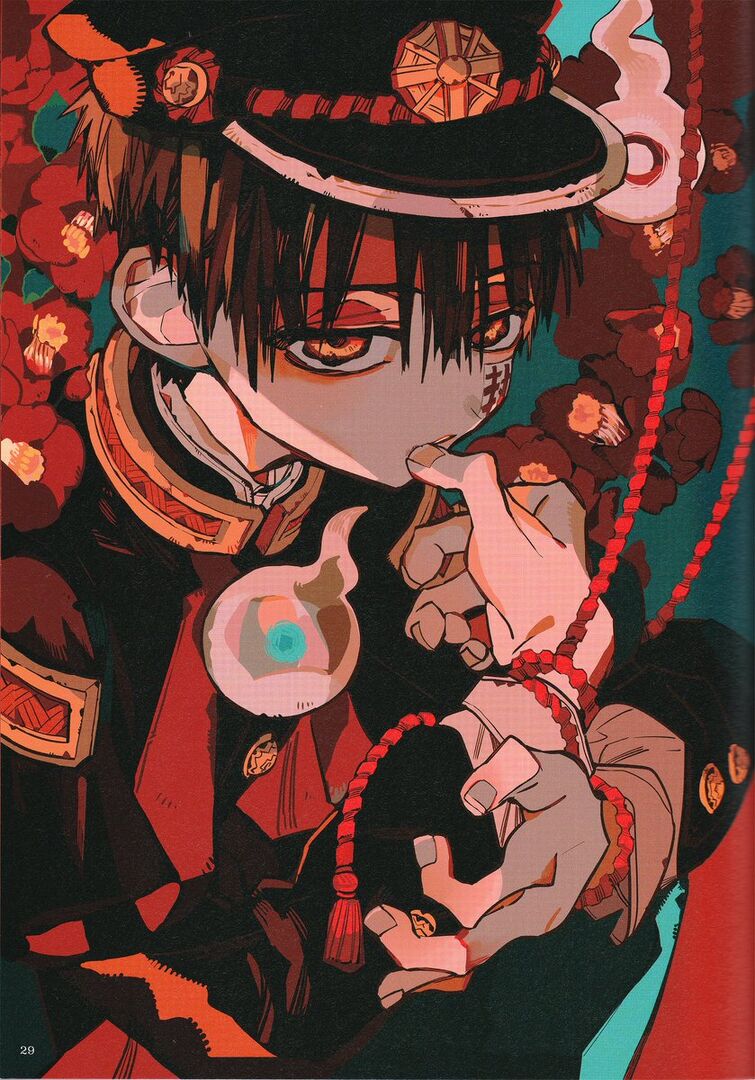
the artist I chose is by one of my favorite mangaka ( besides JOJO) but this is by AidaIro the name is actually the combination of the illustrator and the writer together they make beautiful illustrations they are both japanese. Every panel is very detailed and the art style is very eyecatching. the colors are like muted pastels but at the same time vibrant. Red, yellow, black, white, and blue are used in this piece but they are used in different ways to make it feel like the character is alive. the shading also being the same colors darkened. for example, the use of dark red in the flowers in the back is also used in his clothes.
the artist only has a twitter is https://twitter.com/aidairo2009
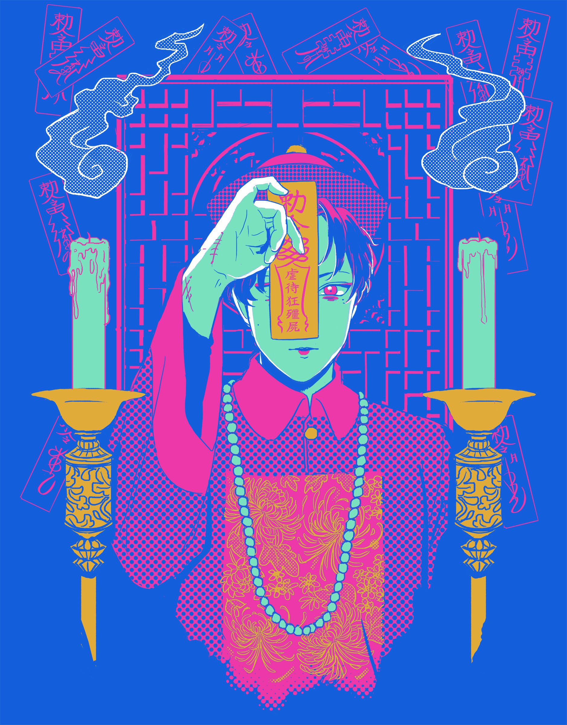
The artist of this image goes by Billie Snippet on their Instagram and Twitter. They are a South Korean artist working in illustrations, comics, and apparel. For their work, they love using limited color palettes such as the example shown above. While they didn’t show their process for this piece in specific, I believe that every aspect of this piece was created digitally. For this piece, we can see that Billie ended up going with a triadic color scheme of cyan, yellow and magenta with blue-green mixed in. The yellow of the jiang-shi’s tag as well as the yellow in the candle holders draw our eye to them. Cyan serves mainly as a background color and the color for darkers parts of the drawing like the character’s hair and the shadows of the piece. Magenta stands out from the primarily cyan background and gives form to the character through their clothing. The blue-green tone of the candles and the character’s skin serve as positive space and it allows our eyes to relax. I consider Billie to be very effective. Their use of limited color palettes and positive and negative space come together to create a piece that is appealing to look at and enjoy.
Listed here are links to Billie Snippet’s Twitter, Instagram as well as their collective apparel store, Uchuu Summer.


Recent Comments