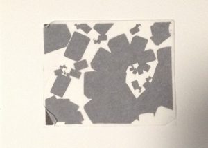
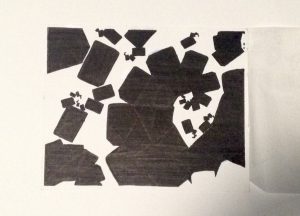
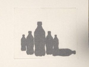
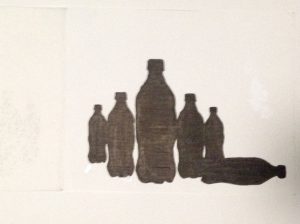
This is the inked version of the digital compositions created previously through Adobe Photoshop. I chose to create the inked version of these two out of the other ones I made from the suggestions of my classmates and professor. The composition I created with the Metro Card was supposed to be ambiguous. I tried to make it as difficult as possible for the viewer to figure out the background from the foreground, which really doesn’t exist. As for the Obvious composition, its pretty clear what is the foreground and which ones the background, its pretty stable.
Hour(s) Spent: 2


Leave a Reply