

Image above are my experiments at developing my line composition for my textured image, which was the desert. I honestly got stuck at this part, hence the multiple trials for this part. I was trying out different thickness and types of lines to see which suits best for the zen and peaceful feeling that the original image had. I’ve decided to stick with curved long lines over the broken lines. The broken lines looked grainy and rough, not the feeling nor look that the original image is giving.
For my type composition for the texture image, I’ve decided that I would like to incorporate different types in order to achieve the different grays that the original image had. I was also experimenting with the thickness of the letters, just like the line composition.
The pattern in the other hand, again, I was trying out different types of lines and also playing with the direction of the lines.
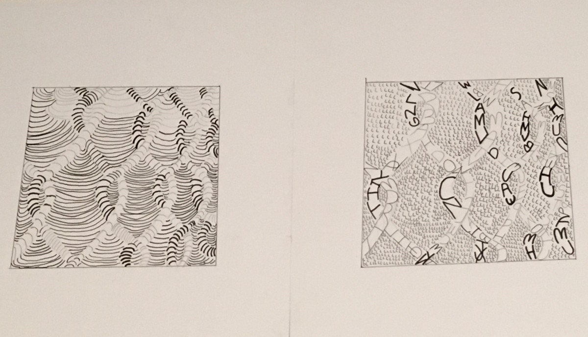
 When I first saw the texture photograph that first thing that came up in my head was that it felt so zen. Throughout the process of sketching out my line composition I decided that I would stick to a rather regular line, but that had a sense of movement. When furthering to the type composition I found that while sketching I was losing the mood of calm it just looked to crowded so i decided to change it a little for my final.
As for the Pattern photograph the initial mood I personally got was confusion. It was one of those photographs that when you it one shape can pop up in your head. But as you look more you different shapes. My type composition was a little tricky at first because I wanted to use letters to form the shape and not have a actual outline of the shape. Soon after I decided to use the outline as a sort of guide and I think it helped me in the end.
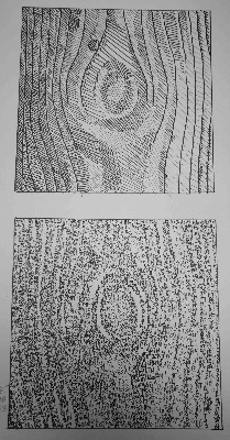
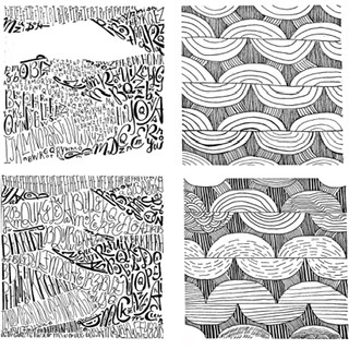
Texture Description – The texture photograph is a picture of a set of black and white rocks. The rocks are organized by having 7 black rocks on the left side and 10 white rocks on the right side. This makes a total of 17 rocks in the entire image. The black rocks look more rough than the white rocks
The white rocks have a rounded shape. Between the rocks have a dark black color. The flow of the image is smooth. The black rocks have more angles.
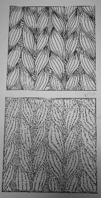
Pattern Description – The pattern photograph is a picture of a bunch of rope. The rope has a rough-looking texture. The rope is going down vertically. It has some strands of string coming out of it.
The rope has a bumpy shape. There is two rope next to each other making the imagery of a pattern. There are lines going through the rope diagonally. The rope has rough lines.
Final Composition
Sketches
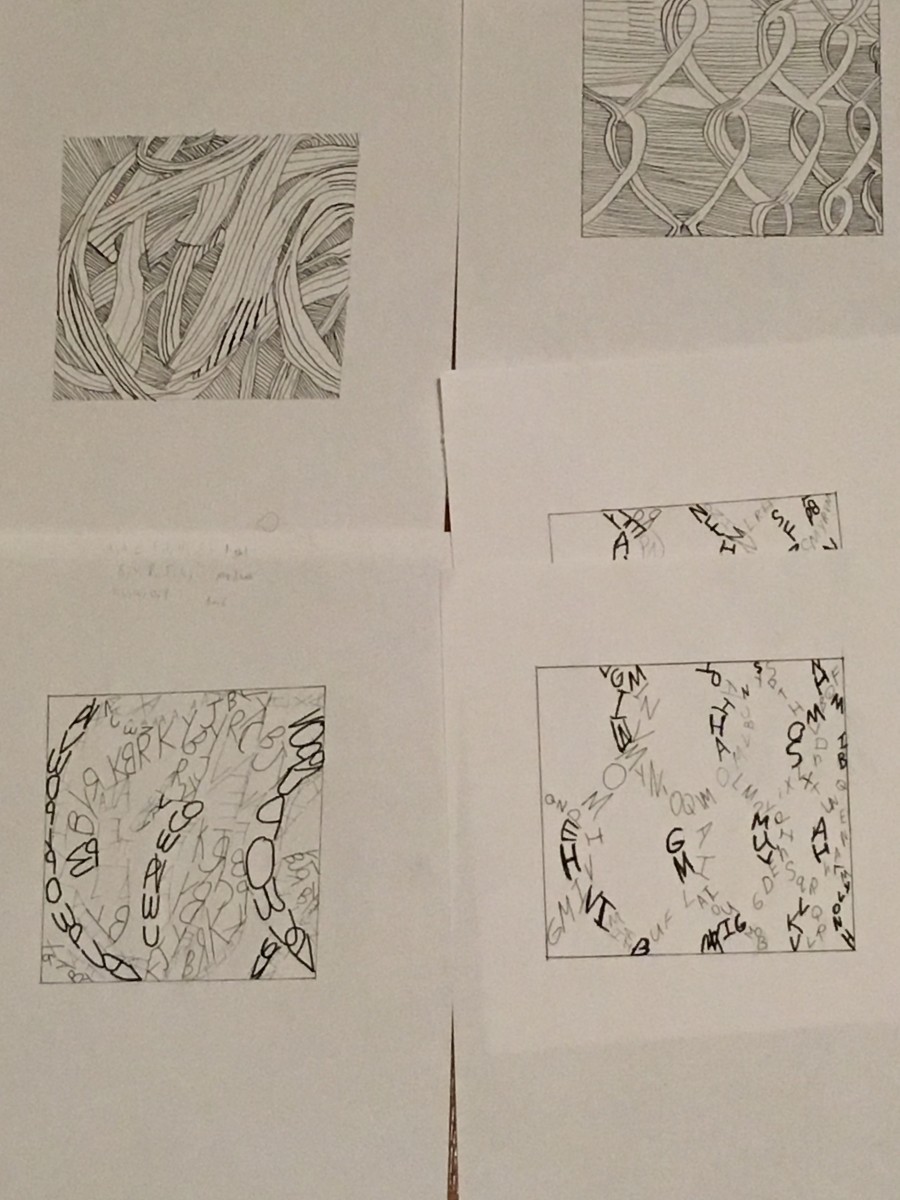
The photos I choose were the rubber bands/pasta(texture) and the wired fence(pattern).For the texture it gave me a state of flow ,and restlessness.The movement was also going vertical and the light source created varying grey tones. The pattern image was similar to the texture but more symmetrical with motion.To me it had an energetic/straightforward mood/feeling. It was not that to go from sketches to final draft because I understood the project and the steps that needed to be followed. I also kept in mind the mood and characteristics that the images had .
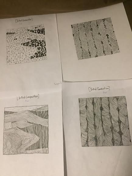
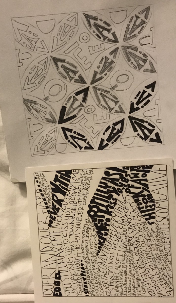
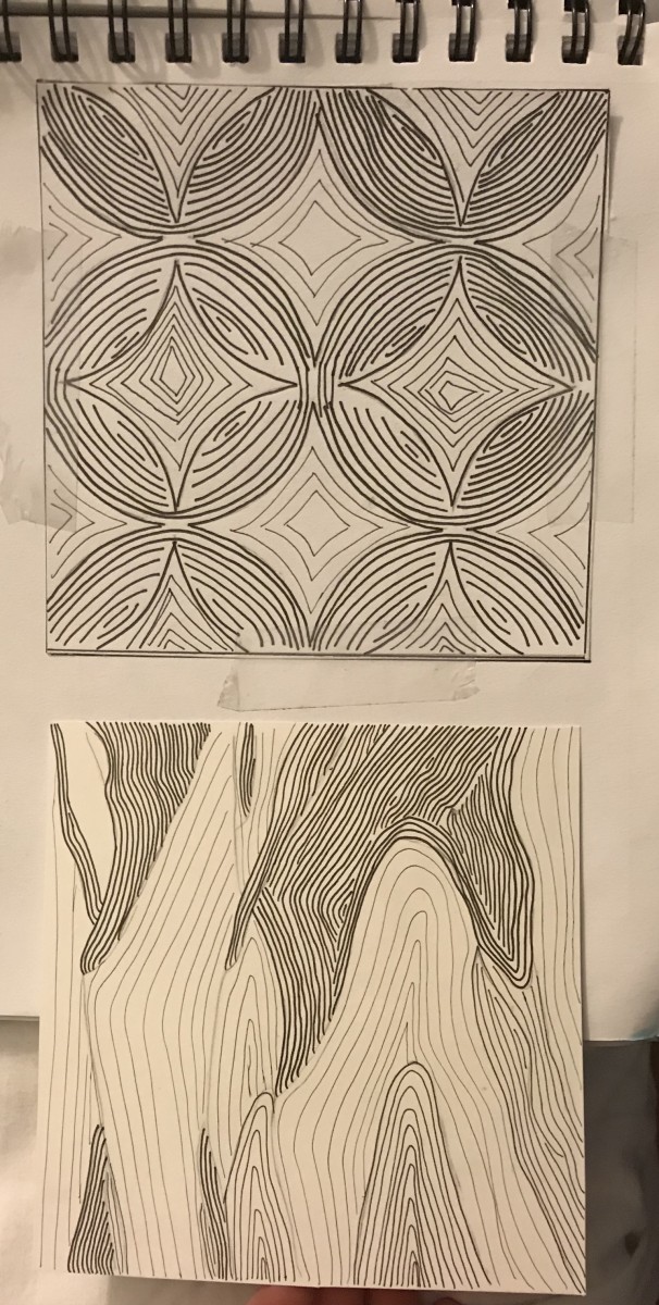
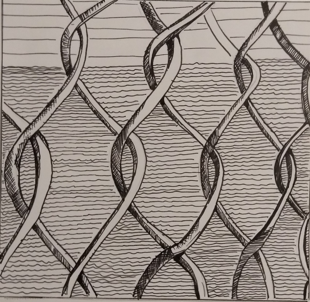
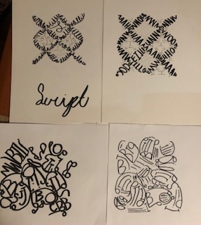
For my inked sketches I’ve decided to really change things up and decided to incorporate major detail into what I was doing. For the handmade twists on the top right I’ve decided to follow the shape of each twist and incorporate it into lowercase type. I didn’t just throw words into it to make it random, but this time I wanted to make it unique. For my line (sand dunes) bottom left, I wanted to add gradient in it to achieve the rich and smooth texture of the sand. On the top left for my type for the sand dunes I wanted the darker side of the dunes which represented the shade to look bigger so that when seen from far away people can see it. Lastly for the bottom right for the lines for my pattern image I kept that same feeling of my first line sketch so that it achieves a rough, itchy, but yet homemade feel. I kept the contortions too add a bit of that hand made feel. Subject to change for final.
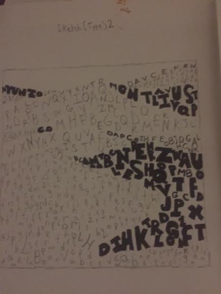
For my first line sketch for my pattern image I wanted to implement contortions and twists that made the feel homemade and the mood smooth. The image I’ve chose was hand crafted and not made by machine, so that meant some things were going to be loose and weird. If it was made to near perfection, then my image would’ve been perfect symmetrical wise.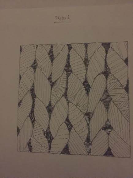
For my second line sketch of my pattern image I’ve felt that I lost the feel of the image I’ve chose. for my first line sketch I’ve added twists and contortions and that’s what I was aiming for, but I lost it for this one. I’v achieved the mood I saw which was a itchy, but calm mood, but I mad the feel of it too perfect. That wasn’t what I wanted. I’ve also implemented patterns of my own to give it a different feel, but again I didn’t think it achieved what the image portrayed. This is only a sketch and not final.
Again for this image I made the lines too perfect and added minor difference form my second sketch. I also didn’t like this image and though it was time to go forth a different path for my ink compositions. Once again this is a sketch and not final.
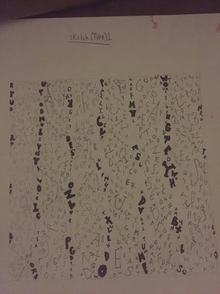
This is my first sketch of my type for my pattern image. I wanted to instead of adding the letters into the shapes of the image, I wanted them to vertically go down. The bold letters shows the dark spots within the image. This is a sketch and is not final.
.
For my second sketch for type on my pattern image I’ve decided to enlarge it so the type can be more visibly seen. I’m not quite satisfied with my sketches, but as I get to some of my ink and final presentation drawings it turned out great for me. This is a sketch and is not final.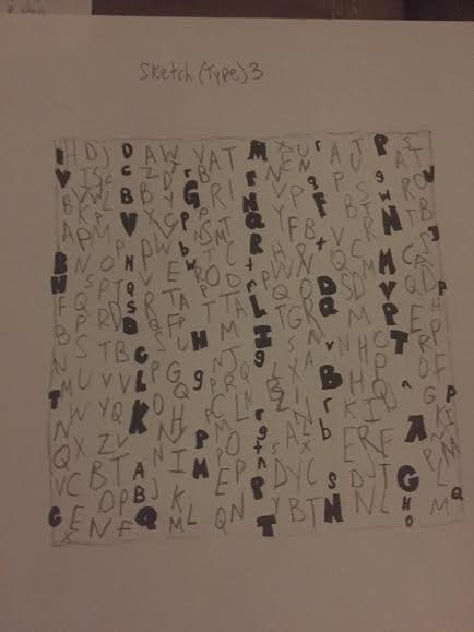
For my third sketch I wanted to enlarge my the type and when I took a look at it I thought this looked ugly. It’s as if I completely lost the feel of both the image and what I wanted. Although this is a sketch and not final I wanted to show people my process from beginning to end. For my refined ink compositions they get better.
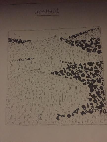
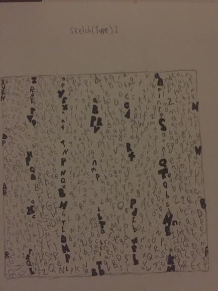
For my first sketch for my type I wanted to add the letters in a somewhat horizontal motion so that it gives it the feel of smooth terrain which is also what I’ve described for my mood. I was quite satisfied with my first type sketch for my texture image and it gave me a sense of what I wanted to do. Not final.
For my second sketch for type for my texture image I wanted to make the letters look bigger. I wanted to show the clear contrast between regular sans serif type to ultra bold sans serif type. I liked this sketch I did, but I wanted to make it more clear and aesthetically pleasing. I was thinking about incorporating this sketch into my final ink one, but i had other ideas in mind.

For my third sketch I’ve also made the text appear bigger and for some reason I didn’t think I’ve achieved the mood I wanted. I wasn’t satisfied with the product and brainstormed other ideas to make it look more simple. This is a sketch and final.
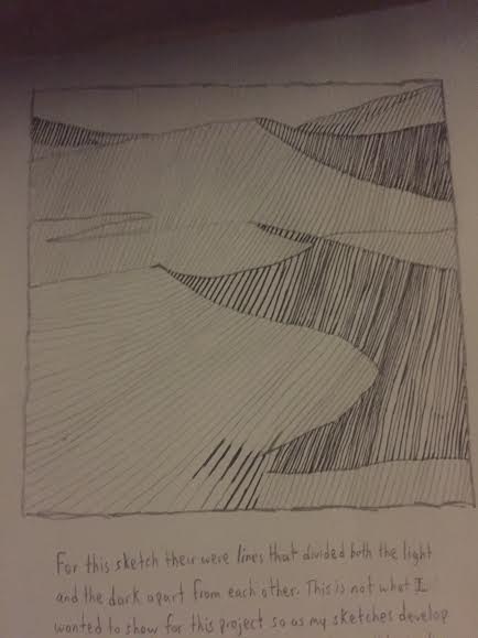
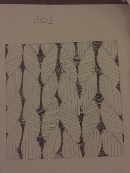
For my line sketch for my pattern image I’ve added smooth lines that shows a clear contrast between light and dark elements. One thing I thought I did wrong was by adding lines that separated from light and dark. This isn’t what I wanted and for the next sketch I’ve decided to go for a different approach.

For my second line sketch for my texture image I’ve decided to eliminate all divisible lines. For the bottom right side for the dark elements I think that some areas didn’t work because I’ve added squiggly lines and I thought that it quite didn’t match the mood i was aiming for. Not final.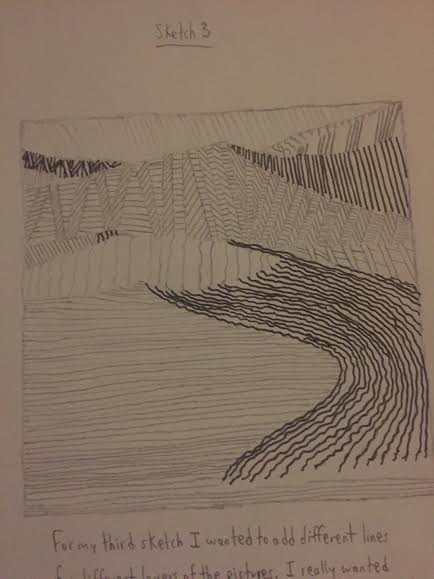
For my third type sketch for my texture image I did the same thing for my second sketch, but decided that I wanted to make the lines smaller. I also made various pattens for different areas of the sand dunes, but once I looked at from far way I didn’t like it. Not final.
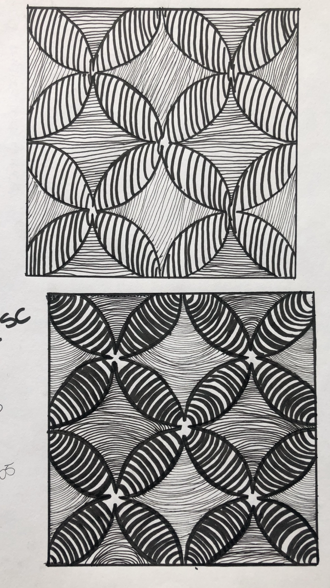
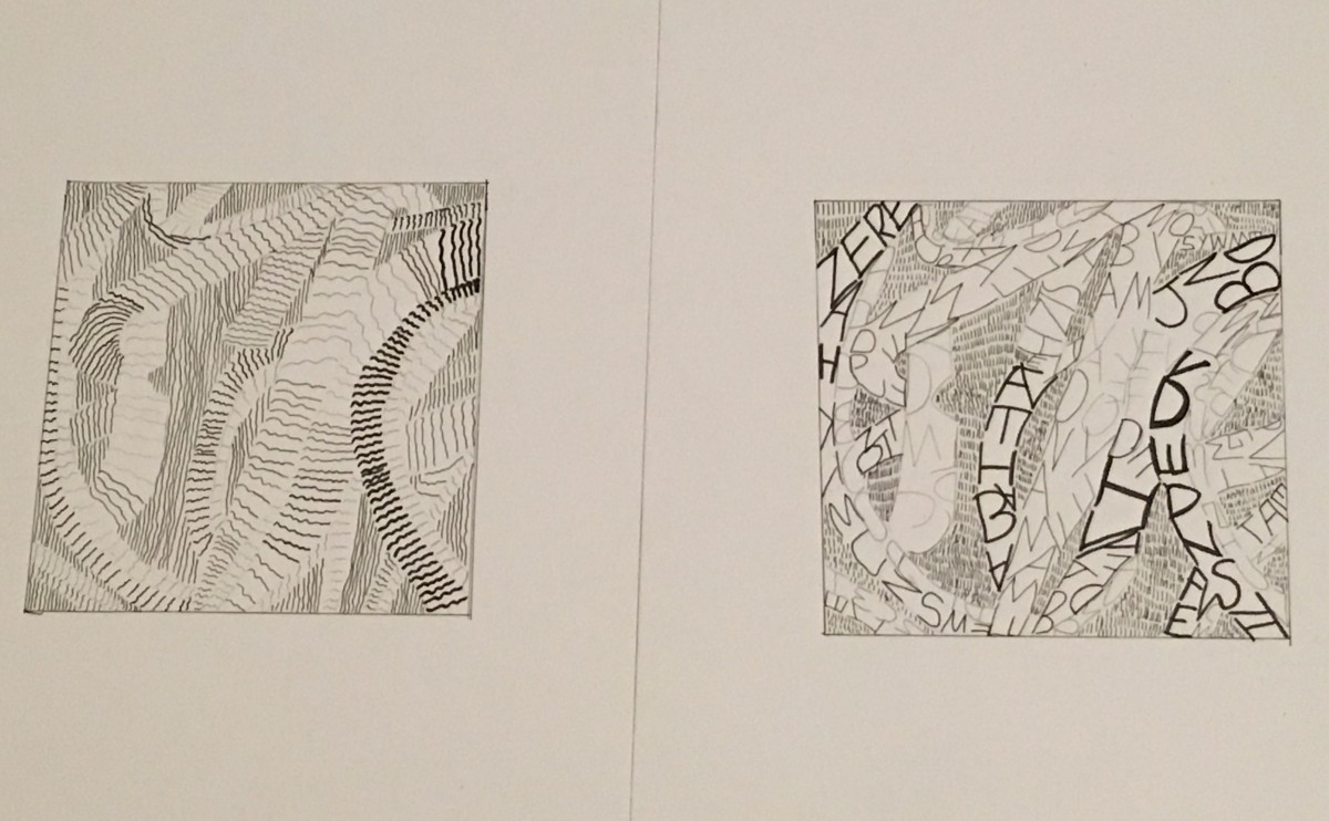
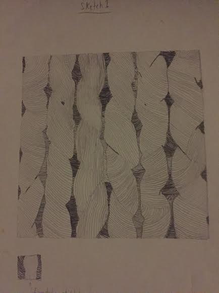
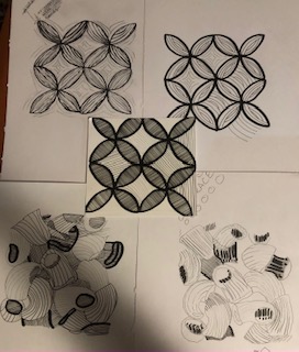
 This is my final line composition i think it turned out well and maybe the lightness and darkness needs a little work
 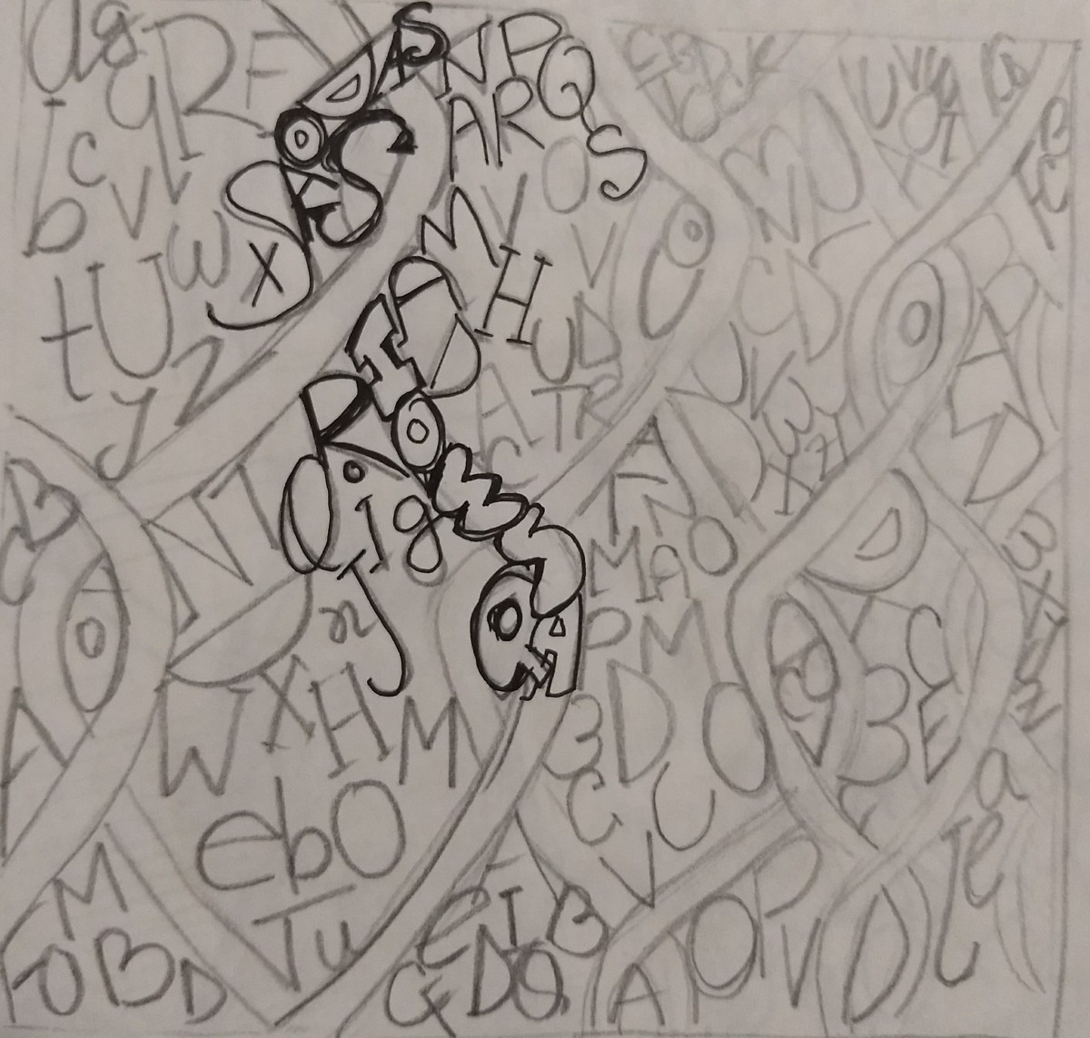 line composition sketch
 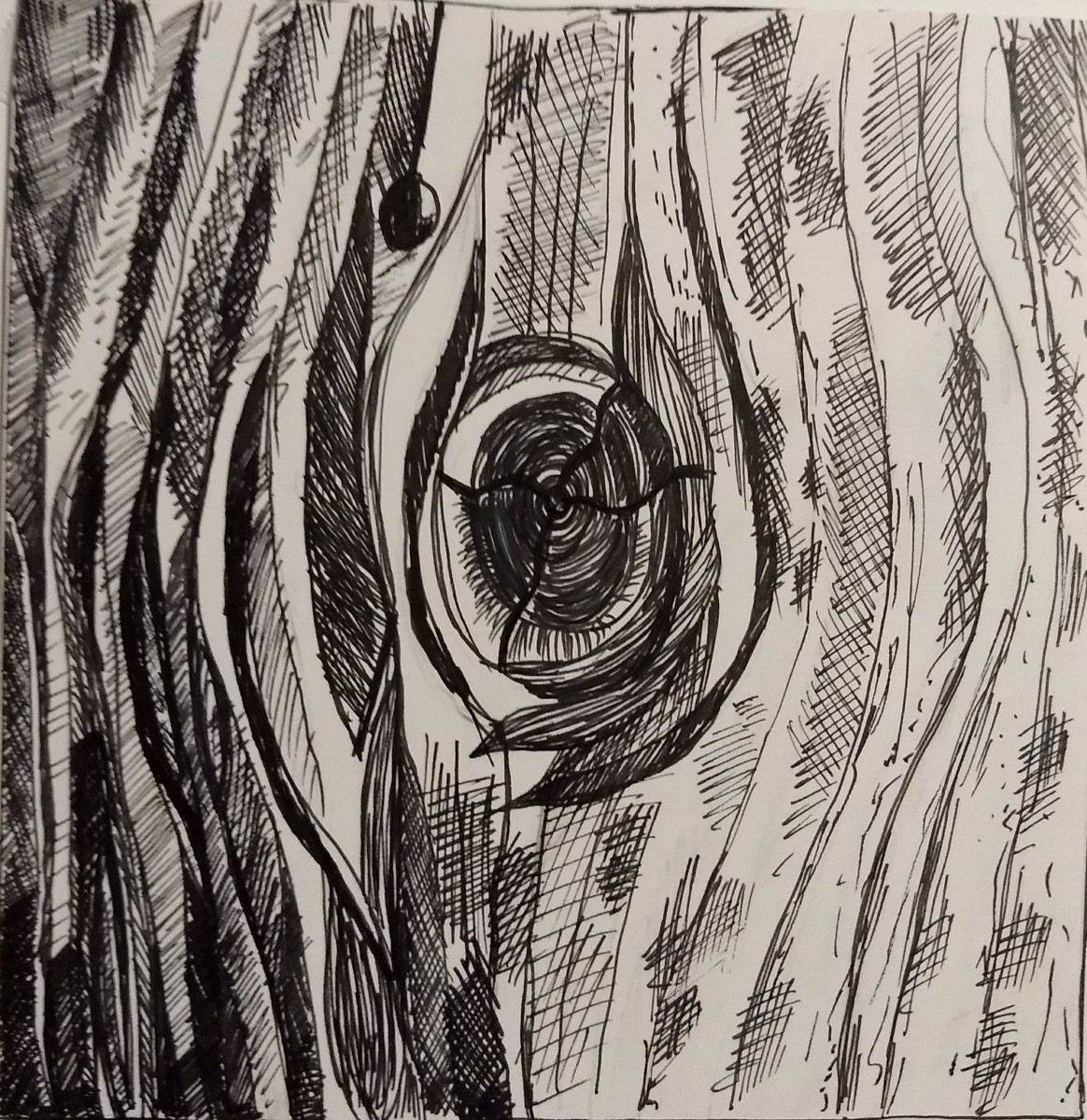 My final texture ink composition I think I achieved the contrast and light darkness very well and the design came out the way I wanted
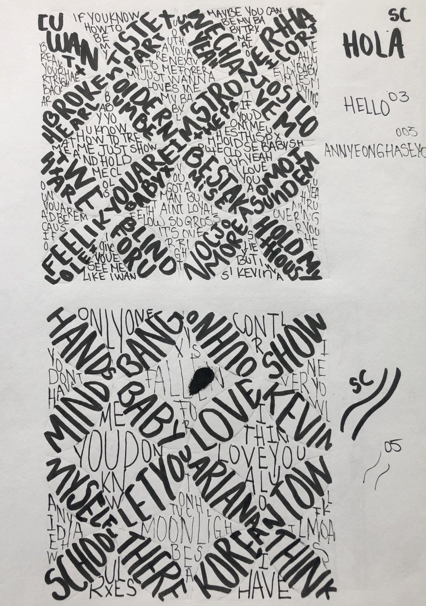
 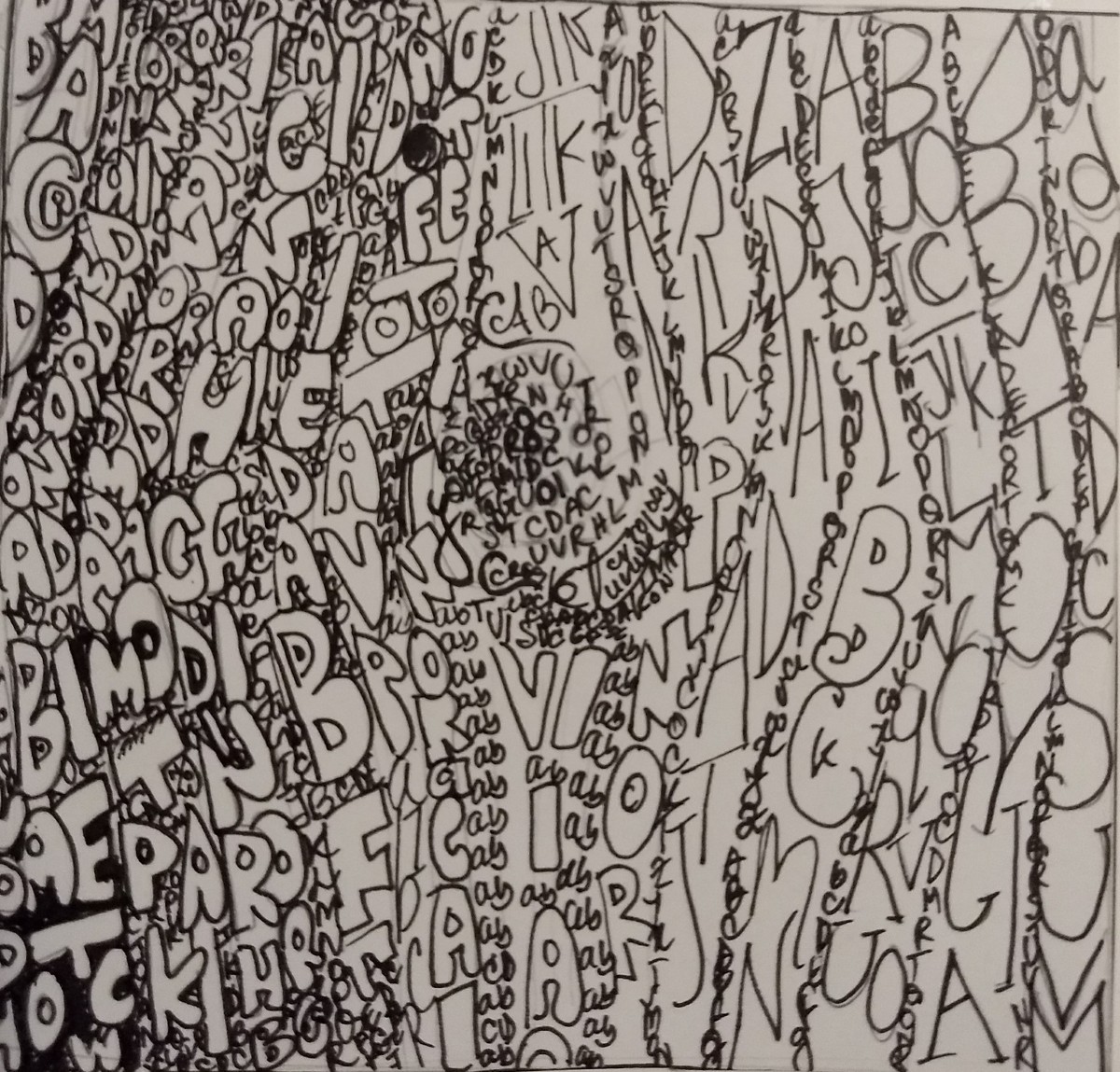 This is the final texture type ink composition again I think the light and darkness is okay but it kinda looks messy and I didn’t want that but i think it doesn’t look too bad
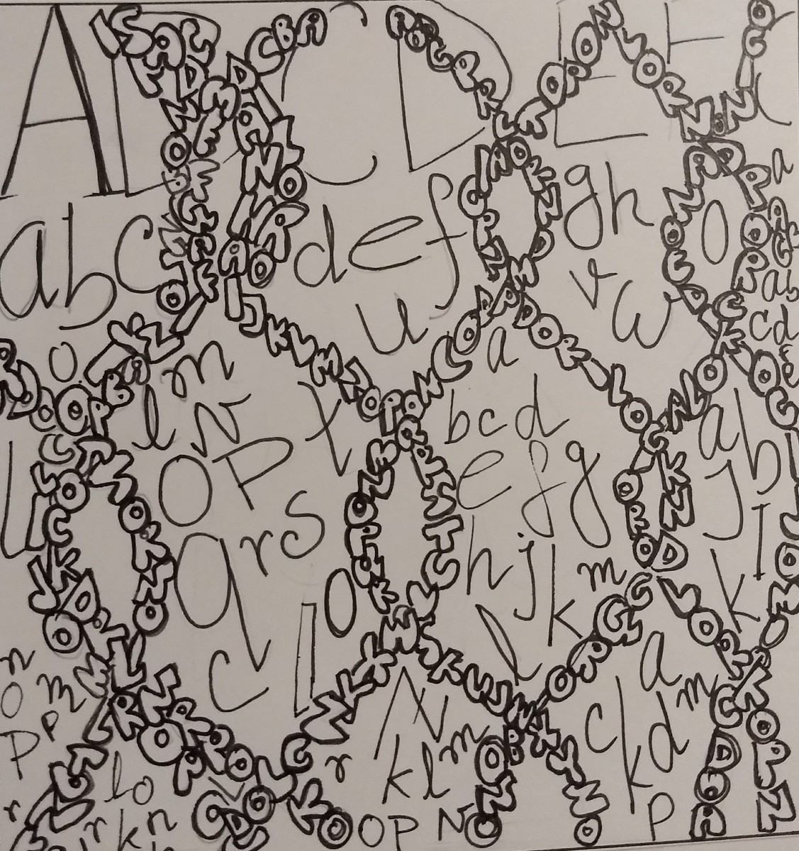 This is the line type composition i think the design is pretty good but contrast needs work also it has some empty sapaces which I should have filled but I was afraid that It would make it look messy like the other one
 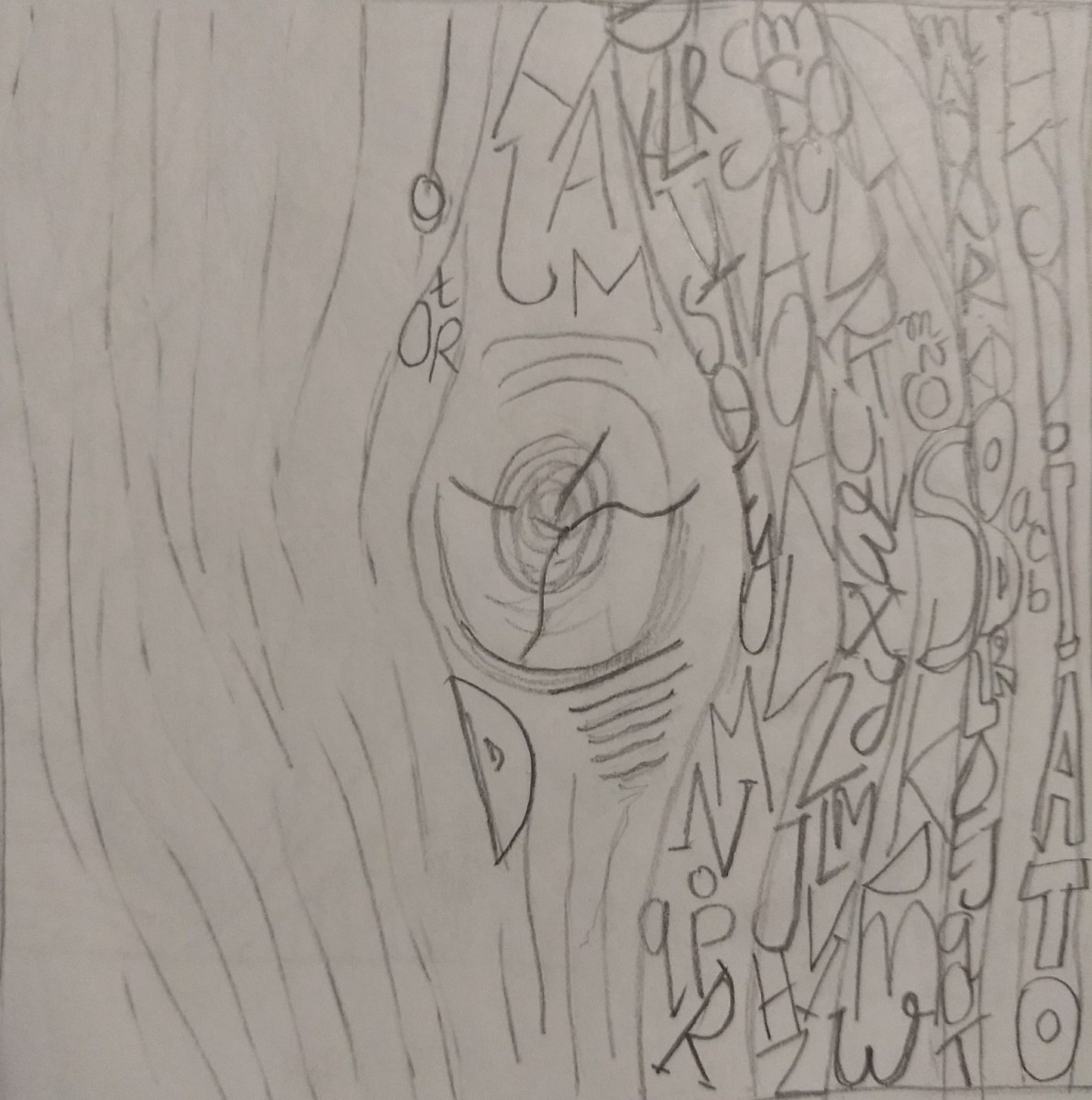 texture type composition
 line composition
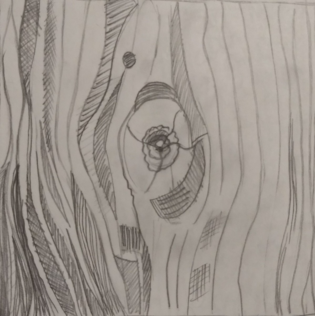 texture composition
Pattern Description- The feeling the image is projecting is overwhelmed, but also gives off a flowery vibe. This pattern has elements of both organic and geometric shapes. The line weight is really light and same throughout the photo. The shades are different and clear obviously. The mood of the picture is nice and flowery.
Texture Description- The feeling the image is projecting is that it makes me happy and hungry because I love pasta! The picture reminds me of home. The light on some of the pasta is bright and others in the back are way darker . High extreme contrast cause you can really tell all different shades.
P.S IN ORDER TO SAVE SPACE ON OPENLAB I TOOK ALL OF THE SKECTHES AND INKED SKETCHES IN ONE PHOTO SO SORRY IF IT’S HARD TO SEE.
The OpenLab is an open-source, digital platform designed to support teaching and learning at City Tech (New York City College of Technology), and to promote student and faculty engagement in the intellectual and social life of the college community.

