Developed In Ink Creations

Final Composition


Sketches

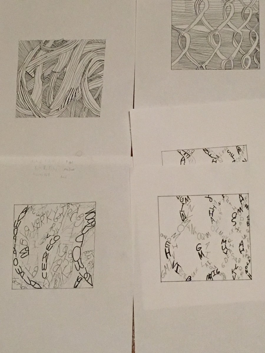
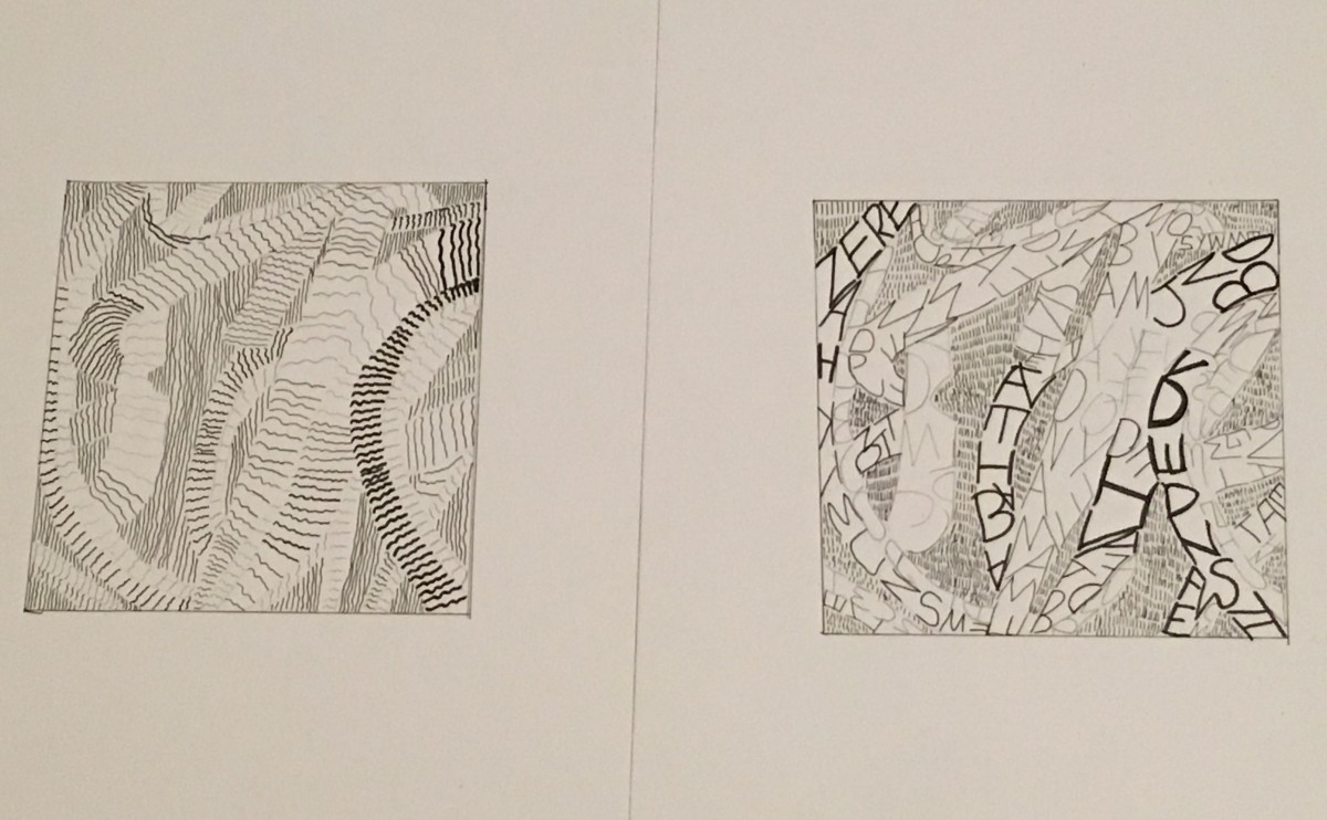
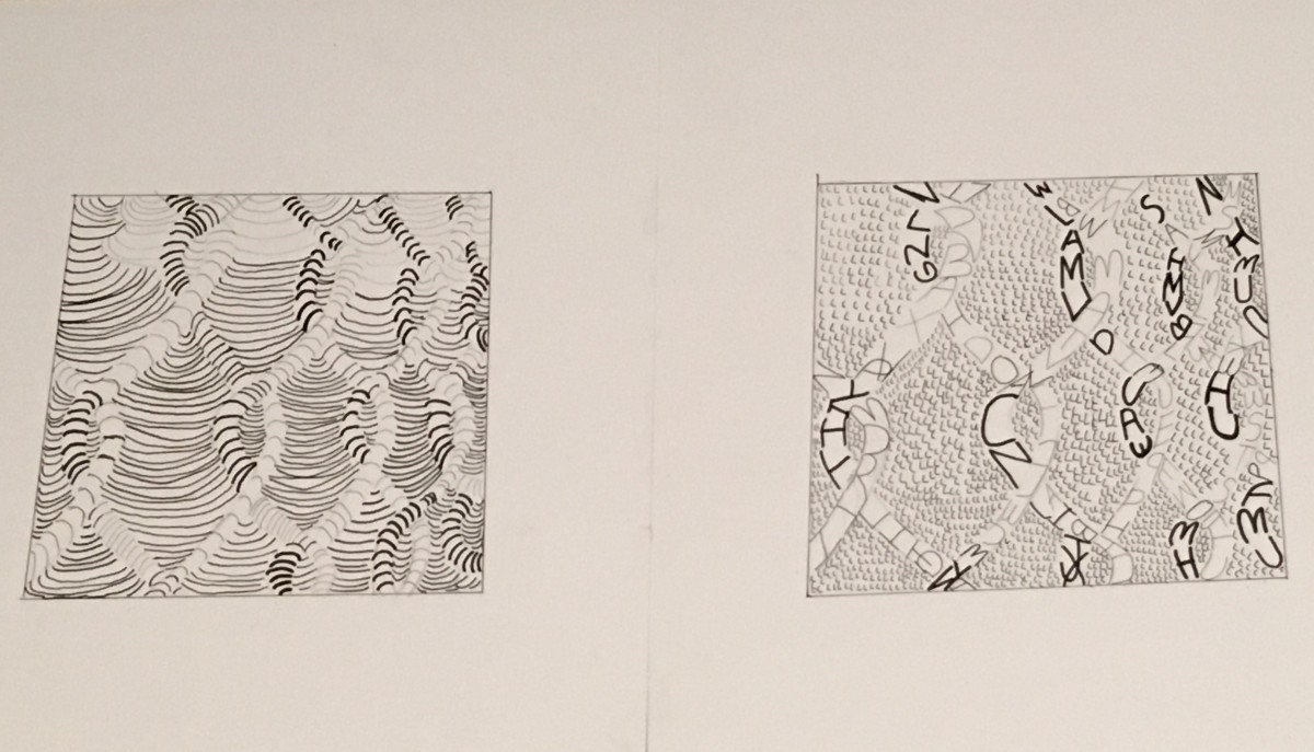
The photos I choose were the rubber bands/pasta(texture) and the wired fence(pattern).For the texture it gave meΒ  a state of flow ,and restlessness.The movement was also going vertical and the light source created varying grey tones. The pattern image was similar to the texture but more symmetrical with motion.To me it had an energetic/straightforward mood/feeling. It was not that to go from sketches to final draft because I understood the project and the steps that needed to be followed. I also kept in mind the mood and characteristics that the images had .

This entry was posted in Step 4 - Develop in ink on by .

About MattC

I am currently pursuing a BFA degree and throughout these years I plan on consuming as much knowledge as I can on designing. Most importantly I would like to better my skills and hopefully master the art of communicating visually. I have been working on photoshop and similar editing programs for around 5 years. I am a late novice in Premiere Pro and After Effects. I love photo bashing, photomanipulation and I am entering the world of drawing which is very tedious. I have done work for rappers/ hip hop artists and also small brands. Here is where you can find my current work that I come up with in my free time: β€”β€”β€”https://www.instagram.com/koansage/ β€”β€” At some point I will create a website that adheres to my work

Leave a Reply

Your email address will not be published. Required fields are marked *