
Strategy: 3 – The idea of having people in the background to represent the message was fine but I didn’t feel the energy from them
Layout/Design: 4 – The “M” logo worked very well on “Welcome”. Its a great representation but the layout didn’t match the message.
Copy: 5 – This does not feel like what the client is asking for. Warm message but bad execution.
Message: 1 – The message was welcoming
Creativity: 5 – It felt like they randomly slapped a message on a random photo and called it a day.
Normal
0
false
false
false
EN-US
X-NONE
X-NONE
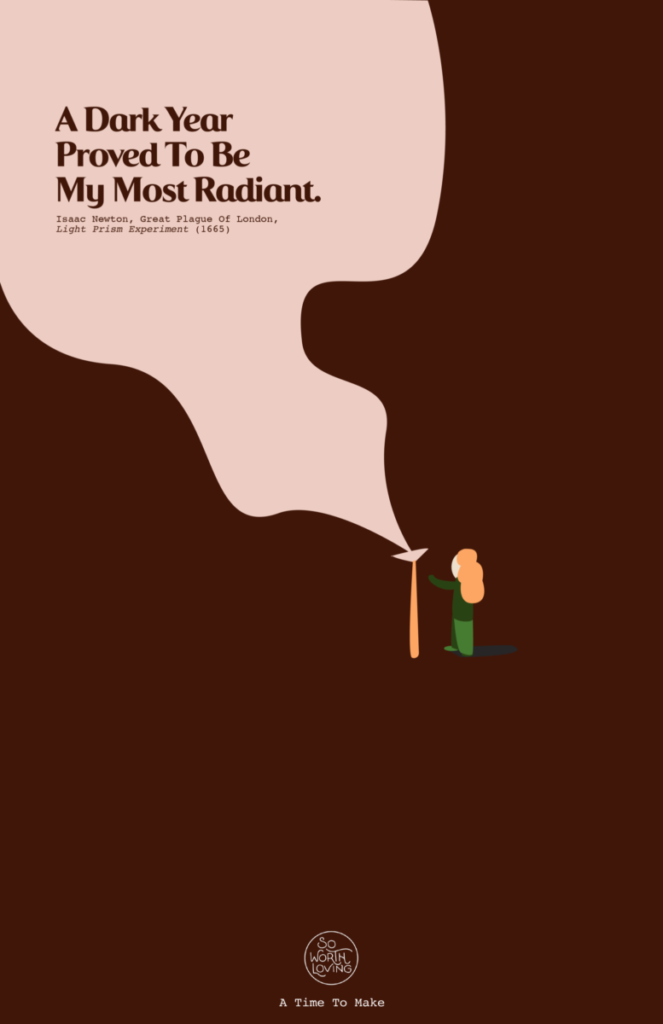
Strategy: 4 – I thought this was a coffee ad
Layout/Design: 2 – Illustration made me feel positive, but I didn’t get the
clear vision.
Copy: 1 – Great representation of what they want to be.
Message: 1 – Great positive message
Creativity: 1 – Simple design that works very well with the
quote
Normal
0
false
false
false
EN-US
X-NONE
X-NONE
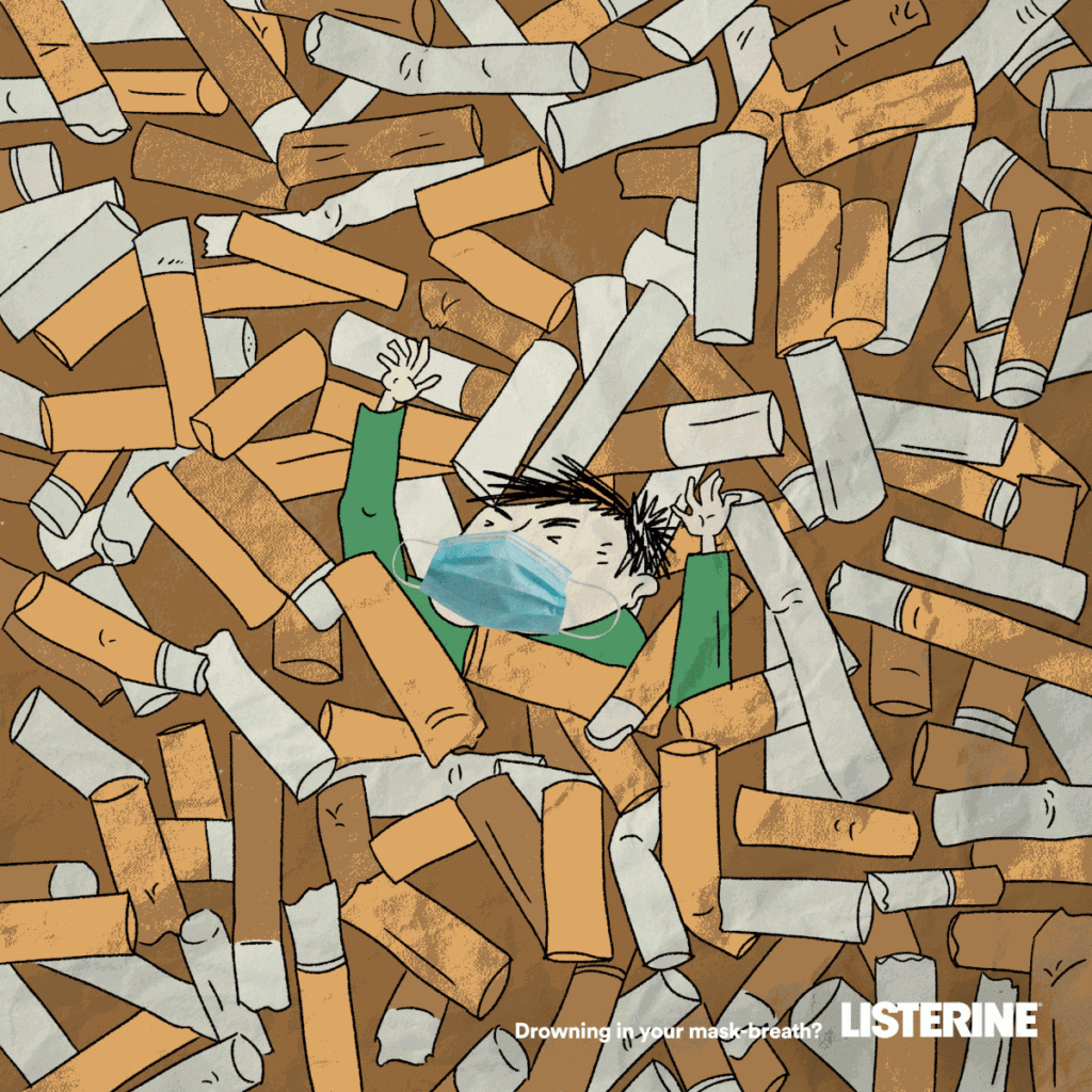
Strategy: 4 – I thought it was about 2nd hand smoking
Layout/Design: 5 – Background gave a different message to me. I thought it was telling me about the causes
of 2nd hand smoke.
Copy: 5 – The ad was quite confusing
Message: 5 – The message can be misleading. For all I know it sounds like
its okay to smoke and you can use Listerine to hide it.
Creativity: 5 – Great illustration but bad vision

Normal
0
false
false
false
EN-US
X-NONE
X-NONE
Strategy: 1 – Great execution and vision of what this ad was made for.
Layout/Design: 1 – It tells a story from designing a car with legos as a kid
to professionally design cars for a company.
Copy: 1 – This really shows the creativity of Lego
Message: 1 – Very clear and a strong message about creativity in children.
Creativity: 1 – Well thought and placements of the items that compliments
the product.
Normal
0
false
false
false
EN-US
X-NONE
X-NONE
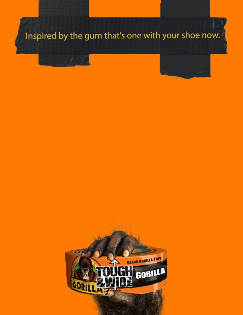
Strategy: 1 – Loving the simplicity and it gets the job done
Layout/Design: 1 – The design of the ad matches with the brand.
Copy: 1 – The message of the ad reminds you that their brand is that good
Message: 1 – The message was funny and clear at the same time.
Creativity: 1 – Well thought. A funny
message that tells you how great their product is.

Normal
0
false
false
false
EN-US
X-NONE
X-NONE
Strategy: 1 – Simple, people can easily associate the sound of the bus to opening
a fresh bottle of Coke Cola
Layout/Design: 1 – Color of the bus is very noticeable, and the typeface is
readable.
Copy: 1 – the color and the illustration of the product represents the brand
very well
Message: 1 – I love that the message is open for interpretations.
Creativity: 1 – Simple and it gets people to stop, then read the message and
then imagine the sound.


Leave a Reply