Design 1: The first design I created which was really not my best design since I was still very unsure of what route I was going for. I know that I wanted mainly a shape surrounding the typeface but wasn’t all too sure on which front fit inside the shape well. Here the font I used was Caviar Dreams but I feel it may have worked slightly but it’s too thin of a font to really suit the shape. It just makes the shape look very bold and heavy around it and not really blending well together as two forms being the text and background shape. Also, I felt it was really bland looking and it needed a bit more character to suit my brand of sorts/style.
The first design I created which was really not my best design since I was still very unsure of what route I was going for. I know that I wanted mainly a shape surrounding the typeface but wasn’t all too sure on which front fit inside the shape well. Here the font I used was Caviar Dreams but I feel it may have worked slightly but it’s too thin of a font to really suit the shape. It just makes the shape look very bold and heavy around it and not really blending well together as two forms being the text and background shape. Also, I felt it was really bland looking and it needed a bit more character to suit my brand of sorts/style.
Design 2:
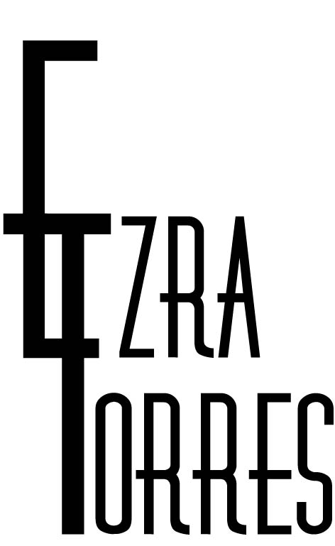
The second design I made that is still pretty good starting point to where it led me to my final design. Here I basically did my ligature plus adding my full name as well. I really liked the typeface I used for this called Diner which gives a 1950s retro feel which is my favorite era design concept wise being very art deco like. I could have made this design my final but I still really liked the idea of having my initials and a shape background concept for the final design. So keeping that in mind I hoped when I created my third design I could keep this typeface and have it fit perfectly inside.


Design 3:
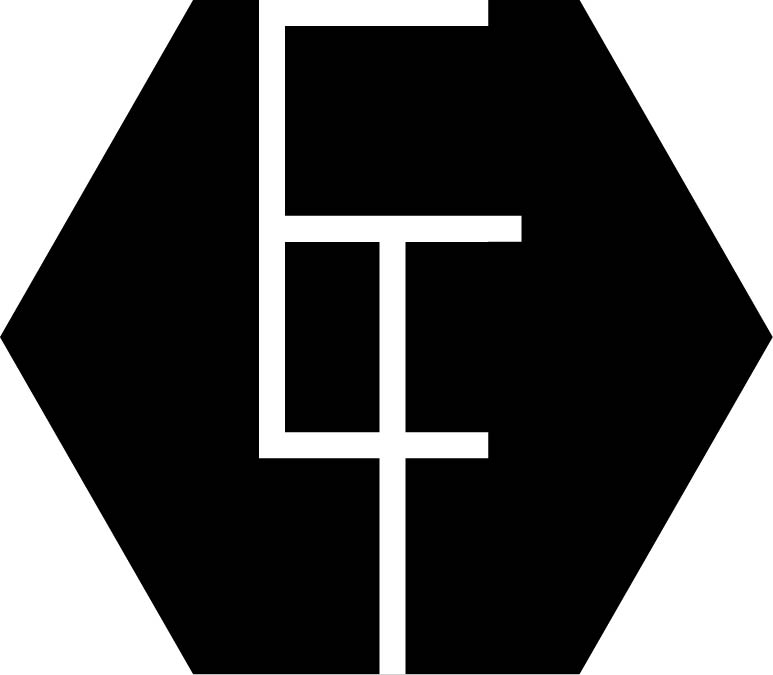
Here is my final design well the first of the final design on the left and the currently finalized design on the right. At first, I was really happy with the left design once I finished making it since it was all that I wanted to create in the first place but executed in the right way. It is using my preferred font diner from the second design while incorporating it with a square that I had turned which gave it like a diamond shape. That said I placed the ligature inside and resized it till it fit inside the diamond and added the “Digital media Portfolio” part on the side to really finish it. After that, I slowly realized the next day It could have something added to the sides which then I added the rectangle strips on the empty sides and that completed my ligature.

