Quick note: AJ (Alzerina Jewelry) | CV (Cabo Verde) | TOT (This or That) | JS (Jewelry Silhouette)
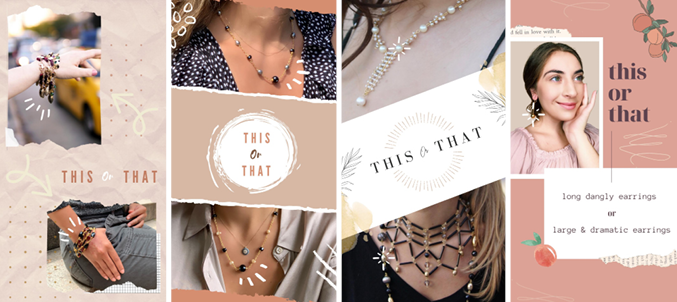
For this or that I wanted to create different looks and designs to make it more interesting rather than sticking to the mold, I had done prior. I made 4 designs for both CV and AJ showcasing different jewelry pieces that were similar to see which garners more attention. All the designs had fun animation effects to make the design more interactive and eye-catching so persons who would watch would be inclined to answer. Though I plan on making designs with more colors since I been playing it more neutral for the designs. I really want to explore more with pops of color like the first one on the right which is a mix of peachy/pink tones. I never want the colors or the choice of elements I use to distract too much from the photo of the jewelry pieces. Sometimes I find it difficult to find a good balance but after a lot of trials and errors, I feel I have managed to overcome those barriers.
This or That cont.
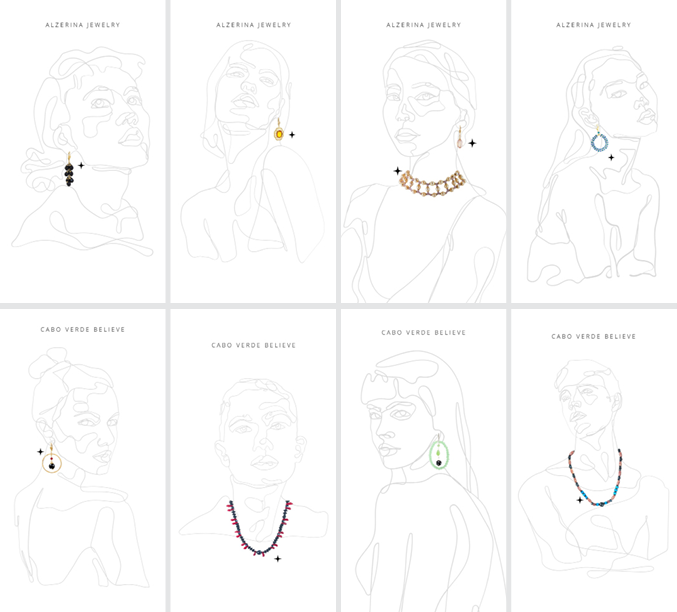
My boss wanted me to do a series on having silhouettes of women & men with the main idea to be showcasing their jewelry pieces of my choice. My boss had done something like it before but she wanted my take on the same idea. It took a lot of trial and error with this series and making sure each piece where used in the correct company either AJ or CV. I had a few mistakes from using their site to pick the jewelry pieces that I would mix of AJ pieces and CV. I had to correct a few and also tweak some of the silhouettes and also change some completely to satisfy my boss’s particular eye.
For example, the first female with the low bun on the top left she had a completely different earing before the one she has on now. I was told the earing prior got lost in the linework of the female’s silhouette hair/neck. I had to then look for an earing that would not compete with that to make the focus be the jewelry piece. I also had the gray that is being used darker until my boss said it completes for the attention of the jewelry piece so we decided on a light gray that made a good balance. I also had one silhouette that was supposed to be a female not used since her features gave the appearance of stronger features (the jaw mainly). I had to make sure each model gave off a more feminine appearance for women and for men a masculine appearance for clarity. In addition, since in CV’s photography, they don’t really have many male models so I wanted to include men for this series to show inclusion and that CV does in fact have a men’s collection.
Fourth Story series | Jewelry Silhouette