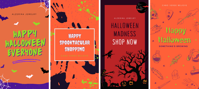
For Halloween, I made these for designs making 2 to be posted on their respective pages. I had a lot of fun making this series since I wanted it to be a bit more light-hearted but I also played with a spookier tone for the 3rd design (left to right). I got a lot of inspiration from looking up Halloween posts online through Pinterest and google searches. I got so many ideas that I was able to combine then to make these 4 designs that I’m really excited and proud to see posted on the 31st.
Starting from the beginning first design (left to right) I thought of all the things that remind me of Halloween and listed them. I think bats, spider webs, spooky blocky text, and the infamous Halloween color palette of green, black, purple, and orange. I wanted those to be the stand out colors to keep it bubbly and fun to suit the brand. I followed the same ideas for the next post but I wanted a more “Mature” design for the next two and the final would be more so lighthearted. My two favorites are the two on the left side since the AJ one was spookier and I had to combine a lot of elements to create the scene I had in my mind. As for the CV design I wanted a more “witch” theme which was fun to choose all the witch-like crafty elements.
General Story posts | Halloween Edition
Below I wanted to showcase the older logo my boss designed in 1998 to the newer one she had me design. She wanted it very similar to the one she currently has for the time being due to the fact she does not want to confuse her loyal customers from when her business began till now. My boss wanted to keep the same font and the same AG ligature but with a new gem style that looked modern. As well as wanting to get rid of the Paris and Cabo Verde bottom part and only keep New York. I had a hard time with the gem since I designed multiple gems up until she decided to choose the one I had done and asked me to add more triangles within the gem linework. Not only that she wanted me to find a similar font to the Alzerina font instead of the original gray clean sans serif. It took me a lot of trial and error and font hunting to find a font similar to the one she used until I came across it but realized the font had to be purchased. I used the part where you can test out the font and screenshotted it to place it into an illustrator. After that, I took the photo and image traced it to the black and white logo and was able to make the jewelry text just as the same as the original. Then showing her that she said to finally add the New York underneath with a clean modern sans serif so I chose Avenir and space it out to give the cleaner more modern look.
Her goal was for the logo to stay very similar but a touch more modernized and she was very satisfied and happy with what I was able to do after all the subtle tweaks she wanted with the logo till it was completed. It took a lot of trial and error to get the logo to how she wanted it but after all the hard work I feel I did do her logo justice to how she wanted it. In addition to the main logo, she wanted me to have the gem AG ligature on its own as a secondary logo to use for her jewelry line. As well as, the gem without the ligature to use on her new tissue packaging for the brand.
Overall, personally, it’s not entirely what I would have wanted to design for her logo if I had the choice. While in the first few logo sample trials I designed some that I thought would fit the brand and the identity she wanted for the brand. Though she didn’t particularly like them since she didn’t want any drastic changes but it made me think. I realized that you may not always be satisfied with a design you make for a client since it’s what they want 99.99% of the time rather than what you as a designer would want. In the real world, this is an experience that most designers have to deal with and this is my first time. I’m glad I was able to handle it professionally and give my boss what she had envisioned with my design skills.
Logo comparison | Final logos
![]()

