I wanted to continue to woman empowerment series since It’s been one of my favorite series that I have done so far. I love typography it’s something that I enjoy messing around with and playing with color as well. I also don’t necessarily need to use their photography since the core part of this series is the message behind each woman’s quote. I made a few color palettes I wanted to play around with each quote has a specific color palette I made to enhance the quote visually. Not only that, I wanted to use elements that paired well with each quote that made everything seem cohesive and meant to flow with the design. I’m extremely satisfied with how they all turned out and honestly they showcase to me something that I’m passionate about. But not only that but designs I have a really fun time in designing since the series stays true to what I believe in.
Empowering woman as a jewelry brand that is owned by a woman only comes across as a woman wanting to support other woman’s dreams. I know I briefly mentioned it in my other post when the series started but it’s still very much an important topic to me. If I one day have the opportunity and strive to have my own brand I always want women to feel powerful and remind them that they are capable of so much more. Women have every right to things that men have controlled for years. Though it is very important to showcase your own beliefs but obviously in a non-political way. This series goal is to uplift women and remind them of their worth. I want to continue this series and I’m glad to continue researching powerful woman’s thoughts on uplifting other women.
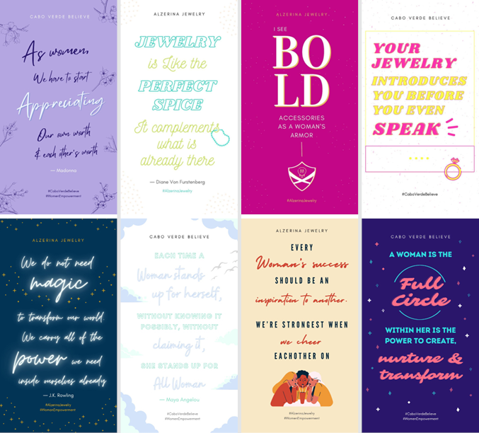
Woman Empowerment Quotes + General Jewelry Quotes cont.
Continuing to explore with logos she was looking for a potential font change although she was still in favor of the font already use for Alzerina Jewelry. She stated if she wanted another font it would have to be a more modern sans serif that suited the brand’s image and was clean with less adornment. I gave 4 font options from Glacial Indifference (my personal favorite), Futura, Montserrat (second favorite), and Lato. I felt as though these fonts gave the idea of what she wanted for her brand as well as using those fonts I created ligatures. I made a few variations of the ligatures and hoped that she would prefer one ligature compared to the others. I sent these yesterday so I should be hearing back from my boss to see what she is thinking for the next round of perfecting the final logo.
Logo exploration cont.
![]()
![]()
![]()
![]()

