Quick note: AJ (Alzerina Jewelry) | CVB (Cabo Verde Believe) | JOTD (Jewelry of the Day)
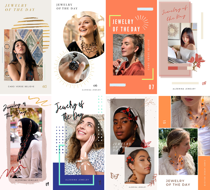
I’ve been working on a lot of jewelry of the day content for Alzerina and Cabo Verde’s social media accounts. I have managed to get adjusted to playing around with the app Canva since the CEO mentioned I should use it since it had lots of specs and content perfect for me. Getting to know the app was quite easy and made things for me quite quickly since everything I needed was there already. So far I have made 8 JOTD story posts and I wanted it to be a mix of modern, bright/bold but also have days where it’s more neutral and aesthetically pleasing. My boss is very vocal when she sees something designed that she’s not fond of so luckily she hasn’t stated any of the designs I show her are not fitting to what her brand is.
Though I was thinking of bringing up the idea of a brand guide since I feel it could make my job easier so I don’t create content that conflicts with her brand image. I’m thinking of how to go about it since I want to bring it up in a professional manner so I will be preparing a google doc with potential questions like “what colors should be included or avoided?” or “what font would you prefer we use for our designs”, etc. It would be a temporary guide to help me get a better understanding and could also potentially help the next designers that come in once this internship ends in December. I want to showcase my ability to work with clients and understand and showcase their vision. I want to bring this up as soon as possible so I will be awaiting our next upcoming meeting to use it as my chance to bring it up as well as my next idea for another story series. I was thinking of a Q&A this or that situation to have more interaction with AJ and CV’s social media followers.
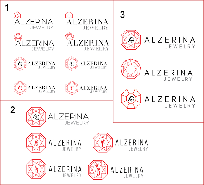
Logo Redesign | Work in Progress
My boss spoke to me in the first week or two that she wanted to change her logo to something more modern but still keeping similar elements from her current logo. She mentioned how old her logo is and how she’s ready for a change but worried if we stray too much from the old design her clients may be confused. I asked her why she would assume that and she said that that logo been used since the 90s. It’s something memorable and classic that her clients instantly know its Alzerina’s brand. As for the elements and ideas she had for the logo she wanted to modernize it so using a sans serif styled fonts but she was open to serifs but they had to be very “chic and clean”. Also, a red gem in the new logo similar to how she has her initial ligature in her current logo and simplifying wording to Alzerina Jewelry without the “New York, Paris, Cabo Verde”. In the images below I showcased in #1 the starting designs until she said she wanted an 8-9 pointed gem instead of a 5 pointed gem. She preferred the sans serif fonts more which lead me to #2 still messing around and exploring ideas on how to use the gem without adding it to the Alzerina Jewelry. She wanted the AJ to be separate from the gem ligature. Lastly, #3 is still be continuing the process and still messing around with sans serif font and ligature designs for her Initials A.G plus gem styles.