Author Archives: Yunique Griffith

Project 5 (Final) Sketches and Compositions (2)


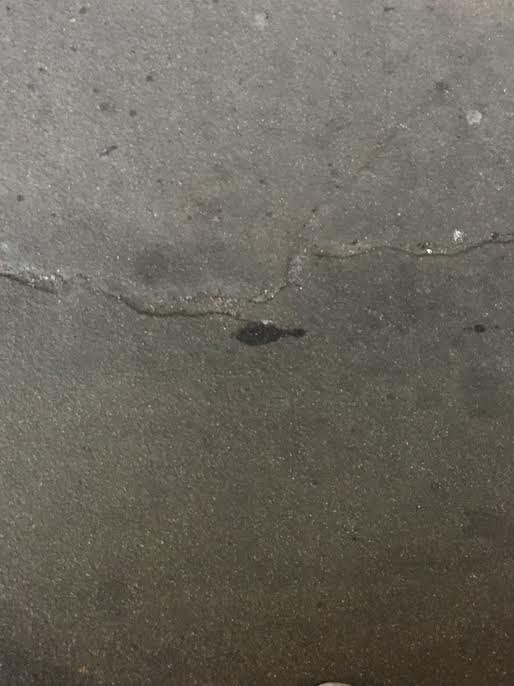
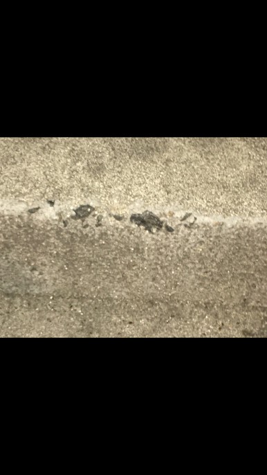
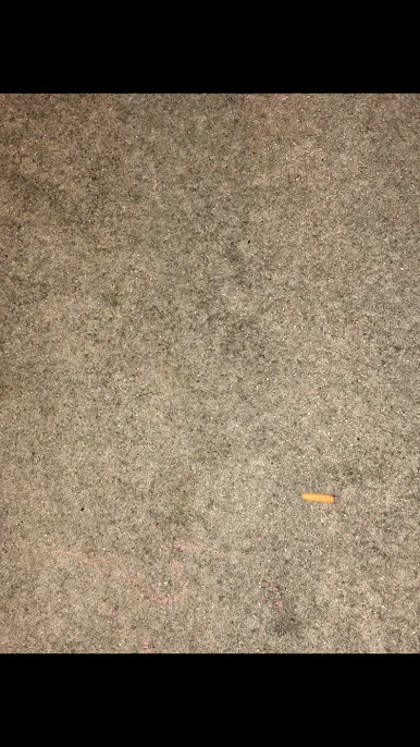
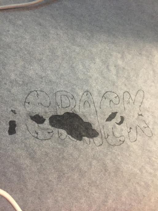
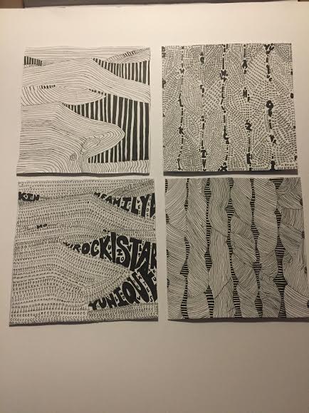
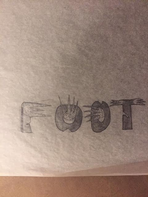
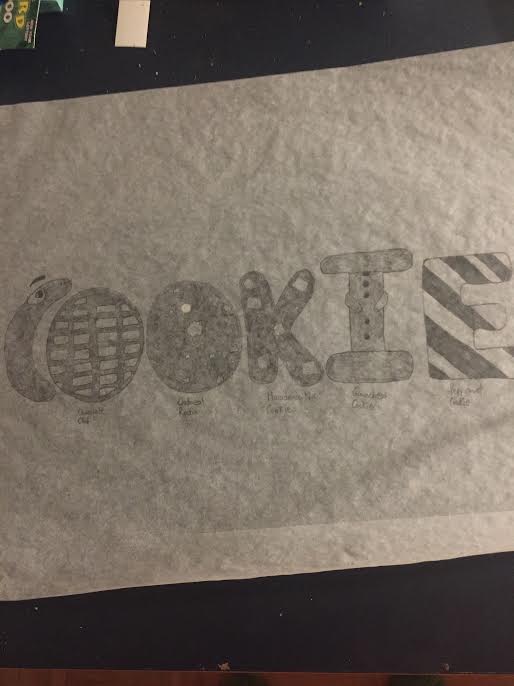
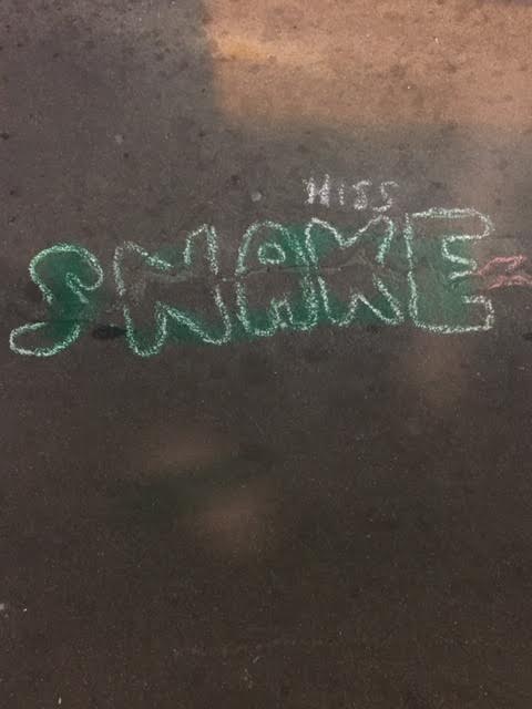
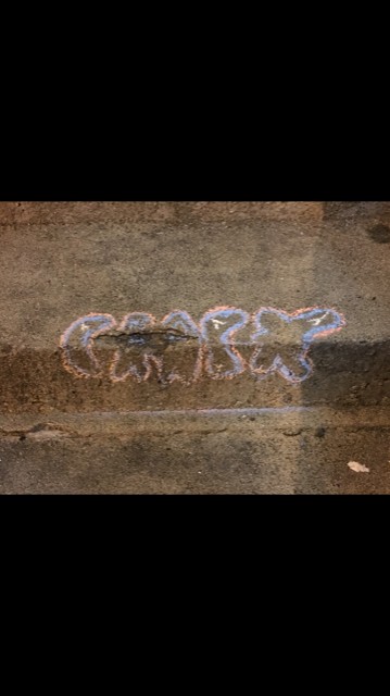
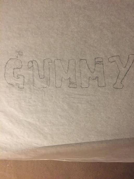
Overall I’d say this project was in a way frustrating, yet fun for me. The reason why I said it was frustrating was because I’m very detailed so it took me more time over the weekend to ensure that everything was right. For the top two pictures of mine the first one was a picture of different ginger ale bottles I’ve seen so when I sketched them out, I decided to arrange them and draw letters out of it. The second sketch of mine was that of a pothole I saw and decided to use that as my focal point and create a chocolate chip cookie. I also decided to use the rest of the letters as different kinds of cookies with the “c” eating them. My last sketch (last pic) was that a series of gum in which I found that I decided to make the font gummy while having the clump of gum on the “g” as my starting point. The last of my final compositions were that of a cigarette bud acting as it’s on fire. I wanted to create a more dangerous appeal and show off how dangerous cigarettes can be to someone. My second final composition was that of a crack that resembled a snake to me. I decided to create the word snake with the ending of the word acting as the snake head. Lastly, my third composition was that of a crack on a set of stairs. I didn’t like the way it came out especially with the last “c” and “k”. It was kind of hard to pull it off, but I wanted to challenge myself. It also rained a bit that day, but most of my work was preserved. This project was fun and I find this interesting that no matter where you are, you can make art out of anything.

Project 5 (Final) Sketches & Compositions

Pictures & Sketches #1

This is my first series of images I’ve decided to do. The first 3 photos will be that of a crack on the street that to my vision, resembled a crooked snake. I decided to use it for my final composition. My second image is that of a large crack on a set of stairs. I also decided to use that for my final composition. My last image is that of a old cigarette bud that will also be used for my final composition. The rest are sketches that I decided to explore for others pictures I took, but will not be posting for the sake of space.

Project 4 – Final Compositions

For my final compositions, I decided to keep my original experimentation of my colored selfie. The reason for this is that I like the way most of my color was portrayed throughout the pictures. For my first composition which is complementary, I liked the aesthetic of which the red  showed throughout the image. I kept my facial features even when I implemented color throughout my image. My mood did not change for this one because we were only experimenting with two colors of my color wheel. For my triad image, I liked the way the image came out because it gives a negative mood toward my selfie. The different variation of colors I used was all dark colors in which completely changed the mood of my selfie. When I first started out with the triad image, the mood of the selfie represented happiness, but then when I implemented the colors the mood had changed sinister-like. Also for my triad image, the focal point I wanted to achieve was to make my glasses a different color than the rest of the image. Lastly for my analogous image, my image completely changed from the three colors I used from my color wheel. For this image I used three different hues of green, but the image came out too bright. What I wanted to achieve was to make my eye target something, but instead I decided to make the lower half a light hue of green. Overall from this project, I liked the way I was given the freedom to play around with colors in photoshop with my selfies. I also learned a lot about photoshop and if there is ever another project that involves coloring my pictures, I can know what to do and how to achieve different variations of color. What I can do better for the future is to achieve a better result of my analogous image.

History of Green “Step 3- Develop”

The color green to many people is not a color, but in fact a symbolic representation of life, purity, ecology, luck, and rebirth. Green is universally associated with nature and many people believe that it has a higher meaning and place. In many Muslim countries, many believe that green means green man: symbol of fertility. Green not only gives people the understanding of life and nature, but also grants people luck. The reason why I chose the color green for this project was because it represents hope and a healthy life for me. It has always been one of my favorite colors since I was a child and I believe that it brings our nature together as a whole collective. All throughout the world many countries think the color green represents impurity, luck, and bad news. Many people all have their own understanding of the color green, but to me it sticks because it has gave me the idea of hope and believing. Green also represents my personality a lot because the idea of being lucky throughout my neighborhood is scarce. Many people in my area don’t finish high school or attend college. I was lucky enough because through perseverance and hard work I made it to where I’m today. Green is not only a color, but a universal representation of life.

Project 4

My first picture is my complementary selfie. I had my favorite colors which was green to be the background of my photo and the other complementary counterpart of my favorite color which was rubine red. I liked the way it turned out because I kept the mood and the features of my face which weren’t lost. My second image is my triad and I also liked the way it turned out. Once again since my favorite color, green, is being repeated as my primary it instead of it being the background, it showed as my foreground. My second color of my triad was violet and I decided to use that as my background. For my third triad color, orange, I decided to use it as a part of my glasses. I thought I liked my triad composition better than my others because the whole mood of my image changed from happy to sinister. It definitely showed a lot a lot of negative connotations throughout it. Lastly I have my analogous. Personally I thought I could’ve done better because the bottom part of my face starts to become distorted. My mood for this was non existent, but it was a part of my experimentation process. My analogous colors were a lime green pantone, a green pantone (primary) and a mellow green pantone.

Final Collage

For my final collage it took me a long time to create something unique. Since we’re on Project 3 already I wanted to create something that was different in which I added a little hat cut out form the carvings of my dark tabloid images so that it resembles a sort of festive theme background. I got this inspiration from my third collage, but decided to add a little bit more so that it can give it more life. I also cut out a piece of my sweater from one of my lighter darker images from my tabloids so that it acted as a blanket. I also decided to incorporate hans from magazines that were actually holding onto something, but I decided that I wanted it to clench onto the blanket. The focal point for this collage can be a variety of things, but I wanted it to be the different tones of my eyes and mouth. I’ve decided to keep my grey scale simple by going downwards from dark to light. This project was really fun and it gave me so many ideas on how to push this through.

Collage Sketches

To start off my mood for my collages is fearful. I wanted to achieve something unique, yet interesting within my pictures by adding some elements that dealt with a cartoony and realistic vibe within them. This first collage of mine added both the cartoon and realistic aspect of my images within it. I decided to incorporate images both from my tabloid and letter size images into it to give it a different appeal. The reaction I wanted it to be was that of me looking at something while also shrieking with having sweat drops. One thing I could’ve done better was by adding more sweat drops and to incorporate more body parts into my collage that was taken from my pictures.

My second collage was more on the cartoonish side and I decided to actually draw hair into my collage, but the more I looked at it I’ve decided that I didn’t like it. Once again I decided to add pictures from both my tabloid and letter size photos into my collage. The focal point of this collage is my large mouth and eyes almost as if it’s looking at something frightful, but that is the point of my entire mood/emotion. I’ve also decided that I wanted to add the lower part of my neck down to my sweater from my photo to give it that humanly look while also maintaining that it looks goofy. One thing I thought I could’ve done better was to make the hair darker so that it doesn’t give off the paper’s color.

For my third collage I wanted to try something different. For this exact collage I wanted to make me look like I’m actually hiding from something. So I’ve decided to carve off the dark picture of my sweater from my tabloid images so that it acted as a blanket. The hands are something that I’ve found in my little sister’s magazine with someone who was actually holding something, but I wanted it to act as if these hands were clenching onto the blanket. My entire point of this collage is to sway people into looking at the irregular colors and the different sizes of my hand. That’s what I wanted my focal point to achieve. One thing I could’ve done better was to add a head or maybe even a hat and a mouth. This collage gave me an idea for my final collage, but instead enhance it to make it stand out.

Final Compositions

I thought this project was quite interesting towards the middle of it. During the beginning of this project I was lost and confused because this was something that I’ve never done before and it required me to push myself and be more creative. To be honest I started becoming quite frustrated towards the sketching part due to me being to detailed in which required a lot of time to get these done. I also had so many ideas into what I wanted to put into my final pieces and it wasted some time for me. What I could’ve done better was to stop wasting so much time for my sketches because after all they’re just sketches. In the end I’ve figured it all out and I thought it my pieces were great since I took back feedback and put them into my work which worked out in the long run. My creative process for this was long, but it was worth it and I’m proud of my work.