

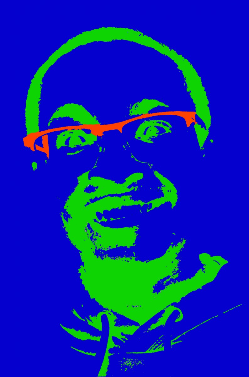
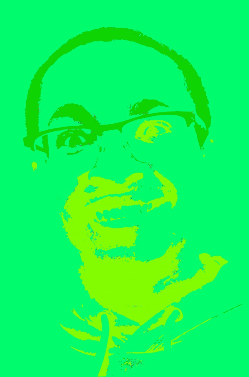
My first picture is my complementary selfie. I had my favorite colors which was green to be the background of my photo and the other complementary counterpart of my favorite color which was rubine red. I liked the way it turned out because I kept the mood and the features of my face which weren’t lost. My second image is my triad and I also liked the way it turned out. Once again since my favorite color, green, is being repeated as my primary it instead of it being the background, it showed as my foreground. My second color of my triad was violet and I decided to use that as my background. For my third triad color, orange, I decided to use it as a part of my glasses. I thought I liked my triad composition better than my others because the whole mood of my image changed from happy to sinister. It definitely showed a lot a lot of negative connotations throughout it. Lastly I have my analogous. Personally I thought I could’ve done better because the bottom part of my face starts to become distorted. My mood for this was non existent, but it was a part of my experimentation process. My analogous colors were a lime green pantone, a green pantone (primary) and a mellow green pantone.


I think you chose great colors for your compositions and that your work really pops. Maybe you could have switched the colors around for the analogous one to be more visible, but overall i agree that its fun experimentation process as you said.
Ya I also liked the colors that you choose especially on the first and last composition