Author Archives: Angela Iacono

Final Composition, Sketches, and Photos

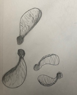
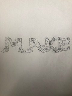
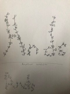
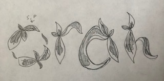
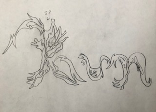
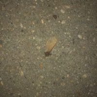
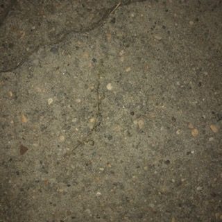
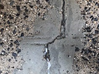
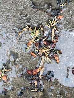
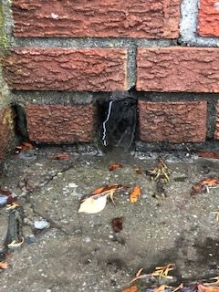
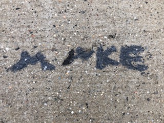
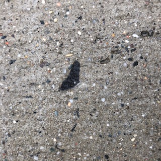
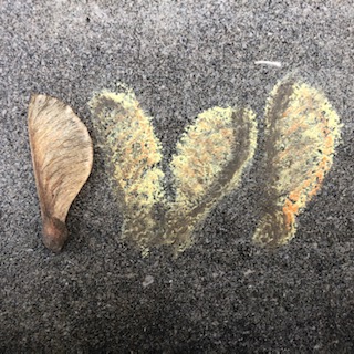
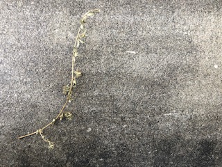
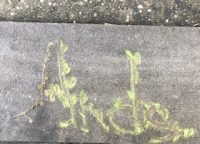
For project five I really went through a lot of trial and error. I couldn’t use some of my photos that I initially wanted because it had snow in the photo, was on someone else’s property, the ground was wet, and the object in the photo had disappeared the very next day. So with all of these new challenges I realized that I needed to take photos of objects that I could either pick up and take home with me or take photos of something that I knew wasn’t going to disappear or distort. I really enjoyed the sketching process of this project and felt that my typeface based around the crack that says, “MAKE” was my best one and I really enjoyed doing the stick with leaves one as well. I struggled at first trying to sketch out ideas for the little sapling thing I found on the ground but then looked at it in a different perspective and found that I could spell out DVD. After the sketching process was complete I was excited to start the chalk part of it. But, unfortunately nothing was working. The surfaces that I found my objects on were way too rough and bumpy to actually see anything that I was doing with the chalk. So, I stayed in the same area but I had moved my stick and the sapling thing slightly to the left and onto a smoother surface because not only was the ground really bumpy and the words barely readable but the ground was wet and created little puddles in the cracks. I found it challenging to mix the chalks and ended up layering up the colors hoping that it would get to what I wanted. For my stick with leaves one it ended up being more green that I had hoped. The brown chalk was just not mixing with the green and it was difficult to make it look dead, it ended up looking lively. I think I had better luck with the sapling object because the colors I used mixed better, I still think the brown could have been darker but it wasn’t mixing with the charcoal I had and wasn’t working. Lastly, I had to do the word, “MAKE” so I went to where the word was originally found, started doing it with the chalk and quickly realized that there was no way that you could even see the word make. This is because the surface changed in elevation multiple times and the ground had things poking out of it such as rocks and wasn’t the smooth surface that I had thought it would be. So instead of working with it I went to look for another object and or crack and found a black shape that sort of resembled the same shape that I was originally going for. I used the charcoal to create the typeface and no matter how many layers I put down it still wasn’t getting darker. Overall, this project during the sketching process was enjoyable but I found it difficult to actually bring those drawings to life with the chalk due the outside forces of nature.

Museum Visit

The painting I chose is from the Brooklyn Art Museum. It is called, “Late Afternoon, New York, Winter” and it was done by Frederick Childe Hassam. The Museum lights got in the way for some of the painting, so the lights in the upper left corner going down are not apart of the painting.

Final Composition

In this project it was fun to be able to finally work with color. For my compositions I wanted to keep it fairly simple but still interesting to look at. For my first photo, the complimentary composition, it was rather easy to work with since it only involved the two colors, light orange and grey blue. The blue C.M.Y.K numbers are C:36, M:17, Y:2, K:7 and the light orange C.M.Y.K numbers are C:11, M:27, Y:33, K:0. For my triad composition I chose my right eye as the vocal point and played around with the background so your eye really draws to the right eye. This composition came easy to me because I immediately knew what I wanted to achieve. The new color that was needed for the triad composition was the purple, and its C.M.Y.K numbers are C:47, M:60, Y:12, K:0. For my analogous composition it was difficult to choose a vocal point as well as choosing which colors were meant to go where. The composition is sort of hard to see and I struggled with the colors a lot. I first chose my eyes as the vocal point but quickly realized it was starting to look too similar to others and I should choose a new vocal point this time around. So I chose the mouth as my vocal point by putting a green bar around it. I think it turned out well in the end because the green really sticks out while the blue and the blue green sort of blend together. There are two new colors introduced to this composition and those colors are the blue green for the background and the green for the green bar. The blue green C.M.Y.K numbers are C:49. M:0, Y:23, K:0 and the green C.M.Y.K numbers are C:56, M:0, Y:58, K:0.

About the color Blue

Blue is my favorite color because it’s the most pleasing to me. It also makes me feel calm. I also like it because I associate the color blue with the winter and that is my favorite season. Many people have found that blue is the color that makes them feel secure, peaceful, and orderly. Not only does it make them feel peaceful, but it also makes people more productive. The color blue is the worlds favorite color because of the peaceful nature attached behind it, for example lakes, oceans, waterfalls, and because the color makes people feel secure. Although the color blue is the worlds most favorite color it is the worlds least appetizing color. According to dunnedwards.com people started, “making blue pigments…About 6,000 years ago, humans began to develop blue colorants, Lapis, a semiprecious stone mined in Afghanistan, became highly prized by the Egyptians”. Many people adored the color blue back then and still do today.

Final Compositions

The Photo is facing the wrong way, it is supposed to be vertical not horizontal. I really struggled finding a good balance between light and dark, I was either too light or too dark. Once I finally found my middle ground I didn’t have to edit much. For the type pasta composition I made the dark areas darker and I also added more dark lines in the pasta one. For my pattern pieces it was a little less of a struggle, I believe this because the pattern image had a lot less going on and the shades were clearer. I think my type composition for the pattern turned out nicely and it was the most fun to do especially creating the medium tones.