Author Archives: Russell A

Russell Armfield Project 5 Step 4 Deliver

Russell Armfield

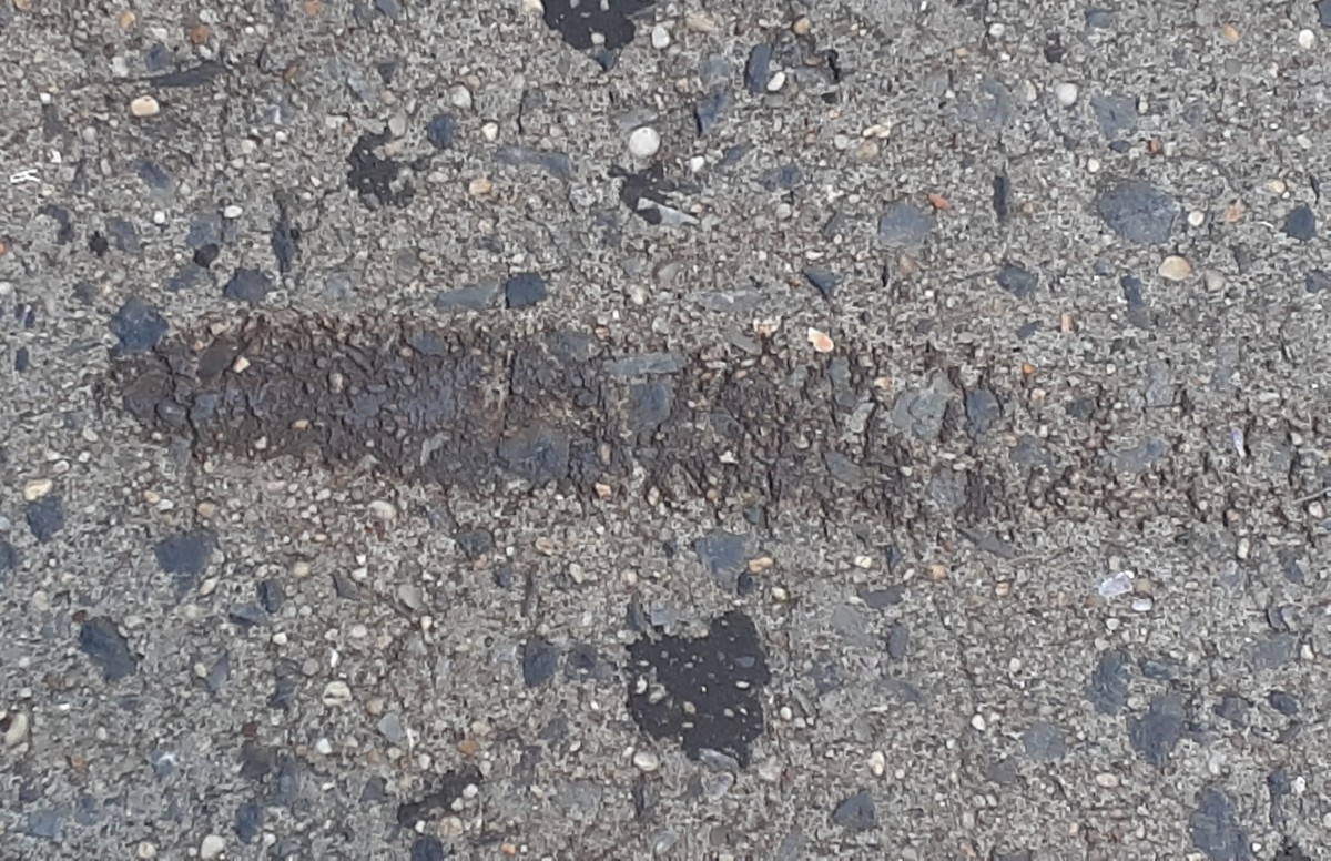
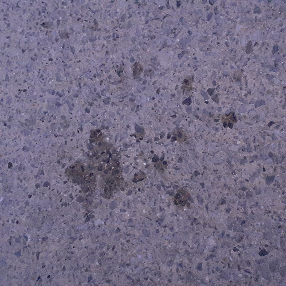
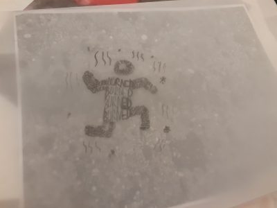
My first piece depicts a figure who has been burned on the ground. Ashes and smoke are surrounding them. The figure is composed of the word “burn”. I got the idea by looking at a tiny brown part of the ground that looked likes it’s been burned.

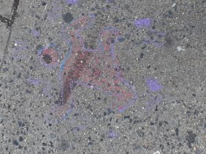
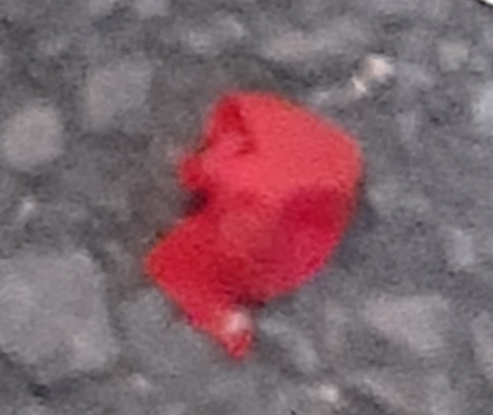
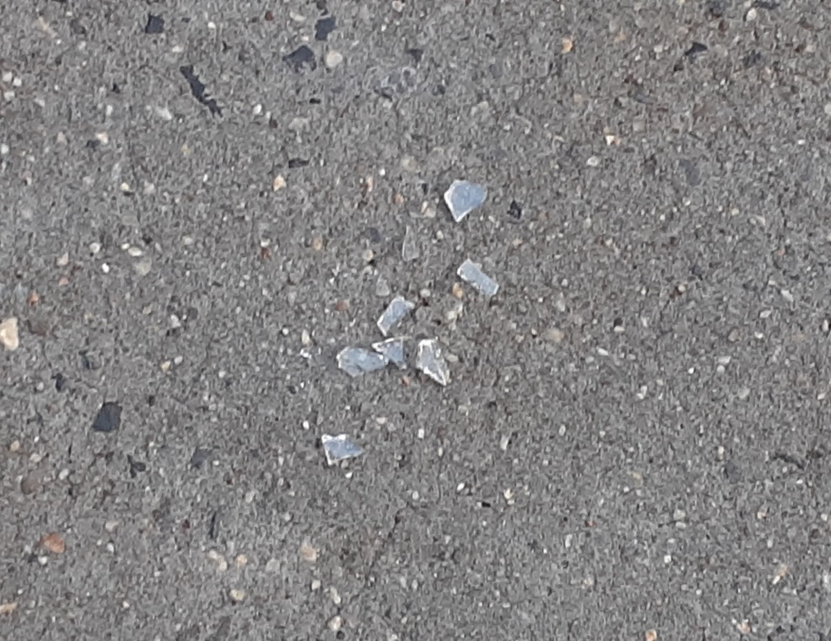
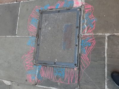
My second image is shows figures attempting to escape from a manhole and a symbolized blood around them. The the blood and figures are composed of the word “help”. I was inspired by looking at manholes and wondering what’s under them

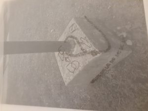
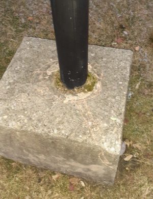
My third image shows a rope tying itself around a pole. There’s a bit of a western theme as well. This is a pole near my house that I used to play on as a kid so it was on my mind and inspired this drawing

Overall I think this project came out well but my text could’ve read better.

Russell Armfield Museum visit

Russell Armfield

Museum visit


This art is a gif. I was featured on a tiny screen near an elevator)

Dain Fagerholm incorporates an array of different design elements into “Gem Creature GIF”. It was featured in the Museum of the Moving Image in Queens. The piece consists of scribbly lines in which some are colored while others are black to give the image some sort of a texture. Although the lines aren’t the creature in the piece is composed of very round shapes with the item he’s holding being in a diamond shape with mini diamonds inside of it. There is negative space shown in the sky where the creature is displaying his object to make it a readable image. The size of creature seems to give off the connotation that the creature appears very big in size with the land he’s on. While some parts of the image contrast to make individual objects stand out on their own, it’s able to work itself into an image.

This piece is very similar to the texture and pattern project. Both my project and the museum piece share a similar type of motion in the visuals. They both have a sense of rhythm even if when being viewed as static images.

Project 3 – selfiemotion

Russell Armfield

For the selfiemotion project, I chose fear as my emotion

In my first version, my goal was the make an image that inspires fear rather than evokes it. By taking elements that make something scary like dark shadows I tried to make something that indicated fear. It didn’t work too well and I needed a better variety of shades.

In my second sketch I tried to evoke the idea of fear more. Rather than caring about my image, I got more abstract with this idea.

In my third image I continued the idea of abstraction but with a different angle.

In my final project I put elements I liked from each of these together create a collage that I’m rather proud of.

Step 4-Deliver

(My finals were handed in during class. Below is only my development. None of my finals are present on this page in particular.)

Obvious:  

Ambiguous:

I’m have a mixed feeling on my assignment. While I believe the I created interesting designs but they weren’t up to par with a few of the expectations set. While not intentional, their was a bit of a lack in consistency in my finished pieces. The marker I used wasn’t too consistent, even if I did apply many coats. Another thing to note is my obvious didn’t completely hit the 30/70 relationship it should’ve.

Step 4-Deliver

(My finals were handed in during class. Below is only my development. None of my finals are present on this page in particular.)

Obvious:

Ambiguous:

I’m have a mixed feeling on my assignment. While I believe the I created interesting designs but they weren’t up to par with a few of the expectations set. While not intentional, their was a bit of a lack in consistency in my finished pieces. The marker I used wasn’t too consistent, even if I did apply many coats. Another thing to note is my obvious didn’t completely hit the 30/70 relationship it should’ve

Russell Armfield Project 1

Taking a walk on my way home from Citytech, I found several objects that either have extreme contrast to their backdrops or blend in. I found several organic shapes or items that have a more obvious figure/ground relationship. The first of the obvious relationships is a black dot against a much lighter sidewalk, while the second is a dark color against lighter pavement. The third image of this group is a red piece of fabric against a gray backdrop. The ambiguous figure/ground relationships were much harder to spot than the obvious ones, all of them organic. The first of the ambiguous figure/ground relationships is a dark brown street against a lightly colored sidewalk, with the second one being glass on the sidewalk. The third and final image of this group is a liquid stain on pavement.

I was attached to most of these objects I took pictures of because I was curious about how they ended up on the road or sidewalk. After taking the photos, I made up stories about how the situations or objects on the image came about. For the first of the obvious figure/ground relationship images, I presumed that a drop of wet concrete was dropped accidentally and dried up. For the second image of this group, I think that an old ripped dress had it’s pieces blown by the wind onto the street. For the ambiguous figure/ground relationships, I think the first one was from someone painting a streak with brown paint that dried up over time. The second of the group could just be someone dropping their phone and having the screen crack and fall out. The third and final image of this group is from a spill of soda.