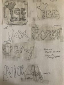
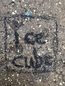
For project five i struggled a bit with finding the right object to make a typeface out of. I first started out with pictures of snow but quickly realized that i cannot use my original idea because the snow had obviously melted away. I eventually found some other promising things like cracks in the ground that could work well. When it was time to sketch you were able to see every detail that i had traced, it flowed well and when i finished my sketches i was really happy with how they turned out. But then it came to actually using the chalk and charcoal on the concrete surfaces. I found that in order for this to actually turn out like your sketch you need a really smooth surface and something that picks up the details well. When i started doing mine i realized that it was going to go south real quick. The texture of the sidewalk was NOT good for the chalk at all and i could barely get any of the details in because it was rough. I knew i had to make it work and i tried to the best of my ability to get it to resemble my sketch. I also tried mixing the colors of the chalk but i had a hard time and decided to make it more readable instead of having it blend in with the actual ground. My thinking was if i couldn’t read it or see what it says i didn’t really create the best typeface. But its a double edge sword because you want to be able to read it but you also want it to be able to match the sketch and have all of the detail within it.
Author Archives: Maria Iacono
Museum Visit- Maria Iacono
Project 4- Deliver
Project 4- Develop
High Contrast Selfie- Project 4
History of the Color Purple
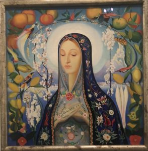
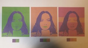
The color purple in history was known for representing royalty. According to the History Channel it says “the color purples ties to king and queens date back to the ancient world, where it was prized for its bold hues and often reserved for the upper crest.” If you were able to obtain purple dyes this meant you were probably royalty. It was very high in demand and only the richest of people could wear this color. Everything made from purple dye was expensive even clothes. Royalty would often say that they were “born in purple” because of how rare, rich, and expensive it was.
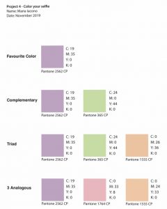
Project 4- Color Your Selfie
Project 3: Selfie Motion Deliver
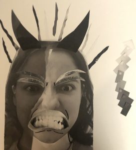
Here is my final collage. I added more pieces of paper to up the contrast to try and achieve more of the grey scale. I also added lines to emphasize the focal point which is the mouth. I also made the final decision to put the flames behind me which worked out pretty well and didn’t look like it was stuck on there. To me it looks like it’s coming out of my head. As for the grey scale I poked holes in it so you really can see the full transition from shade to shade.
Project 3: Selfie Motion
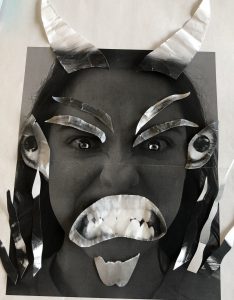
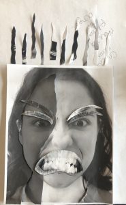
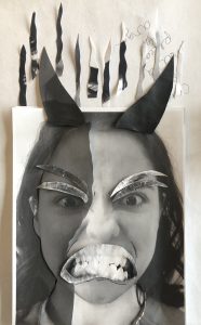
In the beginning I struggled with all of the separate elements. Many of the pieces clashed together and you couldn’t tell what the focal point was. So I took out elements that weren’t needed and simplified it more so the mouth can stand out. I eventually ended up with a simpler design with a couple of flames and no weird elements.

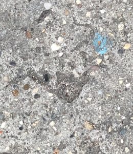
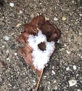

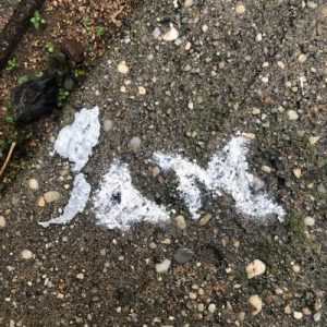
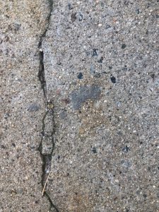
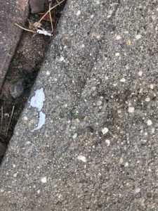



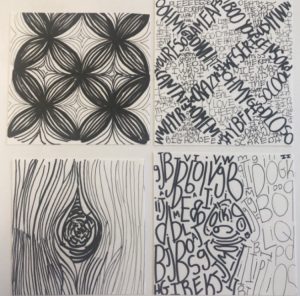 Here are my final compositions of line and text. After experimenting with the line weight i think i achieved it well.

