I guess for a lot of people who want to enter the design field never realize that the number one obstacle you’re always doing to face is to do something you never have done before. There’s a lot of people who fear the general idea of it. Designers have to face this since it comes with the territory even if you’re an expert in a certain field you may have to branch out a little. Paula combined her art with her design aspect to create a mural for the school. Normally combing the concept of art and design needs to be well balanced. Before I even heard about the design I thought almost everything was art and didn’t realize the difference between the two. Art has no purpose while the design does turn out to the core difference. However, they are still relatives since designers are still considered a more logical or mission base kind of artist.
Category: Discussions (Page 2 of 4)
Sometimes you have to ignore the brief, Paula Scher, the famous artist, and designer, says, Scher takes us on four innovative ventures behind the scenes, from renovating the MoMA logo to the Highline park design, She speaks about how it pays to continue working and raise questions, reach uncharted territories, and experience something you’ve never done before. It’s amazing how New York City really turns something so unexpected like the high line park itself into a landmark. The High Line is an elevated freight rail line that was turned into a public park on the West Side of Manhattan. She created a simple, iconic, and easily identifiable symbol for the neighborhood that eventually became the logo for the park itself.
In the “Paula Scher: Do What You’ve Never Done Before” video, Paula Scher walks the viewer through four different design projects she was commissioned to do. Scher explains these design projects had a life of their own as they felt very “accidental”. These projects were all experimental and odd such as making a logo for an abandoned railway or creating a logo for a section of town. Through Scher’s explanation, the viewer can see her confidence and the risks she takes to achieve her successful campaigns. These projects had a life of their own because they were more than her designs, they were systems and structures that needed to be fixed and agreed briefs that must be changed. I believe Scher wanted to reveal design is more than creating a logo and more than the designer but a series of unforeseen events that make it happen.
After watching “Paula Scher: Do What You’ve Never Done Before” I always can learn something new and get inspired by her work. I repeat a lot of time when she takes about the logo for Pittsburgh. she said “so sometimes just ignore the brief and go and do it especially when you’re not getting paid to use Pittsburgh and you have nothing to lose. It kinda reminds me of a YouTuber, when he has nothing to lose, he tries to be a YouTuber and achieve his goal. I like it when she talks about the MoMA project, about how they should communicate with each other in an easier way so they can do more work and use less time.
After watching “Paula Scher: Do What You’ve Never Done Before”, I personally had no idea that there was a show in Grand Central that included ideas from different people on how the Highline was made. It’s interesting how an idea which nobody really thought would happen, actually became something so big for New York City. This just makes me see that one should never give up or doubt their designs because you never know, your ideas or designs might become the next big thing. I really enjoyed seeing her painting of the boroughs of New York on the walls. From a far it looks like graffiti, which I enjoy, but from up close you realize there are words that all of us living in New York, are familiar with. The technique of projecting her original painting on the walls to later paint, was very smart so that everything was placed exactly where it needed to be. I also found it funny how the second work of art she presented was not proofread before being put up. Honestly, I would not have proofread it either. There were way too many languages and would’ve taken up too much unnecessary time.
After watching Paula Scher: Do What You’ve Never Done Before on Vimeo, I love the idea that Paula took advantage of each opportunity that was given to her to become who she is today. It made me realize that some opportunities come only once in a lifetime and if we didn’t take it seriously we won’t ever grow. I love how she worked on the Highline logo. It was too simple but it sent the message it had the idea of being a credible place. I also love the idea that she mentioned about MOMA museum how she brought four brochures that did not look like but at the same time it had the same pieces of artwork, as Paula said, “although the typography was pretty different than one another that happens is because they’re done in different departments and the departments don’t talk to each other and not function together as one brand” which really makes sense as they don’t follow the design manual of the brand. It also showed that without connections and teamwork you’ll never succeed especially if you’re working in a big place like MOMA.
She also mentioned that sometimes take a leap of faith and you better ignore the brief and do something that you see more applicable if you have nothing to lose. I also like the idea that she mentioned there’s a lot of difference between art and design or it is just order it has to do with your eyes. Your eyes can love the artwork without having a meaning although the design has a purpose. Designing has a message behind the art that it is representing.
In the video Paula Scher talks about many things including taking risks such as ignoring the briefs and also taking a leap of faith and doing things you’ve never done before and I feel like these two points are incredibly valuable in which briefs can sometimes be confusing and misleading but still give you enough information to go off from and often time I do find my self straying from the brief because of its somewhat confining details. furthermore on the point of doing things I’ve never done before I feel as that is driving motivation in design pushing you to thing and grow outside the box and push your self what you didn’t think you were capable of within design and you really never know what will happen till you try like, Scher’s idea for the schools mural how it was a leap of faith and an amazing experience and point for her in her design career.
Paula Scher’s video was really interesting and inspiring for me: The process of understanding and analyzing is fascinating. In this video she shares many of her creative processes such as: The Jazz logo at the Lincoln Center, Funk posters all over New York City and the Citibank logo.
The Jazz logo that she designed represents this musical genre. She uses the concept of syncopation. For me this logo represents jazz.
I can say: I did not know until I saw this video that she was the designer of the Citibank logo. She designed it on a napkin and it took her only a minute at the first meeting. it’s great!
Practically, It only takes a minute for her to design (sketch). She has been doing it for 34 years and it is how her head works. That is what is fascinating: Her vision and creativity.
Finally, something to keep in mind. She says: “The computer makes me feel like I don’t have hands because I don’t design directly, everything is digital. It doesn’t smell like art supplies, it just smells like a car. “
I remember learning about Paula Scher in a course I think it was Communication Design 1 in Spring 2017 semester, I was given her name to work on as a project and I finished up doing a mood board of her and her work. She amazes me since she made a logo within 5 minutes that all begun out from a small napkin sketch. She made me learn that no matter where you sketch the greatest ideas come from 1 little piece of paper, or for her, 1 little napkin sketch. Which is by the way worth 1.5 million dollars. Paula Scher has been an motivation for me she ambitious , a trailblazer and a icon within the field of graphic design and she inspires me to get more into the graphic design field more as an illustrator.
Attached on the bottom is a poster I’ve done for class a long time ago dedicated to Paula Scher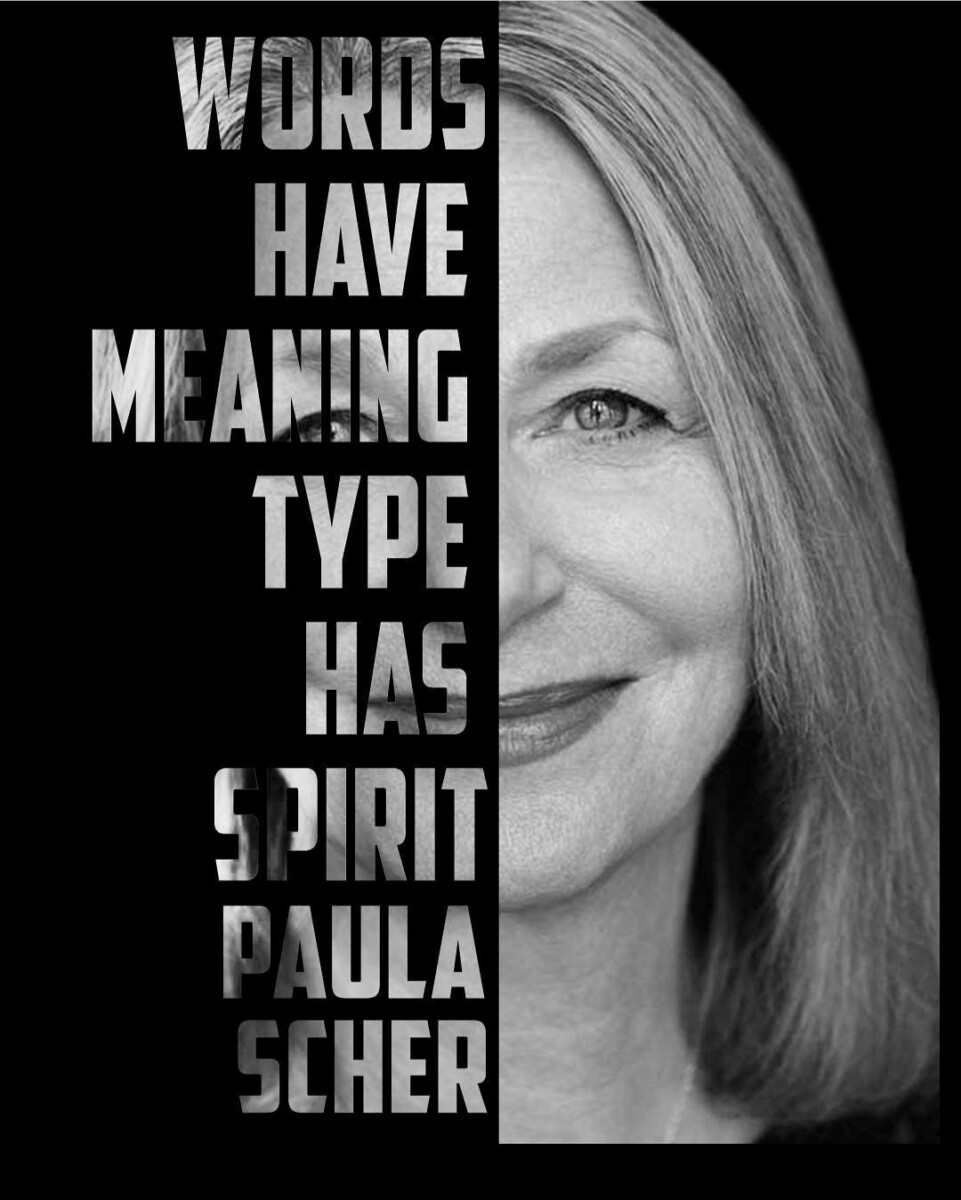
When reading the age of anti logo, I learned around when it comes to the world of design common today numerous things are continuously changing when it comes to standards, and other concepts. I know today many exhibition halls don’t need their symbol to be changed since they think it takes away from their legacy. Also for numerous artists and designers such as ourselves we got to go through the same thing when designing a symbol since a symbol is outlined to provide individuals an thought of someone or something with personality whereas still being moderate in various forms, extents and indeed its outside appearance.
I do remember learning about Paula Scher in a class in which I had last semester and the hand drawn Music posters she did and I thought they were really fascinatingas well as her maps.After watching this video, it still shocks me that it took her minutes to design the citi bank logo, on a napkin nonetheless and this logo is seen all around in regards to advertising, commercials, the banks itself, and the citi bikes and with 34 yrs of experience she’s able to capture the essence of a brand in one or two tries.I also like the advice her professor gave her in regards to illustrating with typography and making it pop out and sometimes it doesn’t feel right when typing it on a computer which I totally get. Nonetheless she a visionary , innovator and a legend in the field of graphic design
In my freshman year of college, I came to admire the work of Paula Scher. I assume she is one of the most popular graphic designers in the world. Scher straddles the line between pop culture in her fiction and fine art. To all woman graphic designers, she is a voice that is no longer a company for men.
Perhaps that’s the story behind the famous logo of Citi Bank. Finishing in just five minutes on a napkin, selling it for $1.5 million. That’s what I love about her unbelievable creativity and vision, Paula Scher.
Graphic Designer Paula Scher explains in the artist series that experience plays a major part in her design process and how she is able to come up with ideas in just a second or as she puts it “It’s done in a second in 34 years”. When she was designing the CITIBANK logo for two merging companies she took the lettermark from one and a symbol from the other and merged it and that was it. Her experiences gave her the ability to be intune with herself that she is able to base all her designs on her instincts.
Paula map painting really gives an insight on who she is and how her career started; her map shows her attention to detail with the hand written type and the amount of patience. All of her original ideas were done by hand because at that time they had no computers,it’s not like our generation where computers are so accessible that we can go online to get inspiration from all over the world with a click of a button. Paula always got inspired by walking around manhattan.
One of Paula Scher’s influential pieces was the funk designs posters which she used typography to show noise surrounding an image.The funk posters reminded me of Filippo Marinetti Manifesto Les Mots en liberté futuristes Also known as Futuristic words in freedom that expressed enthusiasm for war using typography as noise.
“There is this one moment when you figure it out and you get it and you think it’s gonna be the best thing you ever did” if she feels this way about every design no wonder she is able to top her last designs. She loves what she does an it is expressed in her art.
According to “Artist Series: Paula Scher”, what should be reflected in a logo is that it should be syncopated. I, too, did not know what this word meant until she explained it. What I enjoyed about the video is when they started talking about adding movement to text. I personally enjoy seeing posters that have text going in all different directions. It adds more of a personality to the posters in my opinion. There are times where it is needed to add movement into text to attract the viewers’ attention, especially if the information on it is something such as a theater Ad where there is entertainment. I found it interesting that the Citibank logo was made in such a short amount of time, considering how well it works. I would’ve imagined a lot of thought and process and especially time, went into it.
I remember Paula Scher when I’m taking the history class. When first looking at her work, I was shocked about how she has done all these designs and sketches by hand. Her hands are powerful. During her time, she all she got was her hand, it’s not like now we got a computer, we can go online to get ideas from others. When she talks about how the music typography was design to look like it makes noise and how it became an identity, a style of public theatre. I love it! I love her the maps that she sketches. I agree with her that design is something that you work by hand. When she talks about the logo of Citi bank, I can’t imagine she done that logo in a second. Everything is in her head.
The vimeo Artist Series taught me about Paula Scher’s thought process. There were so many parts that stood out to me.
In the beginning she describes the importance of knowing your clients through her experience making the Jazz Logo. What I found important was how Scher wants to be able to give back someone’s values to them through the logo.
Then later in the video she explains what makes identities special comes from what you know. You have to take all the experiences and knowledge you have. She says “…but it is done in a second. It’s done in a second and 34 years. A second with every experience and every movie and everything of my life that’s in my head”. Scher has strong instincts which helps her work intuitively. The negative is clients like to buy processes, so working quickly can often catch people off guard. (I look forward to the days I can write logos on a napkin and walk out of meetings proudly.)
I enjoyed her noise funk series at the Public Theater in 1996-99. It really stood out to me because she made typography move with and around the photograph.
Then I found it interesting how she never goes past the thumbnail stage. That she has so much trust in her team to produce her visions.
At the end of the video Scher says her teacher told her to illustrate with type. You don’t type a design, you illustrate it.
The final take away for me was how she lives for the one moment when you get the logo right. It was inspiring and impressive how that hasn’t changed 34 years.
The Paula Scher video was really interesting and inspiring for me as an aspiring designer hearing a well know designer’s experiences and tips are really helpful. a large takeaway from the video is Paula’s approach to her designs as in she goes by intuition and what comes to her mind or either has it in three takes or she doesn’t have it at all and to me, I feel something similar to that like my ideas like hers are usually random and explosive sometimes and just come out and hearing a fellow designer express similar traits are really inspiring of being on the right track or having the feeling of getting really excited or pumped for a project and that’s what drives her forward as well as I want something as such to keep pushing me forward and to drive me as well in my career.
Watching the Artist Series on Paula Scher I can see her process when designing and her interesting personality. Beginning with the Jazz logo, Scher is able to use a conversation she had with Wynton Marsalis, the artistic director of Jazz, as the basis for the new logo. The keyword from this conversation being “syncopated” a musical term used to describe a variety of rhythms being played in unison, or described in the video as having “a bunch of things in order and one is off”. Using this information she would add a small square inside the rounded “a” in jazz to reflect this. Creating an effortlessly iconic logo, something Paula Scher is known for in her work.
In the video Scher adds, she works on instinct allowing her to finish her work quickly. However, she goes on to say that it may seem quick but actually took all of her experiences and interests to get to the point of being able to do something so instinctual. As I read her biography on the AIGA website I could see her nod to the famous graphic designer Herbert Matter in her poster “Swatch Watch USA”, revealing her influences and how she playfully uses them in instances.


Recent Comments