https://drive.google.com/file/d/1GRX621N0CYWJ0cXkAJodhcO0FQUdHXT2/view?usp=sharing
Author: Virginia Sanchez
Reading the article “How to design an enduring logo: Lessons from IBM and Paul Rand” it was revealed to me Paul Rand was a very detail-oriented designer. Rand would spend over a decade playing with variations of the IBM logo explaining there was a problem with “the sequence, going from narrow to wide…without any rhythmic possibility.” This struck me as a stark difference from the designer Paula Scher who would do her designs quickly. However, both have a playful and deceivingly simple design aesthetic. In my design work, I tend to have a “loose” approach. However, after reading about Paul Rand I was reminded of the importance of meticulous design and a sharp eye.


In the “Paula Scher: Do What You’ve Never Done Before” video, Paula Scher walks the viewer through four different design projects she was commissioned to do. Scher explains these design projects had a life of their own as they felt very “accidental”. These projects were all experimental and odd such as making a logo for an abandoned railway or creating a logo for a section of town. Through Scher’s explanation, the viewer can see her confidence and the risks she takes to achieve her successful campaigns. These projects had a life of their own because they were more than her designs, they were systems and structures that needed to be fixed and agreed briefs that must be changed. I believe Scher wanted to reveal design is more than creating a logo and more than the designer but a series of unforeseen events that make it happen.
Watching the Artist Series on Paula Scher I can see her process when designing and her interesting personality. Beginning with the Jazz logo, Scher is able to use a conversation she had with Wynton Marsalis, the artistic director of Jazz, as the basis for the new logo. The keyword from this conversation being “syncopated” a musical term used to describe a variety of rhythms being played in unison, or described in the video as having “a bunch of things in order and one is off”. Using this information she would add a small square inside the rounded “a” in jazz to reflect this. Creating an effortlessly iconic logo, something Paula Scher is known for in her work.
In the video Scher adds, she works on instinct allowing her to finish her work quickly. However, she goes on to say that it may seem quick but actually took all of her experiences and interests to get to the point of being able to do something so instinctual. As I read her biography on the AIGA website I could see her nod to the famous graphic designer Herbert Matter in her poster “Swatch Watch USA”, revealing her influences and how she playfully uses them in instances.
The article “The Age of Anti-Logo: Why Museums Are Shedding There Identities” discusses the process of designing a logo for a museum and how intricate the approach can be in its quest for flexibility. As museum logos become less concrete they are able to advertise in more ways they would have if not. Describing current logo design as “complicated” and a “chore” the author brings up the argument if something is lost in such an elaborate approach to design. Personally I find these flexible logos interesting but I do wonder how far one could go until it’s real purpose is lost, becoming something entirely abstract. As this style becomes popular it will be interesting to see what can be achieved next.
Hello, my name is Virginia Sanchez and I am a junior at City Tech under the Communications Design major. Although I focus on Graphic design in my education I find myself drawing in my free time. I am quiet but friendly. Along with drawing, I really enjoy watching movies and Japanese animation. Some of my favorite directors include Satoshi Kon, Quentin Tarantino, and Hayao Miyasaki, I love most if not all their work.
“The Art of Logo Design”, including many successful designers, explained the conceptual design process. Some points I found especially interesting in the short video is the explanation of logo origins. Steven Heller describes how ancient civilizations would depict what a certain merchant specialized in or the expression of an individual with visual symbols. This comes back to the central idea that “ a logo is an extension of WHO you are and WHAT you do.” During this semester I will try my best to achieve that for the company I choose using visual language and detailed research.
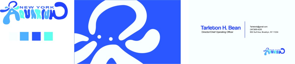
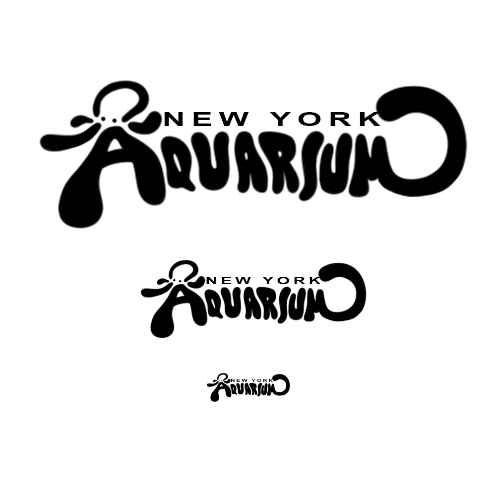
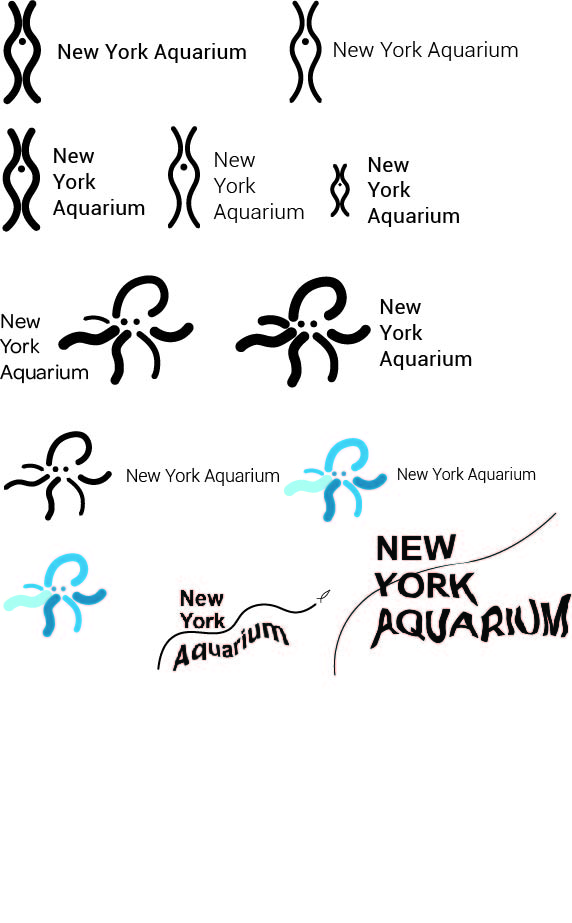
To make a successful logo it must be simple, timeless, and able to give a company or institution a personality. A question I ask myself is how far can a symbol go? At what point does “simplistic” turn to “abstract”? It will be interesting to see how the application of logos change as culture and common ideas progress.


Recent Comments