https://drive.google.com/drive/folders/1znGwzSaOBRq3xNfkesgRtsMQ12LsltkI?usp=sharing
Eva Machauf | COMD 3501 OL26 | Fall 2020
https://drive.google.com/drive/folders/1znGwzSaOBRq3xNfkesgRtsMQ12LsltkI?usp=sharing
https://drive.google.com/file/d/1US3H3d9DyD0piKDJ5Fg2JjHTLQAZgbFH/view?usp=sharing
https://drive.google.com/file/d/1pRLhRk8zkZR70HLZ7hfYDRjxIotdrxxO/view?usp=sharing
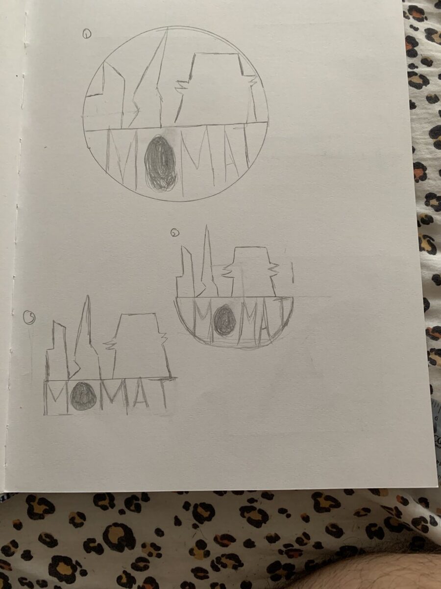
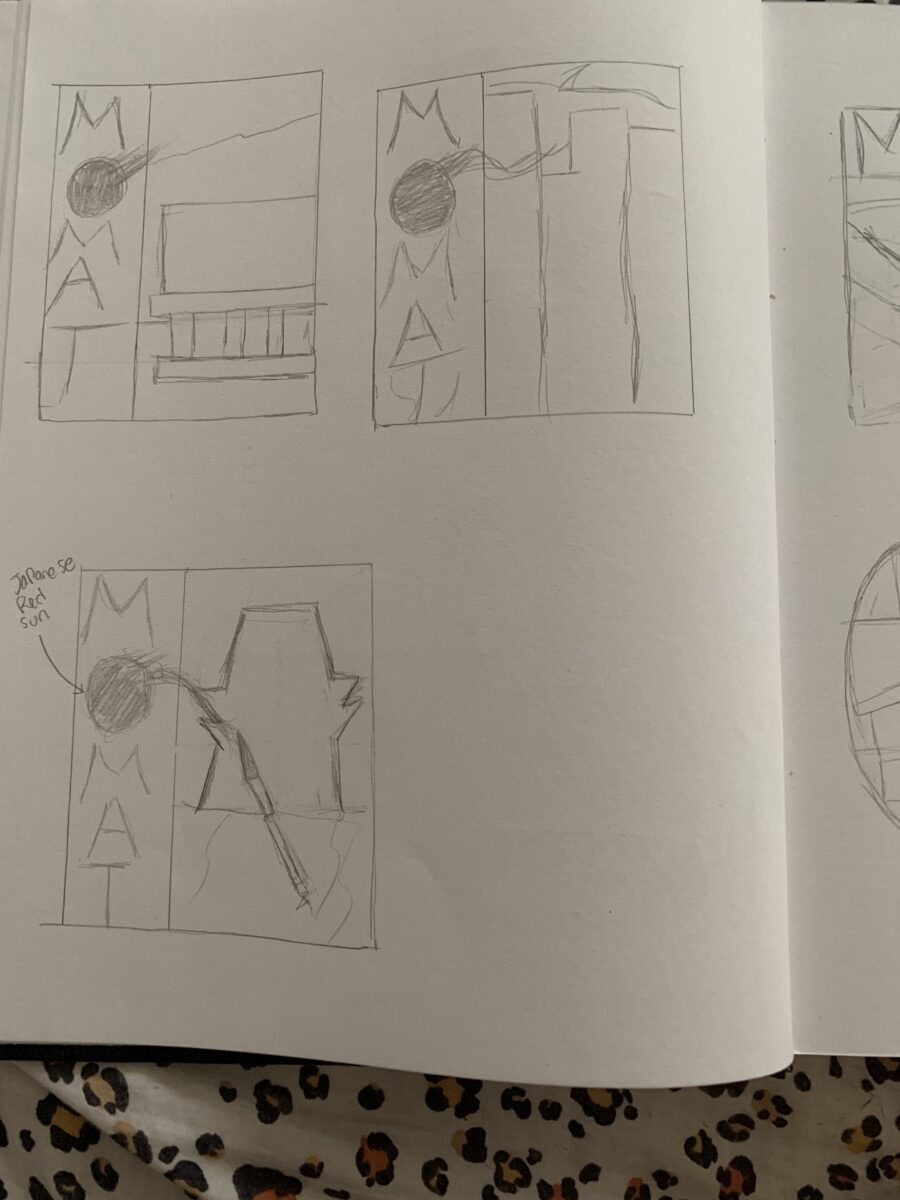
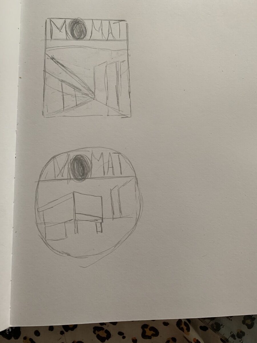
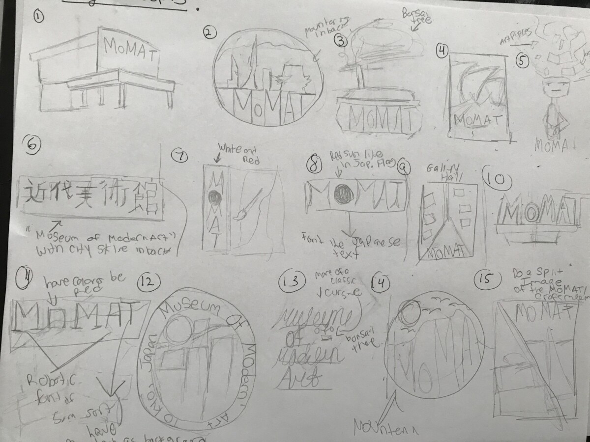
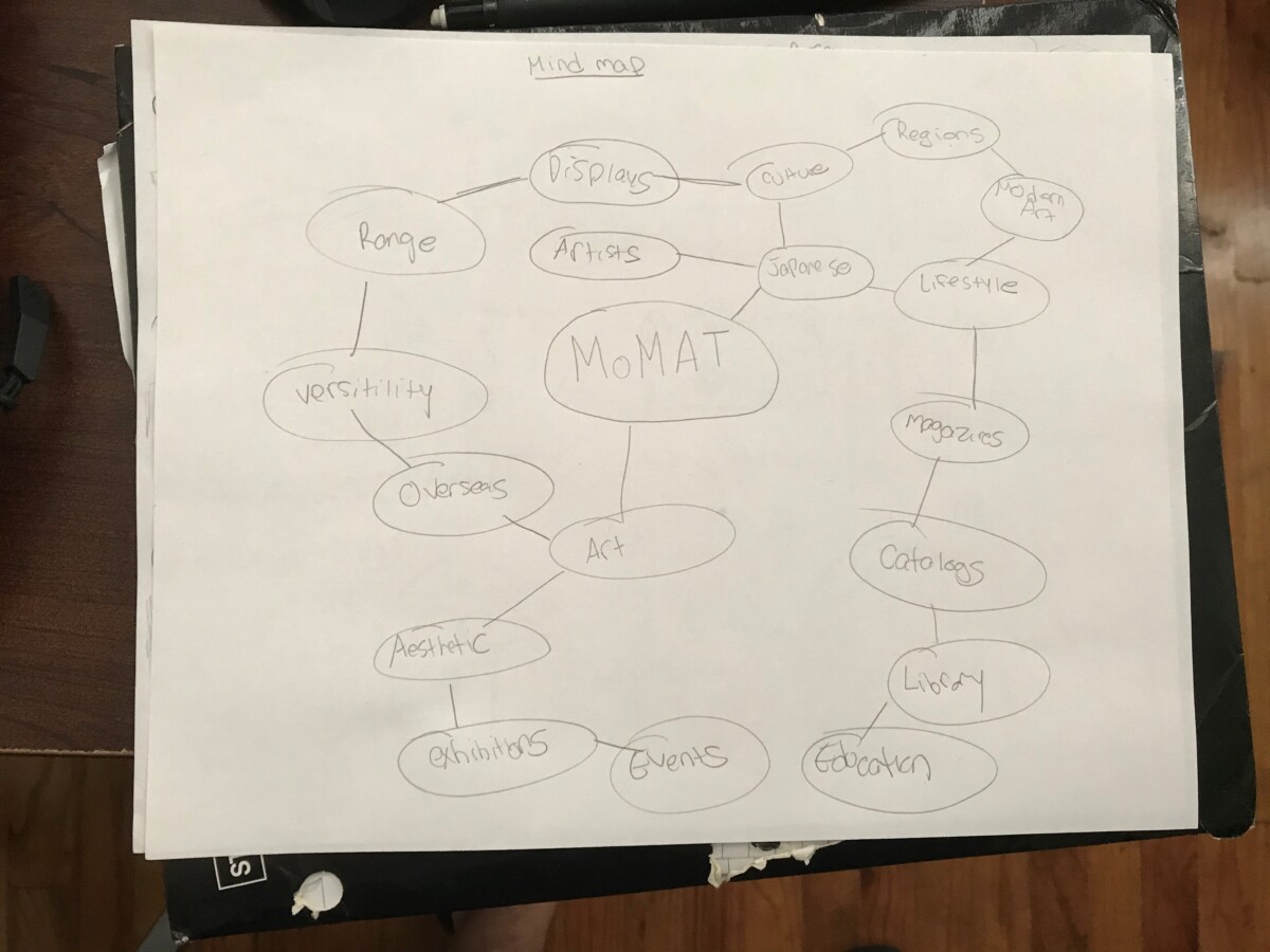
Sorry for not putting it in a mock up. Have to fix the dimensions a bit
https://drive.google.com/file/d/1SW476oZSE1ZzeDIvy4OS-q8cVbYk6njU/view?usp=sharing
https://drive.google.com/drive/folders/1T_hH4yvK_RC-bgIJhrvR7Ylf0Ksnc6jT?usp=sharing
https://drive.google.com/file/d/1V6XwI4QJyN8qTTQbhr8W367XQ-AhuFJa/view?usp=sharing
https://drive.google.com/file/d/1dG-_9qZaIk-Umto_TwxQ4VEVl4QHO9lD/view
https://drive.google.com/file/d/1OuTKVSpddoK7s2q082qa9Apo6l8k-FK2/view
If the link doesn’t Open then I will screen share
When I first started learning about the world of graphic design I remember faintly hearing about Paul Rand and not knowing much about him but as time went on and especially after reading this article and watching the videos I can see why he is so highly regarded and I honestly love his thought and design process and way of handling things. I like the way how he took the way of designing as solving a problem and by solving it in a simple way but in a way that it became timeless and basically became the image of the company and catch your attention with a certain amount of surprise, as said in the video. It still baffles me that it took ten years to perfect the IBM logo. His design process and approach is rather different from Paula Scher’s process due to the fact that Paula Scher is able to get it on the dot and capture everything within a logo in a matter of minutes. Nonetheless It is a well known fact that both of them are masters of their craft and regardless of their approach, it does take a huge amount of time and dedication and years of practice to get to that level of mastery and they have always managed to pull through and shine.
After watching this video, there is a lot of great and useful information to use and absorb in regards to being a graphic designer. You definitely have to branch out , because that’s one of the ways you’ll grow as a designer, and when you’re developing or redesigning an identity for something or someone, everything needs to be cohesive and go with each other. Paula Scher shows how this is done when she talks about her working at the MoMA and how they were not functioning as one brand and with the introduction of one template, everything looked cohesive regardless of the design that was presented, and that sometimes people fail at communicating things. Also, I learned that when you’re designing something , you never know if it’s going to become iconic. Take the example when she’s talking about the highline, when she was iffy about taking the job because at the time it was just an abandoned railroad. It only took an hour of studio time to come up with everything and now it’s iconic and pretty much a landmark. It’s insane and pretty cool and inspirational at the same time.
I do remember learning about Paula Scher in a class in which I had last semester and the hand drawn Music posters she did and I thought they were really fascinatingas well as her maps.After watching this video, it still shocks me that it took her minutes to design the citi bank logo, on a napkin nonetheless and this logo is seen all around in regards to advertising, commercials, the banks itself, and the citi bikes and with 34 yrs of experience she’s able to capture the essence of a brand in one or two tries.I also like the advice her professor gave her in regards to illustrating with typography and making it pop out and sometimes it doesn’t feel right when typing it on a computer which I totally get. Nonetheless she a visionary , innovator and a legend in the field of graphic design
Upon reading The age of the Anti logo one may find the answers to why museums are shedding their identities in regards to something a bit more modern. When it comes to the world of design and design in general , if there’s ONE thing that’s constant it’s change. Things are always changing when it comes to ideals, concepts and technology and with this age of tech places like museums have to find ways to cater and to appeal to a larger audience and by doing that you have to create an identity/logo that can be flexible, modern yet something that will be appealing to people, and something that you can build a brand off of.
My name is Matthew, if you want I go by the nickname “Matt”. This is my fourth year in this school, my major is communication design and I want to be a graphic designer. I enjoy doing page layouts, business cards, logos, and I want to get better at illustrating. My hopes for this class is that I will begin to grow as a graphic designer and develop more skills in the future.
© 2024 IDENTITY DESIGN – COMD 3501
Theme by Anders Noren — Up ↑
The OpenLab is an open-source, digital platform designed to support teaching and learning at City Tech (New York City College of Technology), and to promote student and faculty engagement in the intellectual and social life of the college community.


Recent Comments