https://drive.google.com/file/d/1aC6bBNwhUS23BH950BRGPERqKfslYXCd/view?usp=sharing
Author: Magi Hossameldin
https://drive.google.com/file/d/1c-MZXyiyInm_dlv8f3SzO7c3_tek8lAe/view?usp=sharing
https://drive.google.com/file/d/1J5TB7JkkV5DEE6gN66L_foURtt6hfOZj/view?usp=sharing
https://drive.google.com/file/d/1u-BNun0kwCcZN_M_yNqmFoIrnJSYx3s8/view?usp=sharing
https://drive.google.com/drive/folders/1t32rtdTnyz5t0jhClCXe8GoQU13tHrqf?usp=sharing
https://drive.google.com/file/d/1kB2nODlo4jKaEbLpbnMO_4u6WgqdUn3p/view?usp=sharing
https://drive.google.com/file/d/1u2QbmSpqCB6e4UtSDCSongoaqtv8ISlD/view?usp=sharing
https://drive.google.com/file/d/1kB2nODlo4jKaEbLpbnMO_4u6WgqdUn3p/view?usp=sharing
https://drive.google.com/file/d/1SlBvpJtWwJh_SNGmy-afpqt5tFWpdo4v/view?usp=sharing
After watching and reading “How to design an enduring logo: Lessons from IBM and Paul Rand An article with 2 embedded videos” I thought he was a strict designer when it came to critiquing him, as he did not give people design options. He gave people a single presentation or a single piece of what he thought to be a good recommendation. As it was also mention in the video “he didn’t want to hear if he didn’t like it he would say you hired me to do it and I’m telling you this is what you should use”, I really noticed that he was a genius and also detail oriented designer unlike Paula Scher she was a freestyle designer who went with the flow, he is way organized than her. As I remember she was more of a doodler and she made the Citi Bank Logo on a napkin even though Rand is the exact opposite of her he used to be more complex for example the IBM logo had more effort, study and thinking(research) done into it.
After watching and reading “How to design an enduring logo: Lessons from IBM and Paul Rand An article with 2 embedded videos” I thought he was a strict designer when it came to critiquing him, as he did not give people design options. He gave people a single presentation or a single piece of what he thought to be a good recommendation. As it was also mention in the video “he didn’t want to hear if he didn’t like it he would say you hired me to do it and I’m telling you this is what you should use”, I really noticed that he was a genius and also detail oriented designer unlike Paula Scher she was a freestyle designer who went with the flow, he is way organized than her. As I remember she was more of a doodler and she made the Citi Bank Logo on a napkin even though Rand is the exact opposite of her he used to be more complex for example the IBM logo had more effort, study and thinking(research) done into it.

After watching Paula Scher: Do What You’ve Never Done Before on Vimeo, I love the idea that Paula took advantage of each opportunity that was given to her to become who she is today. It made me realize that some opportunities come only once in a lifetime and if we didn’t take it seriously we won’t ever grow. I love how she worked on the Highline logo. It was too simple but it sent the message it had the idea of being a credible place. I also love the idea that she mentioned about MOMA museum how she brought four brochures that did not look like but at the same time it had the same pieces of artwork, as Paula said, “although the typography was pretty different than one another that happens is because they’re done in different departments and the departments don’t talk to each other and not function together as one brand” which really makes sense as they don’t follow the design manual of the brand. It also showed that without connections and teamwork you’ll never succeed especially if you’re working in a big place like MOMA.
She also mentioned that sometimes take a leap of faith and you better ignore the brief and do something that you see more applicable if you have nothing to lose. I also like the idea that she mentioned there’s a lot of difference between art and design or it is just order it has to do with your eyes. Your eyes can love the artwork without having a meaning although the design has a purpose. Designing has a message behind the art that it is representing.
This is the first time for me to see a video where Paula Scher is talking and to be honest all her designs speak for her energy, she got a great energy which is reflected in all her designs. She has an amazing spirit, I really loved the part where she said the design of Funk’s posters made Noise, it was loud, visible and original.
Her typography was designed to make a statement and an identity, then it became a popularized style where the design speaks about itself. You see other posters and know that these belong to the others you saw somewhere else. I find it very hard at her time where there was no place or social media for them to search and get inspired about an idea, they had original ideas that weren’t somewhere else and they also worked with type presses they had no computers! As she also mentioned that all she got was her hands. It’s mind-blowing to be honest for me.
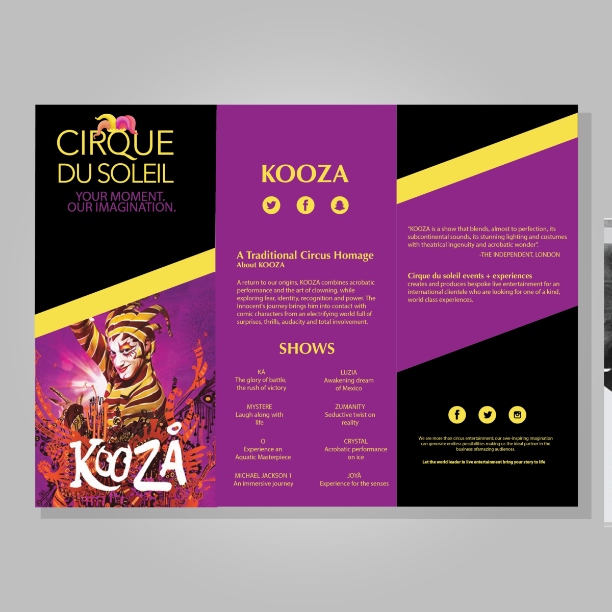
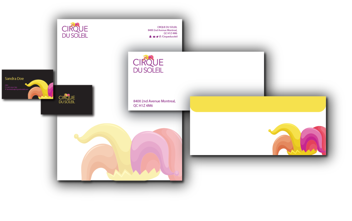
According to the article “The Age of the Anti-Logo: Why Museums Are Shedding Their Identities” mentioned by the designers,“One of the main subjects we tried to explore was the notion of a graphic identity that wouldn’t consists of a static, single logo, but one that would be able to change shape, reacting to ever-changing proportions and surfaces.” Which I really agree upon, especially in logos for collective brands that have a collective of products and services that have to fit each criteria of news and pieces of artworks or even it’s own business cards and envelopes. Creating a logo design for a museum in my own opinion has to be simple and not complex as other companies’ designs. I also liked the idea that the W log was made in a simple black and white frame. Which really doesn’t have any kind of tricky serifs that can go wrong with other contents or products.


Recent Comments