Category Archives: ADV1100 Project #4
Project#4
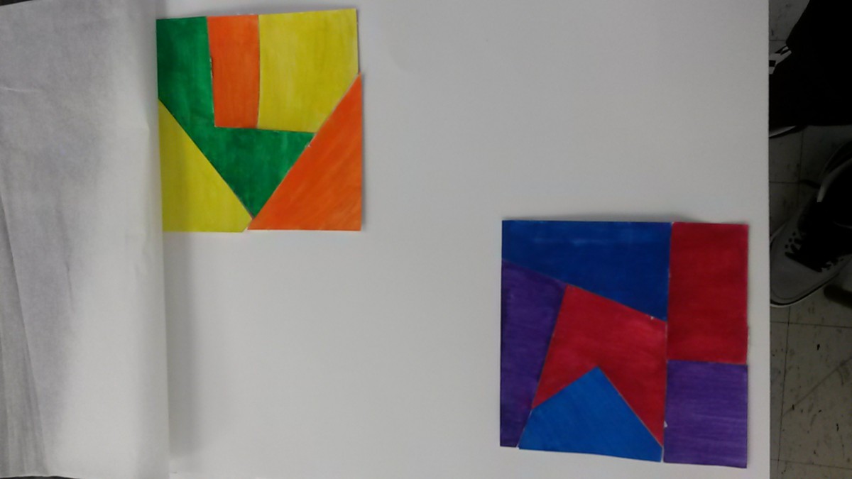
Regular painting (colors along with complements)
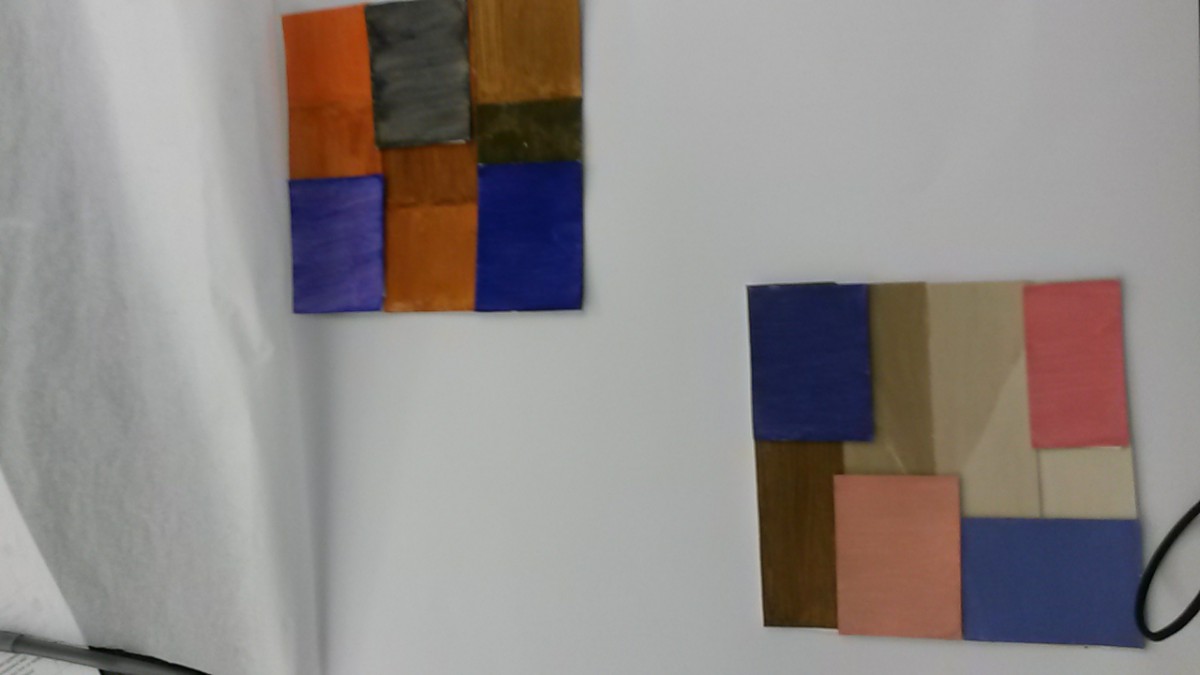
Muted color gouache painting
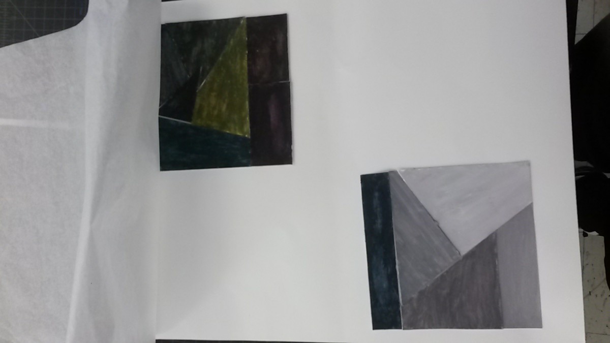
Chromatic gray painting
Project#4:Thoughtful Assessment
During the start of project #4, we began to work with the use of colors. First, we created a color wheel to visual see the colors and understand more of color. We later had to create a chromatic gray, muted, and prismatic color studies. For each of the following three, we created two collages one narrow and the other broad. Later, we worked with a partner to create a poster and than individual redo the same poster in Adobes Illustrator. In this project, I learned more between chromatic gray, muted and prismatic colors. I got to understand more between the value, towards high and low. I feel like I could do better when it came to the first chromatic gray collages, instead of having dark, unknown color. I have a bright colorful chromatic gray which is the opposite of it. Also, I feel like I could have done better in the crafting is the painting. I’m not use to painting and this is my second time painting for a project. If the project requires to paint I will be more careful however, I feel like this project helped me in learning the color value. This is important if its matter with colors, the range and value changes and can affect the surrounding to make it interested or not.
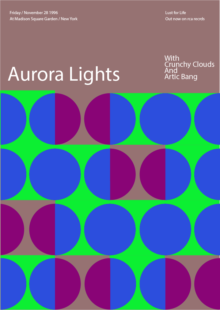
Project #4:Swiss Style Band Poster : Part 2
It took an hour during class time.
It took me an hour to due during the class time.
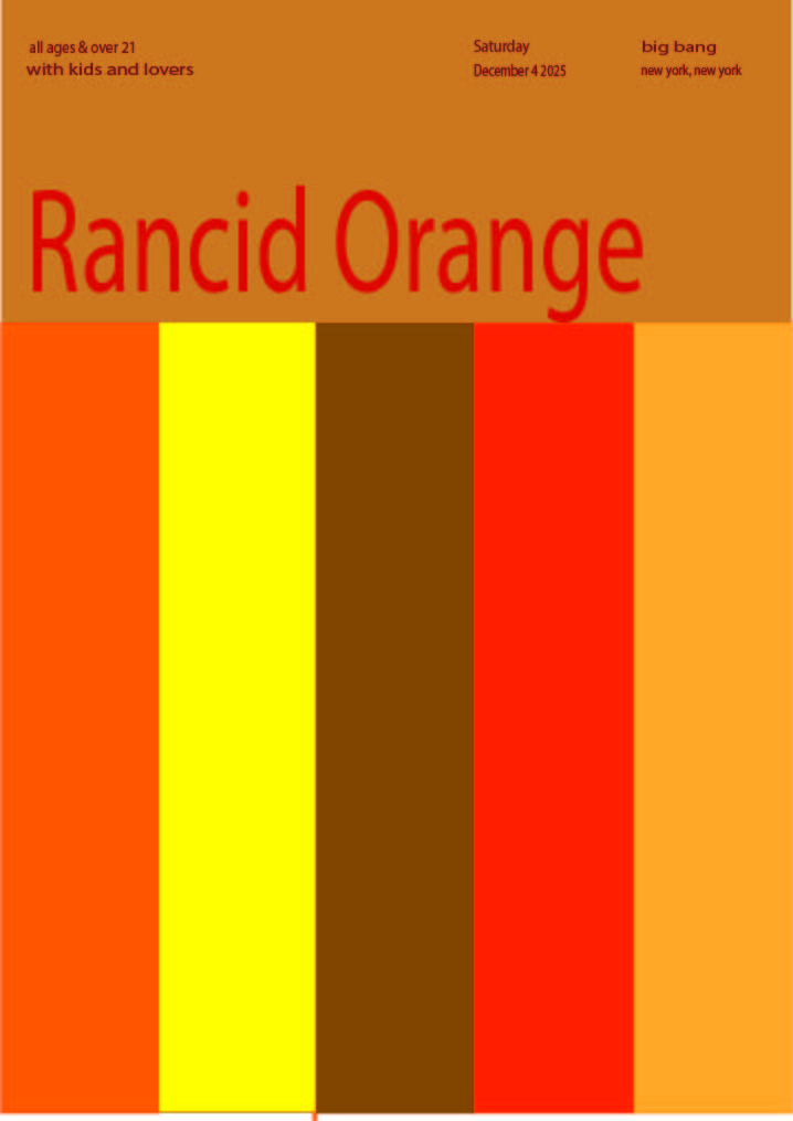
Project #4: Swiss Style Band Poster:part 1
Jessica Pareja and Cheng Long Li’s Swiss Style Band Poster
It took an hour to do however, it was a group project with cheng long li.
Project #4: Swiss Poster

Original Swiss Poster

Idea mapping out

final work from Adobe Illustrator
The Swiss poster took me an hour to finish in the class. Before actually doing the poster on Adobe illustrator, I and Richard were thinking the name for the brand. In addition, we are using cool colors on the poster. In the end, I changed the color to blue, because I believe blue can express the feeling of cold, and I use the pure white color to make the brand name standout from the background.
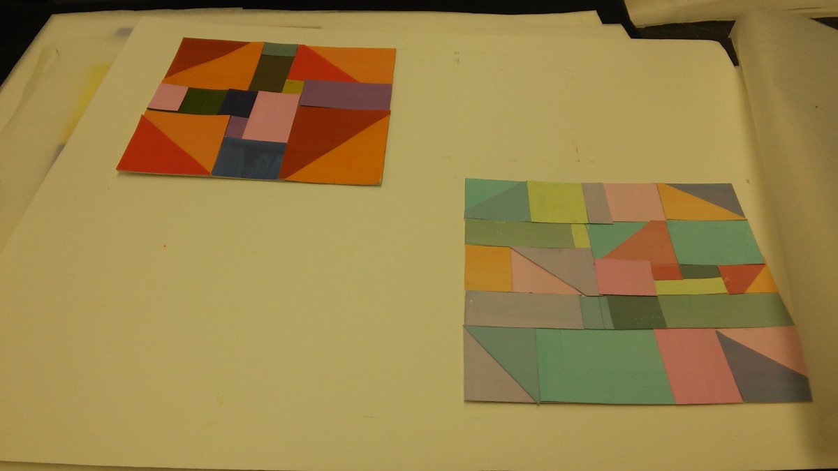
Project#4:Prismatic Color Studies
It took about an 45 mins.
For the Prismatic color, it took about 45mins because the color came directly from the tube.
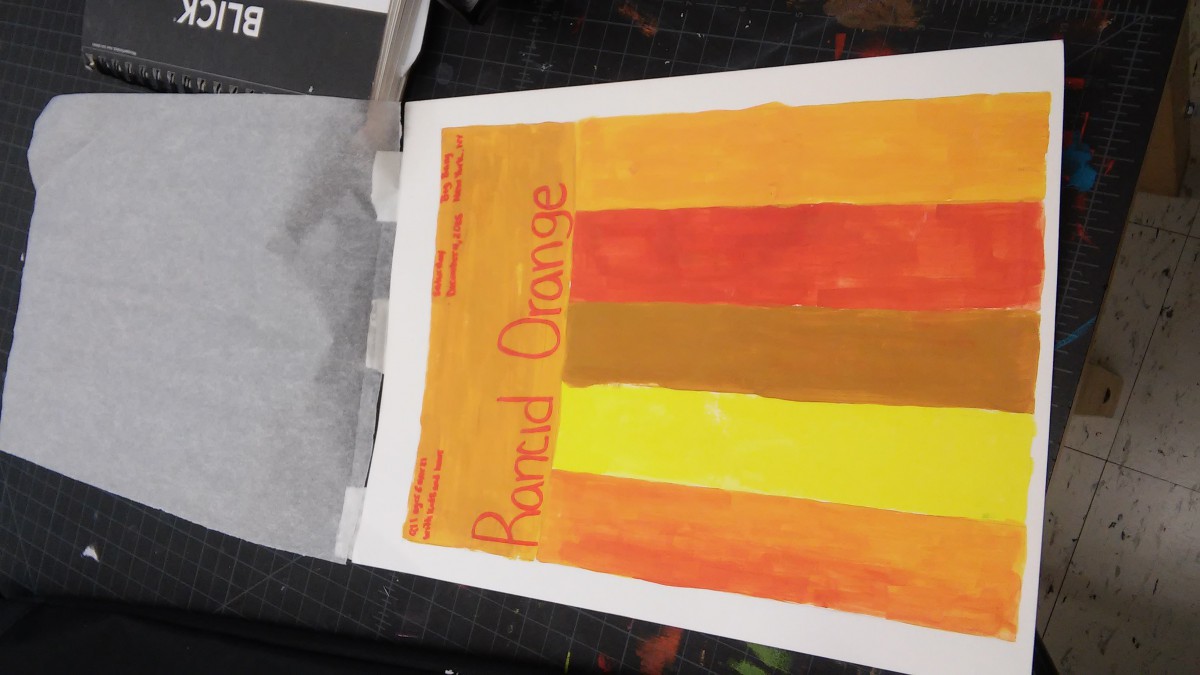
Project#4:Muted Color Studies
It took about an hour to make the muted colors.
It took about an hour to make the colors. I add white to the color or white itself. I enjoy this part was hard to make. How it took me longer because I was arranging it.
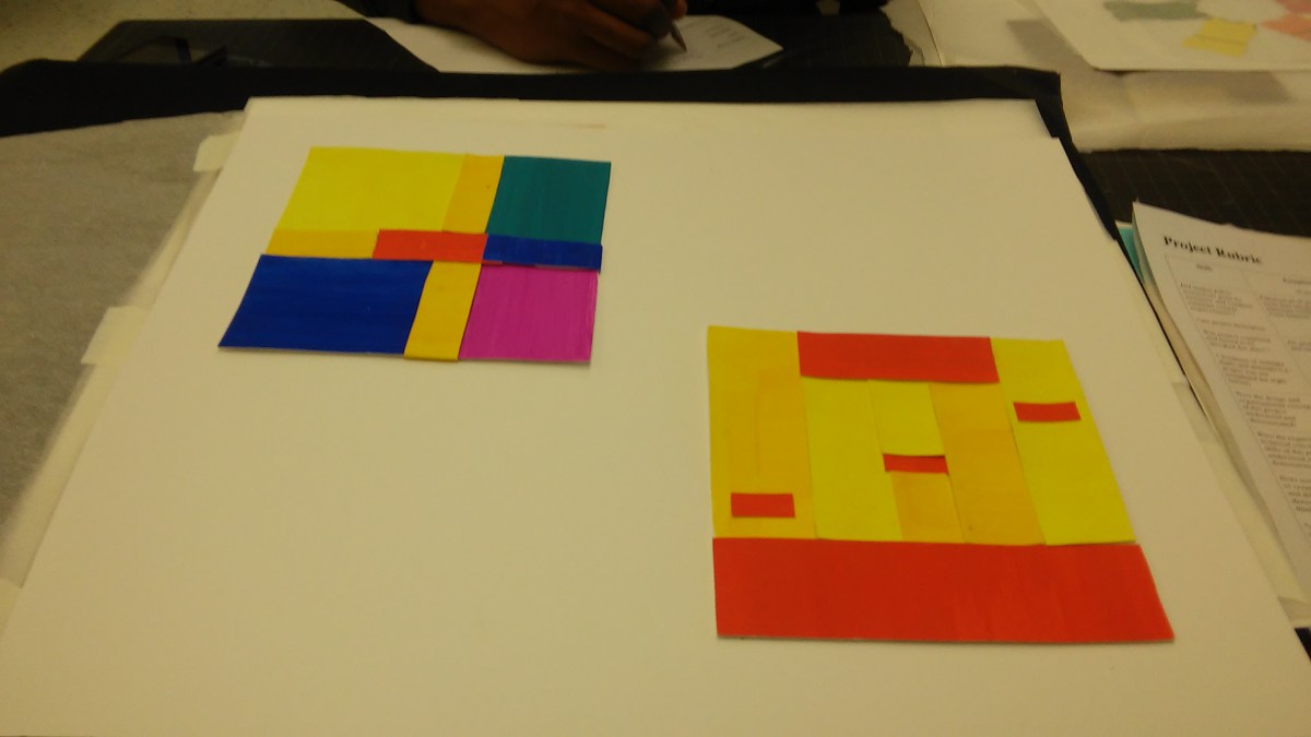
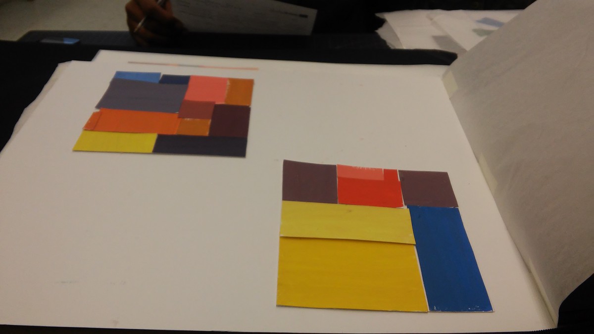
Project #4:Chromatic Gray Studies
It took about an hour to make
It took about an hour to make however, its not like how a chromatic gray is suppose to look like. I going to redo it cause I understand what’s it suppose to look like.
Project#4:Research / Inspiration
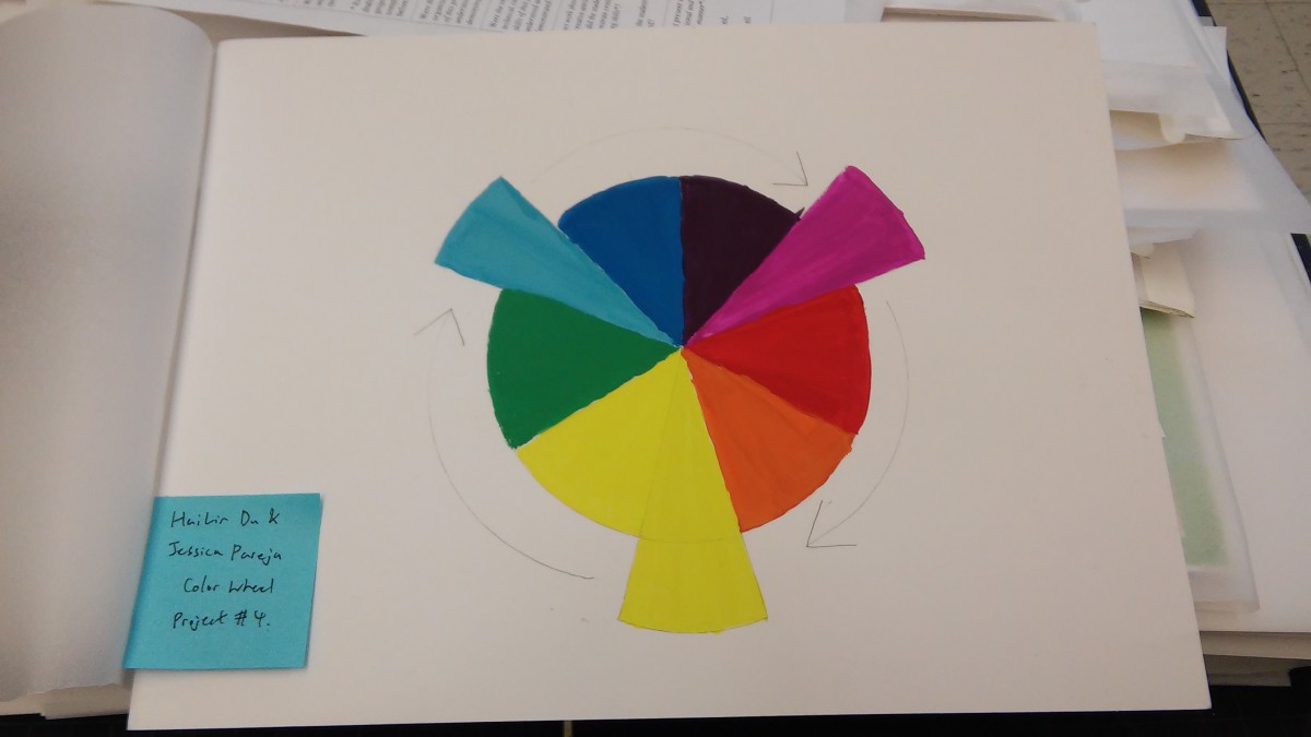
Color wheel:
It was a group project with me and Hai Lin.
Took about two hours to make.
It took about an hour to make however, me and Hai Lin made it together.

