Latest Entries »

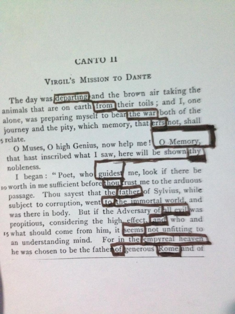
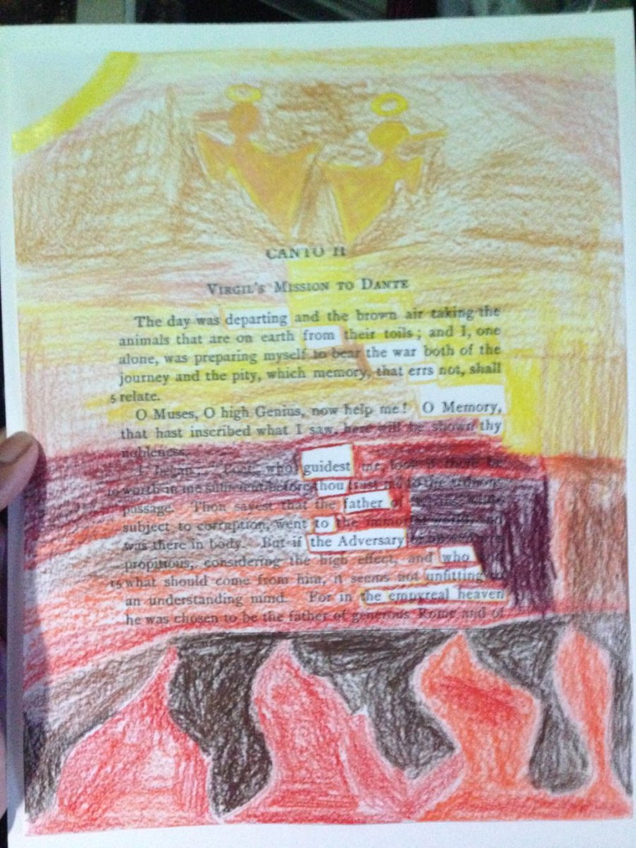
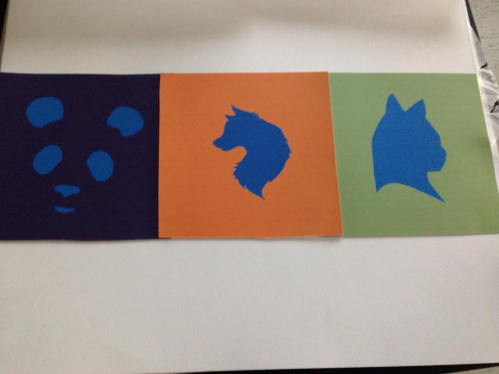
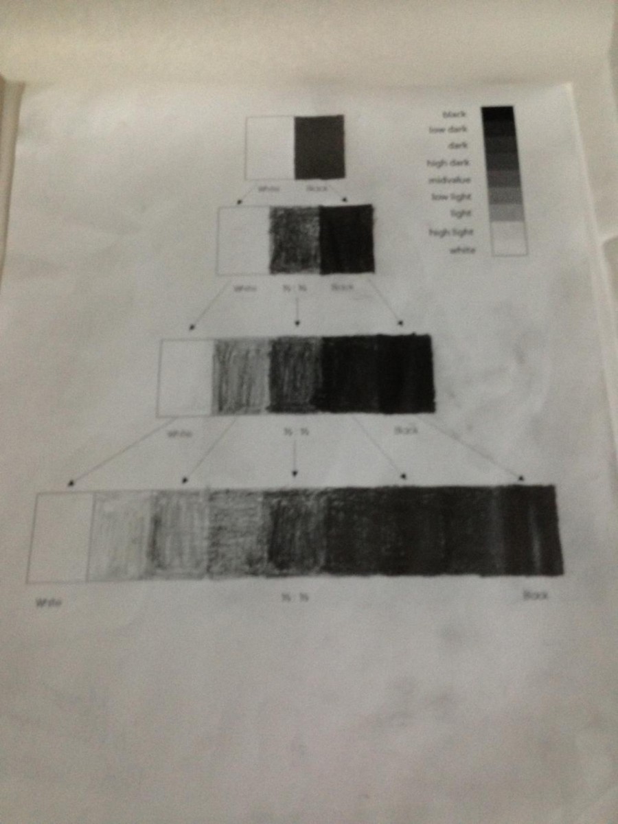
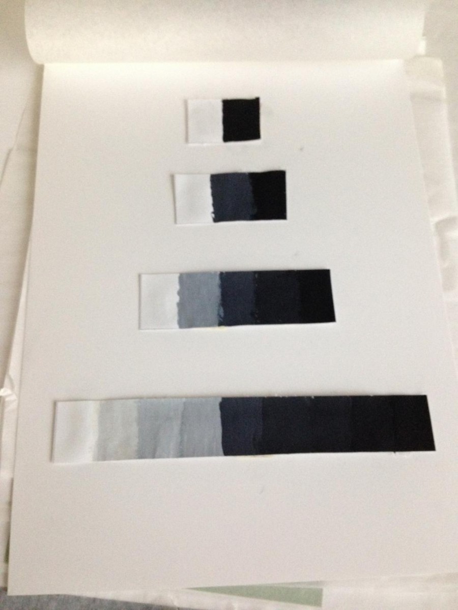
Project 5 was the last project of the semester. It was a project shared between our Eng 1101 teacher and our Adv 1100 teacher. I feel like I’ve learned a lot this past semester. I learned how to write proper essays and we even touched a little on public speaking. We learned the different formats we could use for an essay, along with how to summarize a piece properly. This project was very challenging because we had to do a 50 word post that explained our piece. That was hard because I kept going over the amount. I liked writing the catalog because of using the word I to describe myself , I had to put it in third person.  It was something that I never usually do. I felt like I was writing a short story. I feel like my writing has improved, because my vocabulary has improved. The glossary entries we needed to post really helped expand it.

Reaching the end of the semester, I feel like I accomplished something. My perspective has greatly improved. The many field trips we had really helped. If I were to compare my writing now to when I just started class , I’d see a great difference. I know that I still need more work on my writing, but I’m still happy I improved. I’d like to thank my awesome professor, Ms.Rosen for the patience she’s had with me and my late works. I know that its not a good habit to have in college but I’m still working on it. She was not only patient she also encouraged us to visit during her office hours to help with our essays. That really helped and I’m sure if she didn’t offer, I probably would not have gone. The idea of posting our homeworks online was awesome. At first it didn’t really make sense, but I got the hang of it. I really thought my first year of college would be really dreadful, but the way Professor Rosen taught, just blew the dread into the air. I feel like I could handle college a little better now. THANK YOU VERY MUCH PROFESSOR ROSEN!!!!!

The Humument piece called Empyrean, created by Moeen Razak is based on Dante Alighieri’s novel Inferno. A Humument is a piece of work inspired by Tom Phillips who created the very first one based on W. H. Mallock’s novel A Human Document. In the Humument presented before you, the artist tries to bring out a different interpretation of the original text. The artist uses a staircase style to help guide the reader from top to bottom. The artist uses analogous colors to help portray his meaning of the piece. From where it says” departing from the war errs O memory thy guidest thou father to the adversary who unfitting the empyreal heaven. After reading this piece the artist wants readers to feel enlightened by it. It should give its readers a spiritual effect.

By using an analogous palette for the color choices, the artist helps contrast heaven and hell. The colors used range from red to orange. It uses their chromatic gray hue along with their prismatic hue. Their are some colors that use a muted tone to express a duller hue. The colors, such as red and red orange are more hot and vibrant, so it helped fit with the hellish theme. Colors like yellow and yellow orange are a little cooler and aren’t as vibrant. The artist used these to represent heaven. When these colors are desaturated enough they can start to look cooler and have a darker value. With these colors the artist uses them for shading and produce a darker effect.

The artist uses red as his dominant color. Red has a negative feeling, like war or death. Also anything mixed with red, gives off a more vibrant hue, for example red orange. The sub dominant color would be yellow. You may ask why the artist has done this? The artist wanted to keep some of the original meaning of the text, so he used more red then yellow. The red shows more hell then heaven because the book is mainly about hell. The spaces that are left uncolored are there to help guide the reader along the piece. The artist makes it very obvious which side is hell and which side is heaven. He draws flames in red orange to show the hotness of hell. He uses the lighter colors like yellow, along with a picture of two angels to help distinguish heaven.

The title the artist chooses for this piece is Empyrean. It is a word that comes from the original text, but in a different form. It is stated in the original text as empyreal. The words basically have the same meaning (highest of heaven). The artist uses that word as his inspiration for the meaning of this piece of art. That word itself surrounded by a majority of word that have a negative meaning really catches the eye.  When the piece is read there is a message of how hard it seems to get to heaven. It makes you think as if you were on a journey and their are many forks in the road. You have to choose a way to go. That choice is what puts you closer to heaven or hell. The next few lines talk about ”all evil”. It shows how all evil is not welcomes in heaven. The precise word used is that they are unfit to be in the empyreal heaven. After reading the piece and the message the reader should feel enlightened. The message is different than what is printed on the original page of the book.

Many readers may have their own interpretations of this humument. Moeen Razak’s interpretation is just one of the many opinions out there. The main purpose the artist tried to portray  is enlightenment with spirituality. Having people see the differences of heaven and hell, would get them to choose. They would start to think where they would want to end up. They would think a little more before they make a decision. Using bright warm colors to portray heaven and hell helped support the artist’s view of the piece.

It’s starts off as an interview with the author and a woman named Lucy Kolkin. It then blossoms into friendship, but then they lose contact with each other. The author was doing research for a novel about a woman who worked at the Brooklyn Navy Yard during World War II. That woman was Lucy that worked as a shipfitter. The author read letter about Lucy and her husband. By doing this, she begins to understand Lucy and she feels a strong connection with her.

The wording for the Humument

The wording for the Humument

The finished Humument for Dante's Inferno

The finished Humument for Dante’s Inferno


Analogous and Split-Complimentary Palettes

Took about a hour to finish. It was finished in class.

The Color Palette

Took about an hour and half to finish because finding the right colors to use was hard. Had to start over a couple times.

The Humument itself took around an hour and a half to do.

It was hard sticking to the color palette I made.

The Color Palette for Dante's Inferno Humument

The Color Palette for Dante’s Inferno Humument

Analogous Palette

Analogous Palette

Split-Complementary Palette

Split-Complementary Palette

Empyrean a Humument  by Moeen Razak

This piece is designed to give its viewers a spiritual feeling. Looking at this piece should have you feeling enlightened. This piece should help show, the comparison between heaven and hell. Moeen chooses to use the analogous portion of the color wheel. (Reds & Oranges)


The Moeen, Tevin, Priya Personalities

The Moeen, Tevin, Priya Personalities: Pasted

The Moeen, Tevin, Priya Personalities: Digital

The Moeen, Tevin, Priya Personalities: Digital

The graphite pencil grayscale

The graphite pencil grayscale


The painted grayscale

The painted grayscale

I feel like I accomplished what needed to be done. Took about 2 hours because it was hard getting the different colors in.

Took about like 3 hours to finish because of all the paint mixing and paper cutting.

The in class Mockup

The in class Mockup